
About the author: Stephanie Smith is the GIS Program Director for the Grand Canyon Trust. Her passion is conservation and telling its story. As an avid lover of cartographic design and a researcher who seeks to better understand our environment, she transforms data in ways that engage the public and policy makers.
On February 26, 2019, the Grand Canyon National Park celebrated its 100th birthday, and the Grand Canyon Trust’s GIS and communications team created the Grand Canyon in 100 Images as a way to inspire, reflect, and look back at some of the remarkable places within Grand Canyon National Park.
The Grand Canyon is unlike any other landscape. Its vastness is only surpassed by the remarkable beauty and hidden treasures behind each butte and river meander. With something to see around every corner, people can visit the canyon on the same day and have completely different perspectives on what a Grand Canyon National Park trip is like. Their personal experiences are as unique as the canyon itself.
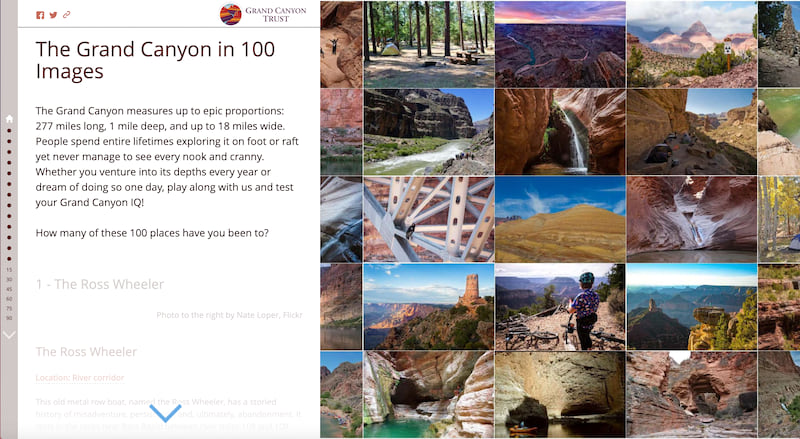
The Grand Canyon in 100 Images gives something to everyone. Whether it is the remarkable beauty of a desert spring, the sunset on the south rim, unique architecture, fossils that have stood the test of time, a muddy rapid that looks more like chocolate milk than water, or bakery treats from a local business. And Esri’s Story Map Journal was the perfect platform to showcase all 100 places.
The idea was born as a way to transform a 100-image social media quiz into a dynamic product that would extend the life of the photos beyond a tweet or Facebook post. Esri’s Story Maps platform would allow for all 100 images to be housed in one application and for us to connect the locations back to key conservation issues throughout the canyon and our Colorado Plateau Explorer hiking site. But which application to use for such a large number of photos became the most challenging part of this project. And much like exploring the canyon, the process became an evolving adventure in learning.
As with all our map-driven stories, we start by brainstorming what experience we want readers to have. For 100 Images, this led to more questions than answers. How will someone navigate through all 100 images? Would the experience be a tour from rim to rim, or east to west along the Colorado? What role would the added content serve, and should the map be the guide to the images, or the images be the star? We also faced another major challenge: 100 photos are a lot of images, and I knew we would be pushing the limits of any application.
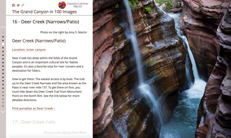
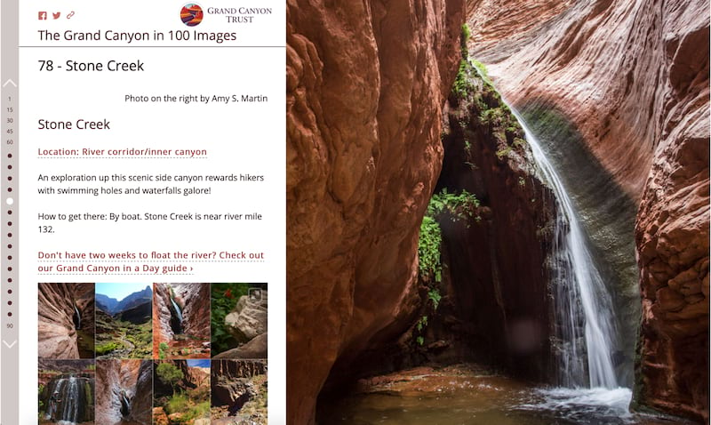
Our decision was to let the images take center stage and the map be an accompanying bonus. We wanted our readers to be emerged in the landscape much like a hike down the canyon. After testing Story Map Tour and Shortlist, Story Map Journal became the obvious choice to handle all 100 photographs, give navigation options so users can quickly jump between photos or scroll in order, allow full text and map functionality, and custom URL perimeters to move between sections. It also allowed us to embed additional images for some locations that our generous members helped supply.
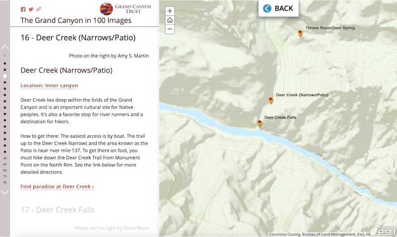
With every design decision, we continued to put the user experience first. How much text should we include, and what purpose should the map serve? It would have been easy to add extra information in the map like trail tracks or in-depth explanations to past and current threats to the canyon. But we wanted a minimalist approach. The map would only highlight the photo point location with a simple topographic map in the background. Word counts would stay low and story actions would direct users to extra content. It’s easy to overwhelm an audience with too much information, but we still wanted them to be able to dive deeper. The Story Map Journal’s story actions were the perfect solution to keep readers in the application but include some extra information for those true canyon lovers.
We still pushed the limits of the Story Journal and learned that 101 sections is the maximum allowed. It also pushed the bounds on loading. Our initial design included the map as an iframe embed in the side panel, but we learned that 100 iframes was asking too much on mobile load times and caused strange behavior with custom URL perimeters. So, with the user experience in mind, we adapted our plan and weighed our options. Should we keep the map embedded in the side panel as a static image or did we want interactivity? Our choice was to link the map to a story action, so clicking the location text on each section would allow readers to further explore the canyon.
Overall, we love the Story Map Journal template because it gives greater flexibility with HTML customizations in each section, so we can completely control the experience without having to host the code ourselves. While we may not set out to push the limits with 101 sections again, we think it worked perfectly for 100 Images of the Grand Canyon. Maybe as you scroll through it will spark memories of your time spent at the canyon, inspire you to lace your shoes (or if you are me, strap on your sandals) and hit the trail, or learn more about ways to protect this amazing landscape.



Article Discussion: