Designing an effective dashboard is not only about clear and meaningful data visualization, but also about making the dashboard digitally accessible to all users. Creating an accessible dashboard ensures that the information is clear and understandable to all users including those that might be using assistive technologies.
In this blog, we’ll share what you as a dashboard author can do today to make your dashboard more accessible to a wider audience. These new features and capabilities were introduced with the June 2024 ArcGIS Online update and will be available in the ArcGIS Enterprise 11.4 release.
We will start exploring the configuration settings of this dashboard and you can create your own copy to follow along.
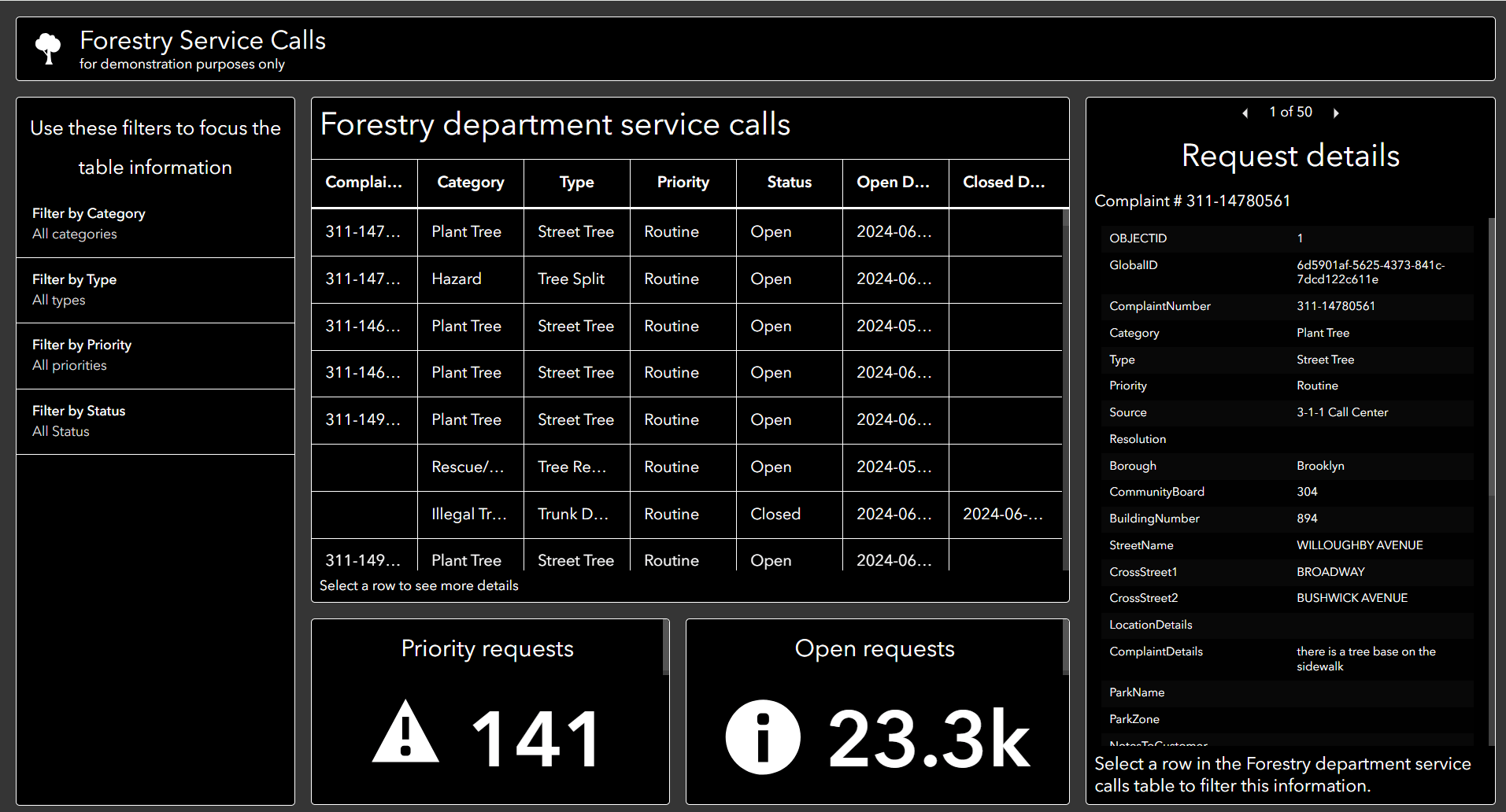
Here are some of the features implemented in this dashboard to improve accessibility.
Headings
We will start at the top of the dashboard with the header panel that includes a short but descriptive title. This gives context to your dashboard and is the first thing that will be read by screen readers. The header panel title is automatically styled as Heading 1 (<h1>) and should be the only H1 heading on the page.
Continuing with headings, each element or data visualization includes a visible and descriptive title styled using Heading 2 or Heading 3. Use the formatting options or add <h2> and <h3> using HTML.
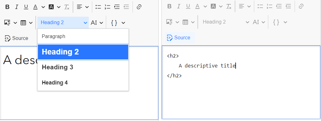
Tip – If you add a subtitle, use the below option so it appears on the second row beneath the title. Subtitles are automatically styled as Heading 2 (<H2>) so will follow the proper heading hierarchy. If space is limited, it’s recommended not to decrease the font size. Instead, use the description area to include additional text.
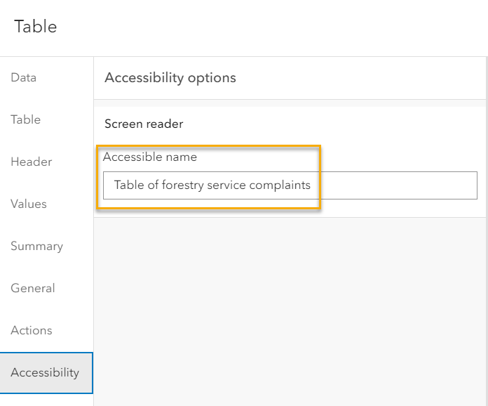
Accessible Name
The Accessible name property for the elements is updated with a short description that is specific to the data being featured. This allows individuals using assistive technology to identify the content and it can read by a screen reader.
Notice that when this dashboard is viewed, all information is visible without the need to switch between stacked elements or expand the sidebar. Having all the information about the contents of the dashboard visible supports individuals with cognitive impairments and can support better understanding for all.
Color
Although all dashboard themes meet minimum color contrast requirements, the new Enhanced contrast theme was selected for this dashboard to support better color contrast and low vision considerations.
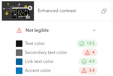
Tip – When selecting custom colors be sure to check the legibility for the color contrast ratio.
Tables
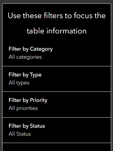
This sample dashboard also includes four(4) filters or selectors to control the information displayed in the table. The same presentation style makes keyboard navigation easier and the descriptive titles give clarity on the purpose of the filters.
A table is used to visualize data as it’s one of the more accessible and familiar options available in a dashboard. As there are many configuration options available, here are a few features that were reviewed for accessibility and either enabled or disabled accordingly.
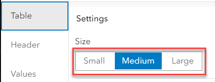
a. Table size – Increased size from the default of Medium to Large.
b. Header row – Included and updated column headers for proper capitalization and spacing.
c. Summary row – For aggregated or grouped values, include the summary row for clarity. (this is not shown in the sample dashboard)
d. Values – Kept the default theme color and text decoration settings.
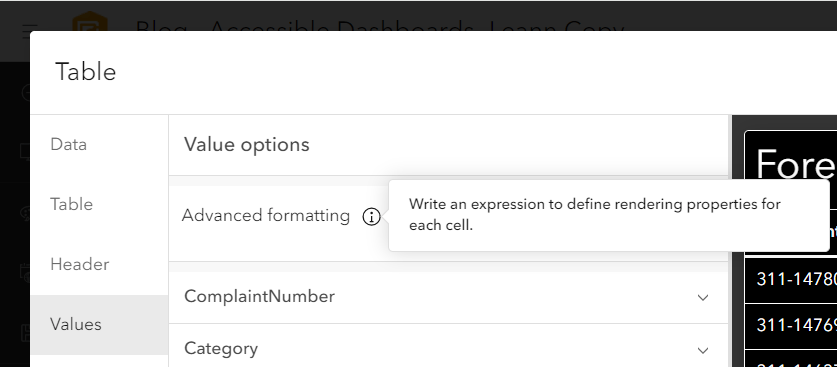
e. Advanced formatting – Use sparingly and with consideration for color, images and overall styling. For example, avoid presenting information only visually, such as distinguishing rows by color. (this option is not used in the sample dashboard).
Details
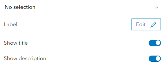
Users of this dashboard will also have the option to select a row in the table and filter the Complaint Details information. The details element is largely configured outside of the dashboard as it uses the same formatting as the pop-up. Care should be taken here too for the color, font, images and media included. We have also included a message to indicate this relationship which also serves to hide the details until that information is requested.
- Table element setting

- Details element setting
Indicators
Finally, this dashboard includes two indicators at the bottom. Like the other elements, a short but descriptive title is added and styled as Heading 2 and the accessible name updated so it is unique between these two elements of the same type. Although a graphic was included, it is complementary to the title and since it is marked as decorative it will not be read by a screen reader or require alt-text.
Elements specific accessibility
As the demonstration dashboard does not include all the possible data visualization options that are available, this next section we’ll cover some key configuration options for other elements.
Serial chart and Pie chart
For serial chart or pie chart, here are some accessibility considerations:
- Increase the text size for the axes titles and labels.
- Avoid using color as the only method to distinguish between data points by adding axes and series labels.
- Choose a theme first and then create the chart. This ensures the default colors used have sufficient color contrast between categories and the colors will complement the theme.
- Use series or slice labels instead of a legend.
Embedded content and Rich text elements
Here are some things to keep in mind for embedded content or rich text elements:
- Ensure that the content meets your accessibility standards and there are no keyboard traps.
- Note that not all websites and applications are accessible or can be embedded in a dashboard. Consider a link from the Header panel menu as an alternative approach.
Remember to use and test your dashboard before sharing
Practice using your dashboard with just a keyboard. You can quickly navigate between the panels and elements, using the Tab and Shift+Tab keys. To move focus within an element, press Enter, then use tab, Shift+Tab or arrow keys to move between buttons, links and interactive data points.
Try using your dashboard with a screen reader. There are different default options provided based on OS, as Windows offers Narrator and Mac offers VoiceOver. Mobile devices will also have screen reader options such as VoiceOver on iOS devices.
Esri is committed to meeting accessibility requirements and continues to make improvements with each release. The dashboard configuration experience allows authors control over many aspects of the design and the choices made must be intentional to achieve the desired experience and improve accessibility., and there is also much that can be controlled by you, as the dashboard author, to make dashboards available to more users.


Article Discussion: