ArcGIS Mission is a powerful tool that facilitates real-time communication between operators in the field and those in a command environment. ArcGIS Mission moves data quickly between mission participants providing access to all hosted services on an enterprise’s portal, or by ingesting publicly shared data services in REST, WFS, WMS, or WMTS formats. The main orchestrator of data is the Mission Manager web application via the Mission Server.
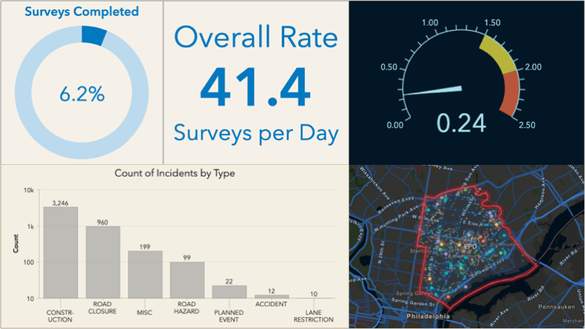
While the mission manager web application is robust, it is not customizable and may not be the most effective means for showing mission data at a macro level. The web app is designed to interact at the user level. In the mission details section of every mission created, an option to create a mission dashboard by leveraging the powerful ArcGIS Dashboard tool is present and can help you tailor the information that an organization needs to see.
Creating a Mission Dashboard
To create a Mission Dashboard from a missions’ details page, open the mission from the main menu by selecting “View Details”. When the details page opens, select “Create” and follow the prompts to name the dashboard, and provide supporting information. After creation, you will see a success toast and be returned to the mission details overview page. Two options now appear in the Mission Dashboard section: Open to open the dashboard and Edit to further configure it. When the dashboard is created with this method, it will prepopulate with many of the key aspects of mission to include: Last Known Locations of participants, broadcast message list, chat list, task list, and other key mission information.
Alternatively, a Mission dashboard can be created by opening the ArcGIS Dashboard application on the app switcher from the organizational portal. Once opened, create a new dashboard and use the Mission web map as the source.
Configuring a Mission Dashboard
Once the dashboard is created, it can be opened and used as is or if more configuration is desired, a user can select Edit to open the dashboard to an editable state. For those not used to configuring a dashboard, this is a good article to start with: Create your first dashboard using ArcGIS Dashboards by Bern Szukalski.
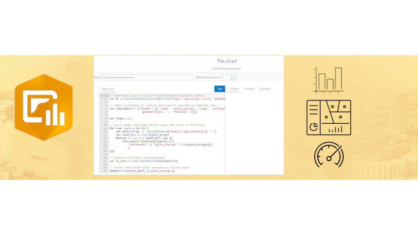
There are many benefits to using a dashboard to expand a mission, one of which is displaying key metrics of a mission utilizing Arcade. Utilizing Arcade can greatly enhance the effectiveness of the data being displayed in the command post. Below are several examples of Arcade scripts that can aid decision making capabilities by highlighting key information.
Identify Users with Low Battery Percentage
To set up a visual indicator of users by battery percentage, with any version of mission, you can do the following:
- Select “Configure” for the Mission Responder Last Known Locations
- Select “List”
- Under “Advanced formatting”, select ‘Enable’ to open the arcade input window.
- Enter the following:
1. var health = ‘darkgreen’
2. if ($datapoint.battery_percentage <= 30) {
3. health = ‘#963232’;
}
4. return {
5. textColor: ‘#ffffff’,
6. backgroundColor:health,
7. separatorColor:’#ebebeb’,
8. selectionColor: ‘#b3c4db’,
9. selectionTextColor: ‘#ffffff’,
10. // attributes: {
11. // attribute1: ”,
12. // attribute2: ”
13. // }
14. }
Code Breakdown: You are creating a variable for health with the `var` function and specifying what color the default color of the bar should be. With the ‘if’ function, you are calling the `battery percentage` field and saying that if the number is less than or equal to 30%, then display a red color of #963232. The `backgroundColor` value is set to health which is your original variable. These values can be easily changed to reflect your preferences.

Separate Important from Standard Chats
To set up a visual indicator of important messages versus regular messages, at version 11.4 or later, you can do the following:
- Select “Configure” for the Mission Chat Log
- Select “List”
- Under “Advanced formatting”, select ‘Enable’ to open the arcade input window.
- Enter the following:
- var color = IIF($datapoint.msg_title == ‘Important’,’#F3DED7′,”);
- var colortext = IIF($datapoint.msg_title == ‘Important’, ‘#000000’, ”);
- return {
- textColor: colortext,
- backgroundColor: color,
- separatorColor:”,
- selectionColor: ”,
- selectionTextColor: ”,
- // attributes: {
- // attribute1: ”,
- // attribute2: ”
- // }
- }
Code Breakdown: To achieve this, you are creating two different variables that will be used to control the Background and the Text Color. We create two IIF statements where the datapoint of msg_title when Important will resolve to color of the background and the text. To activate these two, the variables of color and colortext are inserted into the values for the textColor and backgroundColor.

Format Tasks with Priority Indicator Bar
Our final enhancement falls on the more advanced spectrum as it incorporates html formatting in combination with Arcade. This solution will create a small colored bar to the left of the task information itself that presents a corresponding color with the priority status of a task. To accomplish, there are a few steps to take:
- Select “Configure” for the Tasks List
- Select “List”
- Under “Advanced formatting”, select ‘Enable’ to open the arcade input window.
- Enter the following:
- var crit = Decode($datapoint[“Priority”],
- 0, ‘#878787’,
- 1, ‘#4de308’,
- 2, ‘#ffe701’,
- 3, ‘#e99509’,
- 4, ‘#e03c30’,
- ”
- )
- var html = Concatenate(`<table style=”border-collapse: collapse; width: 100%; height: 18px;” border=”0″>
- <tbody>
- <tr style=”height: 18px;”>
- <td style=”width: 5px; background-color: ` + crit + `; height: 18px;”> </td>
- <td style=”width: 200px; height: 18px;”>
- <p>` + $datapoint.name + `</p>
- <p>Status: ` + DomainName($datapoint, “status”) + `</p>
- <p>Priority: ` + DomainName($datapoint, “priority”) + `</p>
- <p>Assignee: ` + $datapoint.assignee_id + `</p>
- </td>
- </tr>
- <tr>
- <td style=”width: 5px; background-color: ` + crit + `;”> </td>
- <td style=”width: 200px; text-align: right;”> ` + $datapoint.last_edited_date + `</td>
- </tbody>
- </table>`)
- return {
- textColor: ”,
- backgroundColor: ”,
- separatorColor:”,
- selectionColor: ”,
- selectionTextColor: ”,
- attributes: {
- attribute1: html,
- // attribute2: ”
- }
- }
Additionally, you will need to clear the “Line item template” of all formatting and add a reference back to the HTML reference by inserting: {expression/attribute1}. If desired, you can add the last edited date by selecting the option in the “source” brackets of the “Line item template” and then adding the option {field/last_edited_date} with a font size of nine and right justified.
Code Breakdown: Lines 1 – 8 are identifying the colors that will be assigned to each of the blocks in your lists table based off of the domains where 0 is the lowest priority and 4 is the highest. Lines 9 through 24 represent the code which will return the colored blocks to the left of the tasks information block in the list. Line 12 has the crit reference which is assigning the priority color from Lines 1 -8. Lines 26 through 36 represent the return information on the task list with line 33 being paramount as this line attribute1: html, is what arcade will use to reference the html that creates the priority status block and the text fields.

There are many ways that you can adjust this code to make your dashboards work for you and to achieve your organizational goals. Hopefully some of these examples can help get you started. I would also like to thank one of my Esri colleagues, Jennifer Acunto, for her assistance with the advanced code block regarding tasks. She has many excellent blogs and write ups available in the Esri Community pages as well as Esri Blogs that can really help you enhance your dashboard visualizations.


Article Discussion: