The latest release of ArcGIS Dashboards includes significant user experience enhancements to selectors. Selectors offer a powerful way to let users filter data and trigger other actions on your dashboard. We’ve provided more options for controlling how selectors are presented on your dashboard and we’ve also adjusted the UI to make it easier for people to interact with selectors.
Read on to find out more about these changes, and how you can implement them in your own dashboard.
Presentation modes
The biggest change you will notice are presentation modes. We wanted to make sure that no matter what kind of dashboard you have, your selectors always look great. To this end, we designed three presentation modes to choose from when creating your selector: Inline, Accordion, and Dropdown.
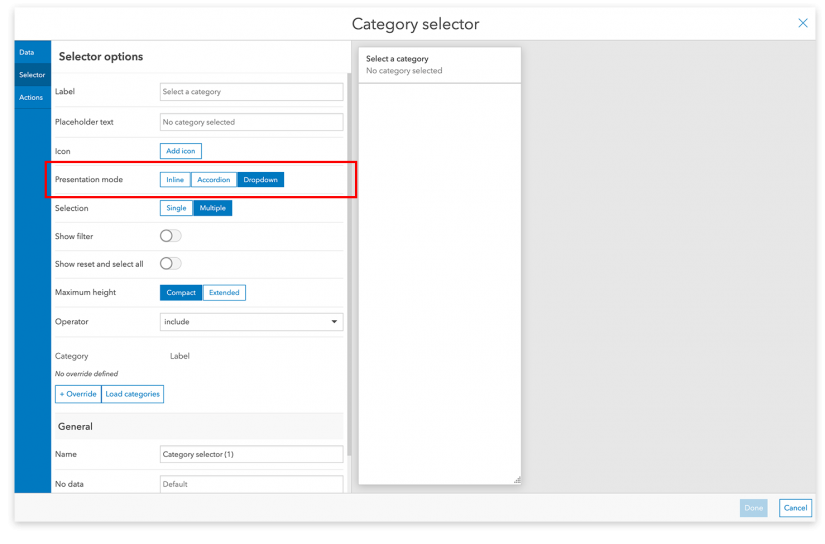
You can change the presentation mode at any time, just head over to the “Selector” tab of the selector configuration workflow and choose the presentation mode that best suits your dashboard.
Inline
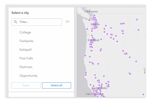
Want your selector to always be visible? Choose the Inline presentation mode. Viewers will be able to see all the options in an Inline selector as soon as a dashboard loads. Due to space constraints, this mode is only available for selectors in the side panel.
Accordion
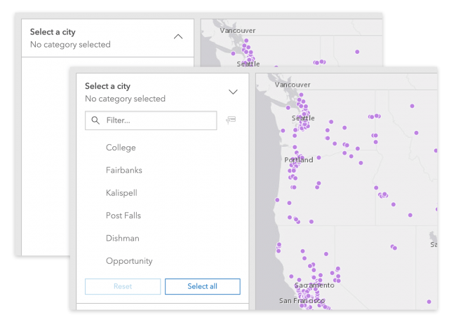
The Accordion presentation mode lets viewers open a selector and, if they want, keep it open as they interact with other parts of the dashboard. Consider using this mode if your dashboard has a lot of selectors and you want to save space. Like the Inline mode, this is only available in the side panel.
Dropdown
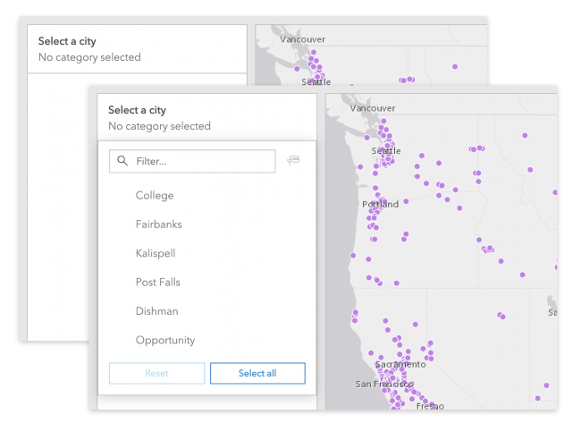
Dropdowns are great for selectors that viewers need to get in and out of quickly. They will open when clicked and close automatically when viewers move on to other parts of the dashboard. This presentation mode is available in both the side panel and header.
Additional Improvements
We also included several more improvements to selectors to go with the new presentation modes. We think you’ll appreciate them all, but we wanted to call out a few of the more significant ones here.
Customizable icons
Distinguish your dashboard by adding icons to your selectors. Choose an existing icon from Esri’s own Meridian icon set or add your own custom icon. This is a great way to help viewers quickly scan your dashboard or add some of your own branding.
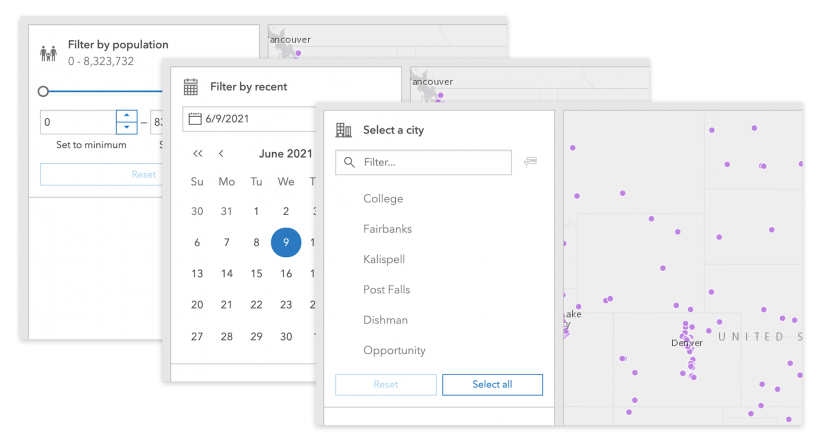
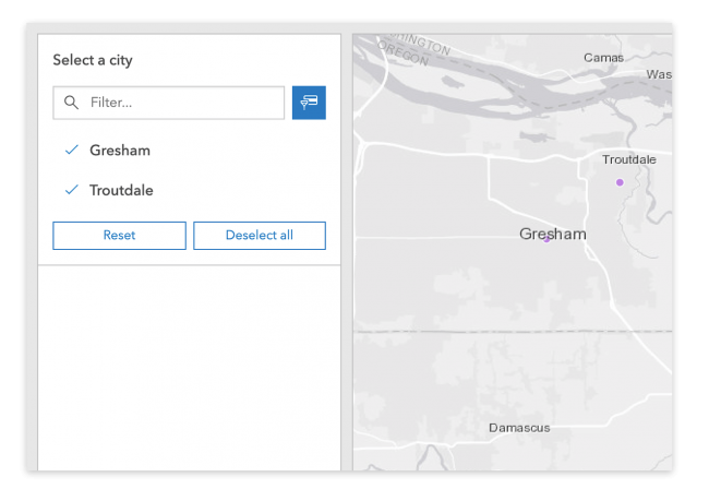
Improved filtering for category selectors
In addition to the standard text-based filtering, viewers can now filter a category selector by selected categories. This option is useful for situations where viewers are interacting with a selector that has a long list of categories.
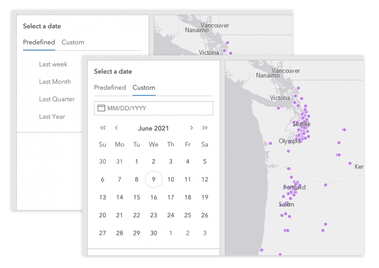
Enhanced combination date selectors
If you’ve ever needed to support filtering by both predefined dates and fully customizable dates, you may be familiar with the combination date selector. This enhancement updates the UI with clearer controls and a better user experience.
That’s all we have room to cover in this article, but there are more improvements waiting for you in ArcGIS Dashboards. And remember, we are always interested in feedback that can make your dashboard better. Don’t hesitate to join the conversation in the ArcGIS Dashboards Esri Community. And remember the #ArcGISDashboards tag when you share on social media!

Article Discussion: