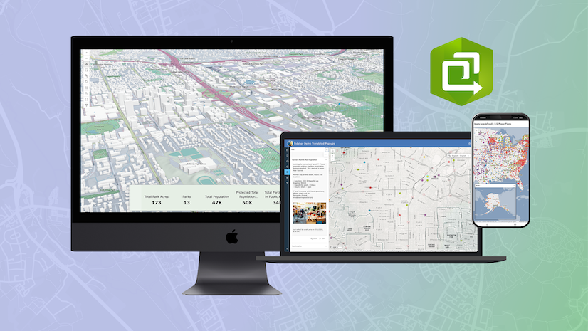
ArcGIS Instant Apps allows app authors to quickly create interactive experiences from maps and data. These apps can be created and shared within minutes. Don’t be fooled by the ease of creating them; Instant Apps is a powerful app builder with a depth of functionality. In this article, we will share some tips and tricks to help you unlock the full capabilities of Instant Apps.
Find the right app
The Instant Apps home page offers over 20 different app templates. Some are focused on specific purposes, while others offer a wide range of use cases and customizations. There are multiple ways to find the right templates; search for capabilities, take a quiz, view a sample app, or preview your map in an Instant Apps template.
Search for capabilities
You can search by capabilities to find the right app for your needs. The search box allows you to select your preferred capabilities to narrow down your options to the right template for you.

Additionally, a matrix of all Instant Apps capabilities and which app templates they are in can be accessed from the search box.

Explore the app card
Each Instant Apps template card holds additional information. Open the description to read about the template and see some examples of how to use the selected app.


If you have not yet chosen which map, scene, or group you are trying to create an app from, the Sample button will be enabled. This will take you to a sample app using this app template. If your map, scene, or group has been chosen, you can click Preview to see what your selected content may look like using the basic settings of the app template.
Get familiar with the configuration
Express and full setup modes
The Instant Apps configuration window opens and by default, the Express toggle button is turned on. With the Express toggle button turned on, the app walks you through step-by-step settings that are essential to configure when creating a new app. If you don’t see a capability you need, turn off the Express toggle button. With Express mode turned off, all configuration options available in the template become enabled and are grouped by sections: App-specific content settings, About, Interactivity, Theme & Layout, and others, if applicable.
Tip: Express mode controls are in the upper left corner of every app; turn off the toggle button to enable all available configuration options.

Searching for capabilities and tools
Right under the Express toggle is Search settings. Searching for capabilities within the configuration is one of the most useful tools in the configuration window. Search settings is available in every app and searches all available tools in the template, regardless of the Express mode setting. Clicking on a search result takes you directly to the setting.

Component highlights
Over the last few years, there has been a strong effort to improve the configurable components offered in most of the Instant Apps. The options you configure when creating your app can introduce your app, focus your audience’s attention, help your audience gain a better understanding of presented information, and make sharing your app simple and efficient. The components mentioned below should be top considerations when configuring your app.
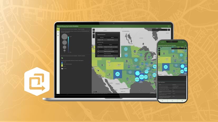
Map area
Use the Map area component to configure the Map view and Navigation boundary. The Map view option allows you to choose where in the map you want your app to open. Follow that up by setting up a defined extent and scale of where a user can view with the Navigation boundary. In the map depicted below, the red point marker defines the center of the map view where the app will open. The green outline shows the scale for how zoomed in/out the map will open at. The solid blue rectangle defines the navigation boundary, which is the extent of where people accessing the app can navigate.
Tip: If you are setting up a navigation boundary, don’t forget to update the map scale. This limits how much you can zoom in and out of in the map.

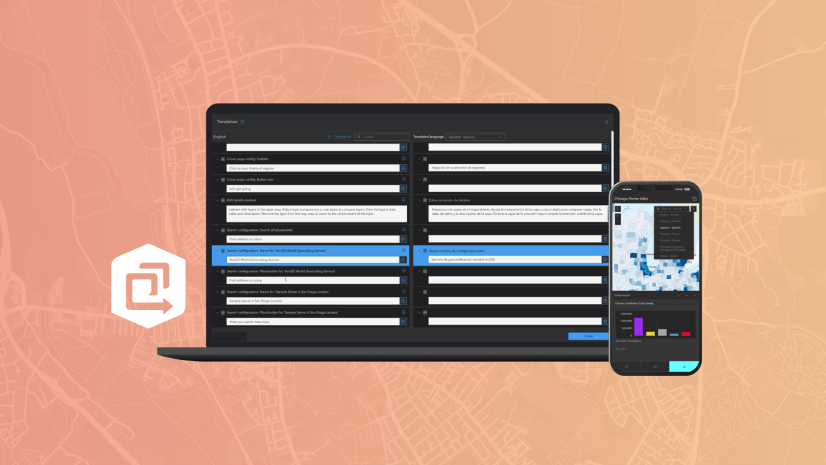
Language switcher
In many app templates, you can add an option for users to switch the language that the app uses. The language switcher component makes it easy to set up translations for all user-defined text in your app. Rather than creating multiple copies of the same app and having to provide translations in multiple locations, you can have one app that includes the language switcher to support multiple languages.


Cover page
The Cover page component acts as a full-size title page for your app. It is the first thing an app user sees when accessing your app. You can add a title, subtitle, description, and icon to be used on the cover page. The background of the cover page can be configured to use either a solid color or an uploaded image to use as the background.


Introduction window
Provide details about your app or the content in your app using the Introduction window component. The window displays over top of your app so that people accessing your app can learn about the content in the app prior to continuing on to use your app.

Export
Provide the option for app users to export a PDF, PNG, or JPEG of the map and selected features in the app. The exported file can also include the legend to provide context for the symbols in the map.
Tip: The map extent being viewed upon clicking Export is the map extent that is exported. There is also an option to set the extent of the exported map will be available.


Sharing
Provide options for users to share your app using social media or by copying a link or embed code. The copied link preserves the current view of your map, visible layers, and any selected features.
Tip: Choose to include social media sharing options or embed options in the sharing tool or leave them out to keep sharing simple.

Style your app
When configuring your app, utilize the theme and layout tools in the Theme & Layout configuration section to style your app.
Theme
The theme settings offer many tools to customize the look of your app, including the options to change the app to dark or light mode, to change the font, and to choose a preset theme. A preset theme determines the set of colors that apply to certain elements in an app like the header. If none of the preset themes fit your app, use the color pickers to adjust the text and background colors so they fit in line with your brand. In the theme settings, you can also add a logo to the app by uploading an image that displays in the header next to the app title. A logo is a great way to consistently convey your brand in an app.
Tip: While using the color pickers, there is a built-in color contrast checker to confirm if your custom color selections meet accessibility standards.

Position Manager
For apps that display widgets in the map (such as the Home button, Zoom controls, Measurement tools, and more), consider using the position manager component to order and align tools in the four corners of the map.

We hope these tips and tricks help you make the most of ArcGIS Instant Apps. For more information, check out Instant Apps on ArcGIS blog or visit the Instant Apps documentation.


Article Discussion: