Police departments around the world have increasingly been shifting to a more data-driven approach to fighting and reducing crime, known as data-driven policing. Data-driven policing focuses on reducing crime by using various data sources, problem-solving with those data, and creating actionable information products that can be used by commanders to craft evidence-based strategies and tactics to impact the problem. This approach allows commanders, analysts and agencies to become more efficient and responsive to the ongoing demands of the job. Now more than ever, data-driven policing is strengthening its role as a pro-active crime reduction method.
The Challenge
When working with a large variety of data on a consistent basis, there are numerous ways to prepare, display, communicate, and analyze it. Another challenge is to grow from just displaying charts and graphs, to adding tangible value with analytics and statistics. Additionally, using the spatial component within data can take any data-driven approach to a new level. To top this off, the speed of producing results is an absolute necessity. All of this work takes time, and timeliness is critical as today’s data must immediately be understood to make decisions accurately and quickly.
The successful implementation of data-driven policing in any agency requires actionable information. This information emerges from the work with various data sources and analytical tools to present easy to understand outputs. ArcGIS Insights provides a complete, web-based exploratory data analysis workbench to support this entire process, which in turn supports the demands of a robust policing program.
We find ArcGIS Insights an intuitive and easy to use analytics platform for our non-GIS experts here at the City. We have a wealth of data collected over many years that needs to be analyzed to inform our policies, decisions and deliver operational excellence and to this end we find Insights a right tool for the job.
In this blog we walk you through common workflows of ArcGIS Insights that can aid in data-driven policing, and identify ways to work with your data that you may not have previously considered. We highlight how ArcGIS can enable data-driven policing at your agency by helping analysts work more effectively across all phases of the analysis process – preparing, visualizing, analyzing, and sharing.
PREPARE
Data prep is a process we are all very familiar with. Analysts in police departments often find themselves stuck looking at row after row of incident data—to include dates, locations, types of crime, you name it. Data are often received in tables or spreadsheets from which you have to decipher, clean-up, and format. These processes can take up a lot of time, pulling them away from the more important and significant analytic work.
With ArcGIS Insights, data sources (databases, spreadsheets, GIS) can easily be incorporated together into the project. Fully preparing your data to include the spatial component adds a new element that is not readily visible in spreadsheet form. Whether it’s enriching your data by adding certain variables to the project, or even doing spatial joins to bring datasets together, spatial data prep will ultimately help to bring better understanding. By incorporating geographic elements, you can begin the next step, exploratory data analysis, with a new dimension. In the examples below, you’ll see preparation of data, to include geocoding, field calculation, enrichment, and spatial join.
Geocoding
After looking at row after row of incident data in those spreadsheets, a very natural next step is to assign a geographic location to each of them. This is the geocoding process. Geocoding a list of incidents is probably the most common way analysts get those points onto their map.
As the video below illustrates, this is as simple as dragging and dropping your table of incidents into your workbook. You’ll then enable their location based on the spatial data you have in your table–address, coordinates, etc. After geocoding is completed, you’ll be able to dive right into more exploratory data analysis.
Field Calculation
You’ve got your incidents geocoded and plotted on the map. Viewing the data in the attribute table, you notice that there are a couple of fields you can appreciate on their own, but you’d like to see these combined into their own separate field. Field calculations are great for this. An example of this could be having separate crime types listed out in separate columns, but you’d like to get the overall count of crimes/incidents in one column.
Take a look at the video below for how to create a new field that is calculated from multiple columns. Field calculations are a convenient way to either batch update multiple records at the same time, or, as in this case, needing to create a new column with the results of a specific calculation.
Enrichment
Another popular data prep step is enrichment. Enrichment is a process that appends, or adds, new data values to your existing data. A library of authoritative enrichment content is available within Esri’s cloud, such as data on population, poverty, demographics, behavior, race, and much more. ArcGIS Insights applies standardized methods that result in accurately apportioned enrichment data for any law enforcement operational area. Simply input your locations (such as patrol areas), select which variables you’d like to add, and the new columns and values are then available as part of your existing dataset.
The following video illustrates just how easy it is to enrich your data with more variables to build your analysis into a more comprehensive one.
You may, however, need to “enrich” your data in a different way. While enrichment techniques are great for adding different variables to your project, maybe there’s a situation where you don’t have all the data you need in one nice, neat catalog. Maybe you have disparate datasets that you need to combine into one; i.e., you want attributes from one dataset in another. A spatial join can help.
Spatial Join
Spatial joins are like traditional joins, however, they are based on location. No common key value is required, the data only need to have a location. Spatial joins allow you to join attributes from one feature to another based on their spatial relationship.
Perhaps you need to see how many incidents there are to a patrol area, but you only have their location (which hasn’t yet been associated to a patrol area). Or you may want to see which patrol area has whichever incidents contained within. A spatial join allows you to combine these datasets to get a more detailed look at what’s going on in the specified area.
In the example below, incident points are joined with patrol areas. Those incident points that fall within a patrol area will now contain the field (row) values from both datasets. Take a look:
Those are some of the more common ways of preparing your data within ArcGIS Insights. While you don’t have to perform all of those functions, or you decide to perform more in prep, the goal is to make it as simple as possible. The benefit of ArcGIS Insights is that the data preparation occurs in a single application, and when complete you can move seamlessly into the next step of this process.
Let’s move on to what happens after you get your data nicely cleaned and prepped. In the next section, you’ll learn about some of the ways ArcGIS Insights helps with visualization and analysis. You’ve got your data plotted, now let’s dive a bit deeper.
VISUALIZATION & ANALYSIS
As noted earlier, one of the simplest ways to visualize your data is by simply plotting it. Plotting geographic data on a map is not difficult, and many people just stop there. But you can easily do more. Below we outline a few functions you can perform with your data to get more meaningful results, produce actionable information, and help your police force in its data-driven policing efforts.
Let’s consider a hypothetical… your chief has set a priority of reducing burglaries citywide as part of the agency’s data-driven policing strategy. You need to understand recent citywide trends for that type of crime, then drill down to uncover actionable information that can be used to drive their crime reduction strategy. We’ll start by looking at the matter of when.
Temporal Analysis
The incidents are plotted on the charts and now you have a better idea of where the crimes are occurring and to a degree, their frequency. When you want to take a closer look and get a better idea of their temporal attributes, i.e. when they occur, temporal analysis is extremely useful.
In this particular case, the police chief may be interested in seeing if there is a particular day of the week, month, or even year when crime occurrences are more prevalent. ArcGIS Insights provides the ability to chart those incidents and related time periods in a choice of over 20 different chart types. An example of this is shown in the video below.
Temporal analysis allows for that quick visualization of data with their associated times which have proven to be essential when investigating patterns and/or causes of particular crimes. That’s a more detailed look at when there is a concentration of incidents. Now let’s take another, closer look at where…where might they be concentrated?
Spatial Aggregation
Spatial aggregation allows you to take those previously observed statistics on incidents to now look at them within specified boundaries. If the police chief asks you which specified geography—in this case, patrol areas—has the highest number of burglaries, you can easily provide that answer by aggregating those crime incidents to those areas with a drag-and-drop. Take a look:
There is no shortage of area boundaries to report on. Other examples are patrol areas, police districts, school zones, cities/towns, council districts, postal codes, census tracts, and subdivisions. Aggregate crime incidents to these areas with a drag-and-drop.
Hot Spots & Hot Spot Policing
You’ve done some mapping and some analysis. Up to this point it seems all you can really say about your data is that there are incidents all over the city. To help make more sense of all that data and make it more impactful, hot spot mapping can help. In identifying hot spots, you are essentially looking for those areas that are “hot”—having a concentration of incidents, or “cold”—having fewer incidents.
Combine hot spot analysis with policing and you get hot spot policing; that is, a crime prevention strategy that aims to identify those areas where crime is concentrated. Having this knowledge in hand allows agencies to focus their resources where they are most needed or where crime is more likely to occur.
Heat maps and binned maps are two mapping options that help visualize many points. There are often so many incidents on a map that the data are not understandable. These easy visualization techniques can help. The video below illustrates these two techniques. The concentrations of incidents can be viewed in a traditional heat map, as well as a binned map, where large amounts of point data are aggregated into different polygons or bins.
Kernel Density Estimation (KDE)
To take your analysis a step above, you can perform a kernel density estimation (KDE). While the methods and techniques we’ve already highlighted can definitely aid in your data-driven policing strategy, you may find that incorporating a density surface into your analysis is valuable.
Within a KDE, you are creating a new surface or layer that will highlight the densest areas of an incident. For instance, you may want to filter out a particular crime type, such as burglaries, and see where they are concentrated within the city. By doing this calculation, you’ll be able to quickly visualize the densest areas and use this information to aid in planning for and assigning appropriate resources.
The video below shows a KDE performed on burglaries within the city boundary.
Kernel Density Estimation & Data Clock
Lastly, we have a comprehensive result with the Kernel Density Estimation and its associated Data Clock. This is an effective collaboration of techniques we’ve discussed in this blog. In this particular example, you’ll find a map and chart side-by-side, changing dynamically according to the actions performed. While the KDE maps shows the density in spatial form, the data clock shows density in graphical form—indicating multiple time units in one display (e.g. showing incidents with day of week along with time of day for those days).
The video below highlights when the temporal aspects of data are brought together with the spatial component, even more interesting patterns can be revealed.
If you are asked questions regarding when a particular incident occurred, what type of incident it was, and where the occurrence seems most prevalent, you will be able to respond quickly with the data, visualizations, and analyses you have right in front of you.
Maps on their own are great, but power is really unleashed when used in combination with charts and tables. In our last section, you’ll see ways in which you can share your data, work, and workflows in different ways to accomodate difference audiences.
Staff come and talk to me about this data and want to know more about it. I want to be able to put this information—the data, the analytics—at the fingertips of even our patrol commanders and sergeants.
SHARE
There are many ways of sharing your work with ArcGIS Insights, but how you share will be dependent on the audience. There are two main personas that you’ll share your work with: Viewers and Analysts.
Share the Page
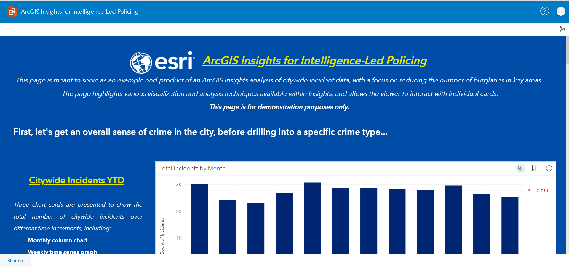
Examples of viewers might be a police chief, a district or unit commander, or simply the general public who needs or wants to view the analysis that you’ve done in ArcGIS Insights in order to better understand the data. The simplest way to share your work with this audience is to share a page. Sharing your page allows others to interact with the cards on your page in a separate read-only ArcGIS Insights viewer. The person accessing your page will be able to view the data, pan and zoom the page, and interact with any charts, tables, or filters, but they will not be able to add or remove data or cards, or perform analysis.

Share the Story(Map)
Not only can ArcGIS Insights pages be viewed stand-alone in a browser, but they can also be embedded in websites and other ArcGIS apps, like ArcGIS StoryMaps for example. Embedding ArcGIS Insights pages in StoryMaps and other apps help provide contextual background to the data and analytical work that was performed, and can help with communicating the strategies you want to undertake based on the analysis.

Share the Model
The other audience you might want to share with is analysts. If you’re working with another crime analyst, you may want to share your analytical process and methodology with them. You can do so by sharing a model.
A model is a visual recording of the steps in your analysis. In ArcGIS Insights, models are created for each page automatically as you work, so you can focus on exploring your data and performing analysis, rather than creating a model. By sharing your model with other analysts, they will then be able to open the model and view the step-by-step workflow, including the data inputs. They can then re-run the analysis with the same data, or replace with their own data.
Models can bring significant time savings for knowledge transfer of analysis methods with more junior analysts, or performing repeatable analyses that are required to be done on a regular basis.
Share the Workbook
A more comprehensive method of sharing your work with an analyst would be to share an entire workbook. Sharing a workbook collects or associates all data and analytical activity across all pages for a project in a single place, capturing and maintaining relationships such as data locations, and storing result layers, models, pages, and cards. This allows the analyst to get a full picture of the methodologies and results used in the analysis, keeping data relationships and models intact.
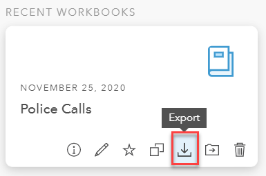
Workbooks can even be exported and imported across different ArcGIS Insights deployments, whether hosted in ArcGIS Online, ArcGIS Enterprise, or ArcGIS Insights Desktop.

Analysis isn’t powerful on its own. Sharing your analysis with others in order to better understand problems and make decisions is where the real power comes in.
Get Started
ArcGIS Insights provides you with a complete, web-based exploratory data analysis workbench. ArcGIS Insights is designed to support your work across the entire analytical process–whether it’s preparing data, performing analysis, or presenting actionable information products. Start using ArcGIS Insights today to support the demands of your robust police program.
While we are sure you’ll find our blog videos helpful, if you want to learn more about ArcGIS Insights, please check out our resources below and remember to feel free to reach out to your designated Esri team if you have questions.
Additional Resources
For more information about ArcGIS Insights, please check out our product page. Here you can find Learn Lessons and training to help get you started. Additionally, view this 1 hour webinar video demonstrating more possibilities of ArcGIS Insights working with 911 call center data.


Article Discussion: