ArcGIS Insights combines data visualization and analysis to accelerate decision making. From interactive charts and maps to advanced analytics, Insights offers a wide array of capabilities to help you understand your data, answer important questions, and create interactive reports.
The Insights 2024.1 release (June 2024) includes running total on summary tables and lollipop chart symbols. Keep reading to learn more about these new features so you can try them out the next time you use Insights.
Running total
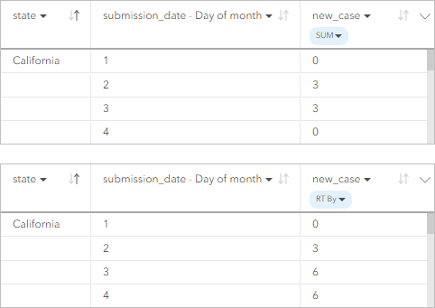
Running total is now supported as a field statistic for summary tables.
You can use running total to calculate how a numerical variable accumulates over time. For example, in a summary table of daily new infectious disease cases, calculating the running total provides the cumulative number of cases for each day.

Lollipop chart symbols
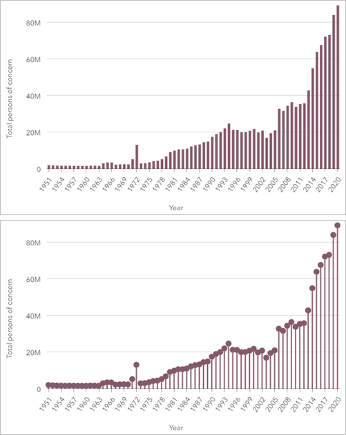
Bar charts, column charts, stacked bar charts, stacked column charts, and combo charts now support representing data as lollipops. Lollipops are useful for charts with a large number of unique values and charts with uniform values.

Other updates
- Items deleted from Insights in ArcGIS Online are now moved to the recycling bin.
- Graduated color palettes for maps styled with Counts and amounts (Color), Bins, or Heat map symbols now show the name of the palettes in hover text.
More resources
You can now access these and several other enhancements in ArcGIS Insights. For a full list of new features, visit What’s new in the Insights help documentation.
We love hearing from you! Visit Esri Community to ask questions, access resources, and submit ideas for new features you want to see in Insights.
Data attribution
United States Centers for Disease Control and Prevention (CDC) Weekly United States COVID-19 Cases and Deaths by State dataset. Downloaded March, 2021.
UNHCR Population Statistics Database. Downloaded September, 2021.


Article Discussion: