A lollipop chart is the same as a bar or column chart, just styled differently in a form that resembles, well, a lollipop! Alternatively, you could consider it to be a point chart of singular values with lines.
The worth of a lollipop chart is somewhat debatable. It can be argued that the location of the center of the value is difficult to judge, and visually less precise than the straight edge of a bar; and that half of the circular head protrudes beyond the value that it represents, opening it up to misinterpretation.
But, within the context of Insights, we decided they were a value add for some of our users, specifically in the following scenarios:
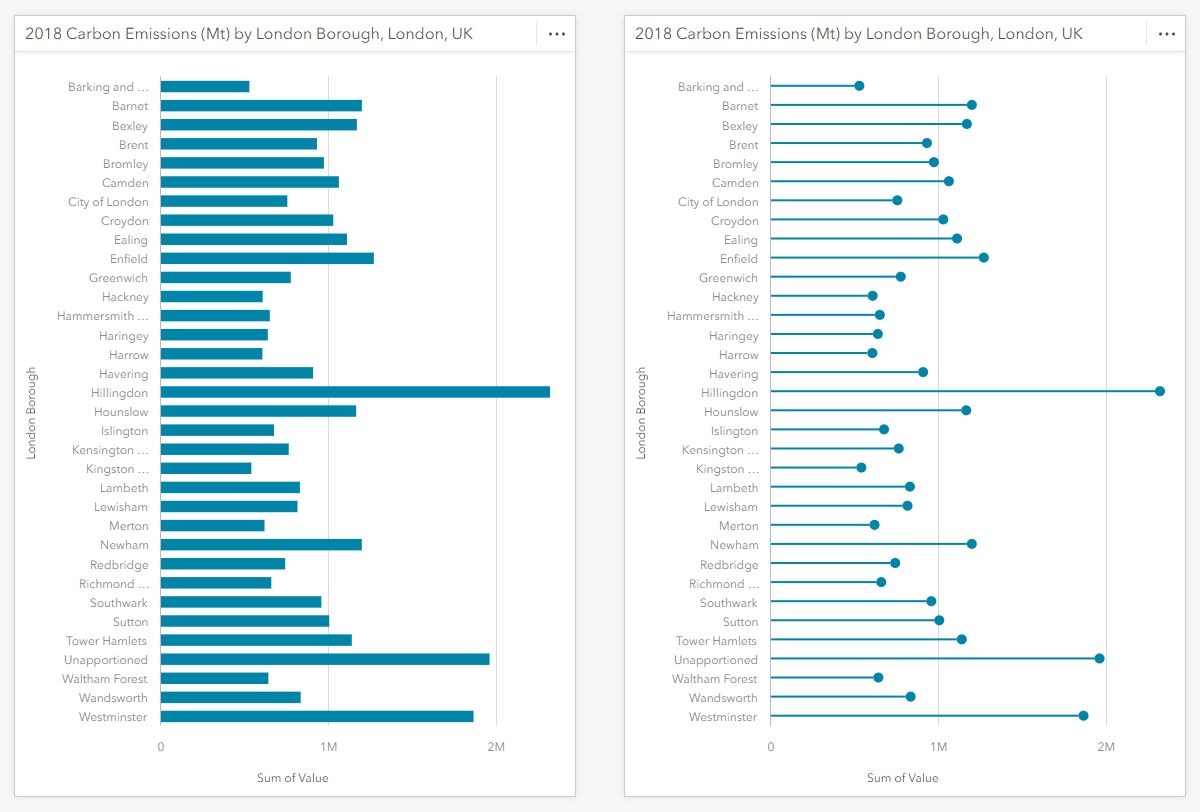
1. When the user wants to show more bars than would typically be shown on a bar or column chart
In this situation, showing lollipops with their thinner sticks helps tone the chart down a little so the bars are not so overpowering; and their point-like heads I believe aid value comparison in such a scenario, in particular when ordered by name rather than size.
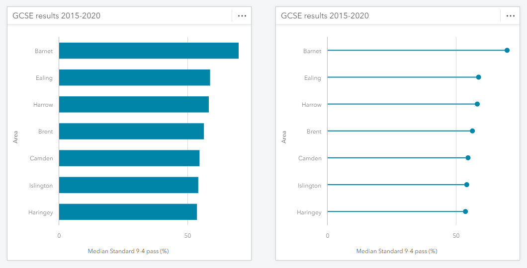
2. When the values are all high, e.g. mainly above 75%
Showing a large set of wide bars or tall columns can also be visually “aggressive”. The lollipop style helps to tone things down just like above.
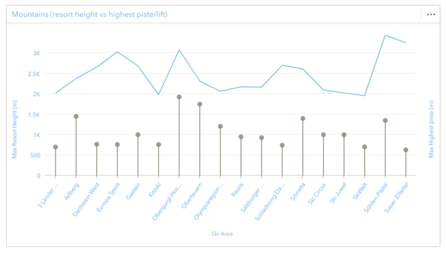
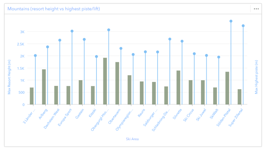
3. On certain combo charts with a line, especially heights
No particular scientific reason here other than the extra “white space” between the column bars helping a chart with quite a lot of columns (see bullet 1). However, lollipops might also make more sense than column bars with your particular theme. Its perhaps a push to imagine them as growing flowers, or as ski poles, but we will leave the creativity to you.
4. On combo charts alongside columns
Comparing two column series side-by-side may sometimes be easier if the series are in different styles as well as different colors. The option to style one series as column bars (columns) and the other as lollipops may also be useful to users wanting to use a single color on their charts, e.g. for printing or brand aesthetic.
5. Grouped bar charts when they’re a bit hard to read
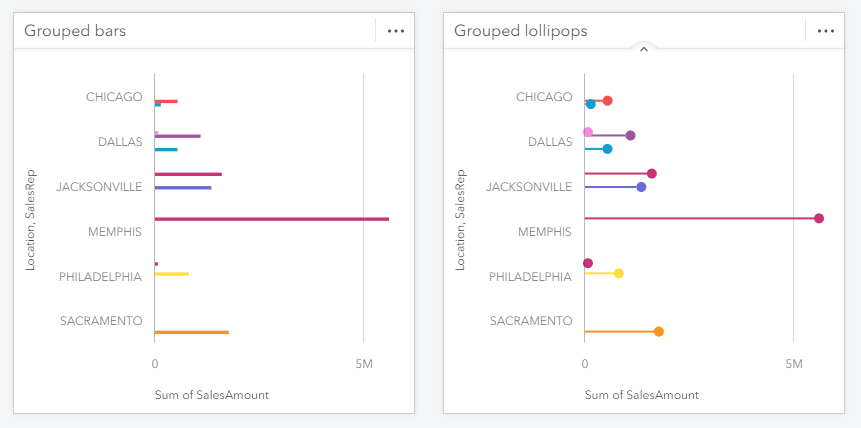
Grouped bar or column charts can sometimes be slightly harder than normal to read due to the data, e.g. the spread of values or there being inconsistent sub-categories between groups, or if the card size is small. In many of these cases the lollipop style can help.
Final thought
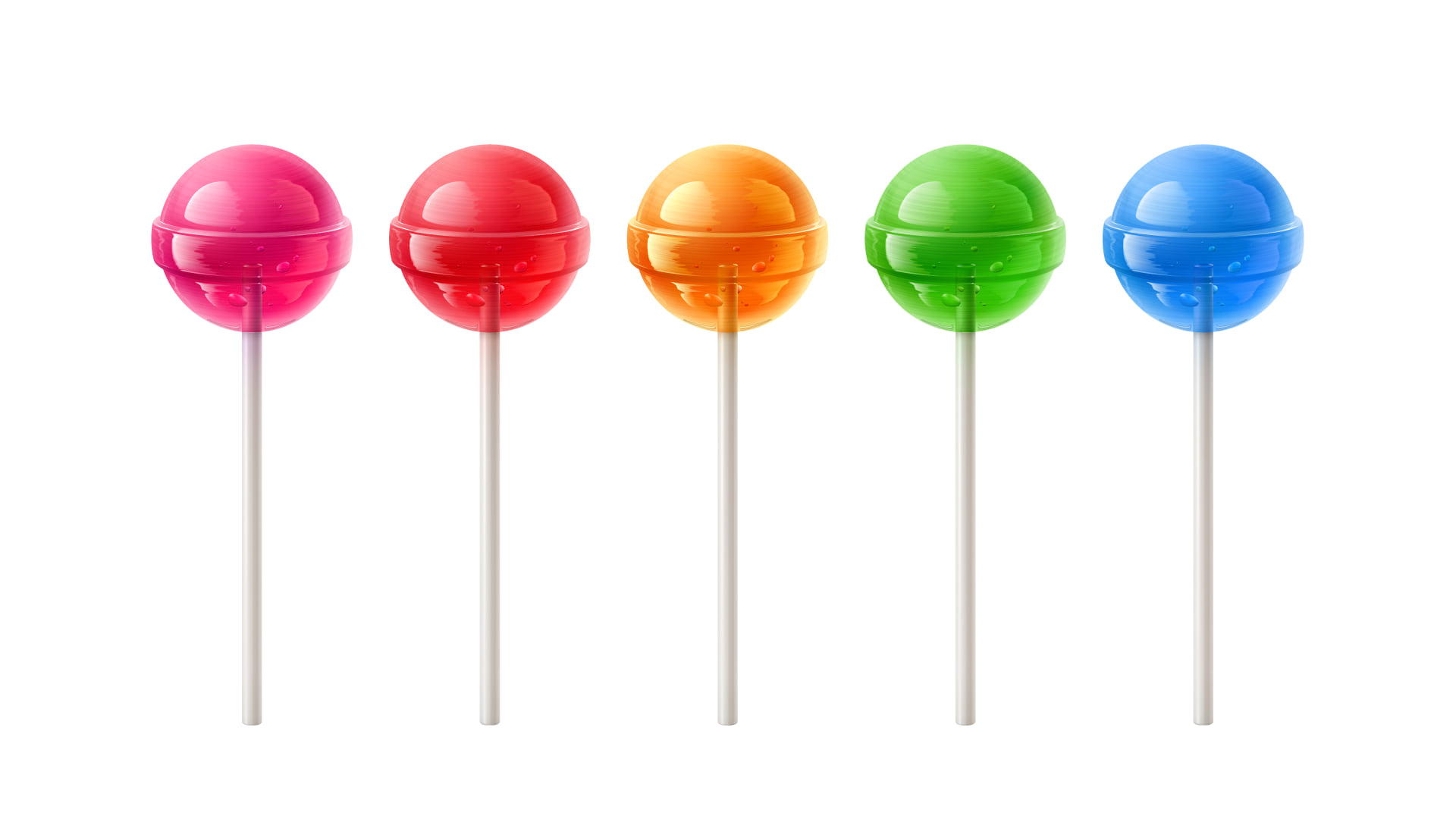
Being British, I often wondered why lollipop charts don’t look more like below. But now I know American lollipops are always the hard sugary kind healthcare professionals ironically give to children, and the frozen ones are popsicles, then everything makes a whole load more sense!

Lastly, if you would like to know more about the other chart types in Insights, I’d like to point you to another post I wrote on what each chart is for, which ones to use when, and how best to style them for your dataset.
Please continue to make great charts, and if you have any great Insights workbooks you’d like to share, please email me directly for consideration for the gallery pages.
Chart data sources
Internal test data
London local government data, UK
Ski Workbook, based on manually researched ski data

Article Discussion: