Recently, I was asked to create a demo on using the reference table in Insights. A feature which I never thought would turn into one of my favorites. Having a geography and GIS background I’ve always been drawn more to Insights’ core spatial tools. Something I’ve come to learn though is the combination of spatial and nonspatial tools working together, interacting together, allows for all visualizations to provide spatial context. The reference table working in tandem with a map allows for both the visual spatial cues and the explicit data context providing a well-rounded view of your data.
Plus, with the reference table in Insights you can add visual cues right on the table to get the most out of your raw data. Let’s look at an example to see if I can make you feel just as strongly about the possibilities of the reference table as I now do.
As a young adult, still renting an apartment, with the roller coaster that has been the housing market the past couple years I was interested in looking at some housing data. Naturally, I turned to the web looking for things I should be conscious of when looking for a house and one thing I found was that you don’t want your home to cost more than 2.6 times your yearly income. For simplicity I’m just going to focus on this one aspect. View the final report to get a sense for what’s coming!

Preparing the data
I started looking for datasets I could use when a colleague pointed out I had everything I need right in Esri’s data catalogue and can access that data right in Insights. I started with a USA county layer retrieved from Esri’s available boundary data and then made use of Enrich Data. Enriching the counties with details on Median Home Value and Median Household Income for ages 25-34 in 2019, 2021, and 2026.

I wanted to compare the cost of homes to household income, so I calculated new fields for each year of data using the equation Median Home Value/Median HH Income. There are many ways you can view this data in Insights. My first instinct is to put it on a map, so I’ll create a map of the 2026 Median Home Value/Income field. However, after doing so I realized I want to show more things at once and I don’t want to add too many maps or have too many layers on one map. I could create a scatter plot matrix, or some bar charts, but if I want to see all the raw values, compare them, and see trends the reference table is going to cover most of that for me all in one visual.

Creating and styling the reference table
Using the County, 2019 HV/Inc and 2021 HV/INC fields I create a reference table by dragging them to the Reference Table option in the Table drop zone. Personally, when I first look at this table my eyes instantly glaze over. Its just a bunch of numbers that are hard to focus on and pull information out of. Luckily this leads me to one of the main reasons I love this visualization – conditional formatting.
Conditional formatting
After selecting Table options in the header, I can select my numeric fields and choose conditional formatting.
Hint: I can select these fields directly on the table itself OR using the menu in the Conditional formatting pane.
Swapping the Visualization option to Rule based allows me to set the format rules to highlight all variables in my selected columns that are less than 2.6 times the median income.
Hint: I can also use another field in my table for the rule as opposed to a set number.
I can style the highlighted values in a way that makes sense to me – I’ll go with green and bold to highlight these as positive areas that meet my criteria of counties where the average housing prices are affordable for the average household income.

When this styling is applied, the reference table instantly goes from chaos on my eyes to something that draws me towards relevant values and shows me how things have changed from 2019 to 2021.
Visualizing the trends
Speaking of the trend, we can further visualize and show the change across time using sparklines. Here I select Sparklines from the Table options, my two fields from the table, and add a field not yet shown on my table (2026 HV/Inc). These columns contain values for individual years which allows me to use the sparklines to show the trend over time and a prediction into the future. I can use data points to again draw the reader to the pattern I want to call out, in this case I’ll call out the high values.
Interestingly we see that not all the highs are predicted to be in the future, some in fact were in the past. This may lead to a future analysis of why these areas are closing the gap between home value and income.

Adding more context
Now that we’ve looked at the areas that meet our criteria and looked at the trends over time I’ve realized I want to show the 2026 Median home value prediction in the reference table as well. I can easily add this by selecting the field in the data pane and dragging it to the reference table.
Again, all I see are too many numbers that are hard to pick out. With this I’ll use another conditional formatting option: data bars. Once applied this gives me a visual of how each row compares to the other rows in the column, the highest value will have a bar that fills the whole column. This allows me to easily visualize where my high and low home values are.

What we learned
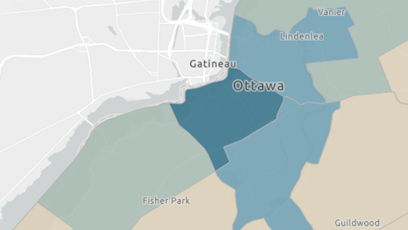
In addition to the table I have a map styled show the 2026 Home value over income to give some visual context and added a predefined filter on the state field to narrow down the findings. With just these three components – the map, reference table and predefined filter we get so much information AND they work in collaboration. The interactivity between the cards allows for an even deeper analysis of the data, tying the spatial and nonspatial context together. We see the spatial trends and how areas near each other compare, the future trends of home value/income, the areas that meet our criteria for house affordability and where we are seeing the highest median home values in 2026. Check out the final report and use it to see how different areas in the USA compare.
I hope this helped you to see how much value you can get out of the reference table. Keep in mind there’s even more the reference table has to offer. From different sparklines visuals such as columns and win loss, to column and table formatting to make your reference table look and act in exactly the way you need. I look forward to seeing what you can do with it!
If you’re interested in learning more about the reference table check out the 5 Tips for Working with Reference Tables


Article Discussion: