Insight at Scale
Recent updates to ArcGIS Insights have opened up fascinating possibilities for improving business intelligence and data science workflows in your organization. Business intelligence applications can enable you to find things out about your data quickly and easily. ArcGIS Insights lets you perform business intelligence analysis and publish the results as interactive Workbooks that visualize and explain the data in an intuitive fashion without sacrificing geospatial detail.
This capability is also an excellent tool for data scientists. Instead of providing raw code or developing custom web apps to be the frontend for your analysis, you can publish a Workbook in ArcGIS Online or ArcGIS Enterprise for others to view.
However, the scale of data used in advanced analytics is often a barrier to single-node applications. That is, the size of our data can often exceed the amount of memory we have, so we look to big data patterns like distributed processing to compensate. Apache Spark is the de facto standard for out-of-memory distributed analytics and since ArcGIS Insights gives us access to python, we also have access to Spark.
Apache Spark
There are numerous ways to leverage the power of Apache Spark in Insights. For some, the solution is ArcGIS GeoAnalytics Server, which can use the ArcGIS API for Python’s geoanalytics module to process and work with big datasets from numerous data sources. Others might manage and deploy their own Spark clusters in the cloud and internally configure ways to access and distribute jobs. Our friends at Databricks have yet another solution.
Databricks provides an analytics platform (built on the Databricks Apache Spark runtime) which enables data scientists to easily create and leverage managed Spark clusters, create notebooks, and manage models and experiments. Using Databricks Connect, we can now access our remote Databricks clusters and datasets inside of ArcGIS Insights.
Requirements
To go through the walkthrough yourself, you’ll need the following:
1. ArcGIS Insights Desktop – this can be done with ArcGIS Insights for Enterprise, as well, but this demo will use Desktop which can be downloaded here
2. Databricks Subscription – Databricks Community Edition doesn’t support remote access tokens, so you must have a paid subscription – check out how to get started with a free trial from Databricks here
3. Local Environment – a terminal, java 8, python, conda, and a scripting gateway for Insights
4. Some data to play with that’s not too small – the dataset I’ll be using is the Oil and Natural Gas Wells dataset provided by HIFLD Open Data. It’s only 1.5 million records, but it’ll do for the purpose of this exercise. I’ll have this data stored in the Databricks File System (DBFS) attached to my Insights cluster.
If you don’t have Insights, but do have access to ArcGIS Pro, my colleague Mansour Raad has setup remote access to Databricks in Pro Notebooks which you can read about here.
You can also find all the code from this article in this repository. If you need to setup your local environment, follow the instructions and links from the README before continuing.
Setup
In a terminal, run the following:
conda activate insights_gateway_env # where insights_gateway_env has the insights gateway kernel configured
pip install -U databricks-connect==6.6 # replace 6.6 with your cluster version
Make sure you have a Databricks cluster spun up that has the proper Spark configuration, including at least the following:
spark.databricks.service.server.enabled true
spark.databricks.service.port 8787 # 8787 req for Azure, AWS can be something else
Next, you’ll need to retrieve the following from Databricks:
1. Workspace URL
2. Access token
3. Cluster ID
4. Port – this is under cluster / ssh configs
The Databricks Connect documentation can help you find these.
Next, run databricks-connect configure and enter the information you just retrieved when prompted. Once that succeeds, run databricks-connect test and ensure the connection is configured.
If you’ve passed all tests, you can launch the kernel gateway for Insights:
jupyter kernelgateway --KernelGatewayApp.ip=0.0.0.0 \
--KernelGatewayApp.port=9999 \
--KernelGatewayApp.allow_origin='*' \
--KernelGatewayApp.allow_credentials='*' \
--KernelGatewayApp.allow_headers='*' \
--KernelGatewayApp.allow_methods='*' \
--JupyterWebsocketPersonality.list_kernels=True
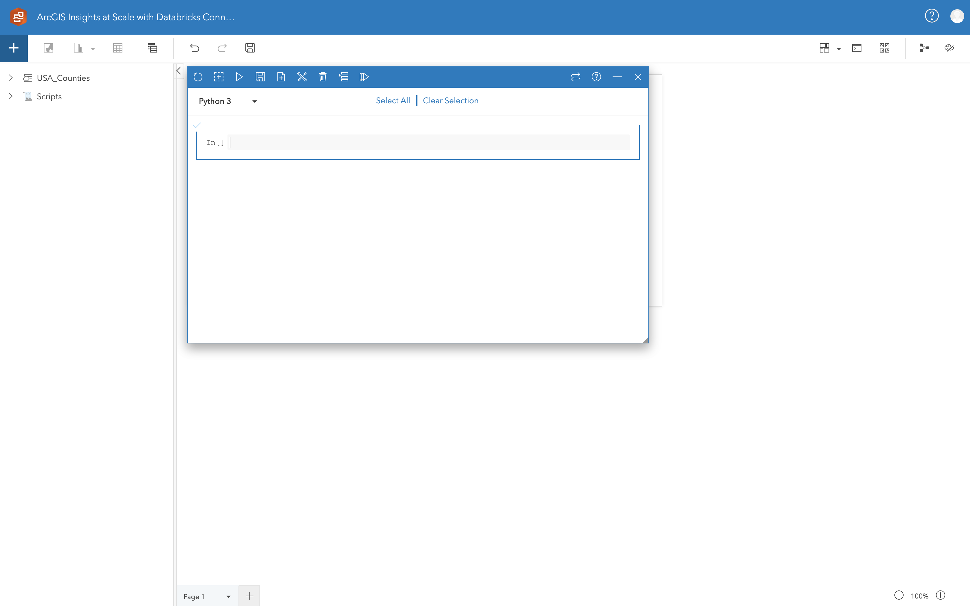
With the kernel gateway running, open ArcGIS Insights for Desktop and launch the scripting window. This opens a pop-up with input options for the connection URL. Assuming you used the default setup described above, enter http://0.0.0.0:9999 as the connection and the websocket URL will autofill.
Click connect and Insights will launch a scripting interface. From here, we’re writing code that is using our local python kernel, but distributing Spark jobs to the Databricks cluster, which makes it both very convenient and efficient.

Analysis
Now, we’ll dive into some analysis to show the value of connecting to Databricks via ArcGIS Insights.
First, we’ll setup a Spark session and access our data:
from pyspark.sql import SparkSession
spark = SparkSession.getOrCreate()
# Your filepath may differ and this assumes it's on the DBFS
df = spark.read.csv("/FileStore/tables/oil_and_ng_wells_hifld_opendata.csv",
. header="true", inferSchema="true")
To view the shape of our data in pyspark:
# looks like there's about 1.5m rows and 35 columns, so something like 50 million elements
print(df.count(), len(df.columns))
And to preview the data itself:
df.show(n=10)
We can proceed to build a feature for our clustering analysis:
from pyspark.ml.feature import VectorAssembler
cols = ["X", "Y"]
assembler = VectorAssembler(inputCols=cols, outputCol='features')
locations = assembler.transform(df)
And now train a simple k-means model:
from pyspark.ml.clustering import KMeans
# fit a k-means model with 50 clusters using the new "features" column
km = KMeans(k=50)
model = km.fit(locations.select("features"))
Performing inference, we get a DataFrame with a ‘predictions’ column that we can filter down to the interesting data we’d like to share, in this case, active wells:
clusters = model.transform(locations)
from pyspark.sql.functions import col
active = clusters.select(["prediction", "features", "API", "STATUS"])\
.filter(col("STATUS") != "NON-ACTIVE WELL")
active.show(n=10)
Visualization
Now, to visualize the results:
import seaborn as sns
import matplotlib.pyplot as plt
sns.set(style="ticks", color_codes=True, rc={'figure.figsize':(12.7,10.27)})
pdf = active.groupBy("STATUS").count().toPandas()
pdf['status'] = ["prod, na", "dev", "active", "unknown", "tx", "smo", "prod", "O&G"] # less verbose labels
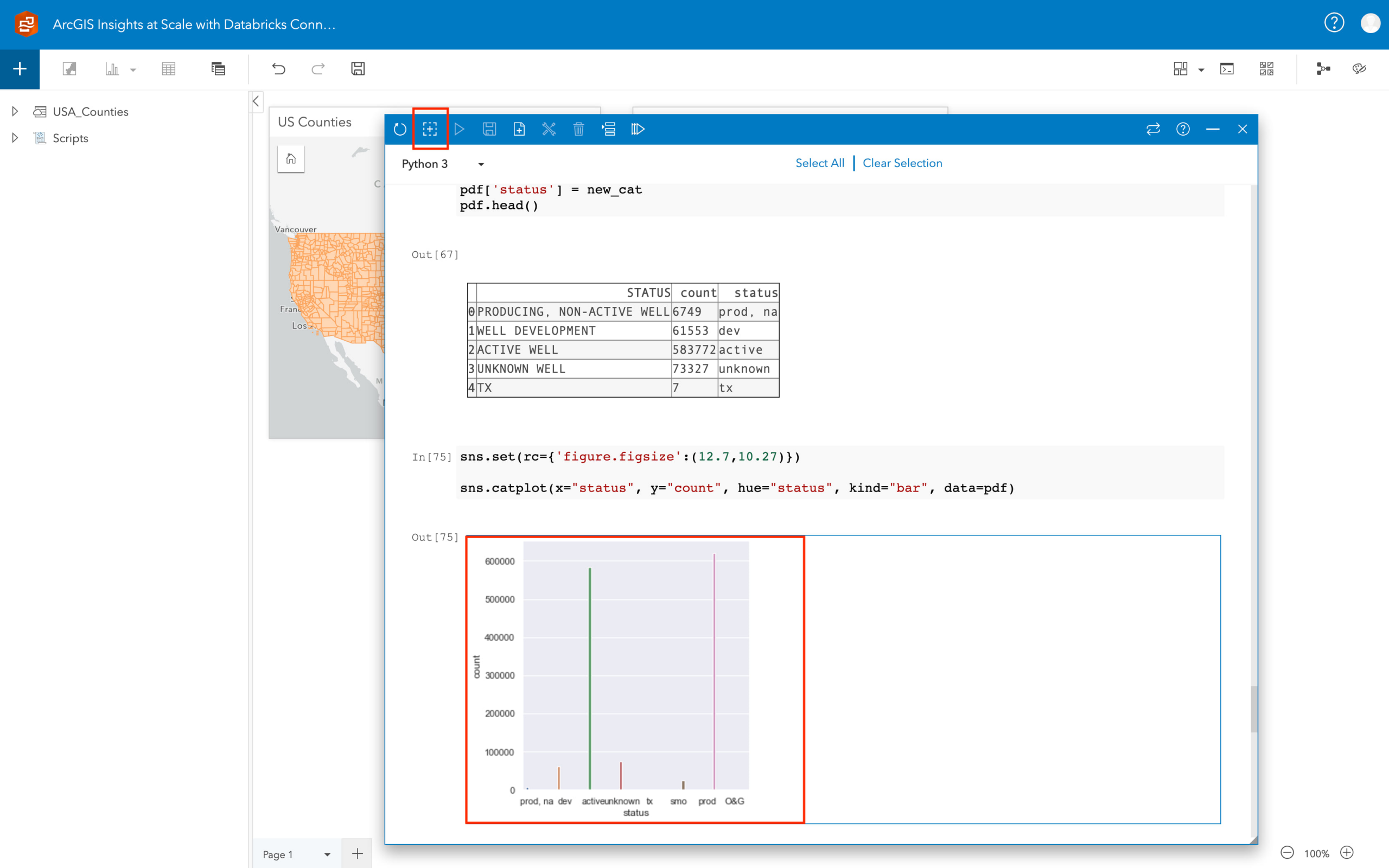
sns.catplot(x="status", y="count", hue="status", kind="bar", data=pdf)
This is really simple chart just to provide an example, and you can get as creative as you want about plotting. From here, in the top left of the scripting console, there’s a plus button surrounded by a dashed square line. Click on the seaborn plot and then click that button. The chart will be added to the Insights Workbook as a card that you can then annotate and share.

Now, you can create new visualizations, perform more in-depth analysis, or publish that data to ArcGIS Online or Enterprise. Others can then use your results and incorporate it into their analysis, maps, and applications.
Conclusion
Scripting in ArcGIS Insights provides powerful new capabilities to integrate with and share the results of data science workflows with the simplicity of a configurable business intelligence application. You can access external data sources to enrich your dataset and compute clusters to power your analysis at scale. With your own python kernels attached, there’s few limits on what you can accomplish.
What’s your organization doing with Insights? Let us know in the comments.
Article Discussion: