Increasingly, organizations are finding a need to be able to process, analyze, and understand larger amounts of data faster – whether it’s customer data, sensor reads, moving assets, competitive information – the list goes on. A more precise understanding of your data often yields better business decisions and improved operations.
In this blog, we will delve into a data analysis workflow for a water utility. Specifically, we will look at a utility’s water network to identify when and where leaks occurred and use that information to figure out what is causing leaks in certain areas.
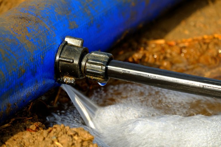
Every water supply network experiences leaks, but the cause of leaks can be numerous and be difficult to identify. Contributing factors range from older infrastructure and maintenance gaps to pressure changes and even soils that are corrosive to the water mains buried within them. Beyond water loss, leaks can be the source of customer dissatisfaction, financial loss, and even further infrastructure issues and erosion. Because of these repercussions, understanding where leaks have occurred is not enough. To effectively mitigate future issues, it is important to also understand when leaks happened and what caused them.
For this analysis, we will be using GeoAnalytics Server, a big data analysis capability of ArcGIS Enterprise that uses distributed computing to speed up typical processing time so you can complete your analyses faster. GeoAnalytics Server comes with a collection of tools to help you aggregate, summarize and find patterns within your larger datasets.
The dataset we will be analyzing is 14 years of work orders and service requests from the White House Utility District in Tennessee. It is a good midsized dataset that will lend itself well to GeoAnalytics, and be especially performant when we do additional analysis joining the data with other large datasets. This dataset is also comparable to the datasets other utilities would commonly be working with at various sizes.
Let’s take a look at the analysis. Our raw data of service requests looks a little something like this:
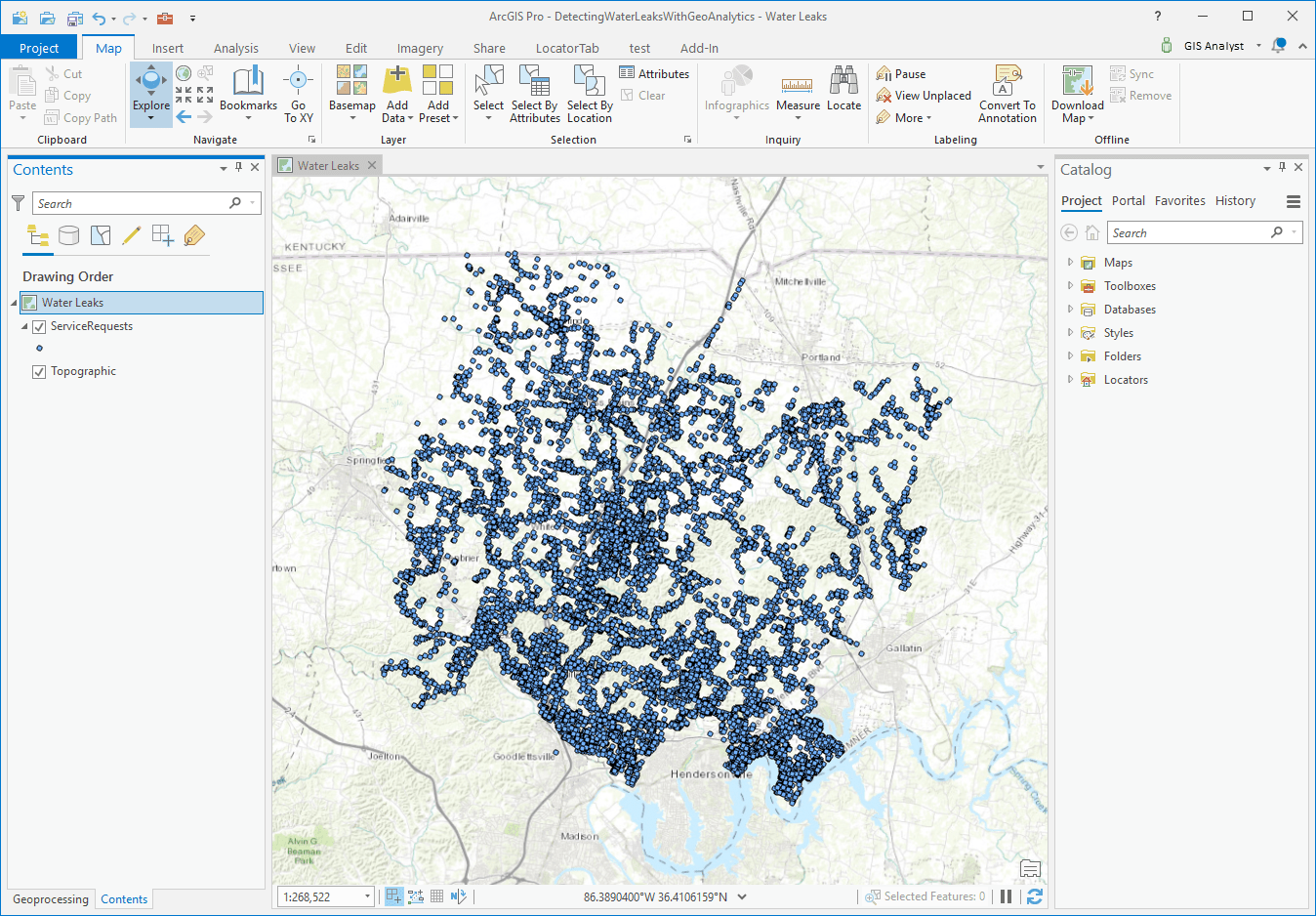
Here we have a lot of points – many overlapping – that extend back in time. Each point has valuable information on when the leak was reported and even the duration between when the work order was opened and when it was closed.
Workflow #1
The first analysis we want to do is take all of these work orders, aggregate them into bins, and visualize them in 3D across space and time. Sounds complicated? It’s not! We’ll use the GeoAnalytics tool Create Space Time Cube to do this. We’ll use ArcGIS Pro as our client, while the analysis will run on our GeoAnalytics Server.
First, we’ll take the layer of service requests and add the following into our Create Space Time Cube tool parameters:
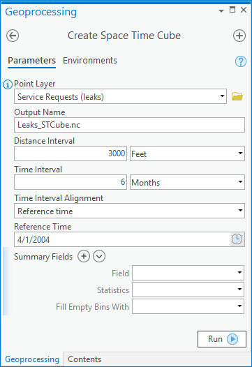
Here we are telling the tool:
- What we want to name our results (Output Name)
- The size of square bins we will be aggregating into (Distance Interval)
- The time span that we want to cover (Time Interval)
- When our data starts (Time Interval Alignment and Reference Time)
We could also include any summary statistics we want to calculate for each space time bin. In this case, we’ll just leave the summary fields blank so that we are just calculating the count of points within each bin. However, if we wanted, we could fill empty bins with zeros or the average value of neighbors, or other algorithm and we could calculate statistics for that bin such as the average number of work orders or max/min. For us, this dataset is on the smaller side, so we’ll just calculate the number of work orders for now. If you are interested in more details on the inputs of this tool, check out the Create Space Time Cube documentation under syntax.
So, what these parameters mean is that we will be sizing each aggregation bin at 3,000 feet by 3,000 feet, and splitting the bins up into 6 month chunks all the way back from April 2004 to present. Since our data is historical, being able to use time in our analysis is critical.
This Create Space Time Cube analysis will take just about 30 seconds to run. Once the tool completes, we will take the resulting netCDF file and use the ArcGIS Pro geoprocessing tool Visualize Space Time Cube in 3D to visualize our results. The result will look something like an army of square bins:
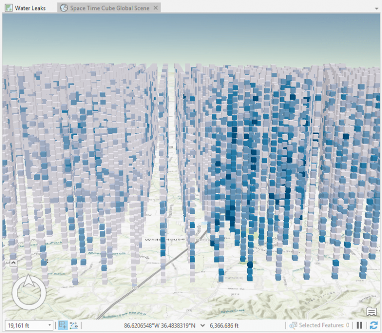
This is an interesting visual, but it doesn’t tell us much yet. Let’s refine the results by filtering these cubes for those that have 4 or more reported leaks in that 6 month time period. This weeds out areas where there weren’t as many work orders to focus on those where there were.
We can do this by using a definition query. You’ll see how, after the definition query is applied, the data is pared down even further, but still maintains its position in space and time across our district:
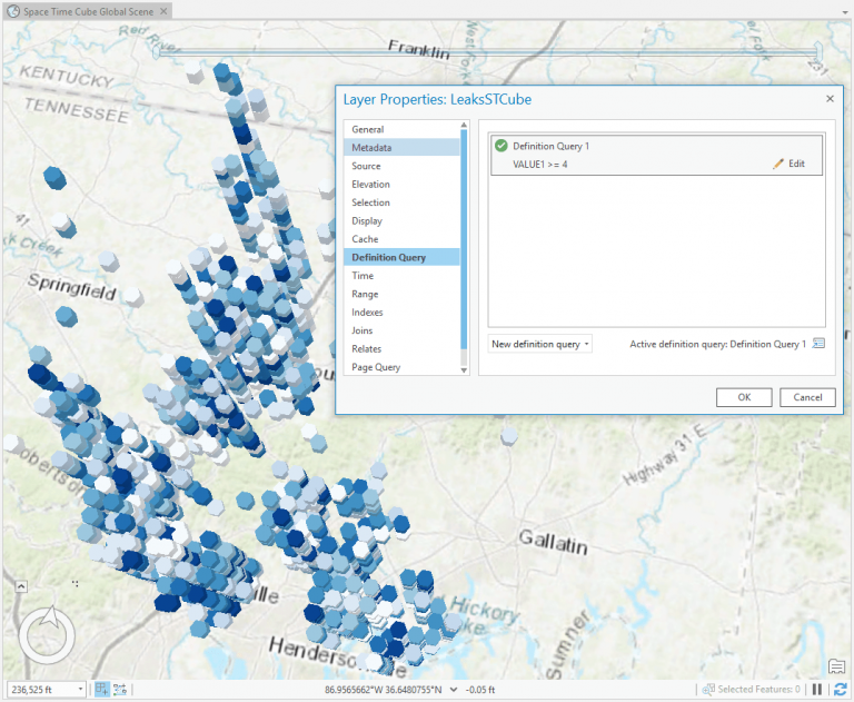
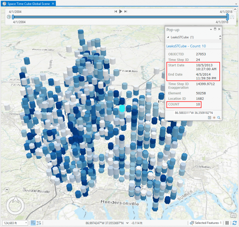
The color of each bin represents the number of leaks. The darker the color blue, the more leaks that have been reported. This data is dynamic in ArcGIS Pro, so by filtering our data we are able to see that there are certain locations where leaks have been more prevalent – specifically around the city of White House and Nashville. If we click on a bin, we are also able to see how many leaks were reported in that area in that 6 month time period. For this bin, there were 10 leaks from this time period from December 2013 – April 2014:
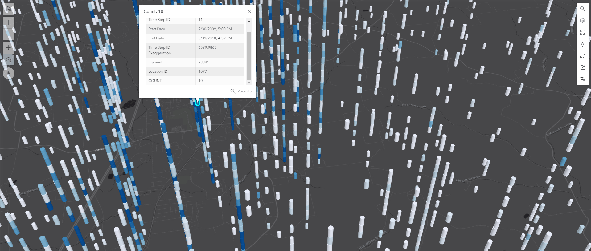
From this analysis, we can understand where and when leaks in the district have been reported. We could even share the data as a web layer to ArcGIS Enterprise for browser-based visualization and data exploration. Below is a screenshot of that – you can see how the data is rendered in the Enterprise portal. These results are now easily shareable through the web with other stakeholders who can use the results to drill down on areas in the district that need attention.
So, we’ve done part of the analysis. But, we may have more questions. Are there areas where there have been a growing or diminishing number of leaks? What is the trend of these leaks? Seeing these common patterns could help us mitigate future events by gaining a deeper understanding of these trends.
Workflow #2
To answer these questions, we can run the Emerging Hot Spots tool in ArcGIS Pro. Though this isn’t a GeoAnalytics tool, we have used GeoAnalytics to run the Create Space Time Cube analysis that will be fed into Emerging Hot Spots.
Emerging Hot Spots is a great way to see which areas have had leaks persistently reported throughout time, which areas have seen an increasing number of leaks, which areas have had relatively few leaks, and more. It’s a good way to take the guesswork out of analyzing the Create Space Time Cube results by factoring in changes over time as part of the analysis without having to manually mine through visual patterns. Below you can see the results of that analysis. (This also exemplifies how you can use ArcGIS Pro tools with GeoAnalytics tools. A common workflow is to use GeoAnalytics to pare down big data or aggregate it in order to use it in other analyses.)
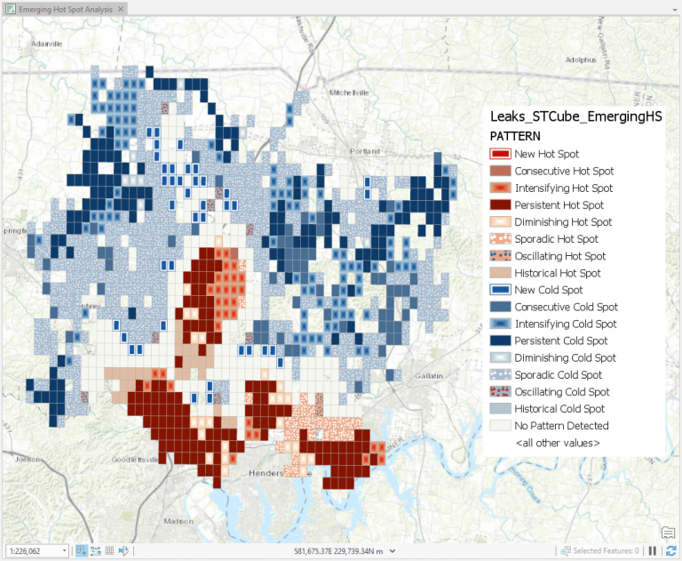
Now that we have run the Emerging Hot Spots analysis, we can see that there are is a significant area of ‘Intensifying Hot Spots’ in the middle of our district (light red squares in the middle.) This is interesting to us because the area around that hot spot is new development and infrastructure. This analysis indicates to us this is an area we should have some technicians visit and monitor as it seems to be a hot spot that is experiencing more leaks than before.
Workflow #3
Let’s do one last analysis on our data. We have another dataset that contains information on water mains and laterals. This dataset has a lot of descriptive information on the pipes that transport water such as the material, diameter, installation date as well as soil corrosivity. As mentioned, soil corrosivity has been found to have a relationship to leakages in the network as it can erode water infrastructure.
Our next question to answer using GeoAnalytics is: have there been leaks close to pipes that are highly corrosive? For this analysis, we’ll use a GeoAnalytics tool called Join Features, which will again run in ArcGIS Pro (our client) using our GeoAnalytics Server.
We’ll enter the following into our tool parameters:
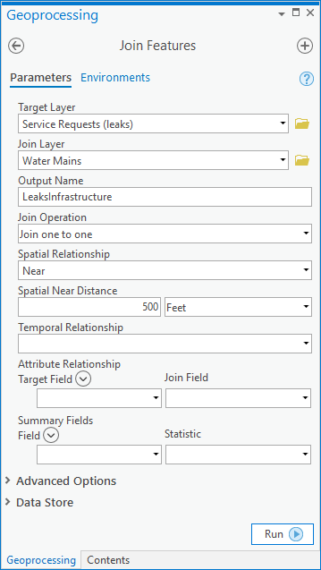
We are selecting our dataset of raw leaks as the target layer and the mains as the layer that will be joined (based on spatial proximity) to the leaks. We are also specifying that we want to join the main data to every leak that is within 500 feet of that section of the main.
By joining these two datasets, our result layer will contain both the leaks within 500 feet of a main as well as the details of the mains (including the corrosivity information). Only the leaks within 500 feet of a main will be returned, which helps us filter down our data even more to find leaks that may have been caused by these soil conditions.
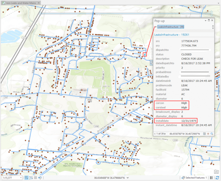
By clicking on this leak, we see that it is near a main in corrosive soil since the leaks and main have been joined together into one dataset. From here, we can then start to understand where there are other leaks on water mains buried in corrosive soils, and potentially target our main replacement schedules around these affected areas, as well as the areas we identified in our space time cube and hot spot analysis.
This is just one example of how GeoAnalytics Server can process a larger amount of complex data very quickly in multiple ways. It also shows how you can use GeoAnalytics as a complement to your ArcGIS Pro analysis tools, as well as ArcGIS Enterprise by creating web layers out of your results that you can then use in maps and applications.
GeoAnalytics provides many other algorithms you can use based on your workflows, including upcoming regression and prediction tools, clustering, aggregation, and helpful data management tools.
For other analysis examples and list of tools you can in ArcGIS Pro using GeoAnalytics Server, visit An overview of the big data analytics toolbox web help.
To see an analysis of how GeoAnalytics Server can mine through sensor measurements, watch the demo video Detecting Ozone Measurements with GeoAnalytics Server.
And, for more information on the White House Utility District, visit this Esri Case Study: White House Utility District.
If you have any questions on this blog or GeoAnalytics Server, feel free to reach out to GeoAnalytics@esri.com.
– Hilary and Sarah (+ special thanks to Matt Kennedy, Bethany Scott and Derek Lorbiecki)



Article Discussion: