In my last post, I showed you how to make this pink map of some pink lakes. But maps usually need some kind of surrounding information to help bring them to life: things like titles, legends, pictures, and text. In the static map world, we put these things in a layout. In the web map world, we put them in an app.
To make this pink lakes app, I used ArcGIS Experience Builder, because it gives me a lot of customization control, without having to write any code. Below, I explain how to do it.
- Add the map
- Plan the app’s structure
- Change the theme color
- Add a button
- Rotate things for fun
- Add a window
- Connect the button to the window
- Add a title
If you need more instructions on any of the steps below, I recommend trying this lesson: Design a layout for a thematic map in ArcGIS Experience Builder. It goes through a very similar process in more detail.
Add the map
1. Sign in to Experience Builder.
2. Click Create new and choose the Blank fullscreen template.
3. From the Insert widget pane, click Map and drag it onto the canvas.
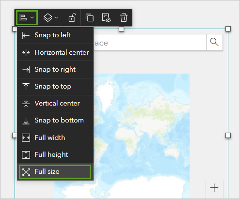
4. On the maps’ toolbar, click the first button and click Fullsize.
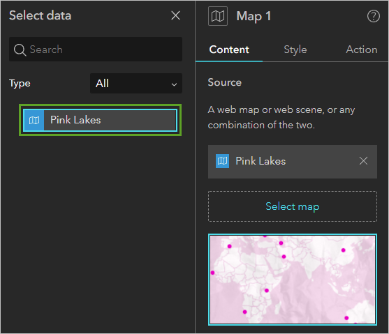
5. In the Map 1 pane, click Select map. Click Add new data.
6. If you made your own Pink Lakes map, choose it. If not, search for 8220de216c634a1d9beb4e797195c757 to use mine. Click Done.
7. In the Select data pane, click the Pink Lakes map.
8. If necessary, click Custom and click Modify to change the default extent of the map.
Plan the app’s structure
Experiences are built from a set of elements or widgets, many of them nesting inside of one another. You’ve already added one: the map. Try to keep the structure simple by sketching out your plan beforehand on paper. I also recommend pausing periodically to re-acquaint yourself with the Outline pane, so you always know which elements are nested inside which other elements.
I’ll show you the structure of my experience to give you a sense of how one is built. Then we’ll get to work building it.
I have one page, with four components: the map, a list widget, text (the title), and a button.
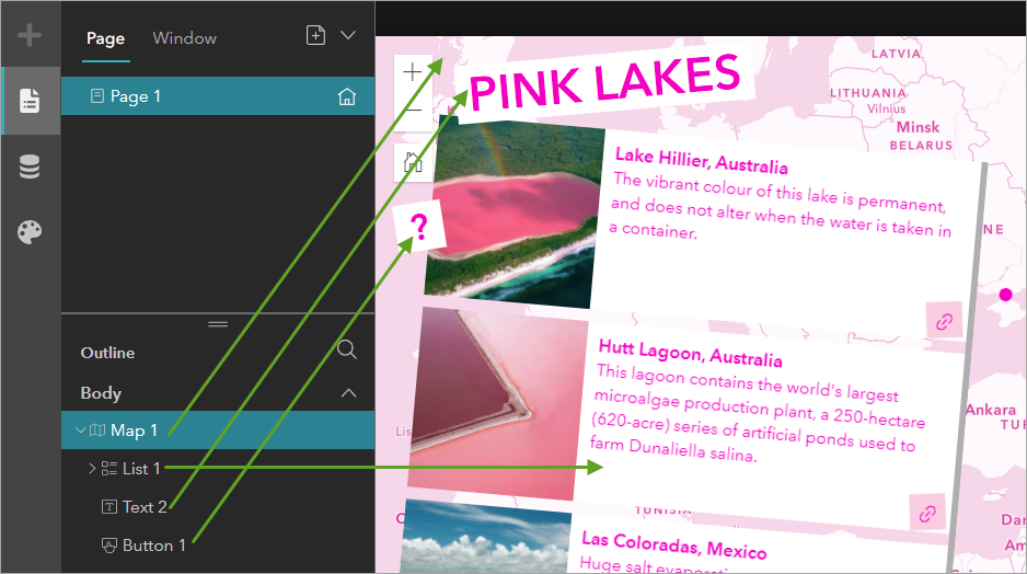
There’s more elements inside the list widget: an image, text, and a button.
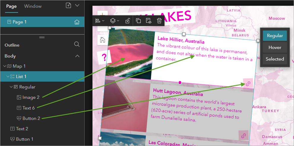
You don’t have to add all of these elements for every lake, just for the first one; the list widget will repeat them automatically for the others.
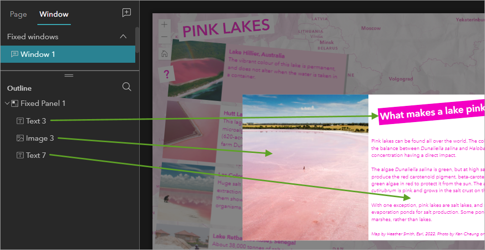
Finally, there’s a window, which appears as a kind of pop-up or splash screen when you click the question mark button. The window contains two text elements and an image.
Change the theme color
1. In the Theme pane, choose Vivid and click Customize.
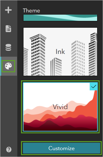
2. Click the orange circle and for HEX, type #ff21c8.
Now the default color for your experience is pink.
Add a button
1. On the side toolbar, click the Insert button. In the Insert widget pane, click Button and drag it onto the map.
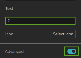
2. In the Button 1 pane, change the Text to ?. Turn on the Advanced toggle.
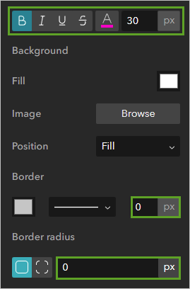
3. Make the text Bold, 30 px, and pink. Change Border to 0 px and Border radius to 0 px.
4. Click the Hover tab. Copy the same properties as above, but make the text white instead of pink.
5. For Background Fill, choose pink.
6. At the top of the Button 1 pane, click the Style tab.
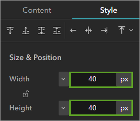
7. For Width and Height, click the % button and change them both to px. Change both properties to 40 px.
8. Move the new button around on your map and place it wherever you like.
Rotate things for fun
In Experience Builder, not only can you place things wherever you want, you can also rotate them. Ever since I discovered this feature I’ve been looking for an excuse to use it. To be perfectly honest, it’s the reason why I made this map.
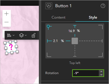
1. In the Button 1 pane, on the Style tab, change Rotation to -9 degrees.
Add a window
Your experience already has a page, which is filed with the map. Next, you’ll add a window to show more information that you don’t want to be visible all the time.
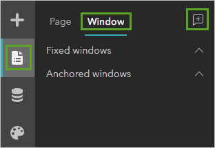
1. On the side toolbar, click the Page button and click the Window tab. Click the Add window button.
2. Choose Vogue. On the new window, click the blank image.
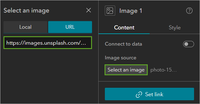
3. In the Image 1 pane, click Select an image.
4. For URL, type https://images.unsplash.com/photo-1590271594778-f592f421057c?ixlib=rb-1.2.1&ixid=MnwxMjA3fDB8MHxwaG90by1wYWdlfHx8fGVufDB8fHx8&auto=format&fit=crop&w=2071&q=80.
The photo appears in the window.
5. Edit the Title text to What make a lake pink?
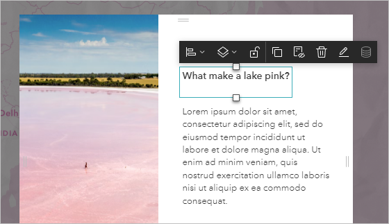
6. Change the text to 25 px, Bold, and white.
7. Click the Style tab and change the Background Fill to pink. Change Rotation to -5 degrees.
8. Replace the Lorem impsum text with the following:
Pink lakes can be found all over the world. The color of a pink lake depends on the balance between Dunaliella salina and Halobacterium cutirubrum, with salt concentration having a direct impact.
The algae Dunaliella salina is green, but at high salinity, these organisms produce the red carotenoid pigment, beta-carotene. This pigment coats the green algae in red to protect it from the sun. The archaea Halobacterium cutirubrum is pink and grows in the salt crust on the bottom of the lake.
With one exception, pink lakes are salt lakes, and many are carved into salt evaporation ponds for salt production. Some ponds are built from former salt marshes, rather than lakes.
Photo by Ken Cheung on Unsplash.
9. Make the text pink.
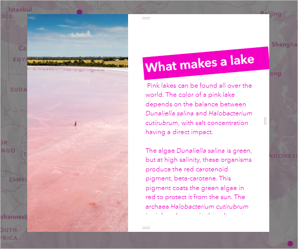
9. Drag the edges of the text boxes, image, and window to resize and reposition them until it looks good.
Connect the button to the window
No one will be able to see your window unless you give them a way to access it.
1. In the Page pane, click the Page tab to exit the window view and return to the page view.
2. Select the button. In the Button 1 pane, click Set link.
3. For Link to choose Window. For Select a window, choose Window 1.
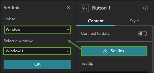
4. Click OK. On the top ribbon, click Live view to test your app.
5. Hover over the button. It should turn pink.
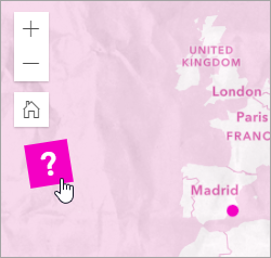
5. Click the button. The window should appear.
6. Click outside of the window to return to the map.
Add a title
1. Turn off Live view.
2. In the Insert widget pane, click the Text widget and drag it onto the map. In the text box, type PINK LAKES.
3. In the Text 3 pane, make the text 40 px, Bold, and pink. Set the background color to white.
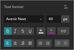
4. On the Style tab, change the Rotation to -5 degrees.
5. Place the title on the map wherever you like.
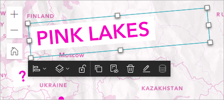
You’ve now made a pink web experience that maps pink lakes around the world. In my next post, I’ll show you how to add a list widget, and then the experience will be complete.



Article Discussion: