The National Aeronautics and Space Administration’s (NASA) Tropospheric Emissions: Monitoring of POllution (TEMPO) mission measures air quality from a geostationary satellite over North America. Since August 2023, TEMPO data has opened the door to understanding air quality and its impacts on people and climate in near real time.
This blog provides a guide on how to visualize and access TEMPO data from ArcGIS Living Atlas of the World in ArcGIS Online. To access TEMPO data and perform multidimensional analysis in ArcGIS Pro, read this blog. You can also refer to this StoryMap as a resource.
Explore TEMPO data in ArcGIS Living Atlas
ArcGIS Living Atlas of the World is a collection of authoritative geographic information from around the world. It includes maps, apps, and data layers from Esri and thousands of other organizations. NASA has released the TEMPO Nitrogen Dioxide Vertical Column Troposphere Beta layer on ArcGIS Living Atlas. ‘Beta’ indicates minimal validation; users are advised not to make public statements about scientific findings or applications until the product reaches provisional validation status. Stay tuned for the release of the fully validated TEMPO data and analysis capabilities in the future. You may access the image service of beta data here.
TEMPO data includes hourly measurements of nitrogen dioxide (NO2), formaldehyde, ozone, aerosols, and clouds. The TEMPO instrument captures light in both the visible (VIS) and ultraviolet (UV) ranges, with a spectral range of 290-490 nm and 540-740 nm (approximately 0.29-0.49 µm and 0.54-0.74 µm) and a fine spectral resolution of 0.6 nm. The Level 3 product offers a spatial resolution of 0.02 x 0.02 degrees (2.2 x 2.2 kilometers), making it a valuable resource for analyzing these critical environmental factors. For more information, visit the NASA Atmospheric Science Data Center (ASDC), where TEMPO is archived and can be cited by following these steps.
Explore TEMPO data through time
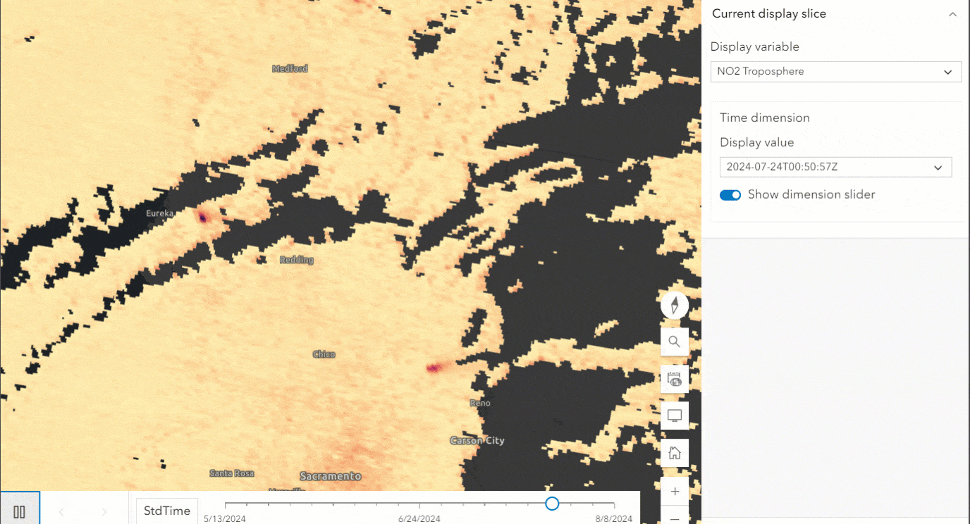
The TEMPO image service is a multidimensional dataset that can be explored through time. This data is available as approximately one-hour scans for daylight hours over North America. The data is updated daily and spans from May 13th, 2024 to present. Each image is a composite of measurements taken over a 40-60 minute period by the TEMPO instrument in an east-to-west scanning pattern. The images are labeled with the start timestamp of the corresponding TEMPO scan. The data will soon include all mission data starting from August 2023.
In Map Viewer, navigate to Multidimensional on the gray bar on the right and click “Show dimension slider”. Using the dimension slider in ArcGIS Online Map Viewer, you can use controls to visualize slices of the data and filter them to your time span of interest. TEMPO scans are of varying time lengths, and the multidimensional slider steps through time from the start of each scan to the next, making it easy to view individual scans. When examining data, defining a time range for visualization isn’t always necessary. You can first visualize the top slice before delving into the subsequent slices underneath.

How to create a Web Map with TEMPO data
You can create a Web Map of processed TEMPO data, which will be the star of our interactive web app, allowing users to explore NO2 in their area. A map-focused web app is a communication device for your story. From the Living Atlas, click the Open in Map Viewer link. You will need to log into your ArcGIS Online (AGOL) account. From the Map Viewer, open the Analysis pane to have access to the Raster Functions and Analysis tools to process your data. TEMPO is a large dataset, so you will first subset it. Navigate to Raster Functions and search for Multidimensional Filter. You can use this tool to select a range of dates appropriate for your study interest.
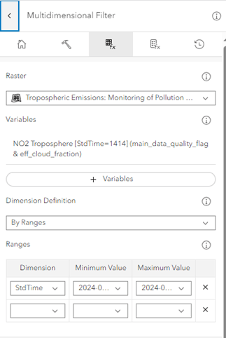
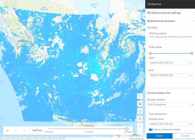
Once you click Run on the tool, processing the Multidimensional Filter will take time. We chose to filter for the dates 7/23/2024 – 7/30/2024, which is when Park Fire took place in California, and the process time can take a couple of minutes. Keep an eye on your History pane to check for the tool’s completion and the Layers pane for your result. Select the result in Layers, click Multidimensional tab, and then Multidimensional Extent to enable time.
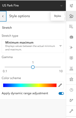
You may also adjust the visualization of the layer in the Styles pane. We suggest selecting dynamic range adjustment for the best visualization results.
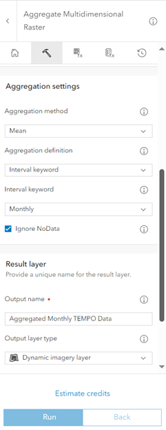
For further processing, you can aggregate the data and perform calculations or analyze anomalies. In this example, we aggregated the mean monthly values.
Once you have completed your analysis workflow, you may save the Web Map to your AGOL account. This Web Map is now ready to be shown to the public through an app builder.
How to create an ArcGIS Experience Builder web app highlighting processed TEMPO data
You can showcase TEMPO data with storytelling and app building in ArcGIS applications. For example, we showcased TEMPO data from the beginning of the 2024 Park Fire in northern California using the ArcGIS Experience Builder app. We encourage you to also choose an area or event of interest for your own projects.
Before creating your application, it’s essential to consider your intended audience. Our goal was to create an application that could be displayed in a museum or similar environment, making it accessible to the general public. For an ArcGIS Experience Builder starter guide, refer to Get Started with ArcGIS Experience Builder and Create your first web experience.
We encourage you to explore different templates that suit your data, images, charts, tables, and anything else you want to showcase. We selected the grid layout for a simple three-panel design. With the Map widget, you can display the web map of processed TEMPO data as the main focus of the app. Web maps may include layers to display multiple results. For the data of the Map widget, you may select your web map you created. There are also options to enable tools in the Map such as Locate and Zoom. With Locate, users can search for their own address or areas of interest. Next, you can add the Bookmark, Analysis, and Add Data widgets for users to effectively visualize and explore the TEMPO data.
The Bookmark widget walks the user through exploring TEMPO data in different locations with text, charts, and images. The Analysis widget adds spatial analysis tools, raster functions, and geoprocessing tools to the web app so users can also perform analysis for multidimensional aggregation and anomaly generation. With the Add Data widget, users can also add data of interest from the Living Atlas, ArcGIS Online, curated collections, files, and URLs. Users can view and use this app on a mobile device and a desktop computer screen.
We hope this encourages you to build apps with TEMPO data in the case of natural disasters like wildfires or environmental concerns such as air quality and ozone depletion. We also hope this demonstrates how complex raster data can be communicated and made accessible to all. This data can be combined with other datasets, such as population density or land use, to create insightful tools for decision-making and community planning. By integrating NASA TEMPO with other datasets, you can enable innovative solutions to real-world problems and make an impact.

Article Discussion: