Valentine’s Day, the national holiday of love is an opportunity to celebrate romantic partnerships. Whether you are married, in a relationship, or simply reflecting on the significance of these bonds, it’s a time to appreciate the connections that enrich our lives.
Utilizing Esri Updated Demographics, we can visualize where couples who have tied the knot are located across the United States. The accompanying county map illustrates the proportion of individuals aged 15 and older who are married, employing a combination of unclassed color and size styles for polygon and point layers. This visualization provides a deeper understanding of marriage in our communities and its role in shaping relationships.
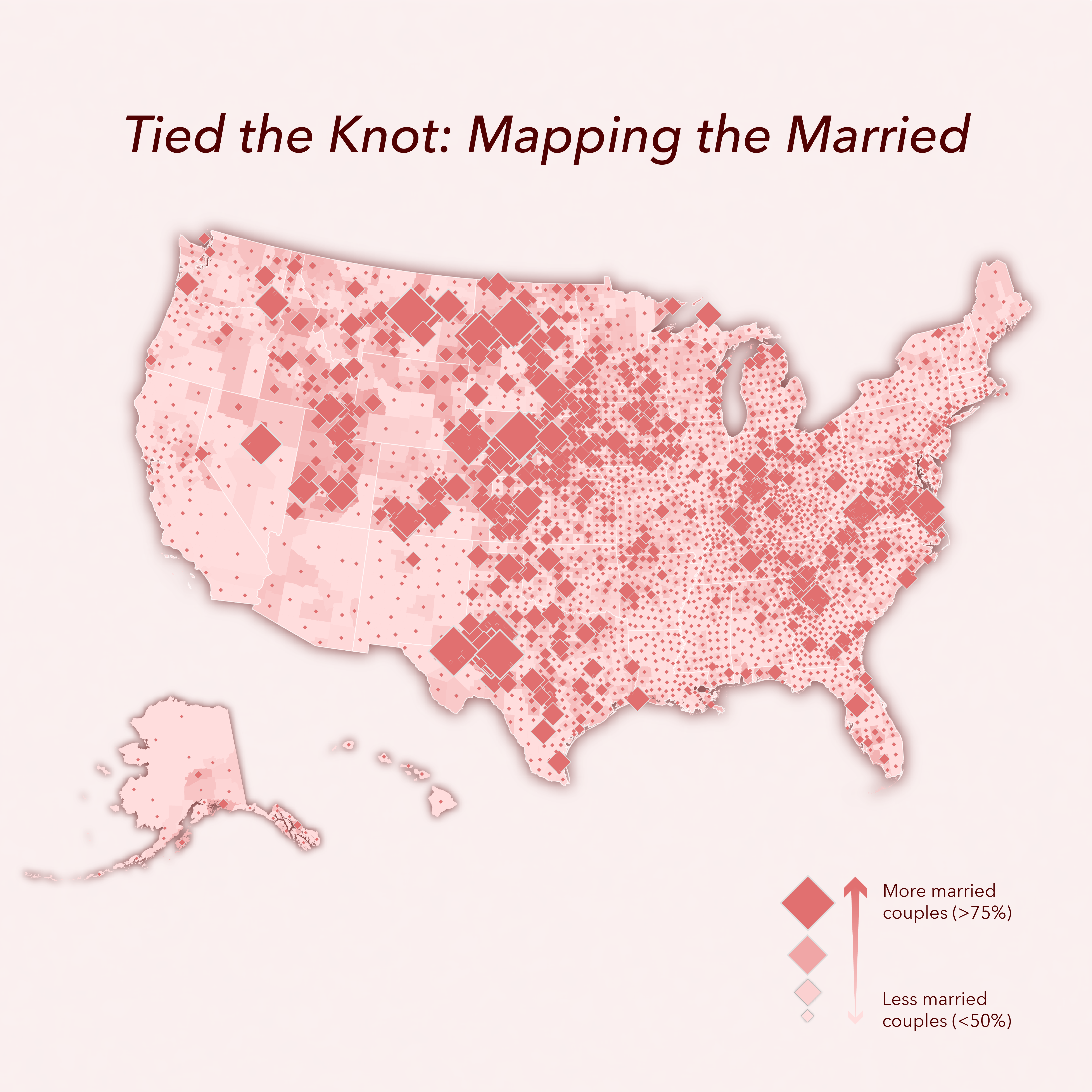
County polygons are filled with an unclassed color that ranges from a light to a dark pink. While graduated colors distributes data into discrete classes with unique colors, unclassed colors distribute a color scheme evenly across features. In this map, the darker pinks indicate a higher percentage of married people, while the lighter pinks indicate a lower percentage of married people.
The diamond symbol also shows the percentage of married people in an area. The larger the symbol size, the higher the percentage. Unlike choropleth maps, where large counties may appear more significant even with a lower data value, proportional symbols accurately represent the data regardless of the geographic size of the area.
In this map, there’s a distinct pattern across the center of the United States of more married people compared to their West and Southwest counterparts. Notable pockets are also visible on the East Coast and in Utah.
No matter where you are in your love journey, Valentine’s Day is a chance to celebrate what makes your heart happy. Whether you’re honoring a lifelong partnership, enjoying the company of friends, or simply practicing a little extra self-care, it’s the perfect time to recognize the many ways love shows up in our lives. So, this Valentine’s Day, take a moment to reflect on the connections that matter most to you. And perhaps make a map or two.
Learn More
Click on the links below for continued Esri Demographics exploration, learning, and ways to access the data, including the data used to make this map and Esri’s demographic data suite.
How to access Esri Demographics?
You can access Esri Demographics using Esri software and through apps like ArcGIS Business Analyst, ArcGIS for Excel, or ready to use maps from ArcGIS Living Atlas of the World. For use outside of the Esri platform data files are available in CSV, dBase, Excel, shapefile, or file geodatabase formats.
Explore a full listing of available data tables and variables in Esri data catalogs.
Connect with us:
If you have a question or comment about Esri’s US data, send us an e-mail. We’d love to hear from you!
Frequently asked questions
Use the data reference page to help answer additional questions about Esri Demographics.

Article Discussion: