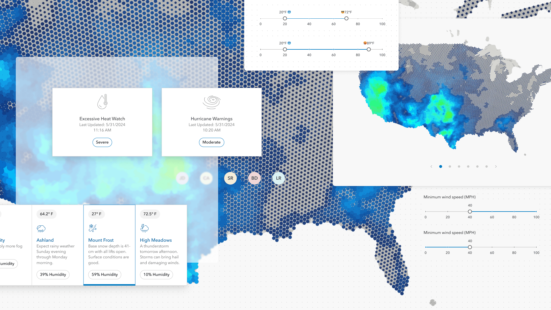
Learn all about the key updates in Calcite Design System that we’ve recently released!
Calcite enables you to build beautiful, user-friendly, and consistent experiences across applications with minimal effort. Since March, we’ve made important improvements to components that facilitate responsive app development, introduced new components, and made many updates worth exploring. Read on to explore some of the highlights since March.
Carousel and Carousel Item
The new Carousel and Carousel Item components enable display and navigation between a set of related items.
Carousel can be used to display onboarding tips, or display messaging, media, or other related content. They can be presented within a Modal or Popover for a fleeting workflow, or within a Block or Panel for a static experience.
autoplay property. When initialized, Carousel will automatically rotate through its Carousel Items. Explore additional resources on Carousel’s autoplay, and Carousel best practices and recommendations.Tile redesign
The Tile component is useful for presenting information in a compact, consistent format. We recently redesigned Tile to streamline workflows, provide selection support, and two new slots, where non-actionable content can be placed at the top and bottom of the component.
You can display multiple Tiles using the new Tile Group component. Tile Group enables responsive design by providing multiple scales of the component, accessed via a scale property.
Enhanced validation
In March we announced form validation support. Over the last few months we’ve enhanced capabilities around validation.
Now form components provide helpful feedback indicating why an element’s value is invalid. This enhancement can be used in variety of use cases, such as patternMismatch, where the user has provided a pattern that fails. To communicate the error with the entry, the form components can display an error message, icon, and status.
Slider customization
Slider handle text can be dynamically updated in response to changes in the component. For instance, the handle text can be updated when the component’s value hits certain thresholds.
Additionally, you can configure which part of the component’s rail is highlighted relative to its handle – either spanning from the start to the current value, or from the value to its end.
readOnly and download support
Input Time Zone and Combobox were enhanced with support for the native readOnly property. When specified, the values can be selected, but not modified, preventing unwanted changes.
Additionally, Button supports the native download property, where when coupled with the href property and accessed will download the specified resource. The new offering matches native behavior and enhances functionality.
Avatar background color generation
Avatar now ensures different backgrounds are generated for similar values specified in its username, fullName, and userId properties using a randomly generated accessible background color.
Accessibility improvements
List and List Items provide support sorting for assistive technology and keyboard users with dragEnabled. To move a List Item focus on the component’s drag, or handle, button and press the space key to activate sorting. To move the item to a new position in the List, use the arrow keys for placement.
List was updated with multiple slotted actions via keyboard. Where multiple Actions are slotted into a List Item using the "actions-start" and "actions-end" slots, the Actions supplied are accessible via keyboard.
Additionally, Combobox provides support to VoiceOver keyboard navigation so users can navigate into the component’s input and manually enter values.
Explore more
Calcite’s releases contain many additional features, bug fixes, and breaking changes that are not mentioned in this blog post. Explore the May summary notes, and in particular the changes since February 2024 for a full list of capabilities offered in Calcite.
Join us at the 2024 Esri UC
Learn more about Esri User Conference, and explore our Calcite technical session, Faster Web Development with ArcGIS Web Components.
The session will bring ArcGIS experiences into an app with a few lines of code. You will learn how to create a compelling web mapping app with maximum productivity when combining Calcite Design System and ArcGIS Maps SDK for JavaScript components and capabilities. We’ll discuss brand-new web components in the ArcGIS Maps SDK for JavaScript, how to build a web app from scratch, key concepts, syntax, accessibility, and design best practices.


Article Discussion: