Transit systems play a critical role in connecting communities, addressing congestion, driving economic development, and improving mobility and equity. Following up on the Esri Transit initiative launched in summer 2024, we are pleased to announce the release of the first-ever transit infographic available in Esri’s Business Analyst Web App.
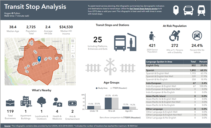
The information provided on the new Transit Stop Analysis infographic was specifically chosen to help transit agencies understand the populations and destinations they are serving at their stops, including:
- Vulnerable populations, such as the number of elderly, disabled, or persons without vehicle access.
- Languages spoken in the vicinity, so timetable and route information can be provided in alternate languages where needed.
- Population income levels, with specific focus on the population living below 150% of the poverty threshold.
- Locations in proximity to transit stops such as apartment buildings, businesses, and medical facilities.
- The number and type of other nearby transit stops within an area.
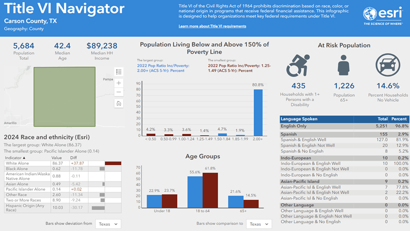
Much of this information is also critical in supporting compliance with Federal Title VI requirements; this was a key consideration in the design of the infographic.
Transit and Infographics in Business Analyst (BA)
Some of you may be saying, “Well, this all sounds very interesting, but I’m not familiar with Business Analyst or infographics.” That’s totally ok. The great thing about infographics is that they are very easy to use, and this article will give you step-by-step guidance through examples a little later.
To provide some background for new users, Business Analyst (BA) is an Esri software product that includes ready-to-use, authoritative demographic, business, lifestyle, and spending data paired with powerful geospatial and analytic tools.
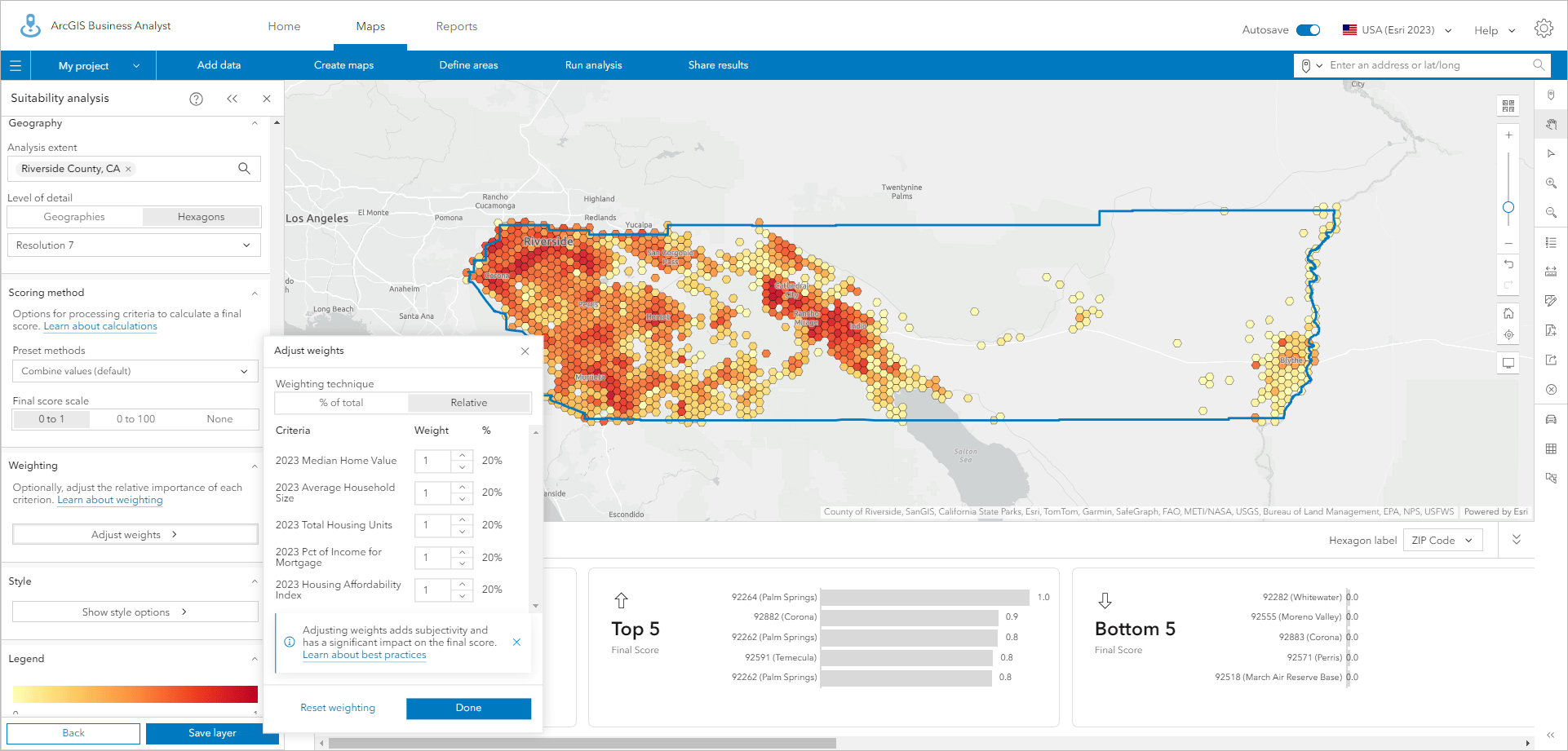
Inside BA, one of the ways this data can be displayed – besides on a map – is through infographics. Infographics are presentation-ready, visual reports that summarize key data trends. For further reading on infographics, the blog Learn about infographics in ArcGIS Business Analyst Web App offers a great introduction to the topic.
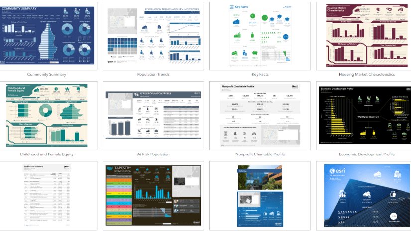
There are many pre-configured infographic templates available in BA, for topics ranging from Economic Development to Community Outreach. With the November 2024 release, this now includes the new Transit Stop Analysis infographic. This infographic can be found in the BA Web App infographics gallery.
By default, this infographic leverages data available in BA with the new Esri Transit Stop feature service , which is available through the Living Atlas. Alternatively, a user can swap out the Esri Transit Stop feature service to their own ArcGIS Online layer; this is discussed later in this article.
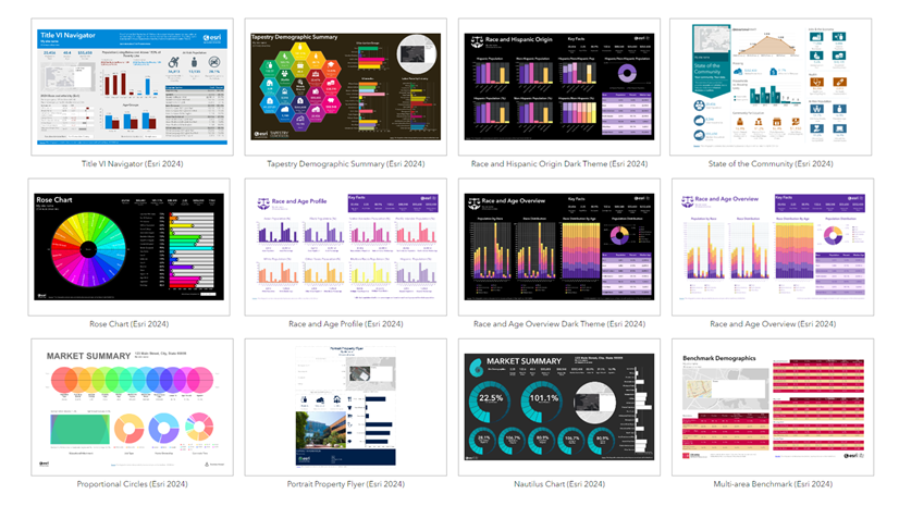
Note there is also a “‘sibling” template to this new transit infographic in the gallery called Title VI Navigator. This template contains most of the same information as the Transit Stop Analysis infographic, but without the transit-specific components.

How to use the Transit Stop Analysis infographic
The steps for running the new infographic in Business Analyst follow this general pattern:
- Create an area you want to analyze – for instance, a walk time or a buffer around a transit stop. Alternatively, select a standard geography like the census block group or ZIP code that your stop falls in.
- Run the infographic for your area. Behind the scenes, the calculations are performed and all the panels on the infographic will update. Even irregularly shaped areas like walk-time areas are no problem.
- Analyze your results and share with others. You can export infographics as a PDF, an html item, or even an Excel file.
Let’s walk through this process with an example. You will need your Business Analyst Web App license to follow along.
Example workflow
Say you are a transit organization considering a new transit stop location in Nashville, TN. Will this new stop provide service to businesses in the area so people can reach jobs? Will it need signage printed in languages other than English?
To get started, log in to Business Analyst Web App. From the Home page, click New project and open the map interface.
-
- Click on the Pin tool on the right-hand side of the interface, and then click in the map where you’d like to add a new transit stop. Give it a name. In the image below, we have created a stop location called “Proposed New Stop.” Click the option to Create site.
- For this example, we will create a site that is a walk time of 5 minutes. Note you can provide up to three walk times, drive times, or distance rings to run at once. Click Apply to generate your walkshed.
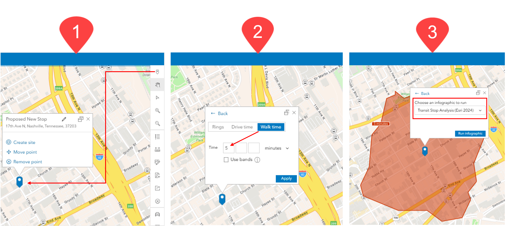
- A 5-minute walk area is created around the stop, and a pop-up appears. Select the Infographics option, click the drop-down for Gallery, and navigate to Transit Stop Analysis (Esri 2024). Press the Run infographic button.
The infographic is generated with all the demographics, business, and transit data filled in. Many of the graphics, including the “What’s Nearby” and “Transit Stops and Stations” panels, are interactive and can be clicked on for additional details.
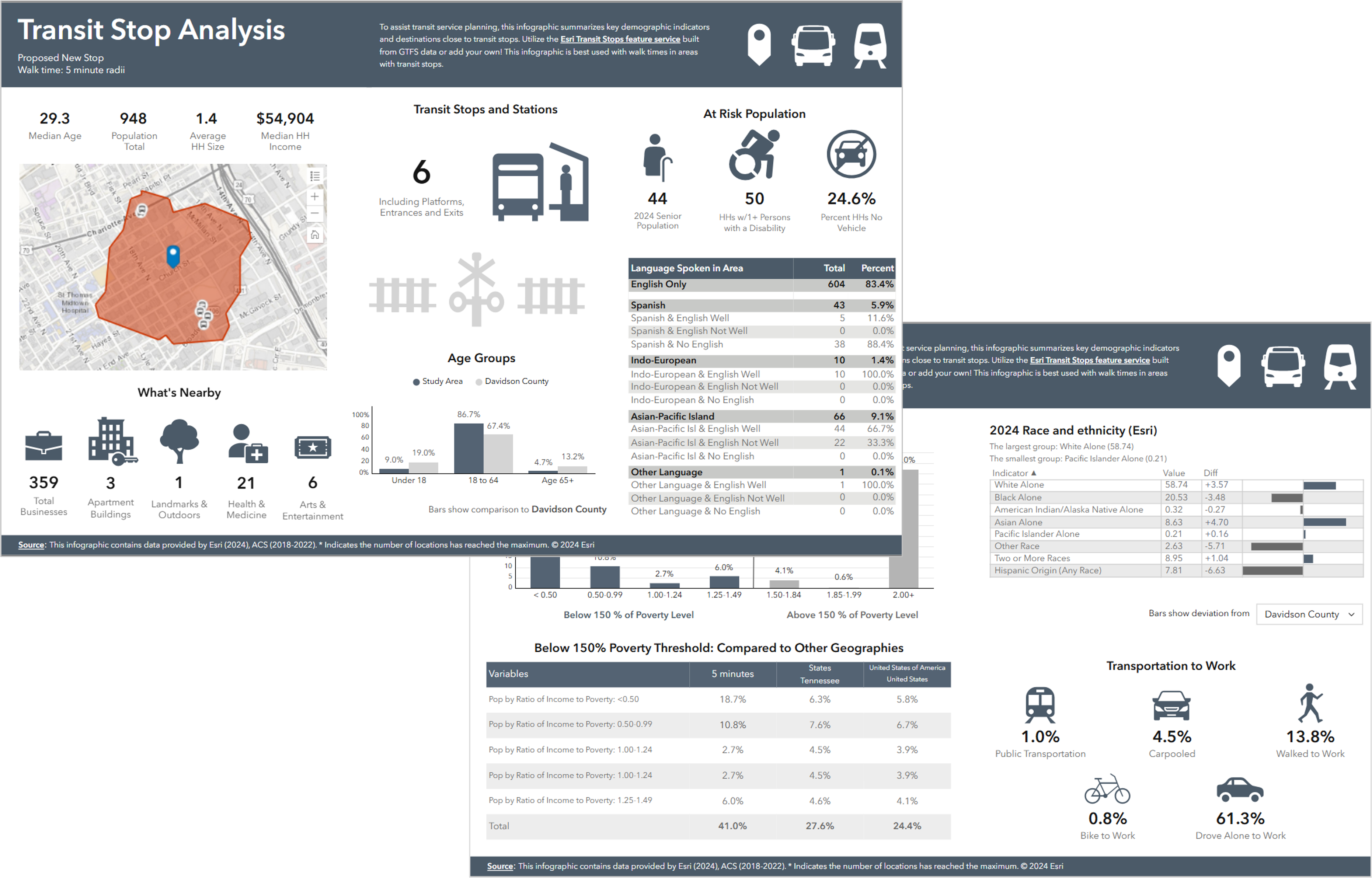
You can quickly see that this walk area contains 359 businesses, and over 16% of the population speaks a language other than English with varying proficiency. There are also 6 existing transit stops in the walk area. This is actionable information to utilize in your transit stop planning.
Additionally, the “Below 150% Poverty Threshold” panel shows that poverty levels are also higher in this area than state and national averages. Note that these comparison geographies can be customized to other areas like ZIP codes or census tracts.
Wait! I don’t see any transit stops for my area
There are a couple of reasons you may not see transit stop information for your area:
- There just aren’t any transit stops (think unpopulated/rural/remote areas), or
- Esri doesn’t have transit data for your area yet. By default, the infographic template utilizes transit stops available in the Esri Transit Stops feature service. This feature service is a work in progress that we are continuing to build out across the U.S. and internationally.
We hope communities will consider joining the Esri Community Maps program to help us grow our transit stop data collection! For the prior example, we are fortunate to have data from Esri Community Maps partner WeGo in Nashville, TN.
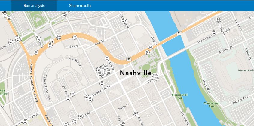
If we don’t have coverage for your area yet, the good news is that the transit data source for this infographic can be redirected to your own ArcGIS Online feature service. Please note however that making this customization to the infographic requires an Advanced BA Web license; this capability is not available with a Standard license.
1. Add your own ArcGIS Online feature service to the map
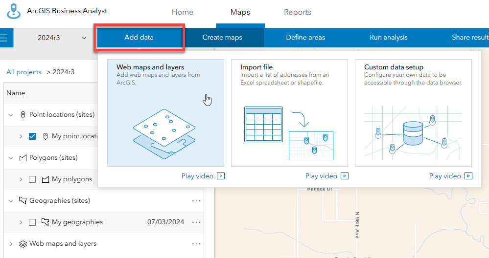
Go to the Maps tab in Business Analyst and click Add data, then click Web maps and layers.
In the Select a layer window, navigate to your feature service in ArcGIS Online. In the screenshot below, we are adding a hypothetical layer called my_agency_bus_stops from My content to the map. Note: The feature service you are adding must be a point layer.
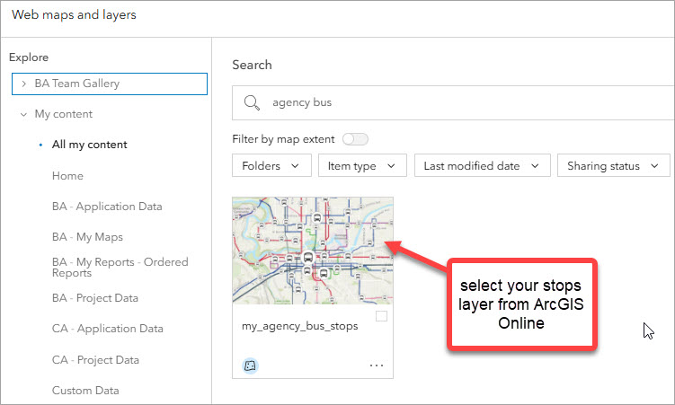
Once you select the layer, you should see it appear in your Business Analyst project’s table of contents.
2. Connect the infographic to your data source
Now that your own feature service is added to Business Analyst, you need to connect it to the infographic.
First you will have to save your own copy of the Transit Stop Analysis infographic because you can’t edit the original template. Go to the Reports tab and click Gallery. Inside the gallery, open the Transit Stop Analysis infographic. Click the Save button in the bottom right. A copy of the infographic is created under My Templates. Rename the infographic if you’d like. Now you have a version you can edit!
Find the infographic copy you just created under My Templates. Click Open to start editing. There are two elements in the infographic to update: the “Transit Stops and Stations” Nearby panel and the Map panel. For each element, you will redirect the data source connection to your own feature service.
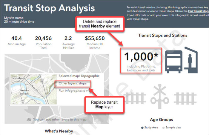
To update the Transit Stops and Stations Nearby element:
- Click the existing Nearby element showing the count of transit stop locations. Hit delete on your keyboard or click the ‘x’ in the in the upper right to remove the element.
- At the top of the template, click Add element and choose Nearby. This will add a completely new nearby panel.
- On the next screen, click the button Layer from Project. Navigate to the feature service you added to Business Analyst; for this example, my_agency_bus_stops.
- Accept defaults on the next two screens until you get to the Select method to display results options. Select Show as summary infographic and hit Apply.
- The new nearby panel referencing your transit stop layer appears on the infographic. You can now edit it to customize icon, font, and styles.

Additional helpful information on working with the Business Analyst Nearby panel can be found in the product documentation.
To update the Map panel:
- Hover over the map and click Edit and then click Edit Map. Select Add other layers.
- Remove the existing ‘stops’ layer by clicking the circled ‘x’ to the right-hand side of the window.
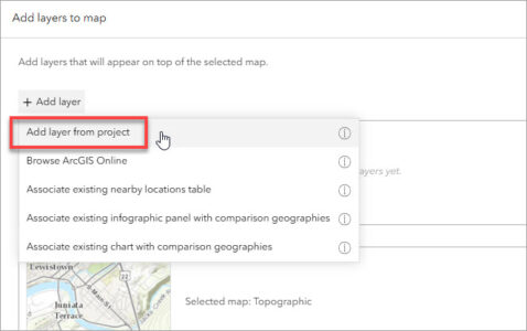
- To add your new layer, click Add Layer and then click Add layer from project.
- Select the feature service you’ve added to your BA project; for this example, my_agency_bus_stops. Hit Apply. You should now see your feature service on the inset map.
- Hit Apply again to finish.
- When you’re done making changes, click Save at the bottom right of the screen.
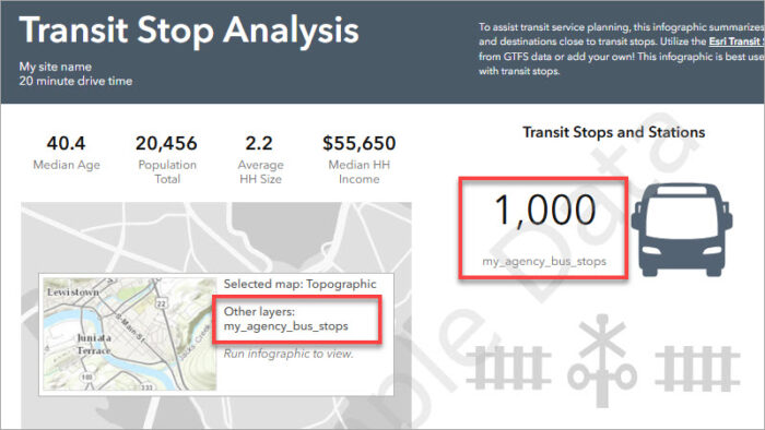
In the screenshot below, the my_agency_bus_stops feature service is now referenced in the “Transit Stops and Stations” Nearby element and the Map element.
At this point, your own feature service is connected to the infographic, and it is ready to be used. To test it out, go back to the Maps tab. Click on a stop or station and select the Create buffers option in the site pop-up. You can then select distance rings, drive times, or walk times as shown in the previous example. Once the area is generated, then you can run your new version of the infographic.
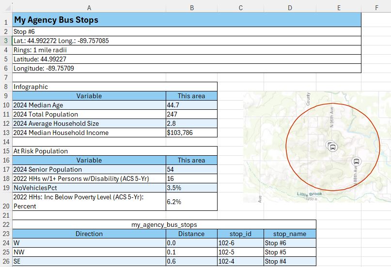
To share your infographic with others, there are options to export as PDF, HTML, or Excel. Here’s an example of the Excel version of the output, which is pretty nifty:
That’s it! Now you can run this infographic for any stop or station you’d like.
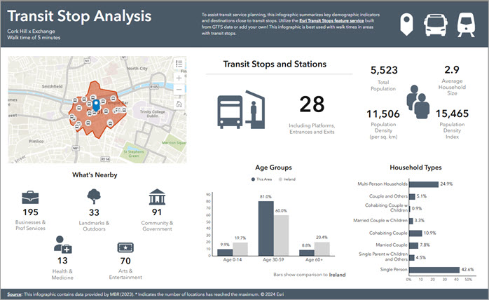
One final note – we are building out international transit infographics as well. Ireland (shown below) is one of the countries available with the November 2024 Business Analyst release, in addition to the U.S. Stay tuned for the transit infographic to appear in more countries.
Where do I get more information?
We hope this has been a useful introduction to the new Transit Stop Analysis infographic! Check out the links below for additional helpful information.
- Read about our Esri Transit Initiative in the U.S. and internationally.
- Learn about the Title VI Navigator infographic also available in the Business Analyst infographics gallery.
- Find out more about the demographics and socioeconomic data available in Business Analyst.
- Read an Esri use case on GIS mobile solutions for transit from St Louis, MO.
- Learn about ArcGIS Pro tools available for working with transit data.
A special thanks to Esri solution engineer and transit expert Cory Whittaker, and writer Gemma Goodale-Sussen for their review and contributions on this article.

Article Discussion: