The May 2024 release of ArcGIS Business Analyst Pro 3.3 introduced a reimagined and redeveloped implementation of color-coded layers. Color-coded layers (CCL) now offer new data storytelling capabilities and deliver improved performance with all data types and geographic layers. Like other recent enhancements, CCL leverages improvements in other parts of ArcGIS Pro and lays the groundwork for additional innovation in ArcGIS Business Analyst Pro 3.4 and beyond.
What are the key improvements and changes?
Five key improvements were introduced to make color-coded layers more powerful while reducing complexity, improving user control over all aspects of map visualization, and enhancing integration with installed and online demographic data. These can be summarized as:
- Introduction of group layers across multi-resolution geographic areas
- Automatic range-based zooming and layer control
- Optimized, consistent styling of geographic layers based on data types
- New area of interest control to focus mapping and automate levels of detail
- Improved user experience and interface
In the following sections, we’ll expand on the improvements, explain the user benefits, and provide visual examples of the capabilities.
Introduction of group layers across multi-resolution geographic areas
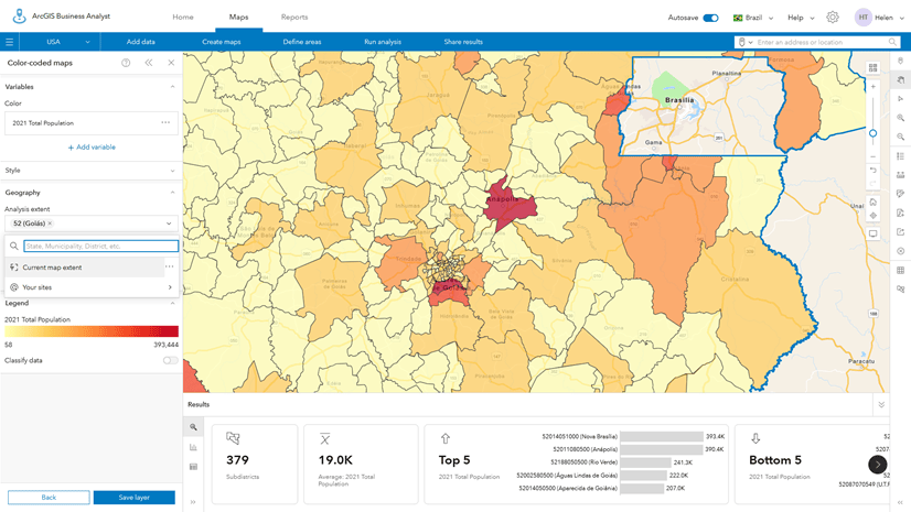
Perhaps the most powerful and innovative enhancement, and certainly our favorite, is the use of group layers to organize and control individual geographic hierarchies and map layers. Business Analyst Pro expands the capabilities of group layers to include a new control component that allows styling to be applied to all layers within the group layer by changing the symbology of the group layer itself. All of the individual layers are styled based on the group layer, with individual ranges and visibility controls set automatically based on the geographic layer type—state, county, etc.—and the range of values within the selected attribute, for that particular area of interest and geography type.
In the example below, total population is initially mapped for the U.S., with Business Analyst Pro also automatically selecting states as an alternative level of geography. When the area of interest is constrained to Utah, new levels of geography are added, including county, ZIP Code, census tract, and block group areas.
You will notice that Business Analyst Pro automatically zooms to Utah, and each layer in the Contents pane is mapped with a consistent style, with easy-to-read range values. Smart mapping is used for each geographic level with the same symbology and style controller. Changing the color ramp for the group layer automatically applies the best style to all layers within the group.
Automatic range-based zooming and layer control
The zooming and panning control has been significantly improved, with each geographic area automatically assigned an optimal visibility range so that as the user zooms in, more detailed layers are displayed and vice versa. A user can individually style any layer within the group using the familiar ArcGIS Pro Feature Layer and Symbology controls. When the style is edited for the group layer, independent of scale, all sublayers will inherit the styling applied to the group layer.
In the animation below, you can see how the level of detail changes automatically when zooming in. Swapping the level of detail to any of the layers shown in the Contents pane will zoom to the visibility range set for that specific layer.
While Business Analyst Pro automatically selects the best mapping style, you can always select one of ArcGIS Pro’s other styles based on your group or individual layer preferences. How that style is applied, and at what scale, will depend on whether you selected the group layer or an individual layer.
Optimized, consistent styling of geographic layers based on data types
Business Analyst Pro comes with access to locally stored or online data. We’ve trained and configured the software to know about each of the 15,000 or more data variables in the U.S. (or worldwide) and the best way to display them.
Many variables are available as different value types including counts, percentages, indexes, ratios, and more. When designing the new color-coded layers, we wanted to provide users with the best type of styling for each data variable independent of how it is presented. For example, when looking at a spending variable like Annual Expenditures, the attribute can be expressed as total dollars per year in the area, the average, or an index that compares spending in the area to the national average.
Each of the annual expenditure data types can be mapped using different styles. We chose the best style, so numbers use natural breaks, the style most familiar to ArcGIS Pro users. Averages are shown using quantiles and indexes are grouped into equal intervals. As discussed above, a user can always choose a different style, and if you want to change the number of categories from, say, 5 to 10, changing this for the group layer will automatically add five new classes for all the layers below. As data scientists and storytellers, this has saved us hours of work in exploring different aspects of the data, highlighting patterns, and explaining distributions to colleagues and stakeholders, compared to previous versions of Business Analyst.
New area of interest control to focus mapping and automate levels of detail
We’ve mentioned the area of interest control in other sections above, but it’s a game changer for many users and worth describing in more depth. Previously, you had to create a selection of the data or use overlay to target your map display, adding increased complexity and time to your workflows. Now you can automatically set the area of interest to any geography, add new geographies of the same type, and focus your work on those locations.
Business Analyst Pro will automatically zoom to or expand the map display based on the area(s) of interest you choose, as shown below, where we add Colorado into our analysis. The map expands to include both Utah and Colorado, and you will notice that the map style is maintained, as are the levels of geography, but the range of values is recomputed to reflect the new values across the two states.
This provides powerful ways to create beautiful and meaningful map visualizations without the need for constant adjustments to data ranges, category values, and styling options. As you add or subtract areas of interest, the map styles, map display, and Contents pane are continually updated to summarize the data in your area(s) of interest and help you better understand your data.
Improved user experience and interface
To support all the enhancements described above, we needed to redesign the user interface and experience. We leverage familiar elements of ArcGIS Pro, such as the Symbology pane and ribbon components to maximize the flexibility in controlling what is shown, how you focus the map display, and styling any attribute to your specific needs.
The color-coded layer workflow has its own tab in the ribbon from which you can control all aspects of the group layer, including style and blend mode, access the Symbology pane, and focus the map on any geographic level. When you set the level of detail using the control, the display will automatically update with the new map layer centered in the display.
When the group layer is selected, the Symbology pane shows controls for all the layers, including setting the area of interest, level of detail, data type, and map style. The ribbon and Symbology pane can be used in conjunction with each other to quickly access the tools you need to help your data story come to life and better explore your maps.
Summing it all up
There’s a lot more that can be done with color-coded layers, which we will explore in another blog article, but we hope you will discover the benefits of these new enhancements for yourself. We know that these improvements will help you become better data scientists, GIS analysts, cartographers, and storytellers and we are excited to see how you put them to use.

Article Discussion: