ArcGIS Experience Builder provides a dynamic platform for creating customizable and interactive geospatial web applications. With integration of the Business Analyst widget, users can thoroughly explore data analysis and visualization through infographics, transforming data into clear, actionable insights.
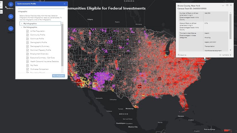
This blog article will guide you through the process of creating a web application in ArcGIS Experience Builder using a web map that displays the primary category of disadvantage for each county in the United States, based on the criteria set forth by the Justice40 Initiative.
You will accomplish this task in eight steps:
- Choose a template.
- Add data to the map.
- Pair the map with the Business Analyst widget.
- Customize the Business Analyst widget.
- Configure the Business Analyst widget for organization wide or public use.
- Configure an Alert widget to provide information and instructions about the application.
- Publish and share the app.
- How to use the app.
You can also view the final product: Predominant Disadvantage Category by County – Overview (arcgis.com) (To access this application, you must be signed in with an ArcGIS organization account to use the Business Analyst widget).
1. Choose a template.
Experience Builder has a large template gallery to create your own Experience Builder app. All sample templates provide pre-configured layouts and contain notes explaining the use cases and configurations.
- To get started, go to Experience Builder and click +Create new.
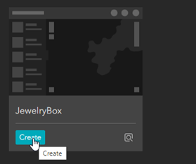
Because we want an app that primarily focuses on the map, we will choose the JewelryBox template.
- Find the JewelryBox template and click Create.
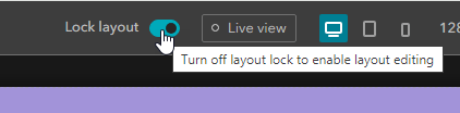
- Turn off the Lock layout toggle button to start editing the template.
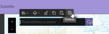
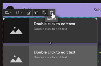
- Select and delete the search widget from the map as we will add own.
2. Add data to the map.
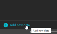
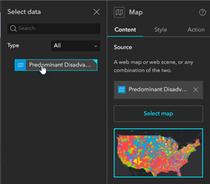
- Select the map on the canvas to activate it and click Select map on the right-side panel.

- Click Add new data.
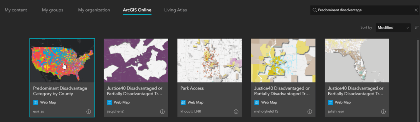
- Click the ArcGIS Online tab and search the keyword “Predominant disadvantage”. Select the “Predominant Disadvantage Category by County” web map from the search results and click Done.
- Select the web map and the Map widget will populate with selected content.
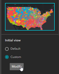
- You can keep the Default map extent or modify it by clicking Custom on the right panel.
- Select the List widget on the sidebar and delete it. We will add our own widgets in this sidebar. You will get a warning about deleting this widget. Simply go ahead and click Delete.
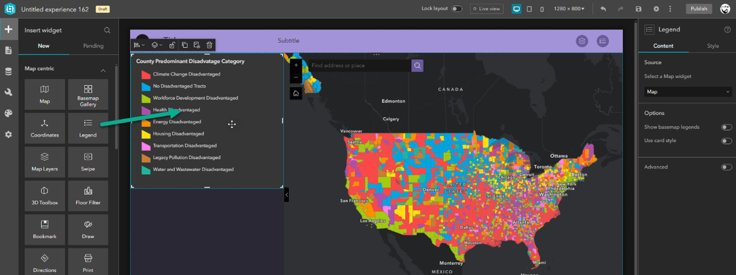
We will now add a Legend widget to the template to assist users with the interpretation of data on the map.
- Drag the Legend widget to the empty sidebar.
- The legend of the web map will automatically populate in the legend.
Now it’s time to pair our map with the Business Analyst widget to view interactive infographics.
3. Pair the map with the Business Analyst widget.
- Drag the Business Analyst widget below the legend widget in the sidebar.

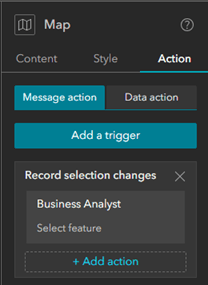
- The Business Analyst widget will be automatically paired with the map widget. We will configure the map to detect feature selections and trigger the Business Analyst widget.
- Select the map widget on the canvas to activate it and click on the Action tab
- Click Add trigger > Record selection changes > Business Analyst > Select feature. This will allow you to select any counties on the map and view infographics using the Business Analyst widget.
4. Customize the Business Analyst widget.
- Select the Business Analyst widget on the canvas to activate it
- By default, the Workflow mode is enabled for this widget. We will customize some of the available options when designing this app for our end users.
- Toggle the Search and drawing tools as we will not be using them in our app

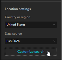
- Under Location settings, click Customize search
- Update the introduction text to: “Start by searching for a county by name or select it on the map.”
- Uncheck the Point of interest option and only select Counties for the geography search options. Users will be able to search for Counties by name now.

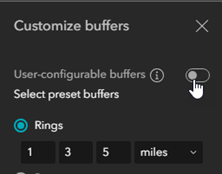
- Click on Customize buffers
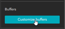
- Toggle the User-configurable buffers option off. We will not use this function as we plan to work with county boundaries.
- Click Customize infographics
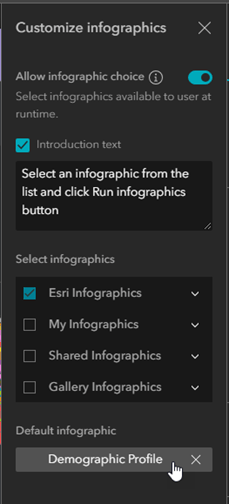
- Update the introduction text to: “Select an infographic from the list and click Run infographics button.”
- Expand Esri infographics and select the desired list of infographic templates. For our application, we selected a range of infographics such as At Risk Population, Commute Profile, Demographic Summary, Employment Overview, Healthcare and Insurance Statistics, Housing Market Characteristics, and Key Facts. Using these infographics to explore our map will greatly improve our understanding of the disadvantages faced by our communities.
- Under Default infographic, click Select and pick the default infographic that will be available for your users when running the app.
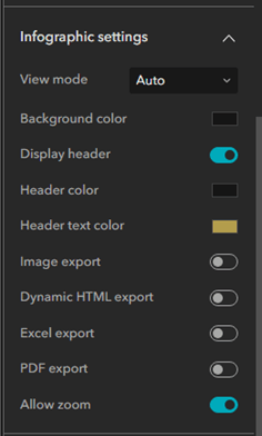
- Expand Infographic settings to customize the available options. Since we are creating a publicly accessible app for a wider audience, we will disable the infographic export options to limit credit usage. Learn more about credit usage.
5. Configure the Business Analyst widget for organization wide or public use
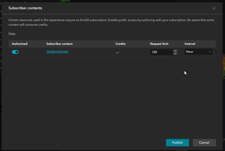
- Click Select utility and select the default GeoEnrichment By configuring a GeoEnrichment utility service, you can share your app with users who have an ArcGIS account but do not have the privileges needed to use the Business Analyst widget, or with public users.

- When you finally save and publish the app, you will be prompted to authorize GeoEnrichment. Toggle the authorize option for GeoEnrichment and click Publish. Learn more about this configuration.
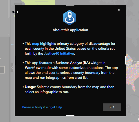
6. Configure an Alert widget to provide information and instructions about the application.
- Click Window on the left panel and add the Alert. A window will pop up, alerting app viewers about the information you provide.
- Provide information and instructions about using the application.
- Save the application and publish it. Make sure to authorize the GeoEnrichment service when publishing as mentioned in step #5 above.
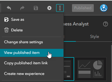
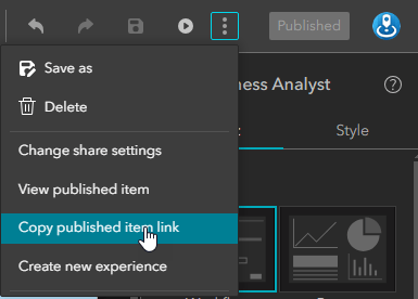
- Click View published item to view your app
- Then, click on Change share settings and share your app with your organization or everyone.
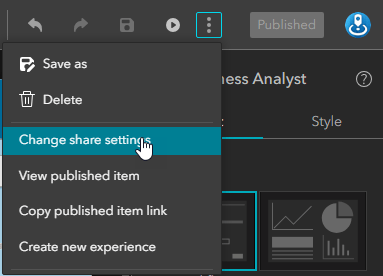
- Once the app is shared, you can provide the link to your app by copying it from here.
8. How to use the app
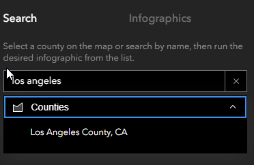
Once you publish the web application, viewers can select a county on the map or search by name and run the desired infographic from the list. This will provide information on the primary category of disadvantage for each county in the United States, along with key demographic details. Here is an example of how to use the app:
- In the Business Analyst widget search bar, search for Los Angeles County by name.
- Click on Los Angeles County on the app, and a pop-up will appear.
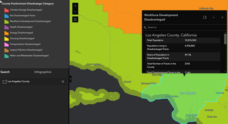
From the pop-up, we can see that the primary category of disadvantage for Los Angeles County is Workforce Development. Nearly half of the population in this county lives in disadvantaged tracts.
- Click ‘Next’ and run the Demographic Profile infographic from the list.
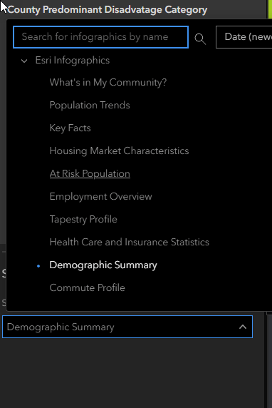
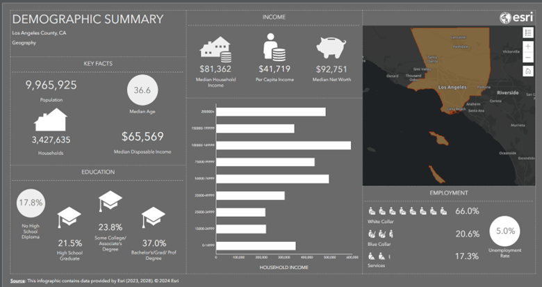
This infographic provides data on population, income, education, and employment in Los Angeles. State and local government officials can use these insights to develop strategies for more equitable community development. Non-profit organizations can leverage this data to target their efforts more effectively, while businesses can enhance their community engagement strategies to address specific local needs.


Article Discussion: