Given that the human mind comprehends data better through visualization, using charts within infographics is a great way to present your data. One of the most popular charts used in ArcGIS Business Analyst Web App infographics is the population age pyramid.
A population pyramid is a type of bar chart used to show the age and gender distribution of an area. Population age pyramids are just what they sound like: population pyramids broken down by age. They can be powerful predictors of future demographic trends and provide much-needed information for community planning.
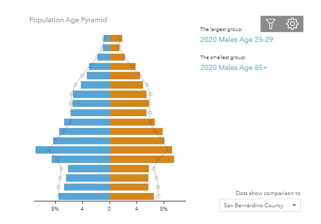
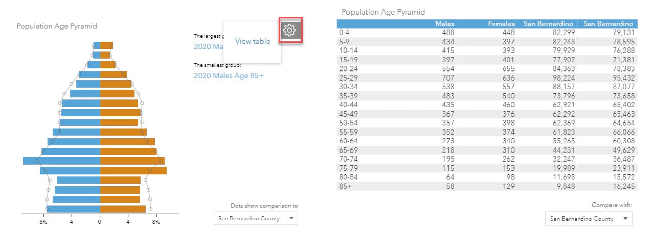
Here the pyramid is divided by gender with males on the left side and females on the right. The width represents the size of the population of a given age group. In ArcGIS Business Analyst Web App, hover over any of the horizontal to view additional information about the age group.
These charts visualize the demographic makeup of a population and can be used to plan for community needs such as education, medical facilities, and jobs at the city, county, and country level. For example, an aging population leads to increased demand for medical and health facilities, while a younger population may call for more schools and daycare facilities—age pyramids can help understand these specific needs.
Business Analyst Web App offers infographic templates like Target Market Summary, Marketing Profile and Community Profile that feature built-in age pyramid panels. You could use one of these templates and edit the chart to your preference. You can also add the Esri Age Pyramid panel to any infographic, or even build and customize the pyramid yourself.
Add an Age Pyramid panel to an infographic
- Sign in to ArcGIS Business Analyst Web App.
- Click Reports > Build Reports > Build Infographics > Blank templates.
- Hover over Blank and click Open.
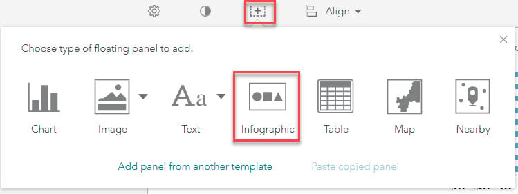
- Click the Add a new free floating element and choose Infographic.
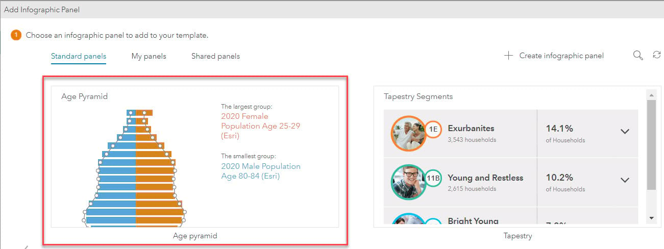
5. Scroll through the standard panels to find the Age pyramid panel. Click Add to insert the panel into your infographic.
6. Hover over the panel and click Edit to edit the chart.
7. Click Edit variables and style to add or delete the variables or to change the style of the chart.
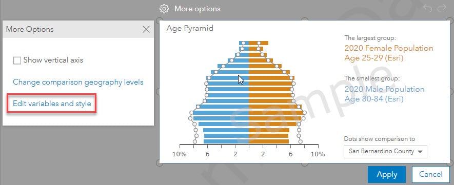
How easy is that? From here, you can customize the age pyramid and reposition it within the infographic. Now, try building the chart from scratch.
Build an Age Pyramid chart in infographics
The ready-to-use infographic panel is a great way to easily add the age pyramid chart to your custom infographic. Business Analyst users bring in their own data and combine it with Esri-provided data within infographics. When combining different types of data, the experience of building the chart from scratch can be useful.
1. Sign in to ArcGIS Business Analyst Web App.
2. Click Reports > Build Reports > Build Infographics > Blank templates.
3. Hover over Blank and click Open
4. Click the Add a new free floating element and choose Chart.
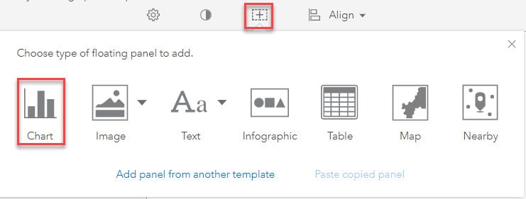
5. From the data browser, choose the data variables to include in your chart.
- We are using the Esri Standard data in this example.
a. Click Age and click 5 Year Increments.
b. Refine your results to Year: 2020 only and Gender: Male only.
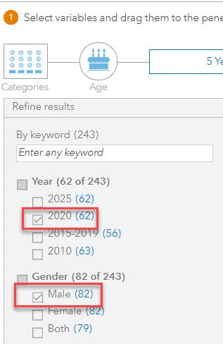
c. Click the arrow to expand the variable 2020 Age: 5 Year Increments (Esri).
d. Press Shift and select the variables 2020 Male population Age 0-4 through 2020 Male Population Age 85+.
e. Drag the selected variables to the chart builder window.
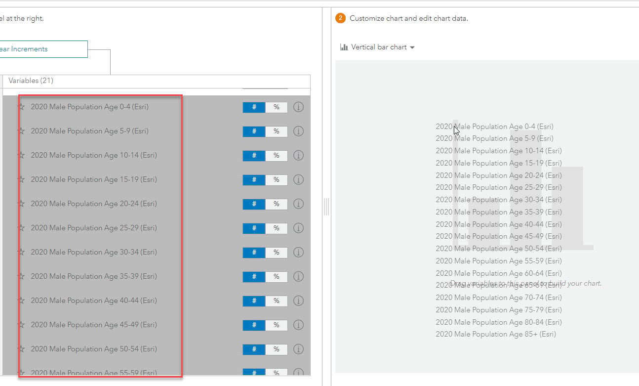
f. Click Add series. A new series, called Series 2, is created.
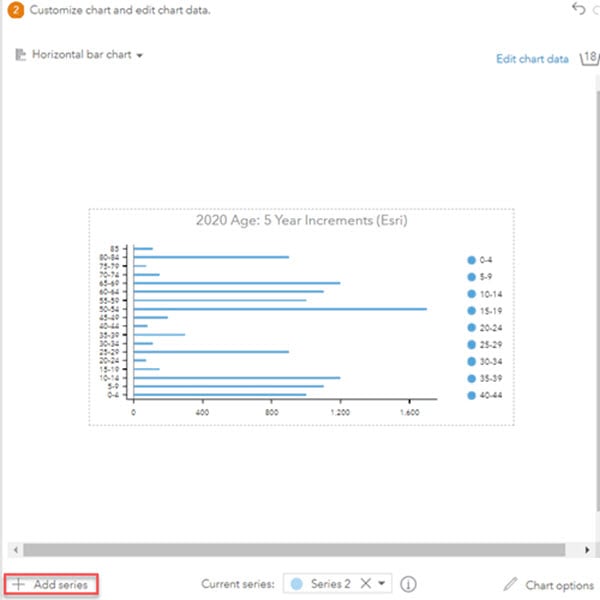
g. Repeat steps 5a-5d, this time using the female population by selecting Female only for the Gender category. Choose the same variables for 2020 Female population and add them to Series 2.
h. Click Edit chart data.
- Click the title Series 1 and change the label to 2020 Male population by Age.
- Click the title Series 2 and change the label to 2020 Female population by Age.
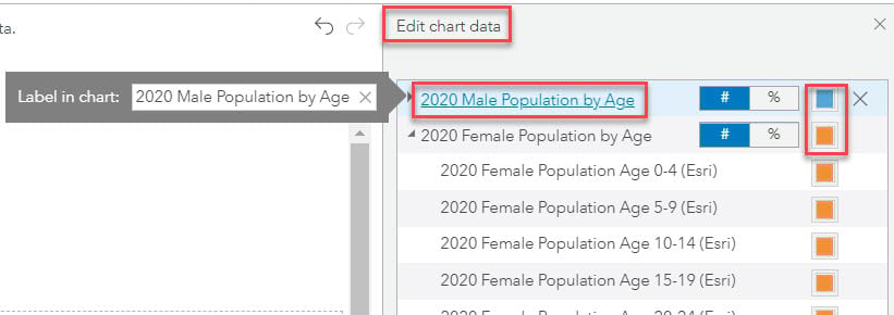
i. Change the color of each group to differentiate them from each other. To change the color for an entire group, click the color swatch beside the name of the group.
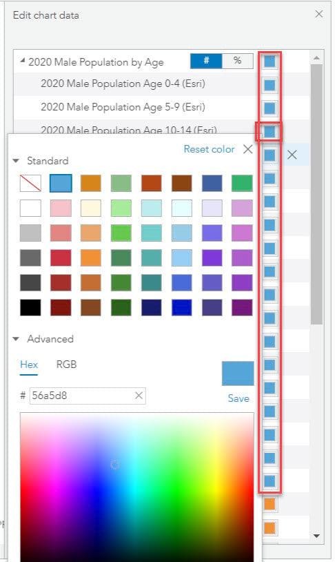
6. Now, customize the chart and edit the chart data in the Customize chart and edit chart data window. First, choose a chart type to display your data.
a. There are multiple chart options to choose from, but the default is Vertical bar chart.
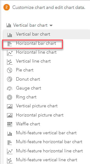
b. To build a pyramid chart, choose Horizontal bar chart. The chart style automatically changes.
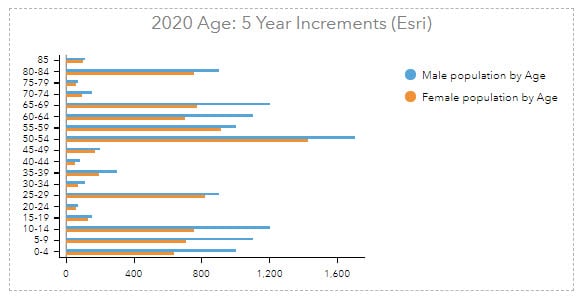
7. Click Chart options in the right bottom corner.

a. Expand the Chart section. Change your chart’s title to Population Age Pyramid.
b. Expand the Horizontal axis section.
i. For Placement, place your axis at the bottom of the chart by clicking Bottom.
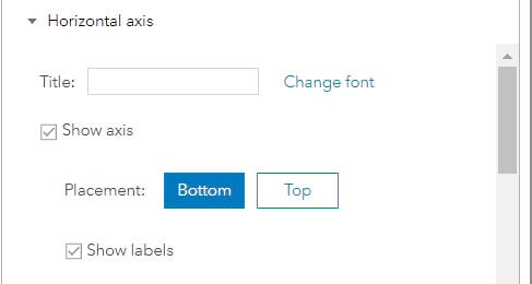
ii. Choose to show your chart values as weights in their series in percentages. Check the boxes for Show chart values as weights in series and Show % symbol.
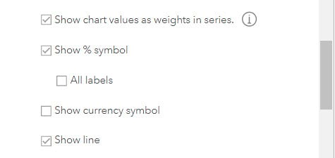
iii. Scroll further and ensure that the Show line and Show ticks boxes are checked.
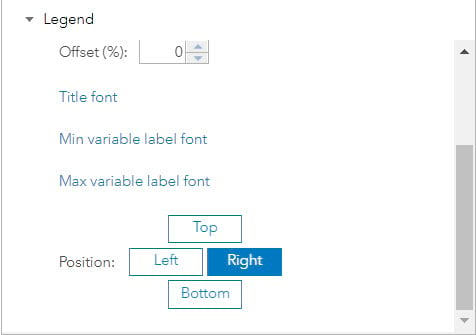
c. Expand the Legend section: Position your data legend to the right of the chart.
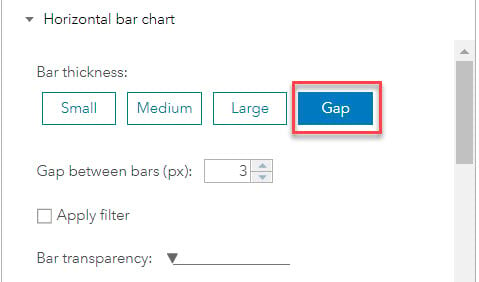
d. Expand the Horizontal bar chart section
i. For Bar thickness, select Gap and set a 3px gap between the bars.
ii. Increase or decrease the bar transparency by moving the slider.
iii. Choose to stack bars, show bar icons, show bars on opposite sides or in the background. Choose Bars on opposite sides to see the horizontal chart transform to a pyramid chart.
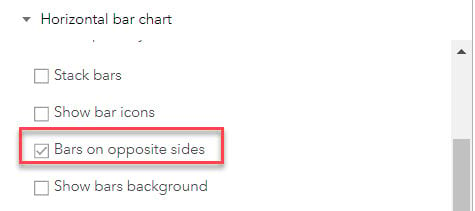
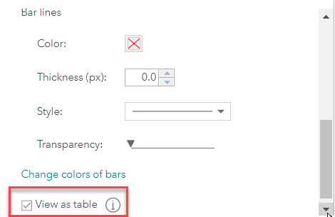
iv. Optionally, scroll further to change the thickness, transparency, and color of bars.
v. Check the View as table box to view the chart as a table in the infographic.
e. You can optionally click on Conditional styling to format the bar colors depending on the chart values. See Creating dynamic and conditional charts in Business Analyst to learn more.
f. Expand the Compare with geographies section and check the Show comparison with geographies box.
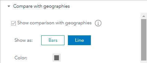
An additional series of population by age and gender data distribution is shown for the study area to compare with intersecting geography. By default, USA, States and Counties are selected as the intersecting geographies. Scroll further to change the comparison geography levels.

That’s it, we’re done building the pyramid chart!
8. Click Apply and Save your infographic template.
9. Run the infographic for your desired study area to view and interact with the chart.
a. Hover over the chart to learn about the male and female population by age in your study area.
b. Choose a different geography level from the drop-down menu—the population data changes on the chart and compares it to the chosen geography level.
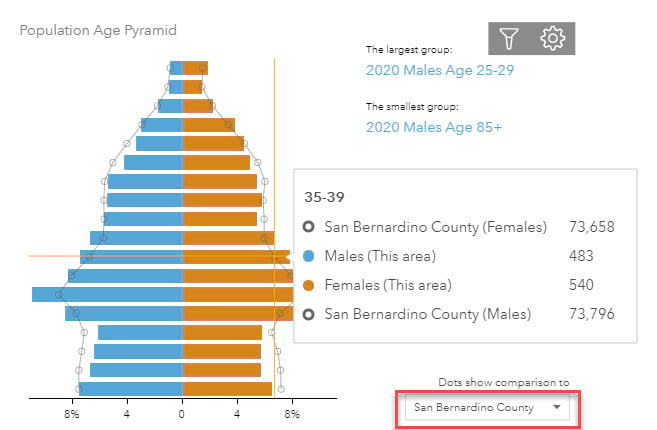
10. Click the gear icon to view the chart data in table format.
Now that you have learned to build a pyramid chart with me, tell your unique data story to the world by building more, using the multiple chart style options offered within Business Analyst infographics. As always, do not hesitate to contact the ArcGIS Business Analyst team at businessanalyst@esri.com or on Esri Community.

Article Discussion: