Business Analyst infographics are powerful tools for analyzing and consolidating geographic information and—perhaps just as importantly—for presenting that information to others. You can run infographics in the following applications:
- ArcGIS Business Analyst Web App
- ArcGIS Business Analyst Pro
- ArcGIS Business Analyst Mobile
- Business Analyst widget in Experience Builder
In addition to running infographics, you can also build infographic templates in ArcGIS Business Analyst Web App with an Advanced license as well as in ArcGIS Business Analyst Pro.
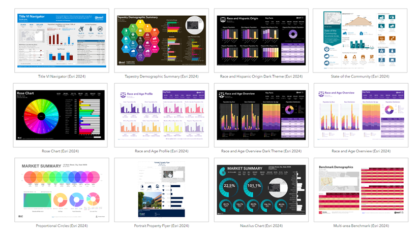
Infographics in Business Analyst are presentation-ready reports that visualize key indicators and information for your sites. Premade infographics are available in the Standard and Gallery collections. Popular Standard templates include the Economic Development Profile, Childhood and Female Equity, and Housing Market Characteristics templates. Gallery templates are a collection of specialized templates, many of which are designed for a particular dataset, industry, or country. Both Standard and Gallery templates can be run as-is, modified with different data selections or visualizations, or built from scratch.

Both types of templates include interactive experiences, which are pop-up panels that appear when you hover over an element. Infographics can be shared with your entire organization, your groups, or specific individuals.
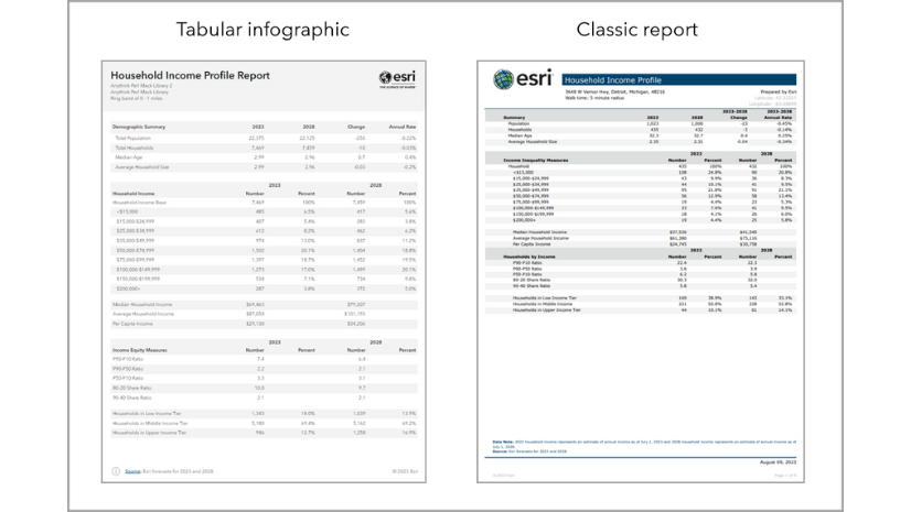
In addition to Standard and Gallery templates, you can use tabular infographics. Tabular infographics are modern data tables that leverage infographic capabilities. A tabular infographic is like a classic report, but with an updated design and improved accessibility and readability.
Tabular infographic styling supports theming and modern design options. For instance, infographics provide additional styling options and interactive elements. The styling options include changing the theme of the entire template so you can quickly adapt the template to your organization’s branding. Tabular infographics are designed to display larger font sizes and high color contrast to meet accessibility standards. This improves readability for a variety of audiences. The default color scheme is designed to be print-friendly.
Check out these blog articles to learn more:
- What is the new tabular style in infographics and reports using ArcGIS Business Analyst Web App
- Build tabular infographics and convert classic reports to the new style in ArcGIS Business Analyst Web App

Modify an existing infographic template
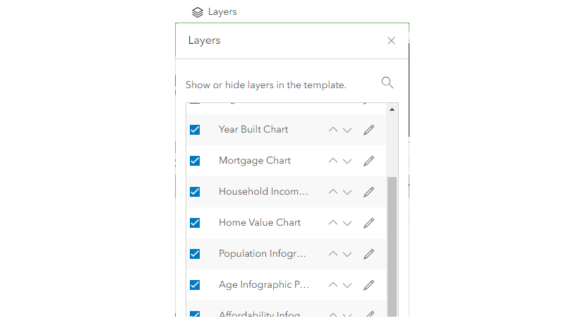
There are a variety of ways that you can customize a Standard or Gallery infographic template to better suit your analysis. For instance, panels can be removed if the information is not applicable to your use case. Or a panel can be replaced with another element that is more specific to your needs. Infographic elements include charts, tables, preconfigured standard infographic panels, maps, and other options.

To see an example of how we modified a Key Facts infographic, check out Modify an existing infographic template in ArcGIS Business Analyst Web App.

To learn about how you can customize infographics panels, see this blog article and associated video: Using custom infographic panels in Business Analyst.
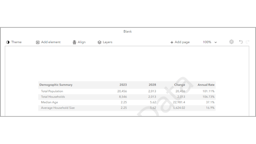
Create an infographic from scratch
You can create custom infographics in the infographic builder, which is available to Business Analyst Web App users with an Advanced license, as well as Business Analyst Pro users. To get started, consider creating a list of guiding questions for which data to use and how to visualize it. The following are a few guiding questions:
- What is the purpose of this infographic? What is the guiding question that the data in this infographic can answer? Is the organization researching a specific topic?
- Who is the audience for the infographic? Are they an expert in the field, or someone looking for a general summary of relevant demographic information? Does the audience understand complex data visualization, or do they require simplified visualizations?
- How will this infographic be used? Will it be shared in a presentation or distributed amongst a team?
The following blog articles provide a variety of resources and recommended best practices for creating infographics:
- Infographic design in Business Analyst: Best practices for layers and display modes
- Infographic design in Business Analyst: Best practices for themes
- Infographic design in Business Analyst: Best practices for tables and charts
- Infographic design in Business Analyst: Best practices for text
While building your own infographic is only available to Business Analyst Web App Advanced license users, you can collaborate across license levels. The user with an Advanced license can share their custom infographic to their organization, making it accessible to all users. For more information, check out How to collaborate across license levels in ArcGIS Business Analyst Web App.

How can I practice using infographics?
Use a tutorial to get hands-on experience using infographics in Business Analyst Web App, Business Analyst Pro, and the Business Analyst widget in Experience Builder. See any of the following tutorials to explore infographic capabilities:
| Tutorial | Product | Infographic capabilities |
| Expand a small business | Business Analyst Web App |
|
| Expand a small business | Business Analyst Pro |
|
| Market property potential with data-driven infographics | Business Analyst Web App
|
|
| Use infographics to understand total addressable market | Business Analyst Web App
|
|
| Design infographics in ArcGIS Business Analyst | Business Analyst Web App
|
|
| Set up custom data for infographics | Business Analyst Web App
|
|
| Create a custom infographic for a catchment area | Business Analyst Web App
|
|
| Customize an infographic-focused web app | Business Analyst widget in Experience Builder |
|
| Build an infographic-focused app in preset mode | Business Analyst widget in Experience Builder
|
|
| Build an infographic-focused app in workflow mode | Business Analyst widget in Experience Builder
|
|
How can I share infographics?
In Business Analyst Web App, you can also share your infographics to ArcGIS Dashboards. A dashboard is a view of geographic information that displays multiple visualizations on one screen, allowing you to provide a comprehensive view of data to support rapid decision-making.
For a quick overview of how you can customize both infographics and dashboards to share information in an interactive, compelling way, see the blog article Get more out of Business Analyst infographics and dashboards.

How do you use infographics?
We welcome your feedback! How are you using infographics? Please use the feedback option at the bottom of this blog article or post on Esri Community.


Article Discussion: