Over my decade-plus tenure at Esri I’ve often talked about the value of creating a “little world” within a story (see, for instance, item number four in my “Nine steps to great storytelling” story.) By that I mean adjusting the appearance of the various visuals within a narrative—maps, images, graphics, colors, typography—to create a unified look and feel that complements and reinforces the mood of your story.
Back in 2016 I became mildly obsessed with Norilsk, the world’s northernmost city of 100,000 inhabitants or more. Marooned within the vastness of Siberia, Norilsk’s residents not only endure a frigid climate, but also live in grim, Soviet-style apartment blocks and breathe some of the planet’s most polluted air, thanks to the smoke-belching smelters fed by its nickel mines.
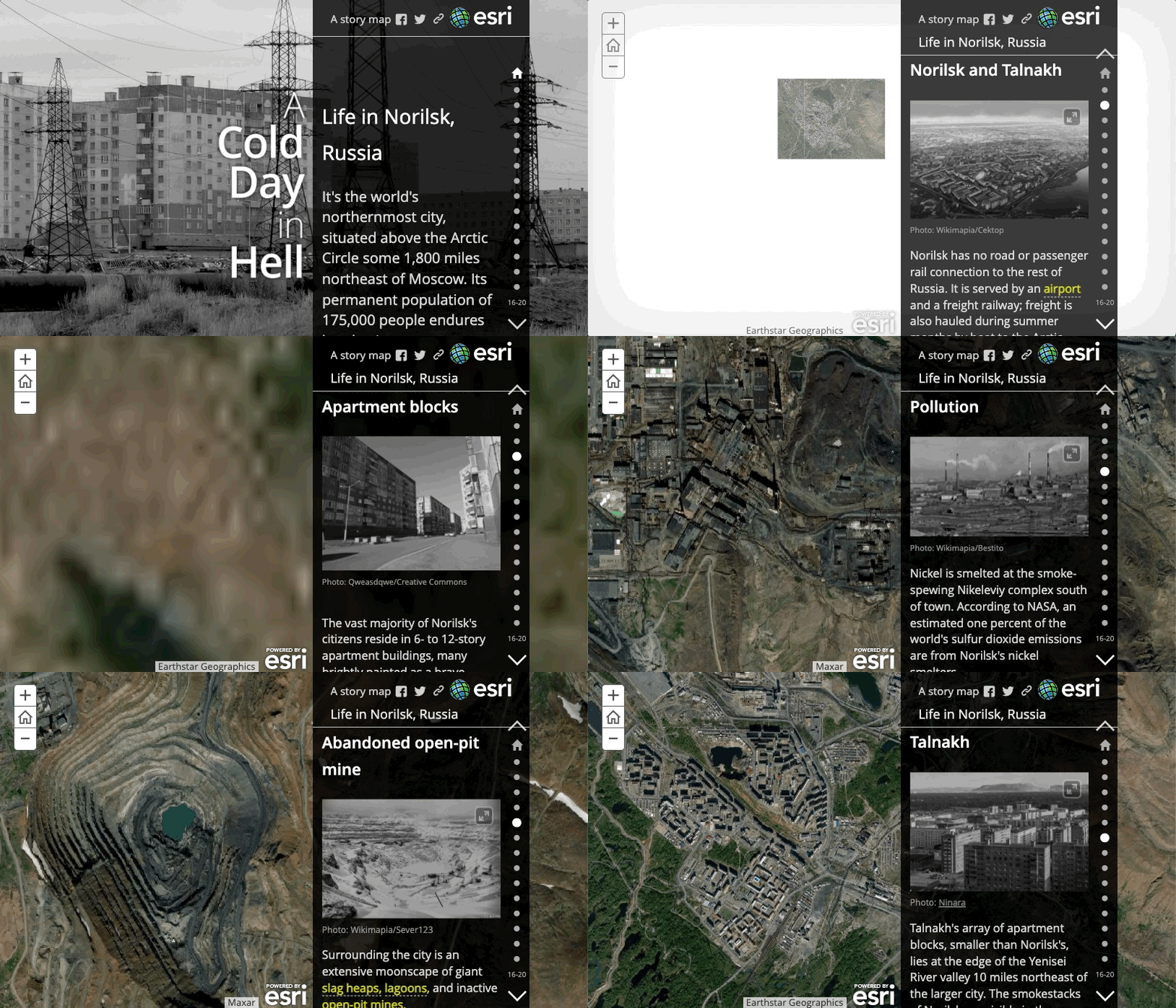
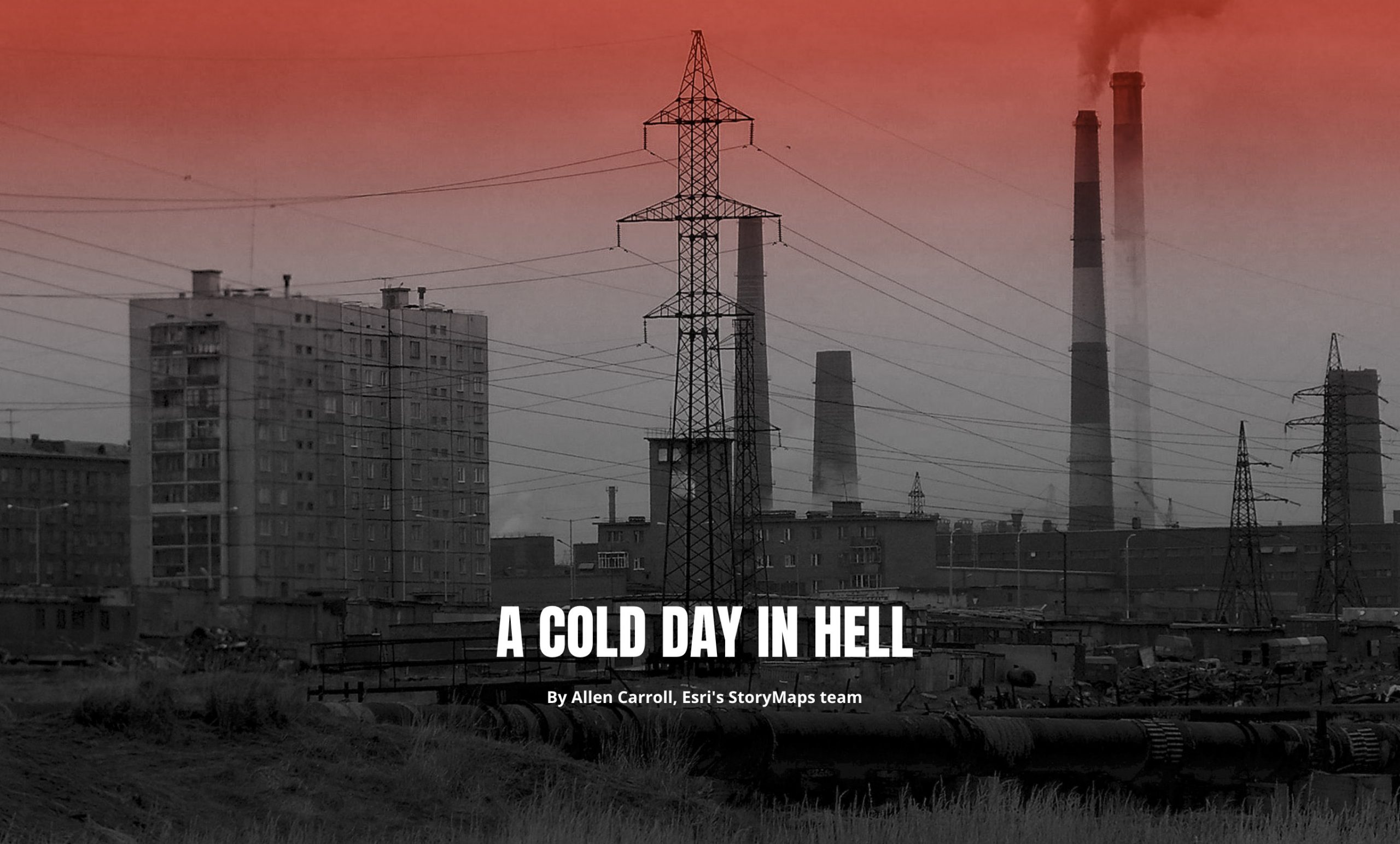
I wrote the original Norilsk piece using the Story Map Journal template, back before we launched ArcGIS StoryMaps. Now that ArcGIS StoryMaps has matured as a product, we’re actively encouraging our community to update their “classic” stories with the newer builder. I decided to practice what we had been preaching and remake my Norilsk story. In my original effort I had converted all the photos in the story to black and white as part of my attempt to create that little world. Black and white seemed suitable to the grim nature of the place, and worked well with the narrative panel’s dark background.
When I started the conversion process, I was delighted to realize that, not only did ArcGIS StoryMaps provide me with more creative options, but the ArcGIS Online Map Viewer—and in particular its Layer effects controls—gave me some exciting new ways to adjust the maps, making them, in a visual sense, full citizens of the little world I was creating. (This blog post gives a general overview of layer effects.)
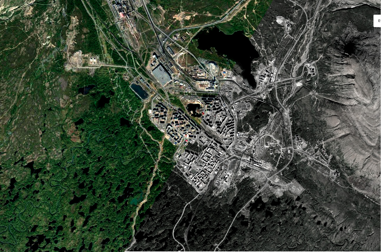
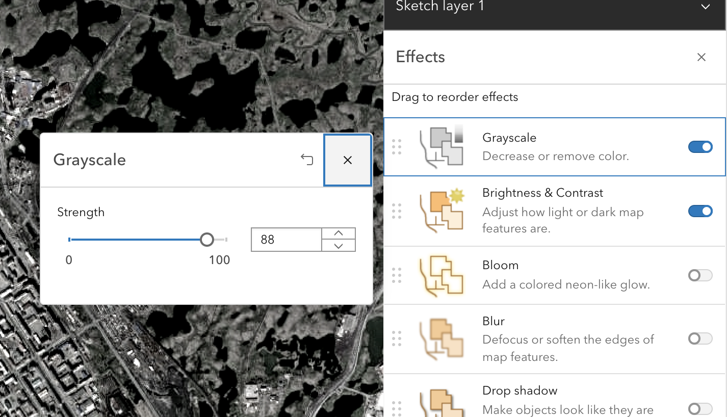
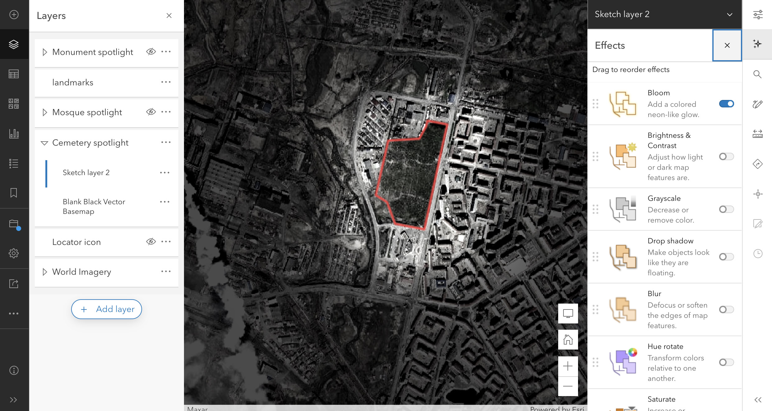
To make the imagery match the black-and-white look of the photos, I added the imagery base as a layer in the Map Viewer. I chose Effects, then activated the Grayscale and Brightness & Contrast controls. I upped the contrast a bit, but the bigger change was to almost completely desaturate the base using the grayscale slider control (below). I wanted to keep just a hint of color; the effect is subtle, but it’s a bit like glimpsing a building’s original color through a thick layer of grime.
Next I wanted to spotlight three locations featured within the story: a mosque (northernmost in the world), a monument to a former gulag camp, and a cemetery. I created a sketch layer, drew polygons around the locations, adjusted the Outline color and width, and set Fill to zero. I used the Blur layer effect to make the outlines slightly fuzzy; that seemed to visually marry them to the imagery layer.
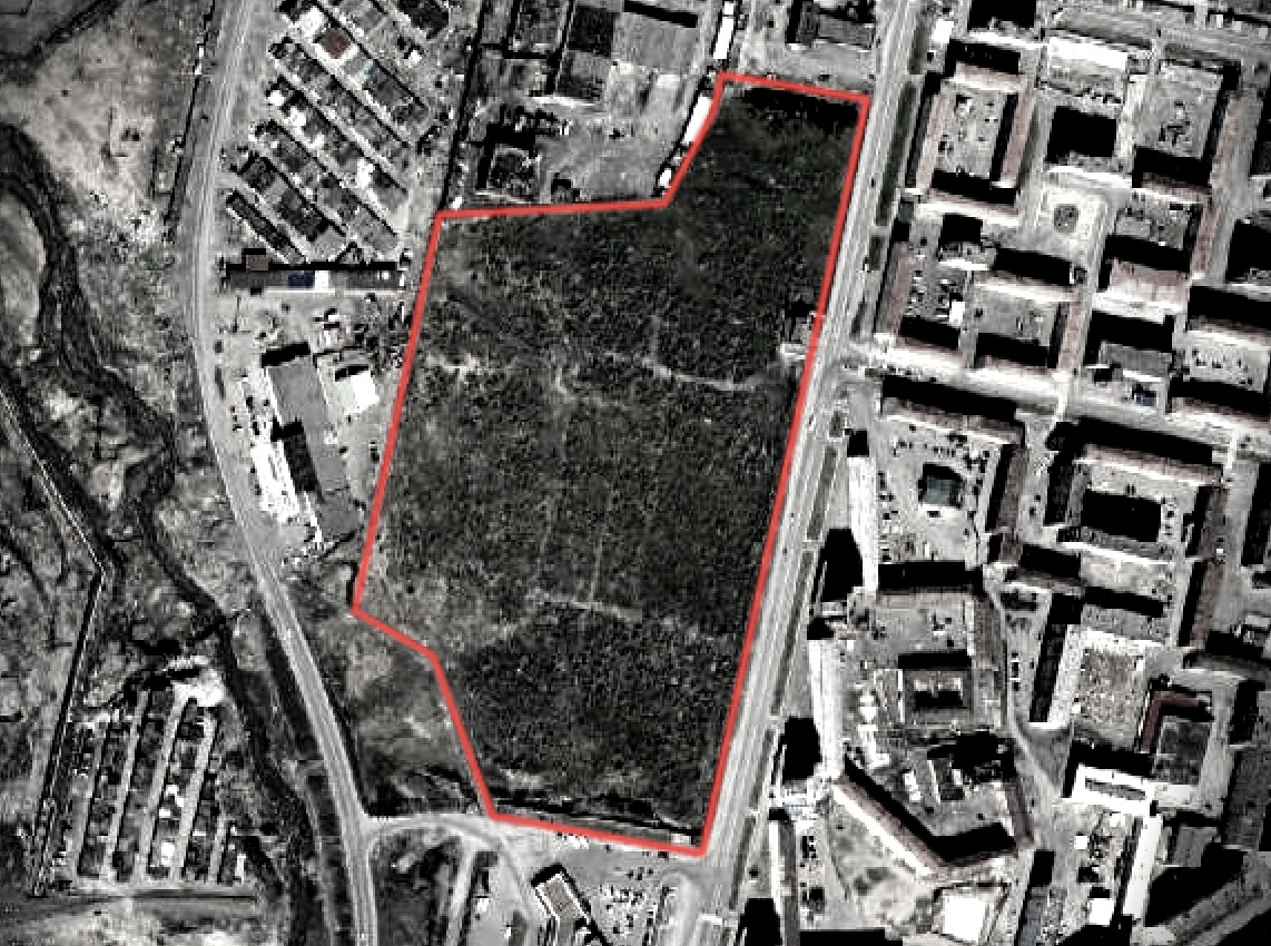
It’s at this point that my colleague and cartographer extraordinaire, Cooper Thomas, taught me a cool trick that I plan to use in the future; namely, using layer effects to “spotlight” a location or area. It’s a multi-step process, but once you learn from the expert, it’s easy:
- Add a new Sketch layer in the layers panel of the ArcGIS Online map viewer (not the classic viewer).
- Draw a polygon around the area; make it somewhat larger than the area itself.
- Select the polygon, and, in the Properties menu, give it a 100 percent white fill. Disable the outline.
- Return to the layers list, choose Add layer, and search Living Atlas for Blank Black Basemap.
- Choose either the polygon or the blank layer, and click Add to new group; move the black base and white polygon into it. Make sure the black base is beneath the white fill sketch layer.
- Return to the black base, and add a little transparency to it, using the Properties menu.
- Go back to the white polygon layer, open the Effects menu, and change the Blending mode to the Destination out option. The result: Your drawn polygon magically becomes a hole punched through the blank black layer.
- With the sketch layer still selected, go into Layer effects and turn on the Bloom effect. That softens the edges of the drawn polygon to create the spotlight effect.
Now, after saving the map, you can contextually turn this layer group on and off in the story builder in order to highlight specific features only as needed. Here’s a blog describing how to create a somewhat similar spotlight effect; here’s yet another set of tips about using sketch layers to highlight an area. The blank black layer is the brainchild of another extraordinary cartographer, John Nelson. He’s also created a white blank layer; just imagine what you can do with that!
In addition to the map effects I created a custom ArcGIS StoryMaps theme for the Norilsk story. I opted for a dark background, of course. For the text font I chose Open Sans, a personal favorite Google font that I find both attractive and readable. For the display font I picked Anton, also from the Google font list. I wanted something bold, condensed, and perhaps even a bit harsh, given the subject matter.
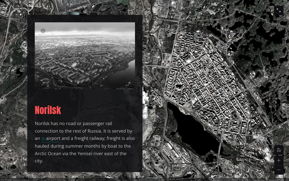
I also wanted a lurid, almost toxic color for the headings. Inspiration came from the one image in the story that I left in full color. It shows a creek turned shocking pink by a tailings pond failure. Finally, the cover seemed kind of bland in pure black and white, so I used Photoshop to create a color vignette that echoes the headings color treatment.
I hope you enjoy my story about Norilsk, and that it gives you a new appreciation for living at lower latitudes!
Article Discussion: