This month we’re enhancing some of the most popular blocks in ArcGIS StoryMaps with additional capabilities and features to make them even more powerful weapons in your storytelling arsenal.
- Video playback options in immersives
- Swipe in sidecar
- New embed options
- And more…
Video playback options in immersives
Sidecar and map tour now offer playback options for videos uploaded in their media panels. These options are the same ones already available for inline videos: click to play, autoplay without controls, and autoplay with controls. When using autoplay with controls, you can also choose whether the video loops.

Note that media panel videos in floating panel layout sidecar blocks always autoplay without controls since they fill the screen and are meant to be in the background.
For more information see the Playback options for videos section of What’s new in ArcGIS StoryMaps (September 2020).
Swipe in sidecar
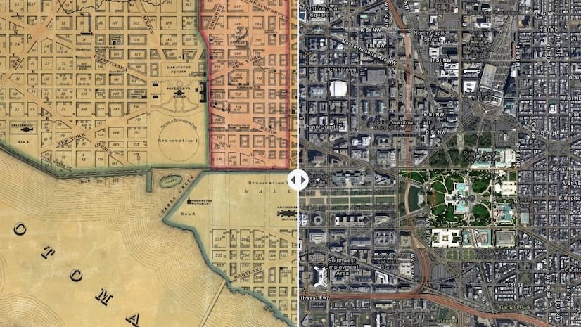
The swipe block has proven to be a popular way to provide interactive comparisons in stories. Now, you can add a swipe to engage your readers with this same experience within the context of a sidecar.
Just like when using a swipe in the main story narrative, you can use a sidecar swipe to compare two images or two maps. It’s available for both the docked and floating panel layouts. If you add a swipe to a floating panel layout, you’ll notice that the narrative panel fades out while the swipe is being used to offer an unobstructed view of the media (see video, below).
Using a swipe in a sidecar is a useful storytelling technique since you have a dedicated space for narrative on-screen at the same time as the swipe. If you have a lot to say about a swipe you can duplicate the slide and have your narrative span several slides.
For more information and lots of examples of how to use a swipe comparison in your stories, check out Swipe right for a powerful storytelling tool and our updated swipe tutorial. Our team has also published a nice sidecar tutorial if you’re looking for more tips and ideas for using that block effectively in your storytelling.
New embed options
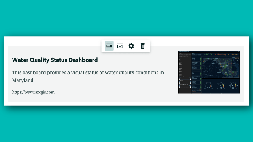
Embeds are a powerful way to incorporate content from elsewhere on the web into a story. Since there are so many different types of web content, embeds are flexible and provide a variety of ways to display and link to the content. This month, we’ve added new options that let you customize a reader’s experience when interacting with embeds. These options apply when a story is viewed on a large screen such as a laptop, desktop, or tablet held in landscape orientation.

The first option removes the click-to-interact panel that appears over live embeds. This experience is designed to prevent readers from inadvertently interacting with a piece of scrollable/zoomable embedded content. However, if the embed is not scrollable/zoomable, this panel may be undesirable or unnecessary.
Unchecking this option is recommended only for content that doesn’t not have any scrollable area or live maps. Interactive charts, live infographics, or dashboards (with no zoomable maps or scrollable areas) are examples of content that might benefit from this new option. If you follow the ArcGIS StoryMaps blog on the Esri Community, you may have known this option was previously available via an iframe parameter. Now, it’s available via a much easier to use checkbox in the story builder.
The second option provides the ability to remove the open-in-new-tab button. This button sometimes interferes with a button or menu in the top corner of the embedded content, so now you have the ability to remove it, if needed. This option can also be used when there’s no purpose or value in expanding an embed. Survey123 forms, interactive charts, and infographics are examples of embeds that often don’t need to be opened in a new tab.
These two settings provide more flexibility for authors to provide the right experience for readers based on the specific content that’s being embedded. The previously available embed display options are now grouped under the Small screens section since they affect how your embed is represented on devices with narrower screens like phones and tablets in portrait orientation.
You can learn more about using embeds in your stories in Enrich your stories with embedded content.
And more…
- For map tours created using a feature service, you can now show up to five image attachments for each place
- Custom basemaps used in express maps and map tours are checked for sharing issues during publishing
- Several bugs have been fixed, including one related to the organization settings page showing an error if the approved themes group was deleted and another related to a theme being removed from the approved themes group if changes to it were published
- PSA: A long-standing bug in Google Chrome that caused some portrait images to appear stretched in certain map tour layouts has been addressed. Update to Chrome 89 to get the fix!
Banner photo by Daniel von Appen on Unsplash


Article Discussion: