Esri and the ArcGIS StoryMaps team have been hard at work building a platform for the most ambitious data visualization and storytelling enthusiasts. They, along with myself and the other guest judges, have invited storytellers across the globe to put ArcGIS StoryMaps—and their own data visualization prowess—to the test.
The 2022 ArcGIS StoryMaps Competition saw contributions from participants in 17 different countries and every continent except Antarctica. Storytellers from across all industries participated, including educational institutions, government agencies from local to federal, nonprofit and non-government organizations, and the commercial sector.
While emphasizing the role of data visualization, we invited participants to compete within five categories:
- Digital humanities and popular culture
- Health and safety
- Humanitarian and social justice
- Nature and physical science
- Planning and infrastructure
Each story was unique, offering a wide array of design, analytical, and storytelling approaches, making this one of the toughest competitions yet. With this year’s focus on data visualization, we expected participants to creatively communicate their stories with gripping graphics and nuanced narratives. And you did not let us down!
This was an exciting and difficult competition to judge. (Explore previous competitions for 2021 and 2020).
Meet this year’s winners and runners up in the five categories plus three special award winners!

Digital Humanities and Popular Culture
Winner: Dante’s Inferno by Josef Münzberger, Czech Technical University in Prague
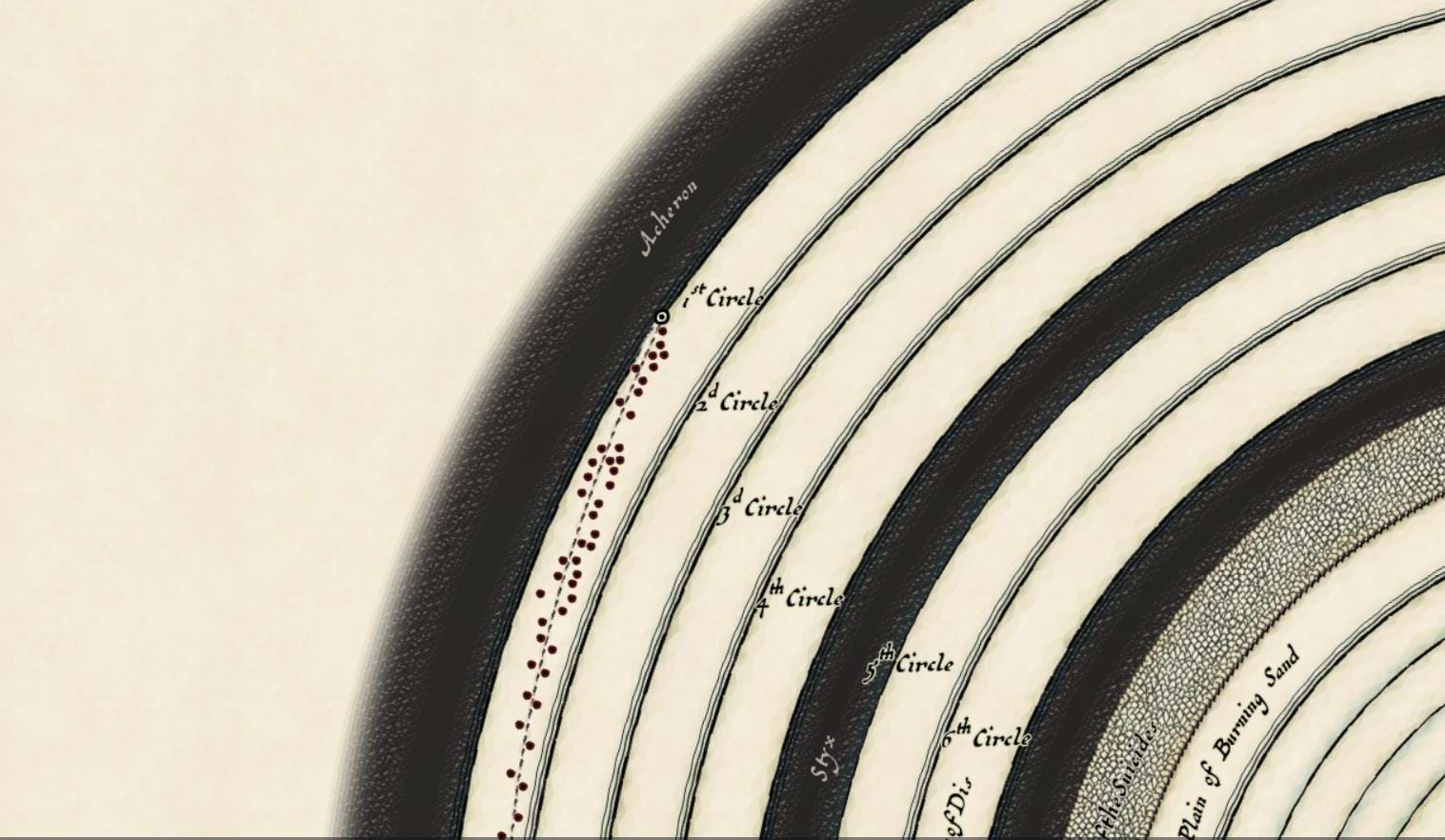
An instant favorite among the judges. Masterfully combining elegant-yet-whimsical cartography with visualizations that describe Inferno, Münzberger invites us to learn more about Divine Comedy and the structure that make the classic work. With gorgeous overviews and ample details-on-demand, readers can explore from the surface or take a deep dive and learn quite a bit. Deft use of ArcGIS StoryMaps’ interactivity makes this a joy to experience. And don’t forget to enable the soundtrack!

The use of ArcGIS StoryMaps to plot the spatial nature of Dante's Inferno put to picture what's been bouncing around in the imagination of millions throughout the years and plunged me into the seventh circle of surprise.
Runner up: Maps and History of Kaibab National Forest by Glenn Ingram, University of Arizona
Historic maps and modern storytelling collide in an elegant, visually strong, and engaging account of the Kaibab National Forest’s history, the change it has undergone, and the work that took place there. This piece is rich with information, showcased with a clean, purposeful visual language that defy you to stop scrolling. It can be challenging to augment historic maps with modern supplements in a way that is visually cohesive and not held back by the art of years past. Ingram faced this challenge with near-flawless execution.

Health and Safety
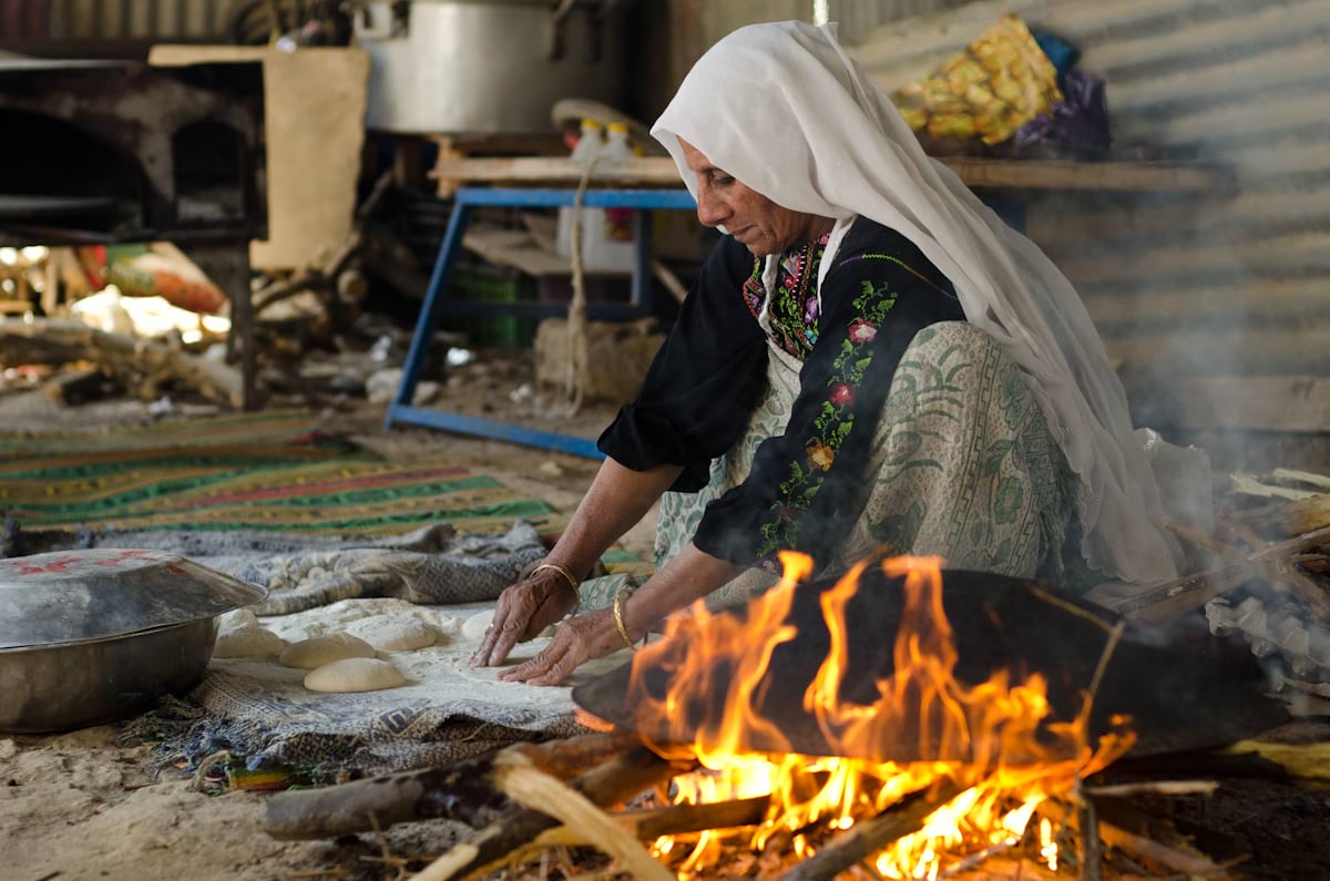
Winner: Hearths and Health: Evidence of the Global Impact of Household Air Pollution on Health by Shannon Lloyd and Alicia Oberholzer, Clean Cooking Alliance, UN Foundation
The judges were all impressed with the concise, polished, and well-structured presentation of data and information. Photography, maps, and data visualization were pulled together in a unified and thoughtful way to make a variety of statistics accessible to readers. The authors made great use of thematic choices—from overall visual style to small touches like the occasional bolding of key words and points—that set this piece apart.
Runner up: A long walk towards a malaria-free Nigeria for children? Why poverty must come to an end by Oluwatomi Adedun and Dr. T. Osayomi, University of Ibadan
Clear maps and strong photography drew our judges into this story. The authors guide us through an important topic with a step-by-step analysis that both captivates and clarifies. The narrative unfolds as data remains in the driver’s seat at every turn.

Humanitarian and Social Justice
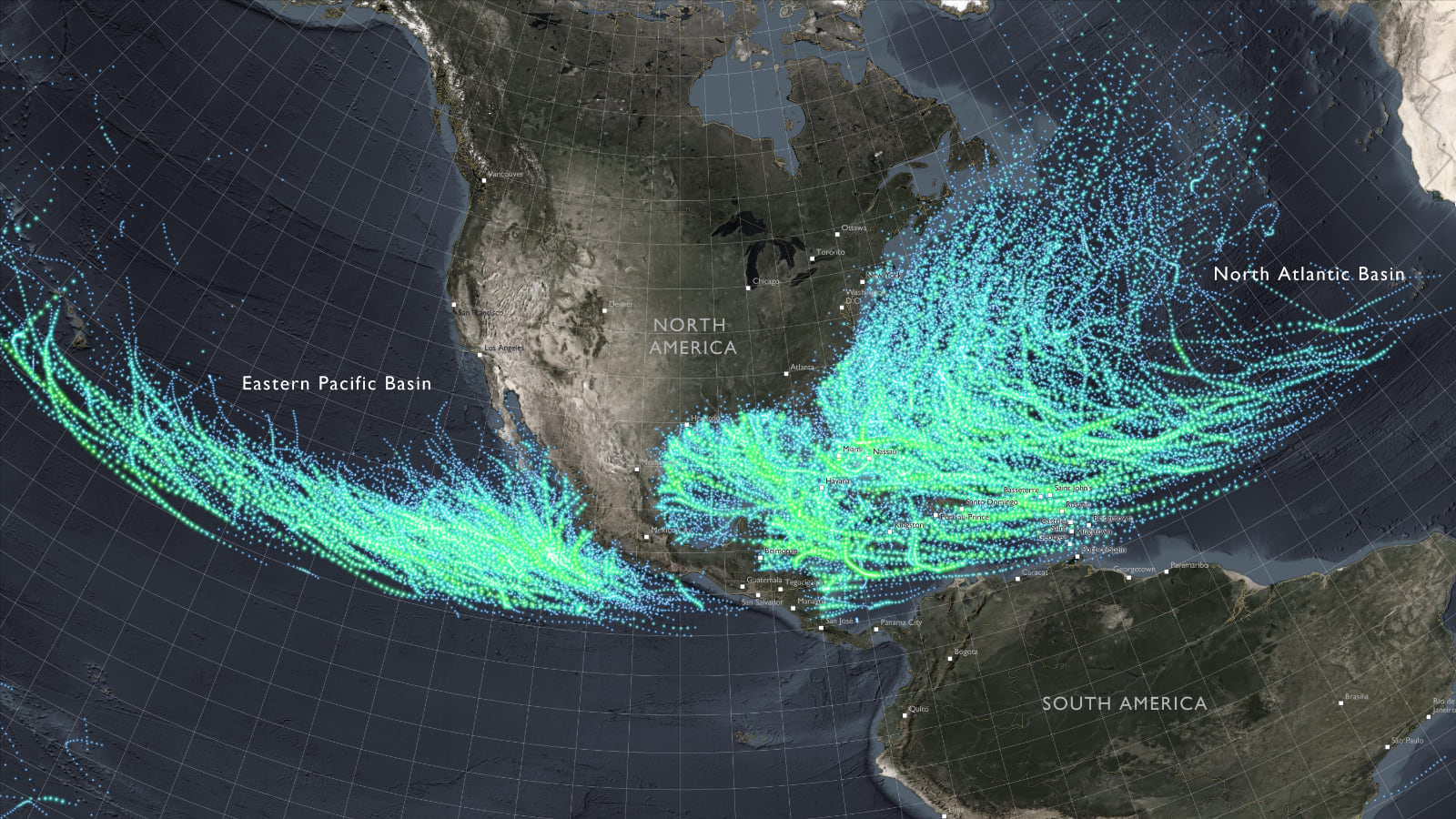
Winner: How USAID Prepares for Hurricane Season by Joshua Rostek, Jasmin Khangura, Emily Rasinski, Mardri Gaston-Williams, and Nina Feldman, Bureau for Humanitarian Assistance, US Agency for International Development (USAID)
Immersive and engaging only touch the surface of this presentation that invites us to delve into the topic and richly rewards us for doing so. Eye-catching cartography is employed with consistency and expertise. Charts that appear follow suit, using the same clarity and visual language that establishes a polish and consistency seen throughout the story.
Runner up: Racial Residential Segregation in Greater Boston: Part 1 of the Environmental Racism in Greater Boston Series by Lisa Frueh, Marissa Chan, Jahred Liddie, Tamarra James-Todd, and Gary Adamkiewicz, Harvard TH Chan School of Public Health
A phenomenal example of digital storytelling. What would otherwise be a daunting wealth of data and information is presented beautifully in some of the most varied use of ArcGIS StoryMaps features and map types in the competition. This is one to really spend time exploring. Each click and scroll weaves a compelling narrative, setting the stage for what is ultimately a much deeper series.

Planning and Infrastructure
Winner: The Diverse Prague by Ing. arch. Alena Zmeškalová; Ing. Jakub Hrubý; Martin Fleischmann, MSc., Ph.D.; and Ing. arch. Zdeňka Havlová, Ph.D., Institute of Planning and Development (IPR Prague)
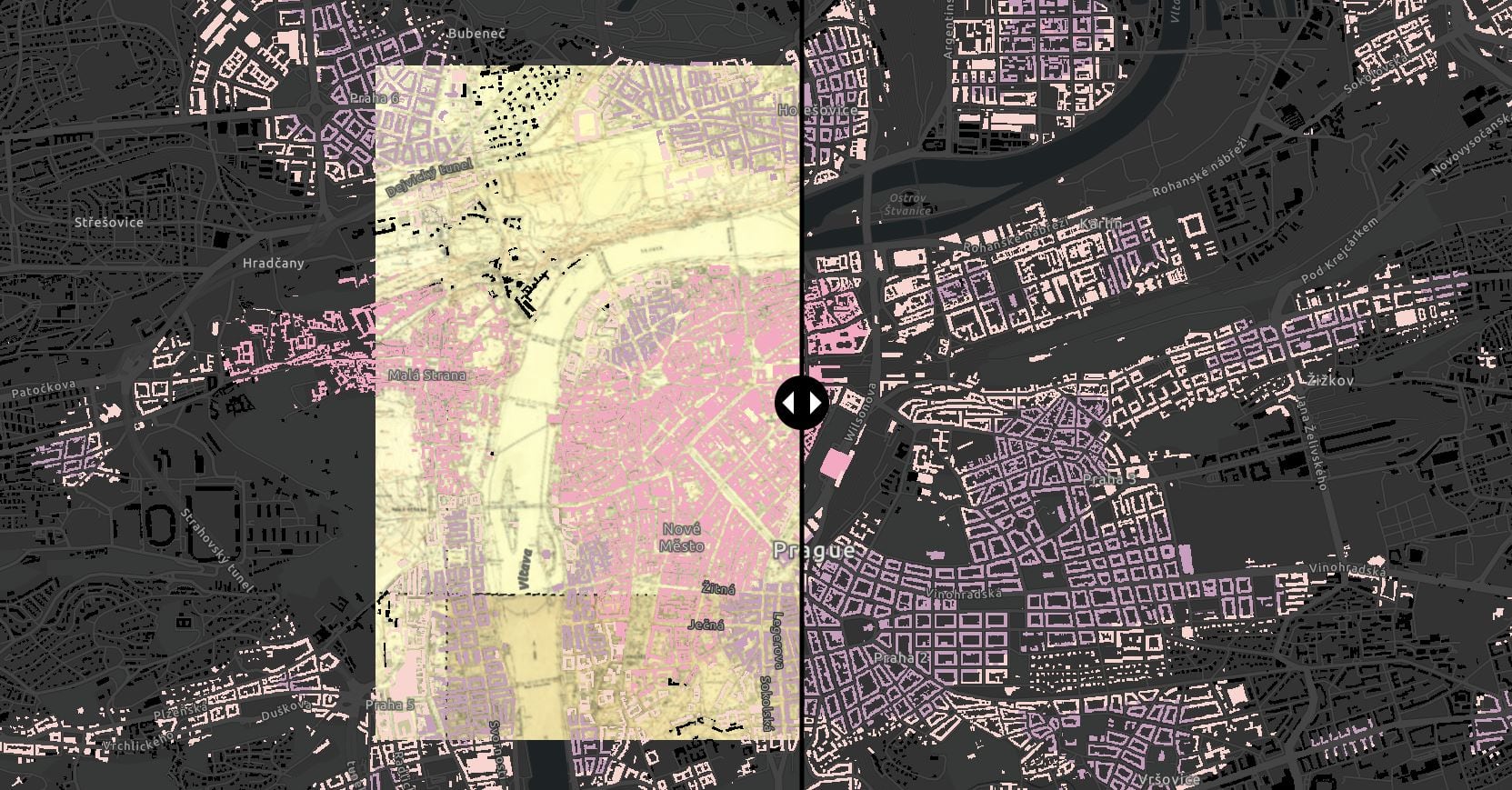
“Gorgeous.” “Welcoming.” “High-craft.” “Top-notch.” These are just some of the words of praise our judges had for this piece. Beauty and order are on peak display in a finely crafted, logically ordered presentation of text, maps, and charts alike. This story comes out of the gate with strong visual language that is reinforced through repetitive motifs and consistent theming that set an example to be followed.

The blending of charts, maps, and seamless highlighting of visual focus through a narrative story was just exceptional.
Runner up: The Electric Commute: Envisioning 100% Electrified Mobility in New York City by Jingrong Zhang, Amber Jiang, Brian Newborn, and Robert Mieth, NYU Center for Urban Science and Progress
A visual tour de force with a potent combination of iconography, typography, and color that underpin a well-constructed narrative. Exemplary use of map sequences that are as informative as they are delightful to explore. This presentation showcases some of the most elegant and legible charts in the competition.

Nature and Physical Science
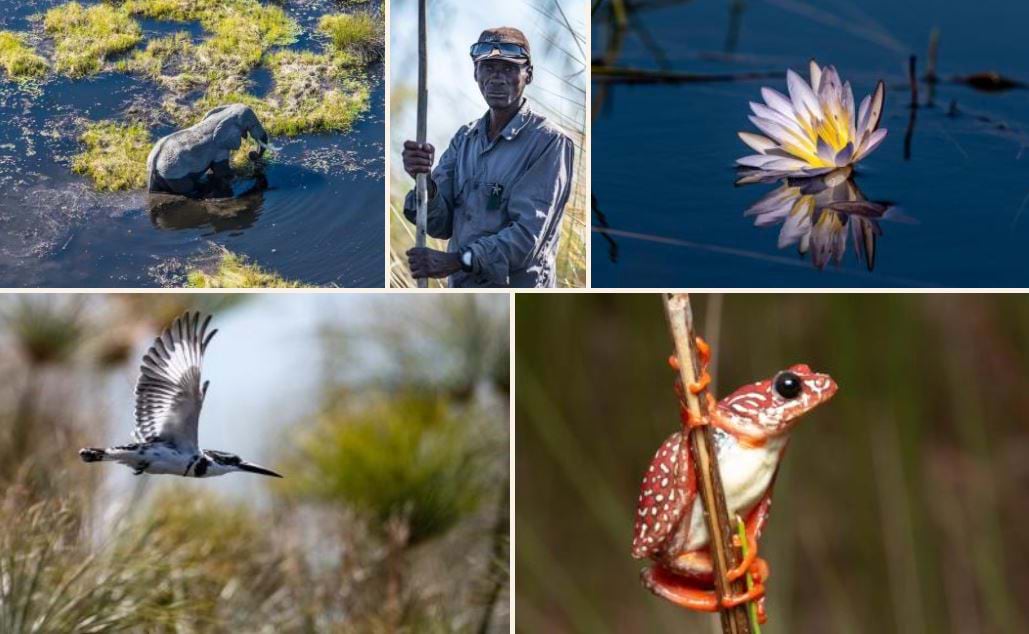
Winner: Okavango Explore by Blue Water GIS for EarthViews, The Wild Bird Trust, and National Geographic Society – Okavango Wilderness Project
With rich visuals across a variety of media, this project demonstrates how well photographs, illustrations, maps, and just the right amount of video can let a story shine without any individual component stealing the show. The whole is truly greater than the sum of its parts due to expert understanding of visual language and unified design.
Runner up: The Sundarbans: A Gift to Bengal by Shwarnali Bhattacharjee, University of North Texas, and Hasan Ahmed, University of Maryland
The authors invite readers into the Sundarbans through a comprehensive array of photographs and maps that neatly connect story, biology, and geography. Clean, legible theming give this a professional polish as a number of ArcGIS StoryMaps blocks allow readers to dig as deeply, or scroll as casually, as desired.

Special Awards
It takes many elements to tell a good data-driven story, from the data itself to the visual language and map choreography used to present it. For our special awards, Esri’s StoryMaps team selected three stories for their stellar use of these elements and going above and beyond in these areas.
Most Effective Visual Language: The Diverse Prague by by Ing. arch. Alena Zmeškalová; Ing. Jakub Hrubý; Martin Fleischmann, MSc., Ph.D.; and Ing. arch. Zdeňka Havlová, Ph.D., Institute of Planning and Development (IPR Prague)
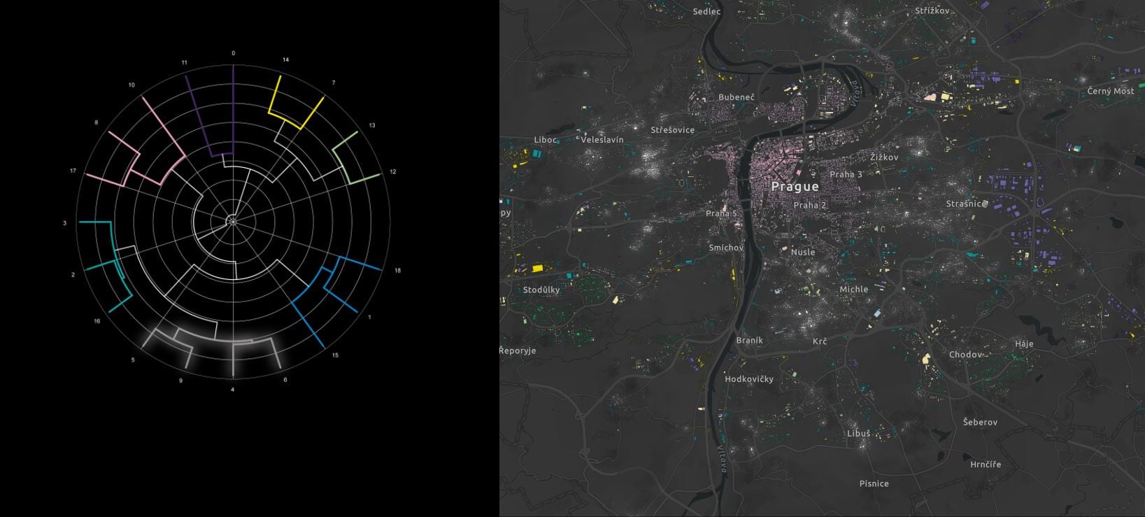
The team overwhelmingly loved this story. During discussions, both the team and the judges went through the story frame by frame and really highlighted the consistent visual language throughout. We were impressed with the visual in the middle of the story that tied so much data together. The authors made great use of multiple product features to tell the story. Their use of color to weave a common thread through every part of the story was second to none.
Most Innovative Use of Data for Storytelling: Nelson Climate Adaptation by Andrew Douglas-Clifford, Tonkin + Taylor for Nelson City Council
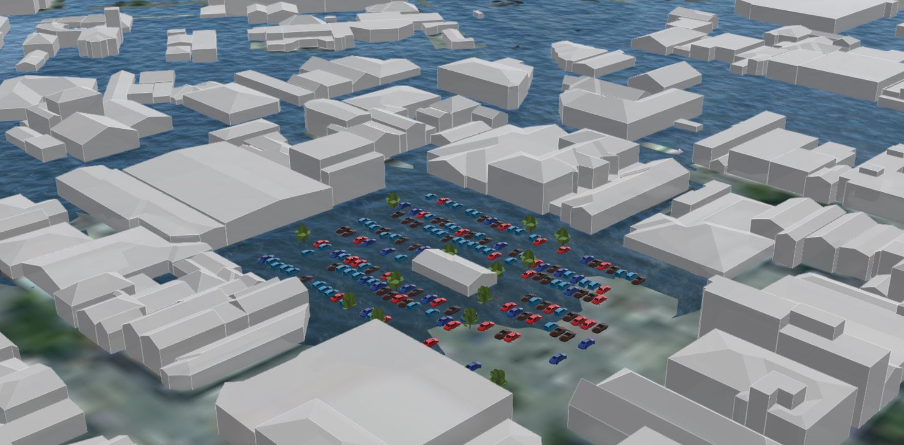
Oblique, 3D views are often used for eye candy. That is not the case here, as the authors take advantage of ArcGIS StoryMaps’ 3D capabilities strategically for great effect. A lot of data is presented in a way that is introduced thoughtfully, while also being open to exploration from multiple angles that allow readers to take command of their own journey.
Best Map Choreography: Inside Fujairah by Ginny Mason, Andrew Critchlow, Josephine Sajbel, Claudia Carpenter, Evelia Gramajo, and Eklavya Gupte, S&P Global Commodity Insights
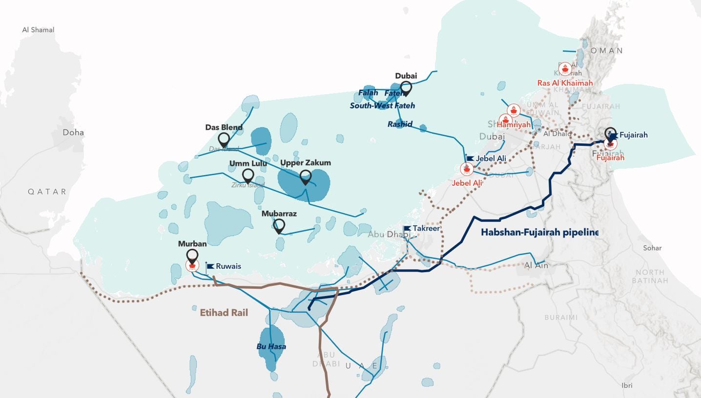
The cartography in this piece is not only custom and incredibly well-done, it demonstrates a sophisticated understanding of storytelling and ArcGIS StoryMaps’ capabilities. The maps zoom, rotate, pan, and become augmented with visual elements with deliberate purpose, keeping relevant information at the fore as we dive deeper and deeper into the story. Masterful cartographic design and visual hierarchy are considered across multiple sequences with poise and expertise.

Congratulations to all of our storytellers recognized today!
And thank you to our many entrants from around the world. You continue to inspire us with your talent and the important work that you do.
You can find more information about the competition on our website at esri.com/storymaps/contest.
A special thank you to Joshua Stevens for preparing this announcement article and providing his thoughtful insights about the competition and each winner.


Article Discussion: