This post was originally published in November, 2019, and has most recently been updated in March, 2021 to cover recent enhancements to the embedding workflow and output.
_________________________
ArcGIS StoryMaps comes equipped with all kinds of powerful tools for getting readers engrossed in the story you’re telling—immersive blocks like sidecar and map tour, for instance, or the map-in-minutes capability of express mapping. Well there’s another tool in your toolkit—or, more accurately, block on the block palette—that can help you create the kind of delightful and informative experiences your audience craves.
I’m talking about the embed block. With it, you can add all kinds of things to stories: Tweets, SoundCloud tracks, Spotify playlists, interactive charts, ArcGIS apps… the list goes on and on. Embedding web content is a great way to add important context, crowdsourcing elements, or just an element of fun to your story, all of which help leave a lasting impression on anyone who comes across it.
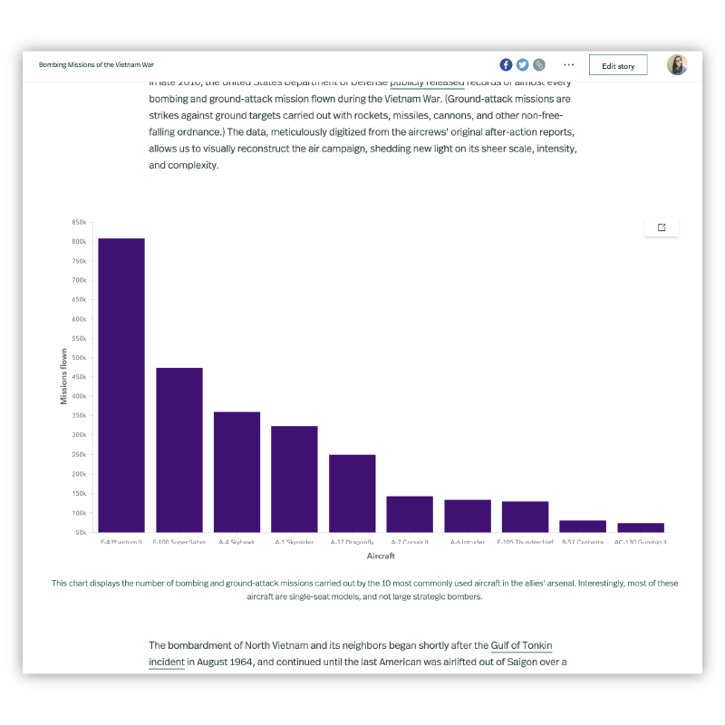
The key to success with external web content, though, is creating a seamless, positive experience for your readers. That’s not always an easy task. Luckily, ArcGIS StoryMaps does a lot of work behind the scenes to get the technical details right so you can focus on your narrative instead.
To help you succeed with embeds, let’s spend a little time going over all the nitty-gritty details. Those details include:
- How to add embedded content
- The different types of embeds
- How embeds can appear
- Where you can add embeds (and why that matters)
- Considerations for mobile readers
- Some practical tips
Ready? Let’s dig in.
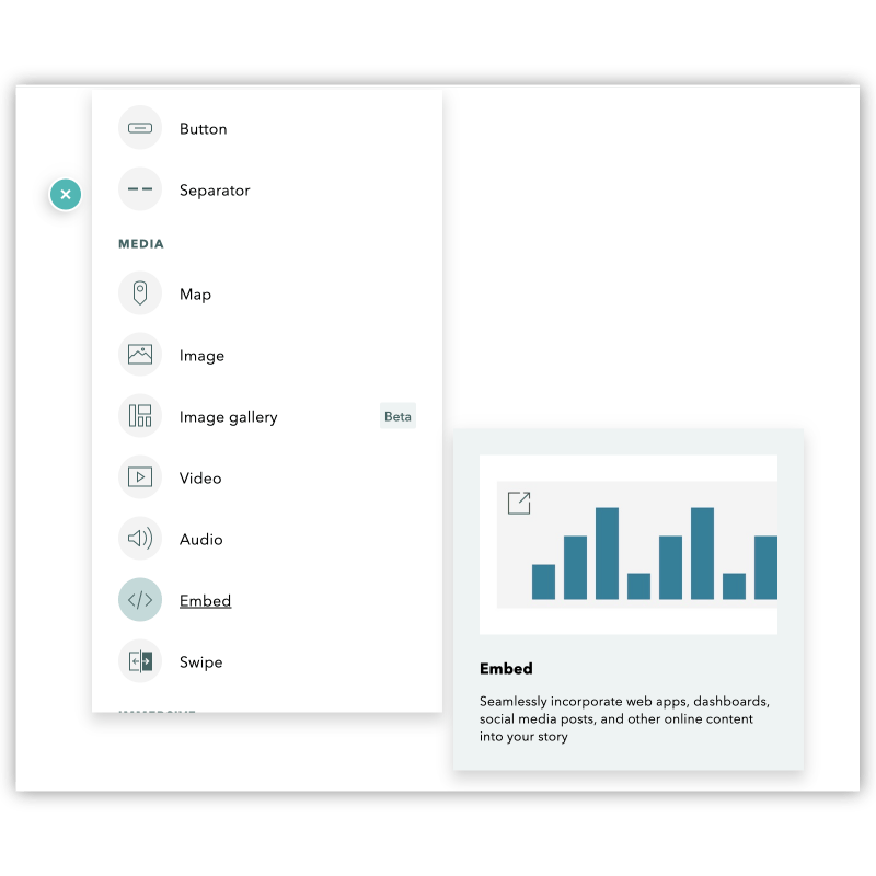
Adding content with the embed block
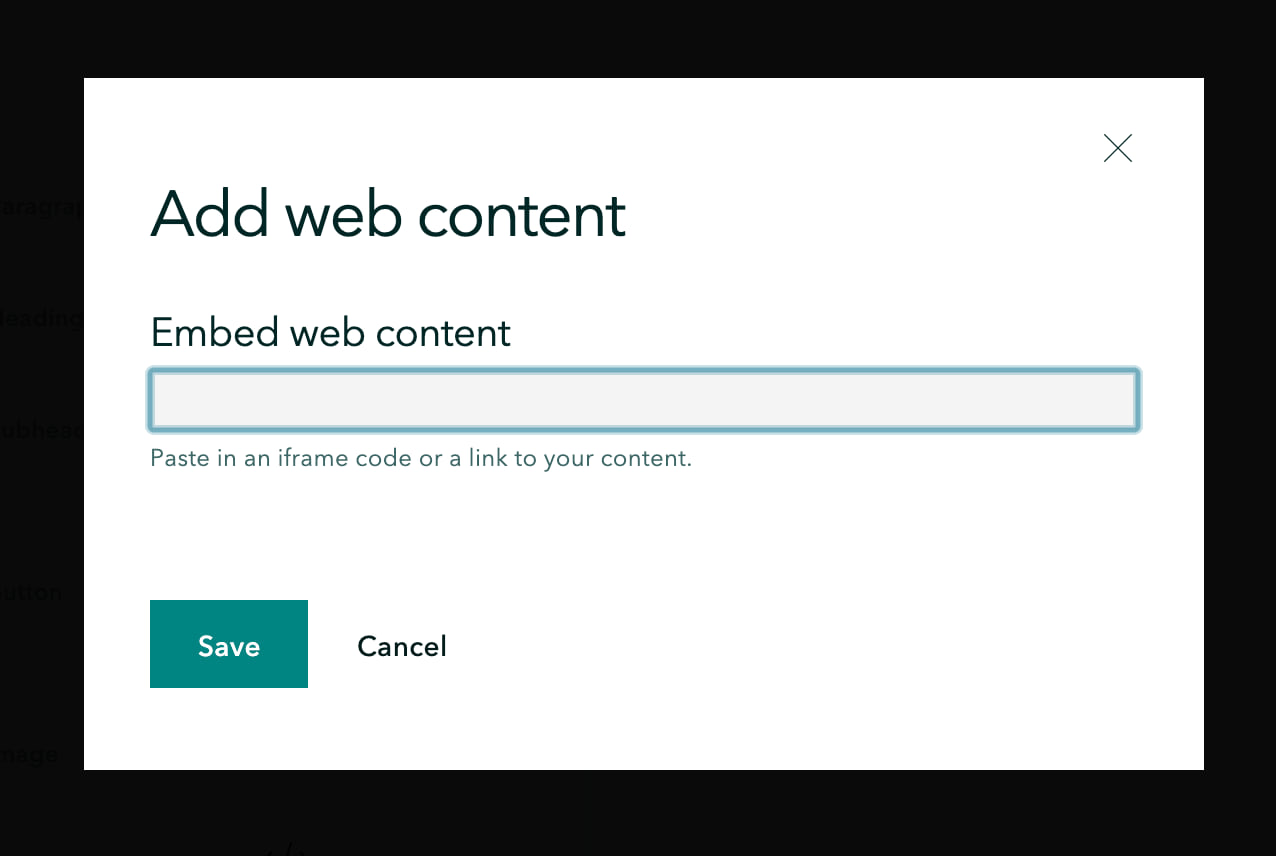
Adding an embed to your story is pretty easy. Simply open up the block palette with the green (+) and click Embed. Up pops a field where you add in your content by pasting in either a link or iframe code. Each way of adding content has its own perks, but I’ll get to those details in a bit. Either way, once you’ve pasted in the reference to your content, click Save and you’re off to the races.
Right away, the builder starts doing some behind-the-scenes decision-making to ensure that what you’re adding is delivered to your readers in the best way possible. This process takes into account a few different things, like the type of content being embedded, its appearance options, where in the story its being added, and how it will look on different screen sizes.
The choices available to you as an author will vary depending on the combination of these variables, so let’s unpack each one and see how they all work together.
The four types of embedded web content
First things first, let’s look at the kinds of content you can embed in your story. While potential web sources are many, their content can all be categorized into four core types of embeds:
Photos
These are images that are already hosted online, perhaps on Flickr or your own private server, and are added to your story via a link instead of being uploaded directly from your machine.
Videos
You know, like the ones available on YouTube, Vimeo, or Dailymotion. The story builder supports dozens of different video providers; add content from them to your story with a link or iframe code.
Simple embeds
This category consists of content like ArcGIS apps, websites, and other full-page content that provides the basic embed info when referenced with a link. Non-video content you’ve added via iframe also falls into this bucket. If you’re embedding an ArcGIS app, be sure to share it publicly first.
Rich embeds
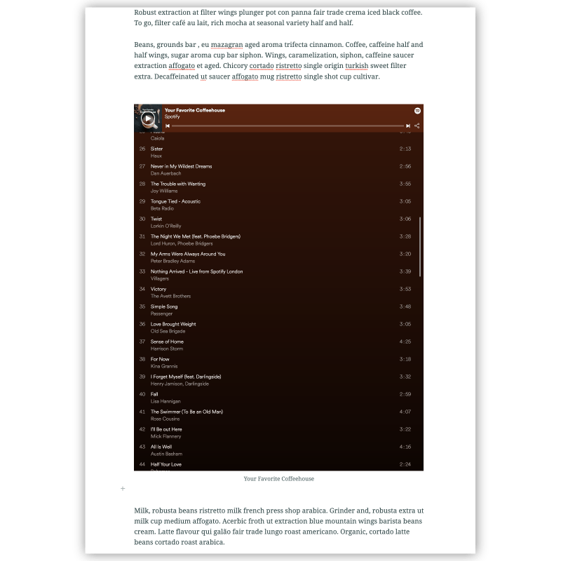
Some trusted embed sources provide special information about their content, which the StoryMaps builder uses to optimize the display and reading experience for that embed. Twitter and SoundCloud are two examples, but there are loads more.
For the builder to gather that extra info, however, you’ll need to add this content with a link. (If the term OEmbed API means anything to you, that’s the kind of thing that’s at play here. If you read that and your response was “huh?” don’t worry, you can get by just fine without knowing what that means.)
Ok, that’s pretty much it for embed types. Moving on…
The three different ways embedded content can be displayed
To help create a seamless reading experience, the story builder has three different ways it can display embedded content. Before we look at where these different views come into play, let’s first get an understanding of what each one is, and why it’s useful.
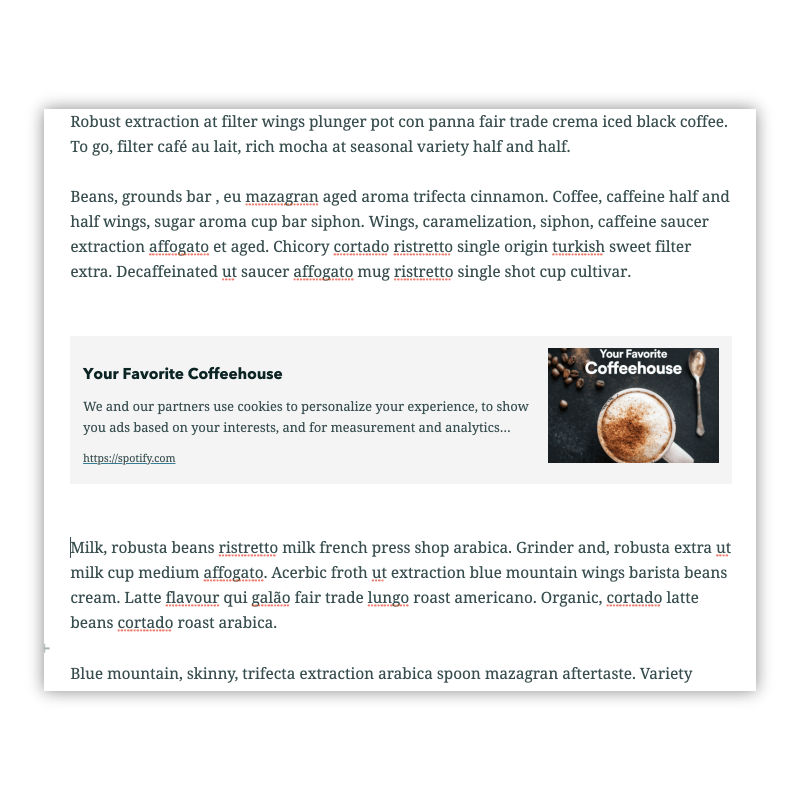
Cards
Cards appear as handy little link previews, pulling a title, description, and thumbnail from the embedded content. These cards are also styled according to your story’s theme, so they match the look and feel of your content.
Cards are nice way to include related resources in your story for the extra-curious individual without taking too much attention away from your main story. They’re also great for creating a list of recommending reading at the end of your story. Once clicked, the card simply opens that content in a new browser tab.
Any type of embed can be displayed as a card if you so choose—use the toolbar that appears above an embed to move between the card and live view. For some content a card may be the only available option, either for security reasons or because the content source prevents live embedding.
You can customize the appearance of a card through the embed options panel (click the gear icon in the embed toolbar to open this up). There, under the Display tab, you can adjust the title and description for the card, upload a custom thumbnail, or reset all the information to what was originally supplied from the content’s source. You can also quickly view and copy the card link from the Properties tab of this panel.
Live content
While cards simply provide a summary of the content they reference, live embeds integrate it right into your story. Readers can view the linked material alongside your text and other media, and can even interact with it all in the same space.
If the external web content you’re adding is pretty critical to your story—maybe it provides more nuance to your discussion or gives your readers a chance to explore some data you’re presenting—a live embed is likely your preferred choice.
Photo and video embeds will appear as live content automatically (though of course there’s no interactivity with a photo). Because of the behind-the-scenes optimization, rich embeds will also be added as live content.
Simple embeds will usually be added as a card at first, but will give you the option to switch to live content (minus the two exceptions noted above). When these embeds become live, you’ll notice that they require an initial click to enable interaction. That’s because the story builder doesn’t have enough information to ensure readers won’t get caught in any sticky situations—like stuck in a scroll within a scroll—if interaction is automatically enabled.
However, if you’ve added web content that doesn’t require any scrolling (like a simple interactive chart), you can turn off the initial-click requirement from the options panel. Just check Allow readers to directly interact with the embed in the display tab.
All live embeds also initially come with a button in the upper right-hand corner of the embed that launches the source link in a new browser tab. You can hide that button via the display tab of the embed options. Doing so comes in handy for uncomplicated embeds that are easy to interact with within a story, or when that button blocks relevant information or interactivity.
Alternative media
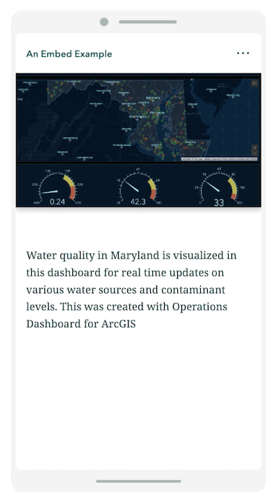
While live content can be great, it doesn’t always provide the best experience on small screens and mobile devices. In these instances, the gist of an embed is conveyed through an image that you upload as alternative media. When you upload an alternative image, you also have the option to make it clickable, so that readers can tap on it to open that content in a new tab.
If you forget to upload an alternative image, the builder will either show the embed card instead, or provide a generic placeholder to alert your reader that there’s more to the story. This placeholder also includes a link to open the embedded content in a new tab. Whether a card or placeholder is shown depends on where in your story the embed has been added.
The three places you can add embeds (and why that matters)
Ok, time for a quick recap. So far we’ve established that you can add external web content to your story via a link or iframe code. This embedded content can fall into one of four categories (photo, video, rich, or simple), and there are three possible ways it might be displayed (card, live, or alternative media). Now let’s bring it all together by looking at where in your stories you can add different types of embedded content, and how that placement will influence the way it appears.
Inline
Add embeds right into the body of your story, between paragraphs or other media, directly from the block palette. Photos, videos, rich embeds, and simple embeds can all be added here, and each one has the ability to be displayed as a card or live content.
Live embeds will also typically have the option to be displayed at small, medium, or large widths. The only exceptions to this are rich embeds like Tweets, where the builder has already determined the most ideal size based on the content being embedded.
In a sidecar’s narrative panel
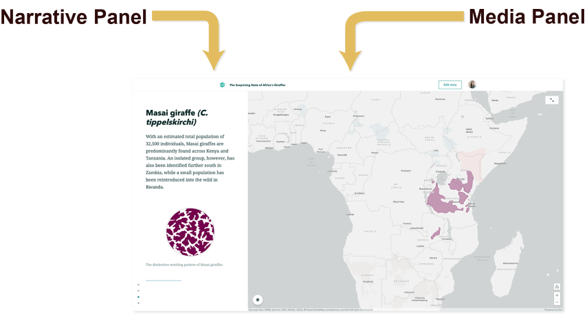
One of the immersive blocks in ArcGIS StoryMaps, sidecar has a long scrolling narrative panel that can include a variety of content. Open up the block palette and, sure enough, the embed block is right there waiting for you.
In the narrative panel, photos, videos, rich embeds, and some simple embeds (such as ArcGIS Dashboards and ArcGIS Survey123 forms) will appear as live content for desktop viewers (though you can change them to cards if you wish). Given the space constraints and limited information, other simple embeds will always display as cards to ensure a smooth reading experience.
In a sidecar’s media panel
Sidecar’s media panel also includes embedded content capabilities. Photo, video, and simple embeds are right at home here. Rich embeds are too, with a few exceptions. Tweets, for example, are a no-go for sidecar’s media panel (but they look great in the narrative panel).
How embedded content appears for mobile readers
While the scenarios above describe the embed appearance rules for desktop readers, things change a little on small screens. When it comes down to it, there’s just not enough space to elegantly present complicated interactives. For most embeds, you can choose to add alternative media under the Small screens section of the embed options panel. Otherwise, the embeds will display as cards on devices like phones and tablets. There is one exceptions here: Embeds in sidecar media panels are always replaced with alternative media, this is where a placeholder is added by the builder in lieu of your providing one.
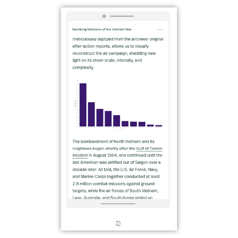
You can see how your embedded content will look for mobile readers by using the tablet and phone views in the story preview (access this in the story header).
A few tips to keep in mind
Now that you’ve got a sense of the fundamental workings of embedded content in ArcGIS StoryMaps, let me leave you with some practical suggestions and insider tricks.
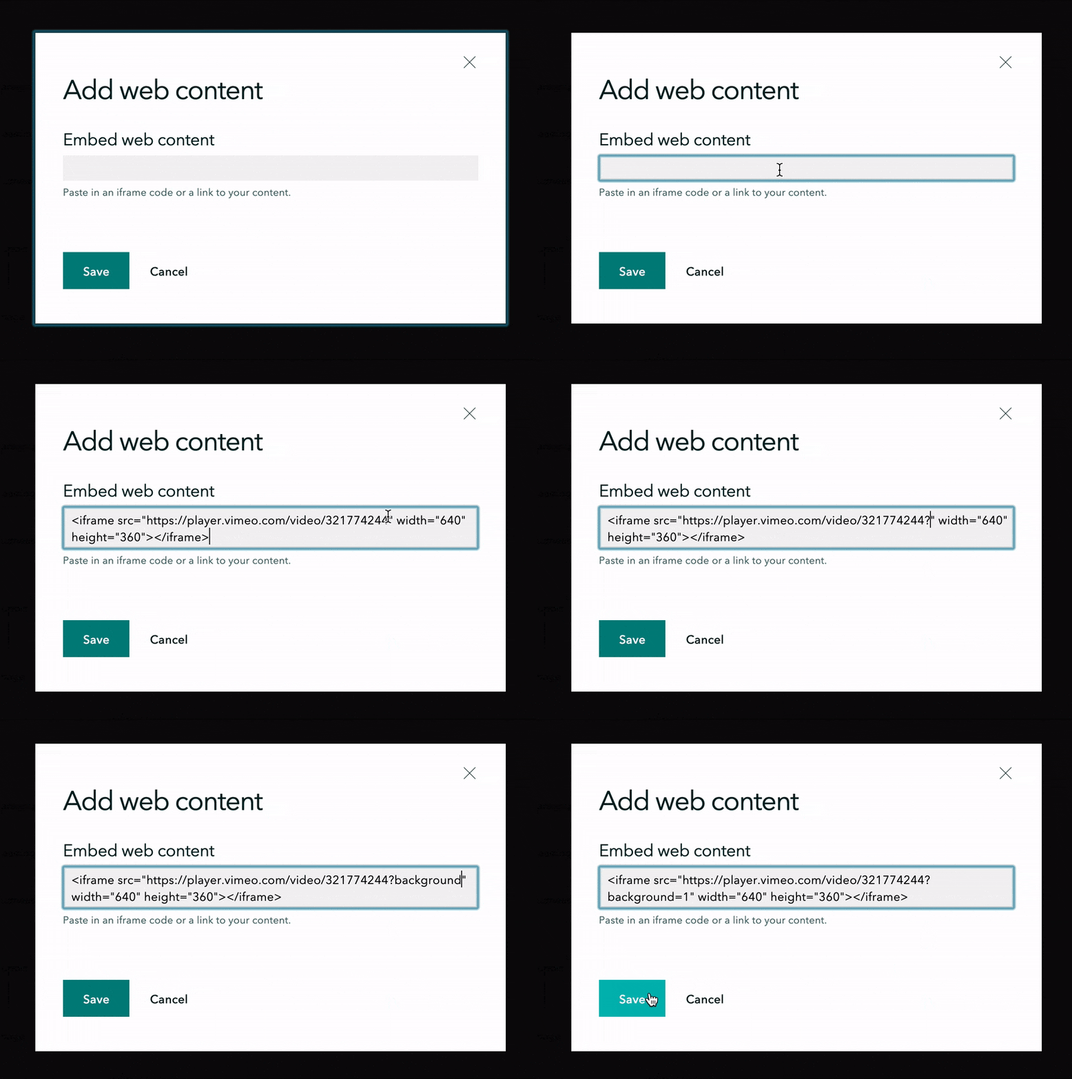
Link vs. iframe code
As I mentioned a while back, each way of adding embedded content comes with its own perks. The advantages of links are, of course, their ease of use, but also that they give the story builder the chance to detect those special optimization details that set rich embeds apart from simple embeds.
Iframes, meanwhile, give you a bit more flexibility in terms of display details. With iframes, you can add in URL parameters to adjust the look of your live content. A good example of this is using parameters to set a video to autoplay or loop.
You can also use iframe code to specify the width, height, or aspect ratio of your live content. If, for example, you’re embedding a survey into your story and want all fields visible at once, you could set the width to be 100 percent of the iframe container, and then set the height in pixels to ensure the whole form appears inline in your story.
Use caution with embedded photos
You certainly have the option of linking to photos already hosted online, and sometimes that’s the only choice available. But ask anyone on the StoryMaps team, and we’ll tell you that, given the option, uploading your photos directly to your story is the recommended approach. The story builder has a few tricks up its digital sleeve to ensure that uploaded images are optimized for the size at which they appear in your story, but it can’t do this for linked images. That can mean longer load times for readers on mobile devices or slow internet connections.
Another risk, depending on your photo source, is the chance of a server crash or some other technical difficulty that renders your linked photos inaccessible. While popular third-party vendors like Flickr are generally reliable, that might not be the case for a small server with just a few images on it.
Don’t forget alternative text
When embedding live content, be sure to open up the option panel and add in a nice (but concise) description in the alternative text field (found in the Properties tab). This text is used by screen readers to help those with visual disabilities enjoy the full experience your content has to offer, making it an essential step in creating inclusive content. (Embed cards don’t require alternative text, since they already have a title and description attached to them.)
Put the reader first
Finally, and most importantly, stay focused on your target audience. If you’re not sure about where to put an embed, or which appearance option is most appropriate, start by asking yourself “how essential is this for my reader, and what’s the most ideal way for them to engage with this content?” The answer to those questions will help you chart a clear path forward.
Have any questions or ideas on how to take the embed experience even further? Be sure to share them with us through our product feedback form. Now, go ahead and start putting all this new knowledge to use—happy embedding!
___________
Note: The embed block is only available to those with subscription accounts for ArcGIS. If you don’t have a subscription account, but would like to give embeds a try, you can always sign up for a free 21-day trial of ArcGIS.





Hello and thanks for the good information on the embedding process. I have read the blog, but I am having trouble with getting a “guided tour” app put inside another App. I have practiced using another App I have to embed in the current app, but it is not seamless. I mean one has to click “Open” to bring up the App, instead of it just automatically opening and fitting into the original App.
I can send you some images if that would help to show you what I mean.
Hi Mark, I think we might want to move this question to the StoryMaps GeoNet space, where we can easily share screenshots for better clarity. It sounds like you’re trying to embed a story that includes a guided tour block into another story? Or a different configurable app? If you can start a new question thread on GeoNet and provide some images as well as a few more details, my teammates and I will be better able to assist. Thanks!
Hi Hannah, in your article you mention photographs are not interactive but I wonder if it is possible to embed 360 images via an embed code – e.g Google Tours
Paddy,
Good catch! Using an iframe code (which Google provides) to embed a 360-degree photo does indeed allow interactivity with that photo. See this demo story.
Dear Hannah,
Any chance you can help me with an embedded vimeo video? I’ve embedded it into a sidecar container with an autoplay function
. And it works perfectly fine in the editing mode – the video just starts playing automatically. However, the autoplay is not working in a published story. When I scroll to a point when the video appears there is no autoplay action and I need to press a play button in order to make it play. Any chance this can be fixed?
Thank you!
Taras
Hello Hannah! Thank you for an excellent post. I work as a tech support analyst @ Esri Sweden. I have a customer who used this technique to embed photos and show them as cards. But after the latest update of StoryMaps, it seems like this is not an option any more 🙁 It seems like StoryMaps recognize the URL as an image and therefor does not present the same functions as when embedding other content. The customer really want their image to be shown as a card, but we can not find a way. Do you have any suggestions for… Read more »