In June of 2023, I ran 10 whole miles in a road race (pause for applause)! Being the humble type, I will resist using this space to detail my accomplishment….mostly because I already did that in an ArcGIS StoryMaps creation.
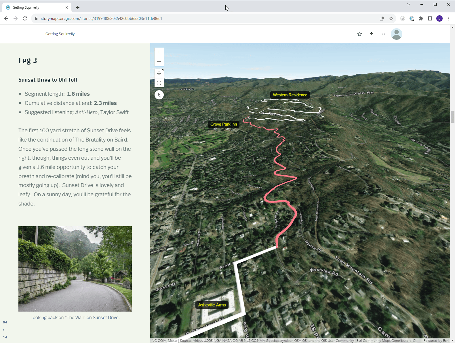
Such an interactive experience is very fun to make – from both a thematic and a technical perspective. The heavy lifting is performed by the centerpiece map, which depicts the running route. To further emphasize my race day heroics, I wanted to convey to the reader just how much elevation gain was involved, a consideration which led me to use a 3D web scene view instead of a 2D map.
If you’re interested in learning about the technical aspects of that story, keep reading!
Overview
The goal of a race report is to give a blow-by-blow account of the run, breaking the journey down into segments. Thus, the creation process involves five main steps:
- Acquiring the route data (otherwise known as running)
- Processing the route data
- Publishing the route data
- Creating a 3D scene with slides
- Using ArcGIS StoryMaps to make the story!
Acquiring the route data
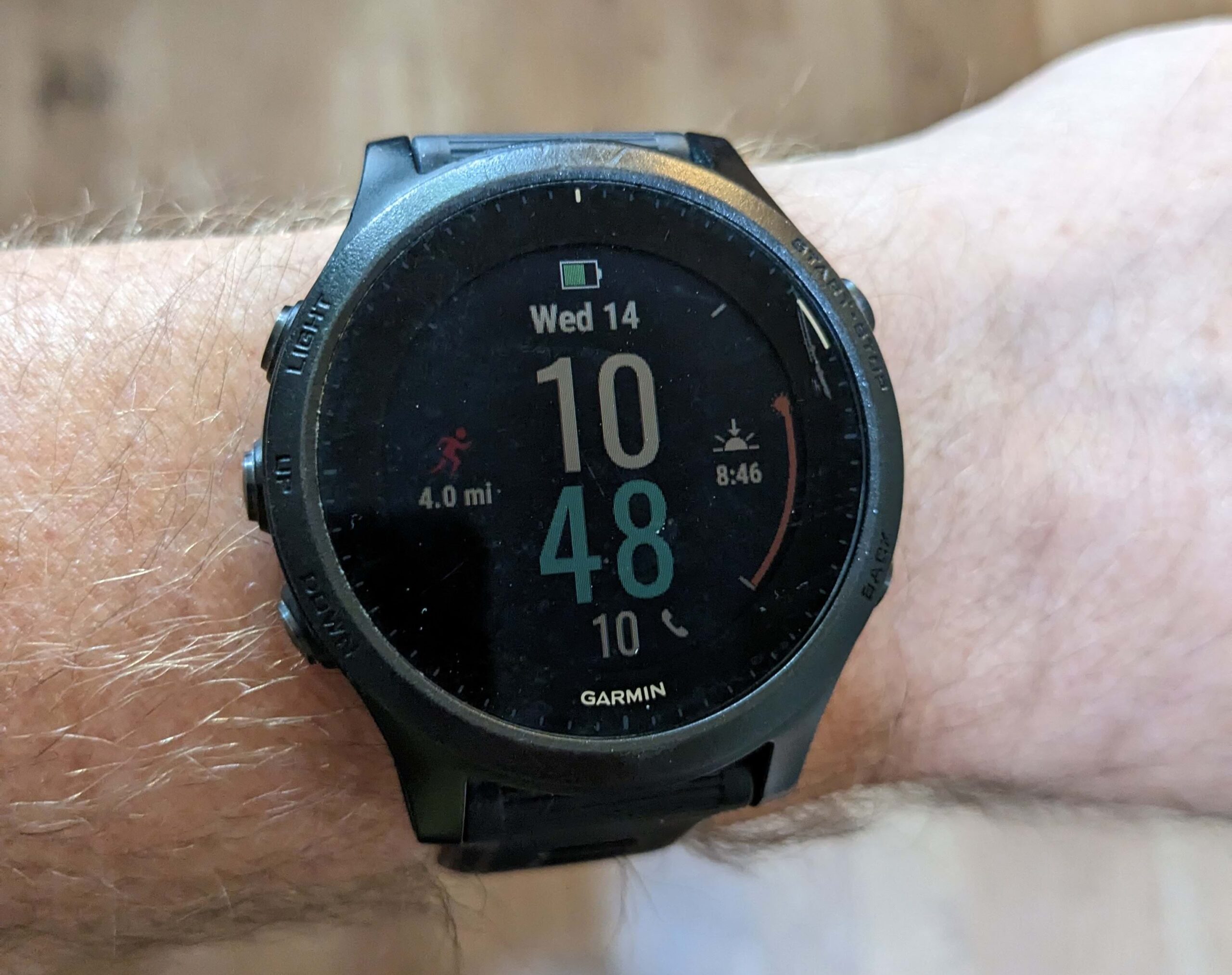
Most people probably wouldn’t think of a GPS watch as storytelling technology, but I beg to differ. Pictured below is my trusty wrist piece, which tracks runs, bike rides, and even swims – each of them an epic story.
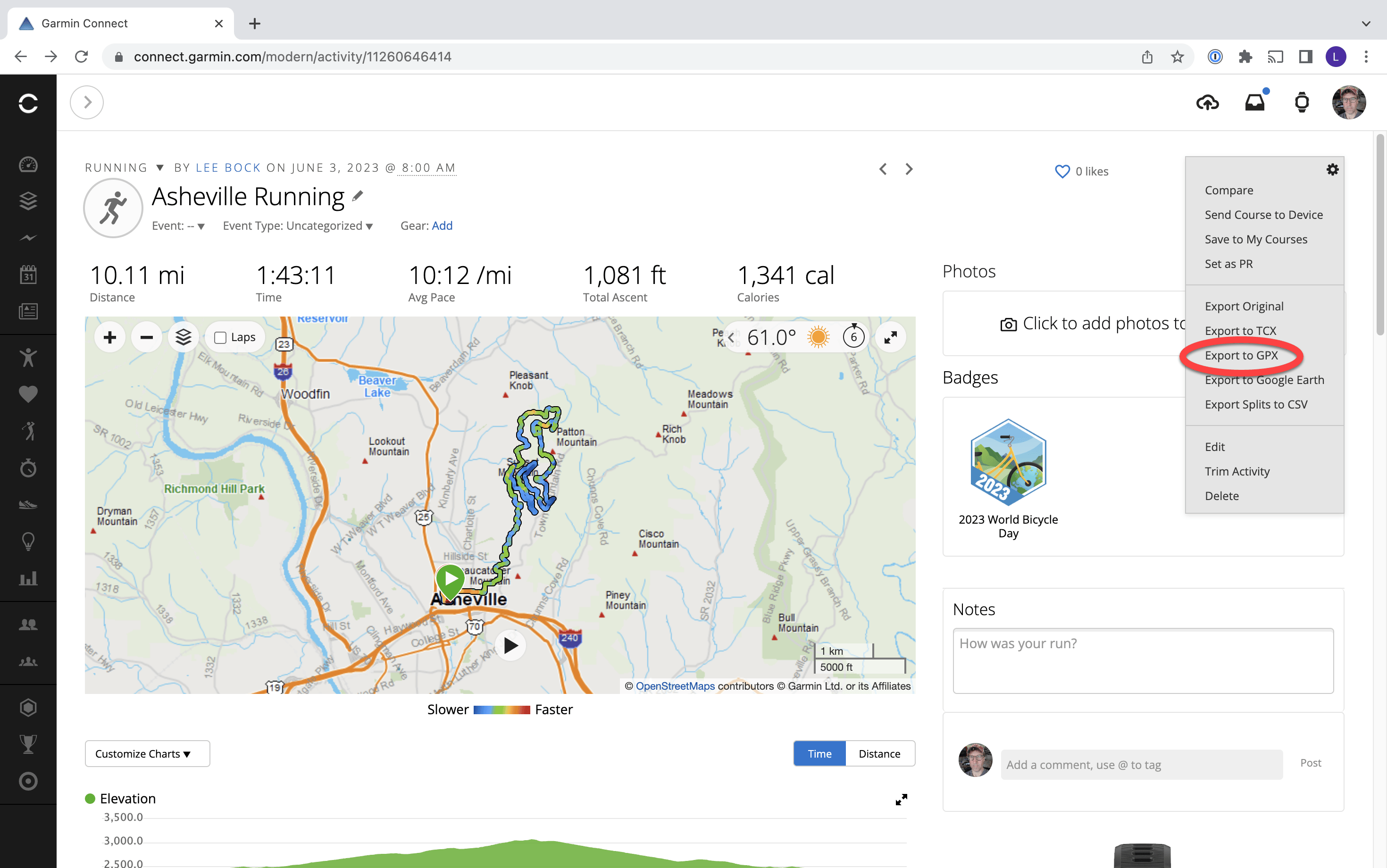
Once the physical activity is complete, the watch syncs up with the manufacturer website (either via wireless network or an app on my phone). The website shows me all kinds of details about the run – elevation, heart rate, etc.
The tools dropdown reveals an option for exporting to GPX, which I use to download the route as a file on my computer. Depending on the make of your GPS watch, the website you use might look different. There are also hardware brand independent websites which interoperate with most watches. Regardless, there’s typically an option to download the route as a GPX file.
Processing the route data
Since the route dataset is delivered as a GPX file, the crux of the preparation is to convert it into a format usable by ArcGIS Online (e.g. GeoJSON or Shapefile).
Before I perform the final conversion, however, I also want to split the route into segments. Segmentation will enable me to highlight each part of the route as I describe the section in the story.
As I split the route into parts, I use the Descript field to name the segment numerically.
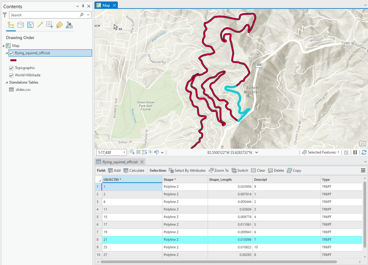
My workflow looks like this:
- Import GPX file into ArcGIS Pro: Conversion Tools → GPS → GPX to Features
- Split the route into parts: Edit → Modify → Split, which kicks off an editing session so that I can manually split the lines according to my discretion.
- Export GPX to Shapefile (or GeoJSON): Conversion Tools → JSON → Features To Shapefile
Publishing the route
Now that we have a shapefile representing the segments in the route, time to upload those lines and publish them as a feature layer!
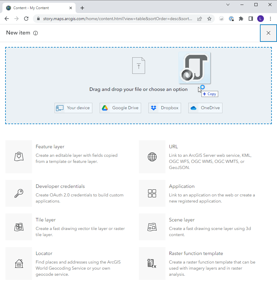
You can take a look at the feature layer in its basic form here.
Creating a Scene
As you probably know, the easiest way to create a scene is simply to put a lampshade on your head at a fancy party (rimshot)…If you’re new to creating 3D web scenes on ArcGIS Online, you’ll want to check out this bit of documentation.
Here’s the scene that we’re shooting for, in its native habitat. Note that it has many layers and many slides. If you click on one of the slides at the bottom, you’ll find that both the camera view and layer visibility change. These slides, each of which offers a bespoke view of the route, will form the heart of our eventual story. They are the visuals to which I will pin my narrative elements.
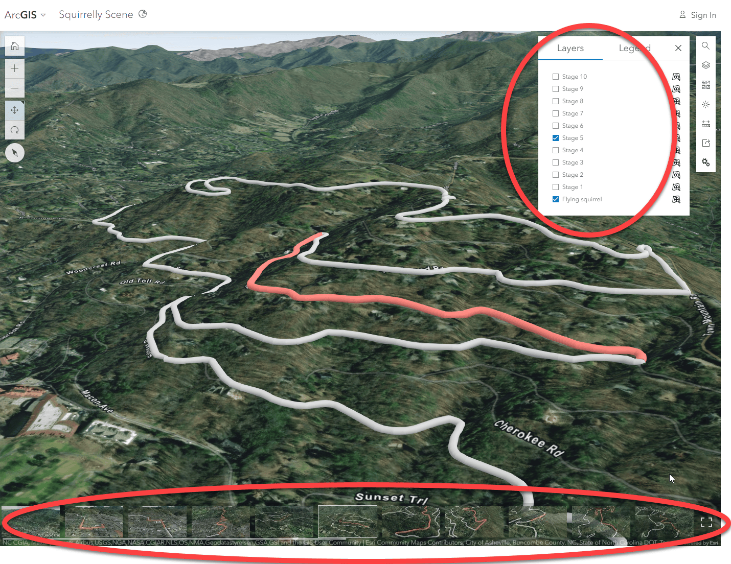
Capturing slides is a pretty straightforward process. But what’s with all the layers? The bottom layer (Flying squirrel) represents the entire race route. Each subsequent layer represents one segment (or “stage”). Alas, each segment must be present in the web scene in the form of its own layer, so I’m in for a bit of busy work. For each segment, the following work is required:
- Add the route data as a new layer
- Use the Layer properties menu to apply a filter to the layer, thus isolating only the designated segment.
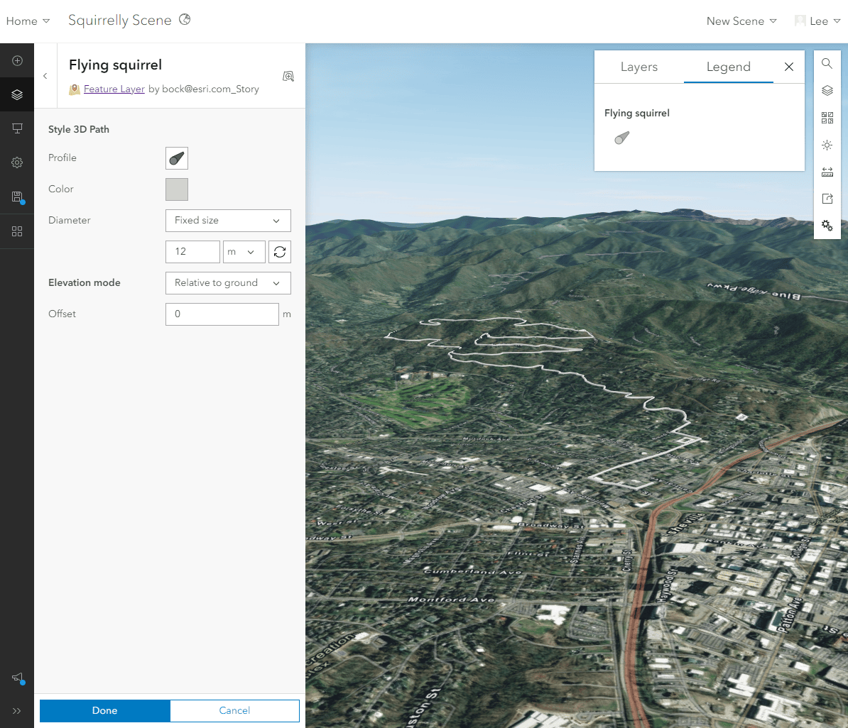
- Use the Layer style menu to style the layer as a 3D Path.
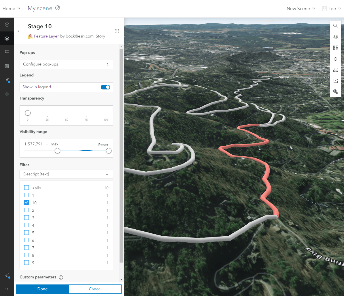
Here are the salient style properties that I use:
Overall route:
- Elevation mode: Relative to ground
- Diameter: Fixed size, 12 m
- Color: light gray
Route segment:
- Elevation mode: Relative to ground
- Diameter: Fixed size, 14 m
- Color: salmon
Note that the route segment diameter is slightly larger than the overall route. Providing a larger diameter ensures that the segment will overpost the general route and show through.
Making the story (finally)
Choosing an immersive style
Of the immersive blocks offered in ArcGIS StoryMaps , I feel that sidecar’s docked layout best fits what I’m trying to accomplish. The building experience involves the notion of “slides,” which matches the slides built in the Scene Viewer.
Another sidecar layout that could suit my needs (and is a little more on the nose, given my fondness for the “slides” metaphor) is slideshow. In this layout, the user navigates horizontally through the slides using arrow buttons. As I am an old-school, pre-scrollytelling curmudgeon, buttons appeal to me. However, two aspects of the docked layout win me over:
- The docked panels accommodate lengthier text and media.
- The mobile interface for a docked panel sidecar divides the screen between narrative panel and map, which allows for simultaneous viewing of both.
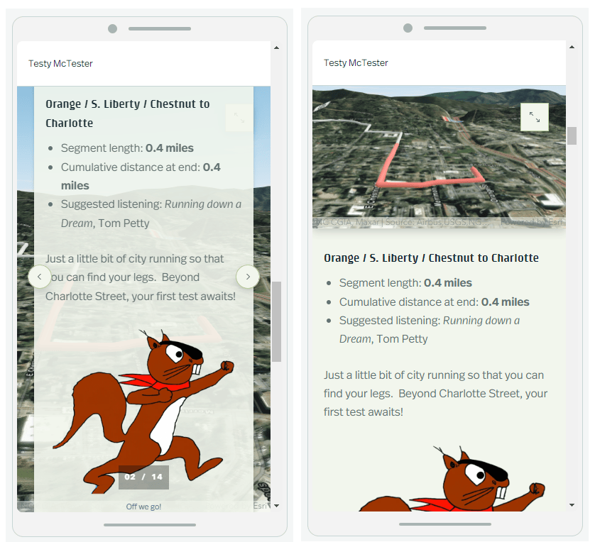
One of the great things about the sidecar block is that, at any given time, you can change your layout with no fuss. So, no need to get too mired in making a decision – just try it out!
Bringing it all together!
We’ve come a long way. We processed and published the data as a feature layer, plugged that feature layer in a 3D web scene, and created scene slides for each segment of the route. Now we just need to author our story slides.
Each sidecar slide has two parts: 1) the narrative panel on the side, which contains my prose and photos; and 2) the main stage item, which contains the corresponding slide from my web scene.
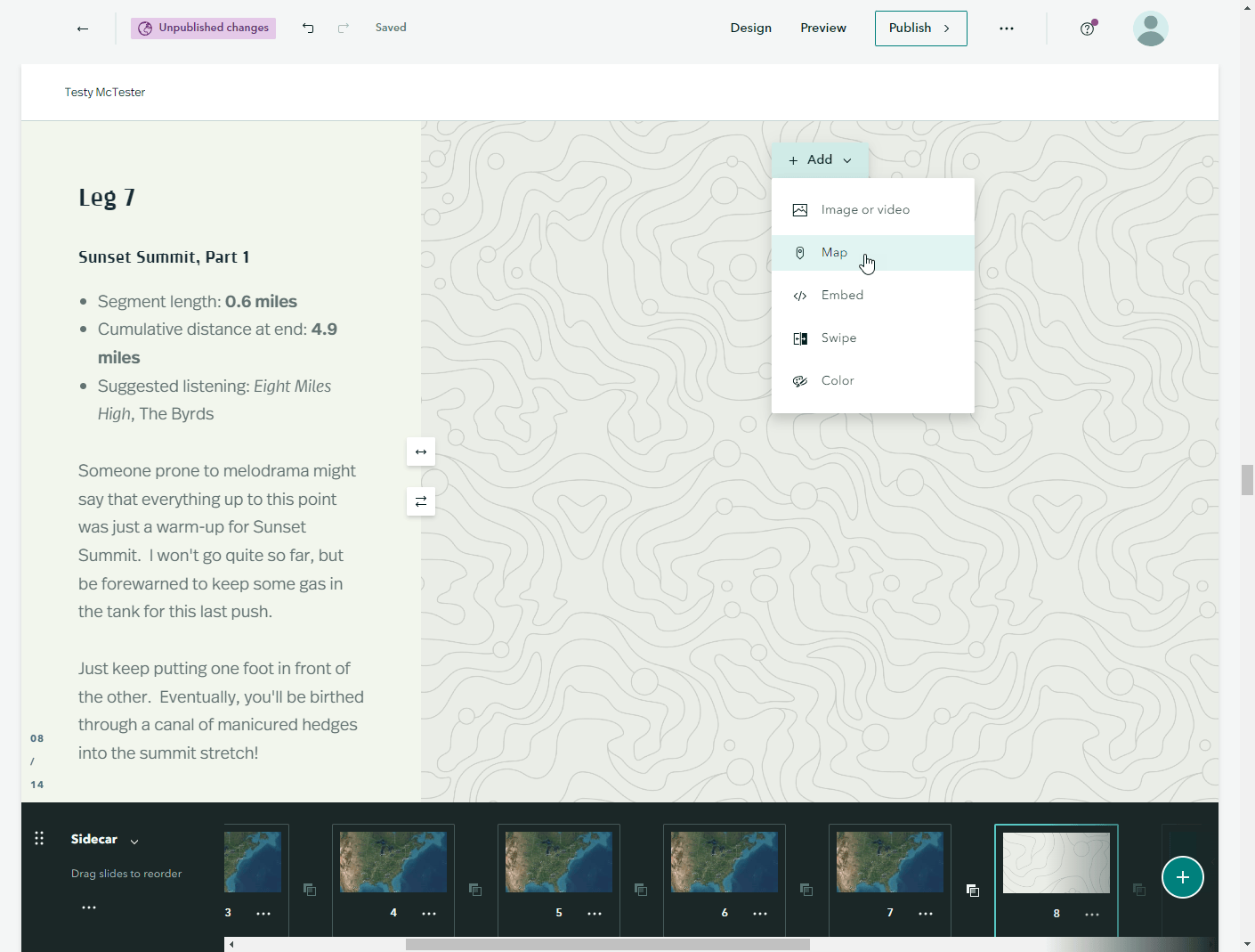
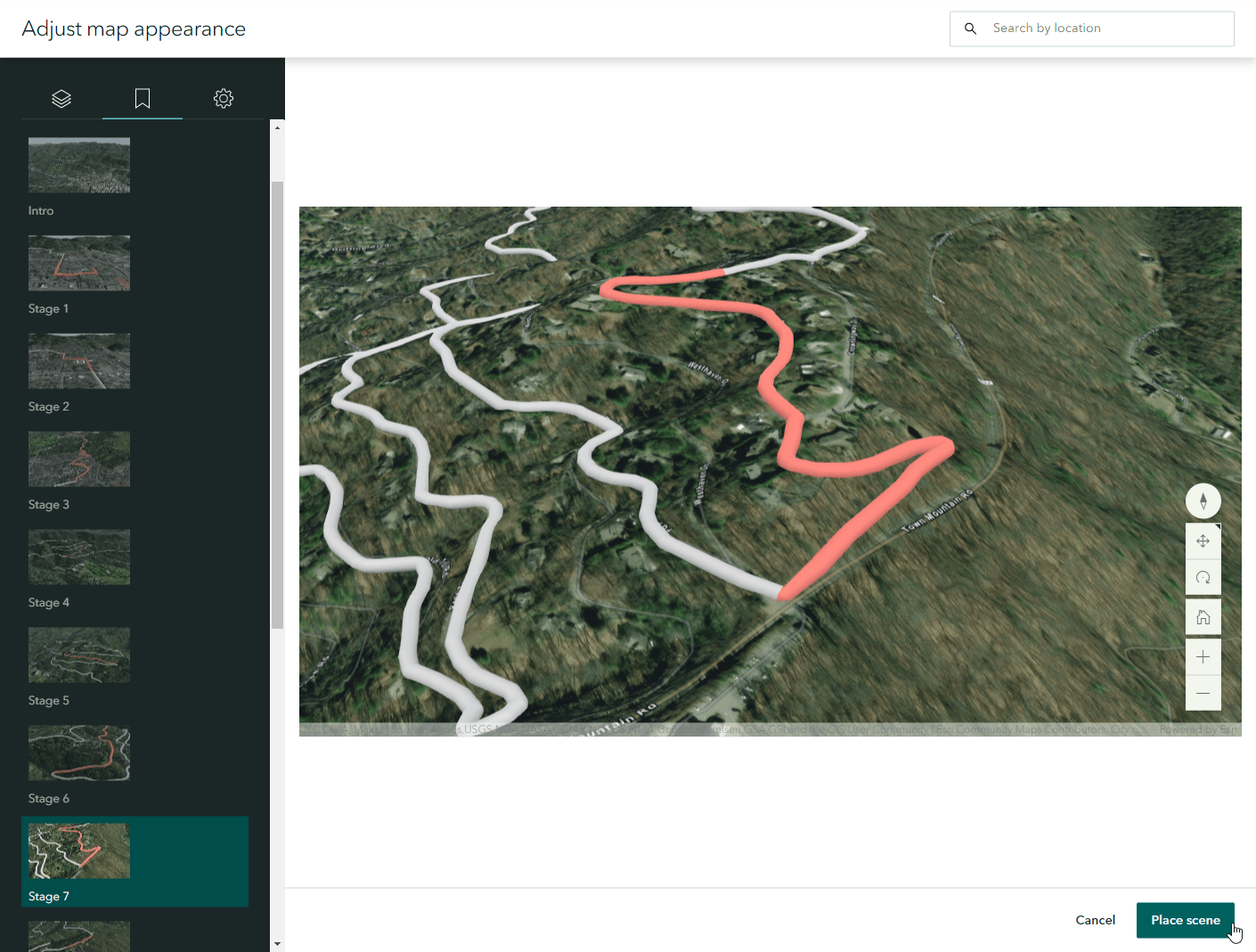
Once I have created each sidecar slide (plus an intro and outro), I am ready to publish and wow the world with tales of my athletic prowess!
Conclusion
That’s it! A soup to nuts recipe for creating a 3D race report in ArcGIS StoryMaps! Hard to say which was more arduous: writing this blog post or running 10 miles!
Maybe you’ve been thinking about tackling some sort of outdoor adventure. When you do, I hope you’ll consider depicting it in a story!
Oh, and here are some other fine blogs about working with 3D!
This is great- I have been thinking of doing a collection of StoryMaps highlighting some of the mountain biking trails in my area and this workflow will translate perfectly. Now I have no excuse.
Fantastic, Claude! Would love to see your story!