The ArcGIS Social Equity Analysis solution is an innovative new solution that helps communities understand the distribution of benefits, burdens, opportunities, and prosperity in their communities, and reveal opportunities to increase equity. The Social Equity Analysis solution navigates users through a 5-step process within ArcGIS Pro. The process includes identifying a focus area of interest or question at hand, an evaluation of which communities are disproportionately impacted or burdened by it, and where to target interventions to address disproportionate impacts or outcomes:
- Evaluate community conditions and actions of interest (What is it that you seek to analyze? What decision is before you? How are assets, resources, harms, impacts, or outcomes distributed across my community?)
- Understand community characteristics & demographics (How are populations of interest distributed across my community?)
- Create an Equity Analysis Index (How are the community conditions and actions of interest experienced differently across the community and among the populations of interest?)
- Optimize Interventions (Where should we target interventions or actions to improve equitable impact or outcomes?)
- Share your results (How can I ground-truth this analysis with the communities most impacted?)
Let’s go into each of these steps in more detail below.
1. Evaluate Community Conditions and Actions of Interest
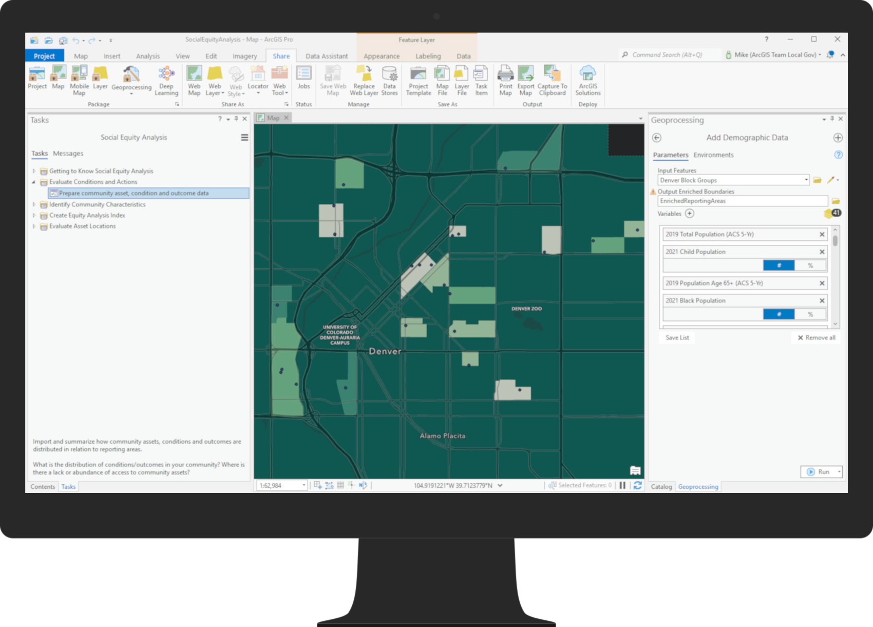
In the first step, users can identify a set of community conditions, actions, assets, or outcomes to understand their distribution across their region. For example, users can select conditions like home ownership rates, educational attainment, internet access, park access, prevalence of certain health conditions, or other things their organization or initiative may be interested in exploring. Users can also add their own data on their jurisdiction’s assets such as the locations of parks, hospitals, vaccination sites, schools, programs, or other resources that they want to explore. The tool will associate each of these locations to a geographic boundary and allow you to create a community condition rate (such as the home ownership rate, the rate of a health outcome, or the rate of internet access) for each given geography. Any numeric, address or spatial data can be used to focus on specific statistics.
The resulting Community Condition Rate map allows departments to visualize the distribution of assets, outcomes, resources and conditions across the community. The map is useful for analysts and decision makers to quickly pinpoint on a color-coded map where rates are high or low of a specific condition.
2. Understand Community Characteristics & Demographics
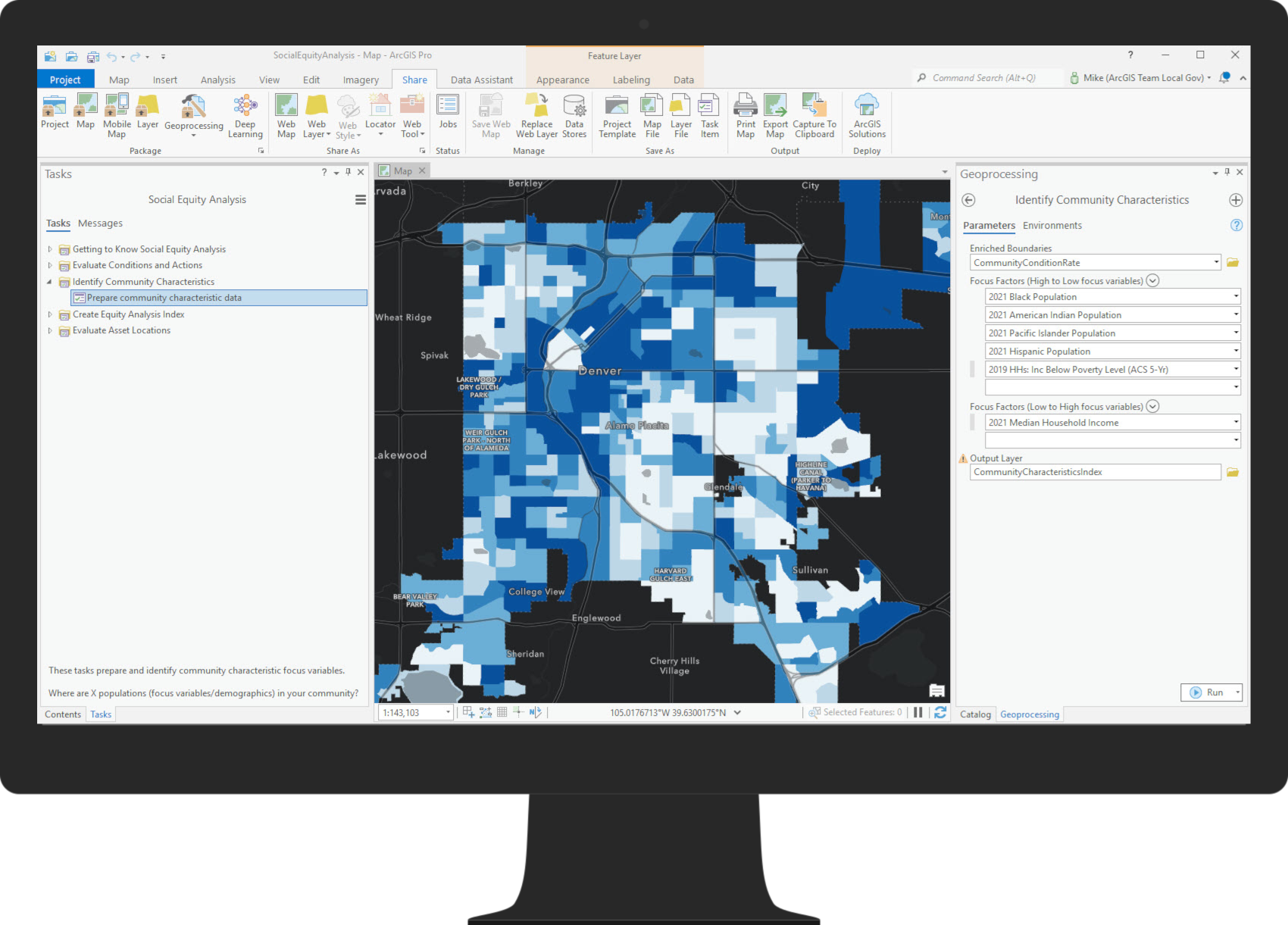
In the second step, users can identify a set of population groups and explore the distribution of these populations across their region of focus. To do this, the Social Equity Analysis solution comes preconfigured with the ACS demographic data layers most commonly used by our GARE partners (see previous blog post) such as race, ethnicity, spoken language, sex, age, income, and more. If you are interested in looking at other community characteristics, the entire Esri data library is available to browse and incorporate into your analysis. The tool prompts users to select population group characteristics to focus on. Next, the solution creates a map that shows the distribution of these focus populations across the region. The resulting Community Characteristics Map is color-coded to highlight the areas with the highest concentrations of your populations of interest.
This standalone map can help analysts see where the specified focus community characteristics have the highest concentrations. The Community Characteristics Index map shows the highest and lowest focus areas based on the demographic variables you choose to input.
3. Create an Equity Analysis Index
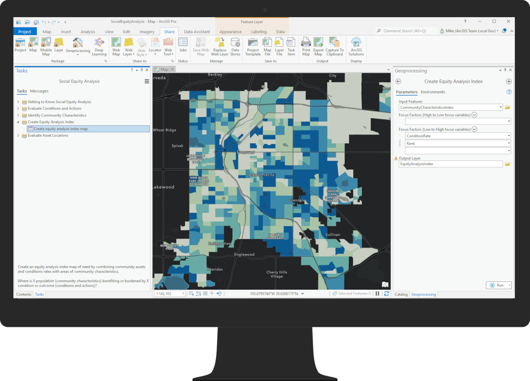
In the third step, users can combine the maps created in the first two steps to develop an Equity Analysis Index map that shows where the greatest concentrations of burdens coincide with the greatest concentration of the populations of interest you identified earlier. By combining these two key pieces of information, you get a map to see where the distribution of burdens in the community is the highest and lowest relative to the other reporting areas. The resulting map can be used by analysts and decision makers to quickly evaluate where the highest burdens or disproportionate impacts exist for the specific community condition and specific population of interest. The variables in the index default to be weighted equally, unless adjusted manually by the user.
4. Optimize Interventions
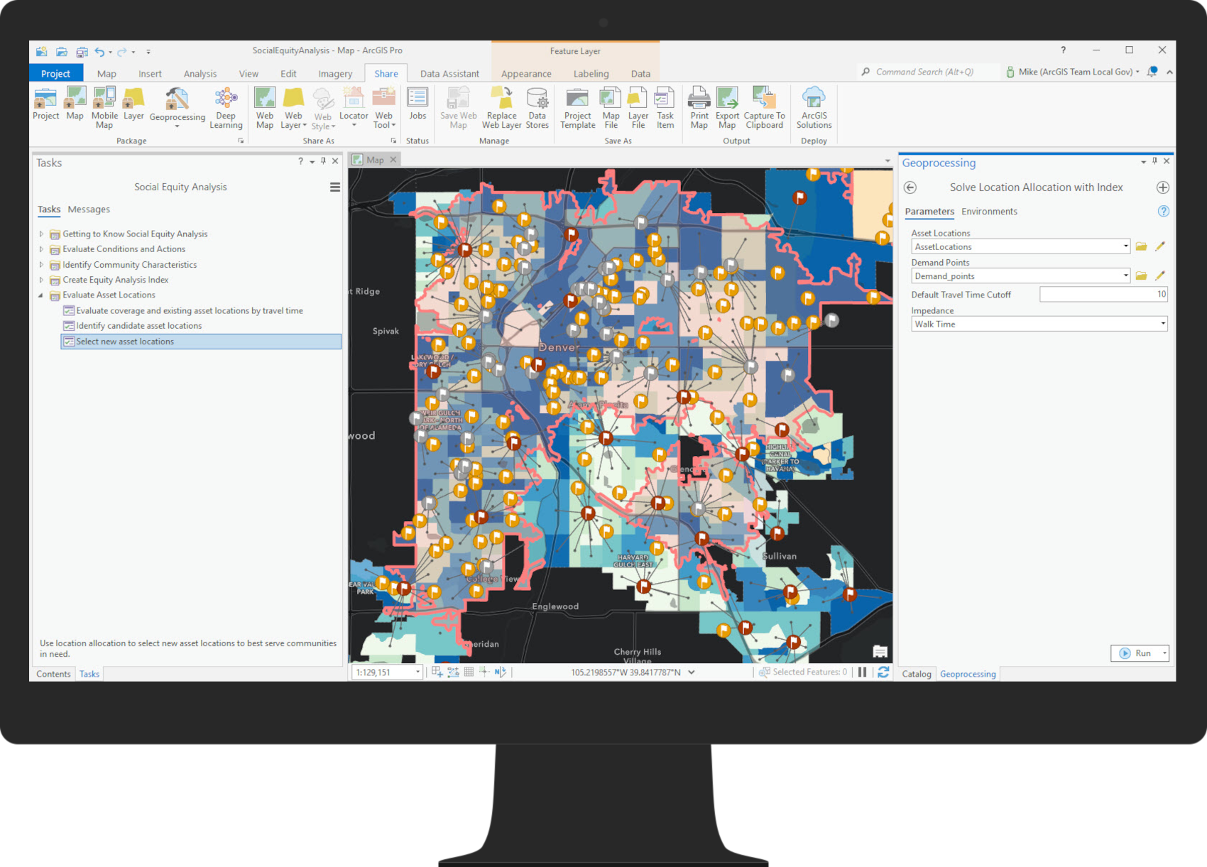
In the fourth step, users can leverage spatial analysis tools to evaluate where new interventions can be placed to address disproportionate impacts or outcomes. First, the solution determines how many people are within a specified travel time of existing asset locations to visually evaluate where gaps in coverage exist. Then, the solution can determine which asset locations (from a set of potential locations you provide) will most optimally address the disproportionate impacts identified in your previous analysis. The selection process weights each reporting area in your Equity Analysis Index as a point of need, so that new asset locations or interventions are selected closer to areas that were identified as disproportionately burdened.
5. Share Your Results with Stakeholders through Web Apps, Story Maps, or Hub Sites
Social equity analysis should be an iterative process that engages community members, leaders, partners, and other stakeholders in conversation and consensus-building. Once you’ve completed this workflow with a set of indicators and community resources, engage the community by incorporating your results into a shareable Web Application or a Story Map that includes context about the inputs and results of your analysis. Ground truth your indicators and results with community members and partners. If your organization is considering a particular equity intervention in a specific location based on these results, explain why, and allow for community input. If you have multiple analyses corresponding to different initiatives, you may want to consider incorporating all of your results into an organized ArcGIS Hub site where people can explore different analyses on topics of interest.
The most important thing is that your community has the opportunity to see and assess the results alongside you, incorporating their local knowledge and perspectives.
Keep Reading…
In the next blog post in this series, users will learn about tips and tricks to enhance their social equity analyses. Once released, the blog will be linked here.
Esri is grateful to our partners at:
- Race Forward,
- GARE,
- City & County of Durham,
- Fairfax County,
- Milwaukee County,
- City & County of Denver,
- City of San Antonio.
We are grateful for their recognition of the importance of location to racial equity and justice. Moreover, we appreciate our partners’ willingness to work alongside us to develop ArcGIS tools that further this work.





Article Discussion: