Even the smallest map can change the course of the future.
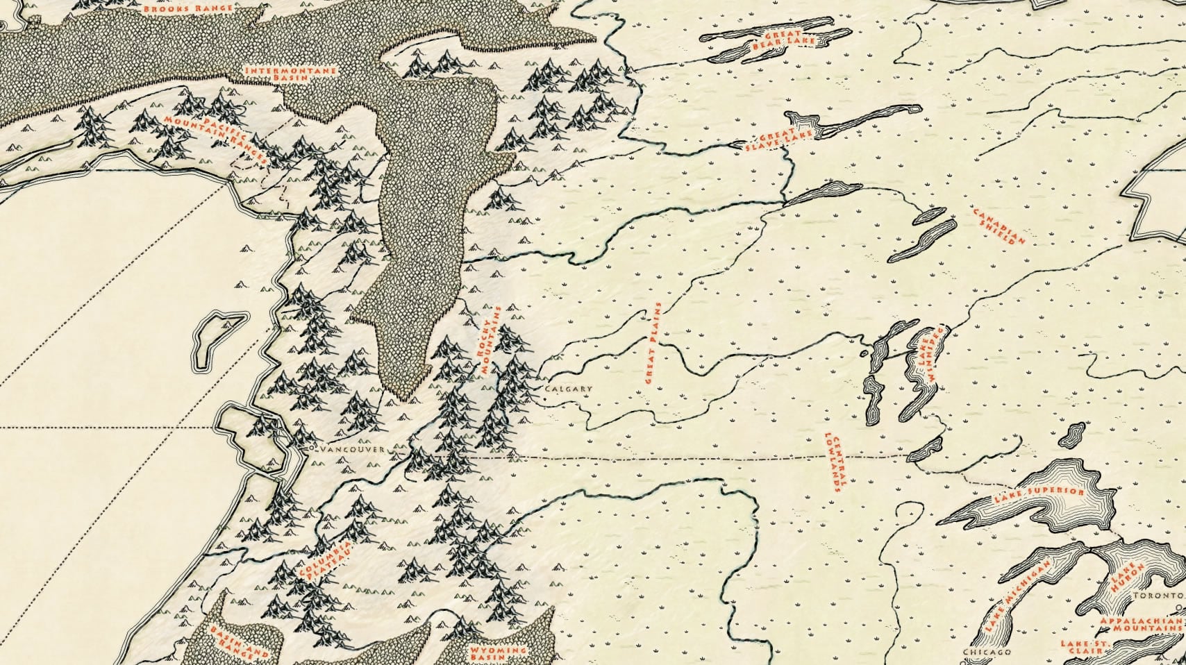
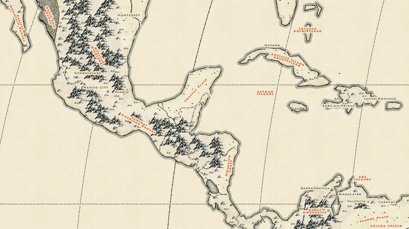
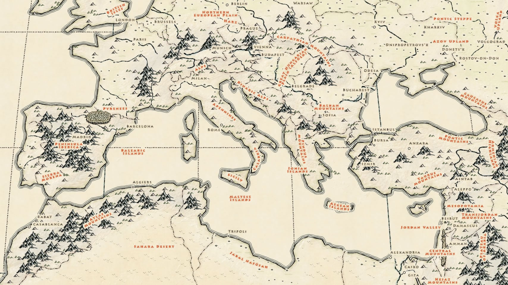
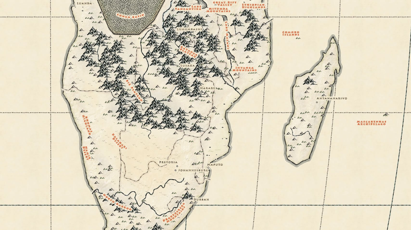
Download the latest version of the My Precious style for ArcGIS Pro and press your quill to the parchment of your imagination. This version has several improvements over the original, to make your Middle Earth maps better and easier…
- Improved symbol scale for better looking and more consistent maps
- Updates to symbol rendering accuracy makes water lines behave as they ought
- Feathered-in textures and faint colors
- More efficient symbol structures for faster rendering
- A subtle crumpled parchment color scheme for your Misty Mountain hillshades
- Text label styles to match the inked aesthetic
That sort of thing.
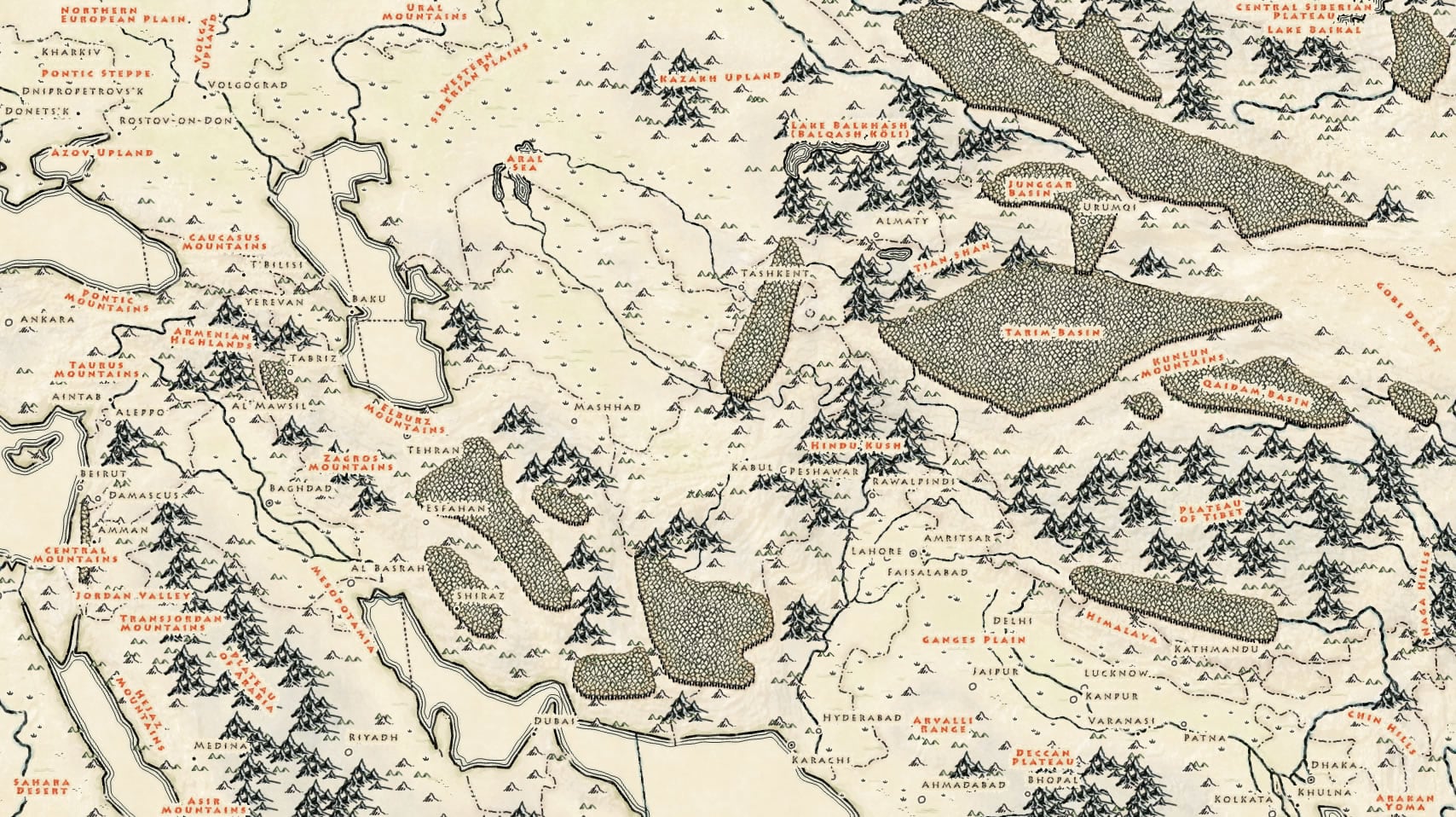
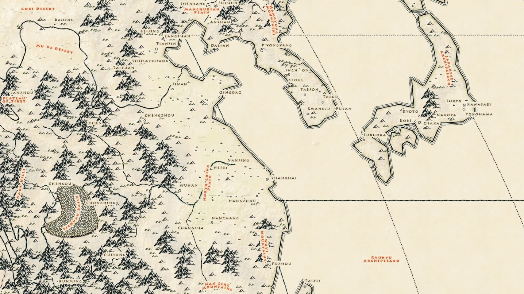
So update your style and get at it. But be warned…
It’s a dangerous business, map making. You step onto the road, and if you don’t keep your feet, there’s no knowing where you might be swept off to.
Happy Mapping! John
P.S. Consider a shortcut through the Mines of Moria to an ArcGIS Pro project with this style, and sample data, all set up and ready to go.

Article Discussion: