Many functionality improvements have been made to pop-ups in the last couple of releases of ArcGIS Pro. What follows are my top five tips when it comes to configuring a pop-up:
1. Configure your elements into a custom grid arrangement.
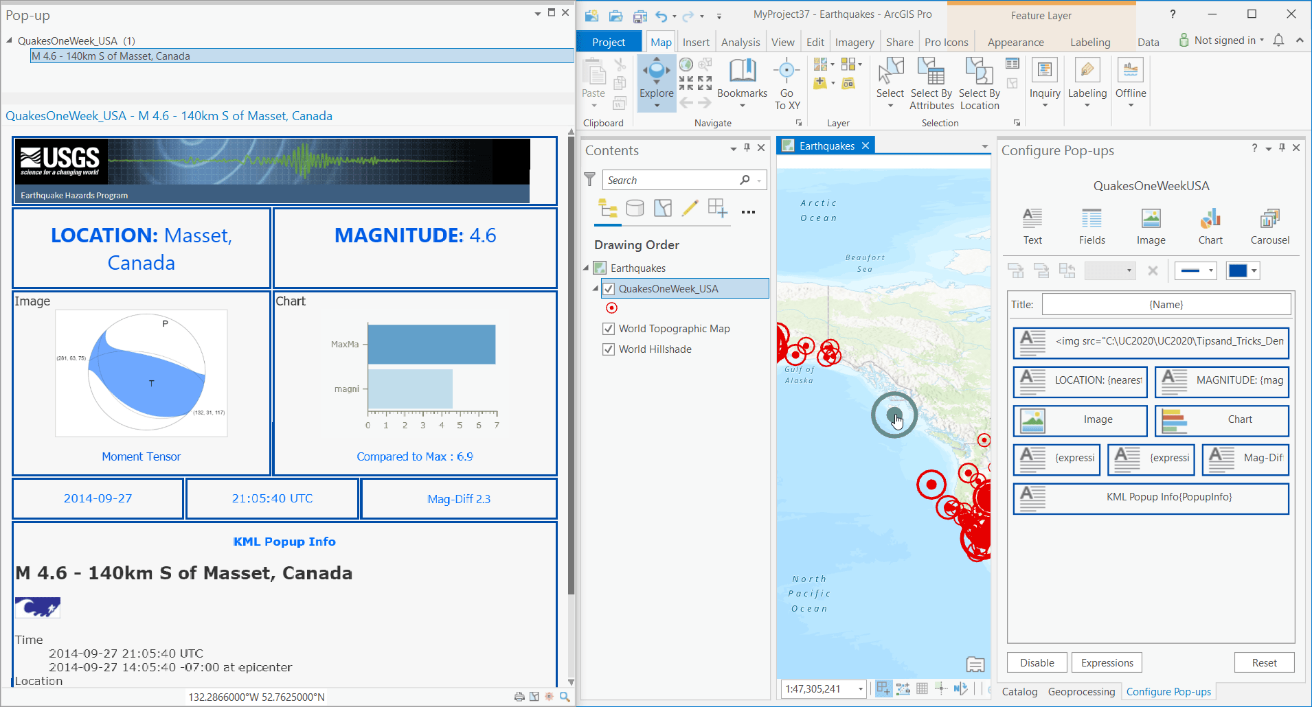
No longer constrained to a single column, you can split elements in both horizontal and vertical directions, though there is a four-elements-wide limit. This allows you to create a custom configuration where some elements can be larger than others.

Realize you wanted it the other way? Change columns into rows without having to recreate everything using the Rotate left 90° button. Select two or more elements of the same width or a set of elements that form an area of the same width to enable this button.
Alternatively, use your pointer to swap two elements, change one element into a new type of element, or even manually adjust things by dragging the edge of an element to resize it within the configuration. This last bit has a few rules in place to prohibit certain things so it may not always be available. For example, you cannot overtake another element when manually resizing.
2. Use the Carousel element to stack images and charts.
A Carousel element acts like a space-saving rolodex for your images and charts. Previously images and charts were automatically condensed into a carousel; however, with the introduction of the above-mentioned grid, you can now show these items independently. Stack elements from the top down in the order you want them to appear. There is no limit on the number of images or charts you can add to a single carousel, and you may add as many Carousel elements to your pop-up as you want.
3. Use HTML mode to further tailor your elements.
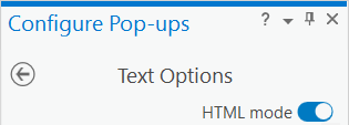
You can use basic HTML code to apply additional formatting that is not normally available. Turn on the HTML mode toggle button while editing an element to enter this mode. Turning it off results in the loss of all HTML customization.

HTML mode support varies by element type. Text elements support HTML entirely. Turning on this mode for a Field element converts it into a Text element that is pre-populated with a table containing the current list of visible fields. Chart and Image elements only support HTML in their title and captions.
For a full list of the supported HTML tags and attributes, visit the documentation.
4. Use an Arcade expression to generate conditional formatting for field values.
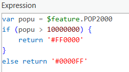
Conditional formatting can help make specific attributes stand out. To do this, create an Arcade expression that returns an HTML color code and then use it in a Fields element that’s been converted using HTML mode. For example, in the following code the color Red (#FF0000) is returned if the value is above 10,000,000 and Blue (#0000FF) if it is not.

Next, turn on HTML mode in the Fields element to convert it to a pre-populated Text element and add a reference to this expression within the State Name attribute, such as the following:

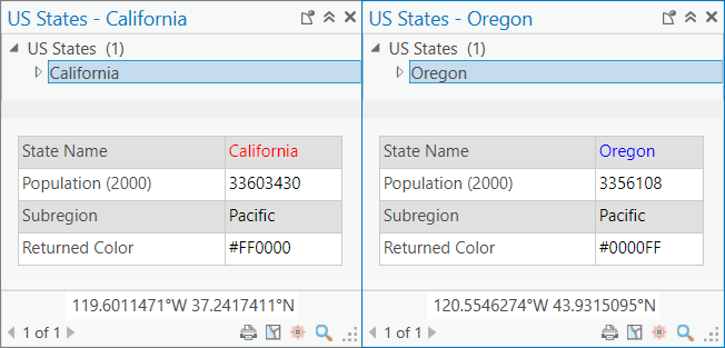
Then when you view the pop-up, the attribute value of the STATE_NAME column changes color based on the POP2000 field value. Here is the resultant pop-up:

5. Classic pop-up mode is still available if you prefer the old look.
For those who prefer the original single-columned look with its uniform colorings and font type, rest assured that this is still available. In the project Options dialog box, on the Navigation tab, under Pop-ups, check the Use classic pop-up mode option to have pop-ups use this classic styling.
A second option available is Honor dark theme. Unchecking this default option results in pop-ups that always display the light-themed coloring regardless of the current application theme.
Give the above tips a try. Once you do, you’ll find that your pop-ups will really pop!

Article Discussion: