Scenario: You have some data. You mapped it. It looks all right you guess. But you wanted to make something more… impressive. You want people to want to read your map.
Solution: This tutorial shares some easy tips for improving the cartography of your map using ArcGIS Pro. It comes with a project package that you can follow along with, but the skills and ideas shared here are transferable to most mapping projects.
Download the project package here: Waterfalls of Cape Breton Island
And open Map 1 and Layout 1.
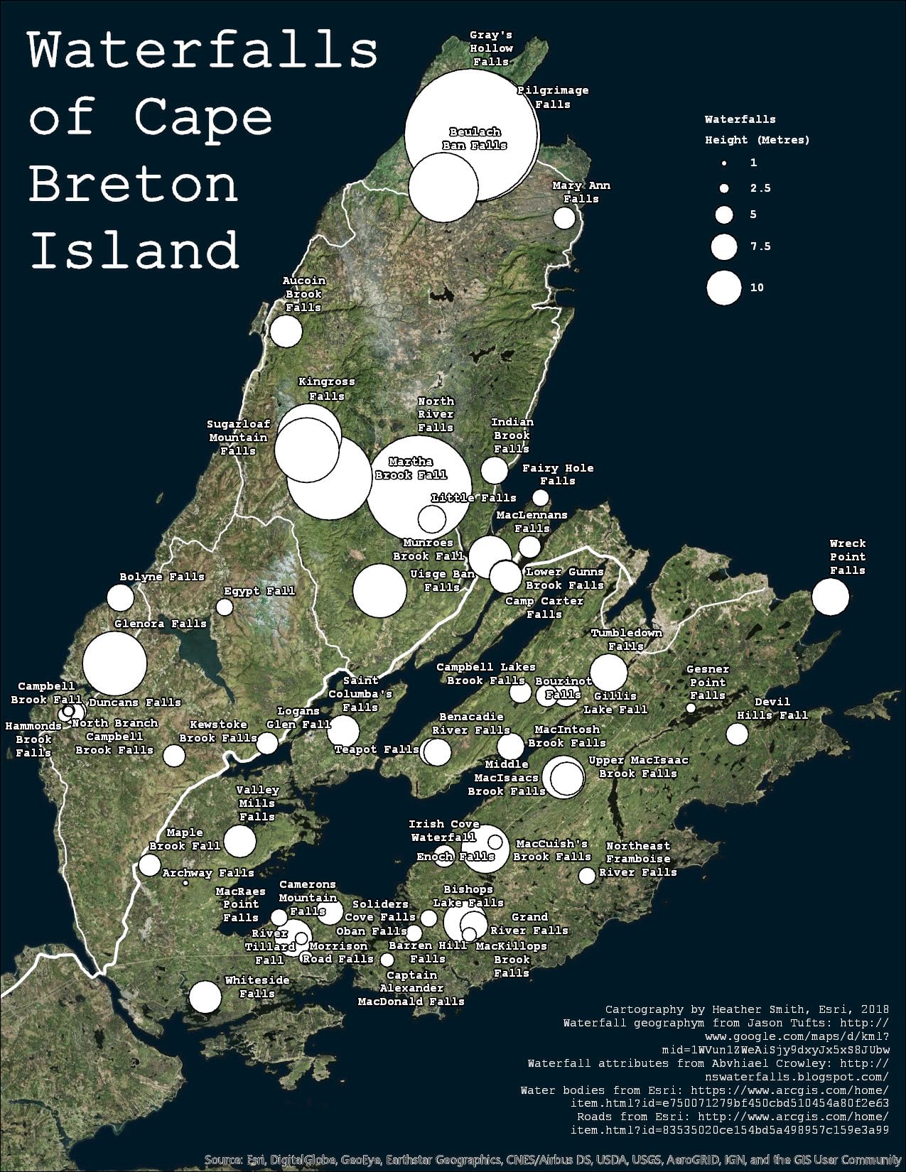
This is an acceptable map, showing the height of waterfalls on Cape Breton Island, in Nova Scotia, Canada. Some good design decisions have already been made: The map has a deliberately limited color palette, a consistent font, and is not overloaded with extraneous data. It’s a good-enough map. But let’s make it better.
WHY??? If the map is already good enough, why do more?
- Because you want to add more information without reducing the map’s clarity.
- Because people are more likely to look at an eye-catching map. They will spend more time reading it. They will take it more seriously. They will share it with their friends. You did all that work to collect, analyze, and display your data. Don’t you want people to pay attention to what you have to say?
HOW??? Don’t worry. There’s some simple things you can do:
- Tone down the basemap so it doesn’t compete with the message.
- Symbolize the data with extra variables to add more information.
- Customize the legend to suit your particular visualization.
- Create label expressions and adjust text properties.
Note: You can refer to Map 2 and Layout 2 (found on the Catalog pane > Project tab) for the tutorial’s finished product.
1. BASEMAP
The current basemap choice – Esri Imagery – is a good one for the subject matter. But it’s kind of bright.
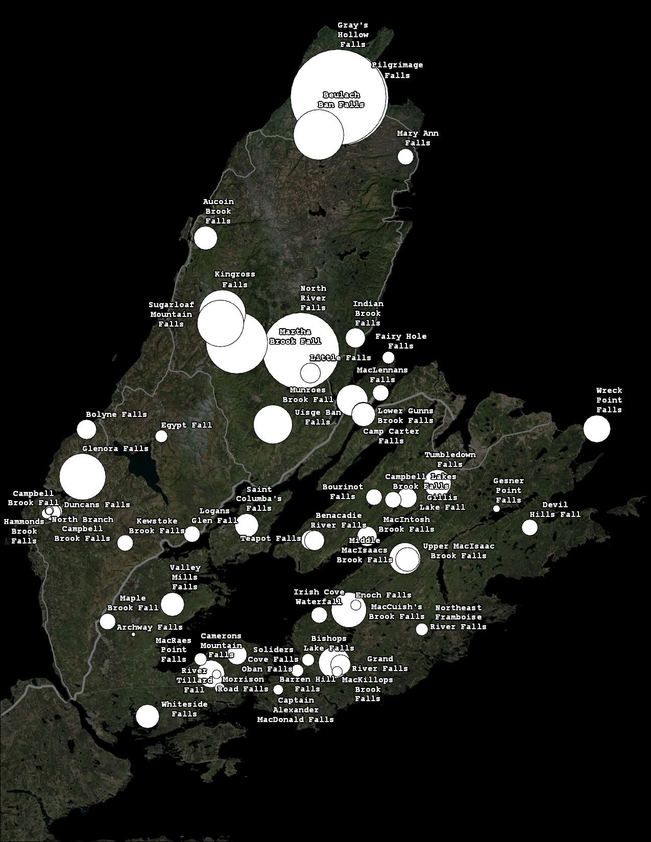
Find the Waterfalls geodatabase in the Catalog pane. Drag and drop the Background layer onto the Contents pane, just above the Roads layer.
This is just a simple rectangle that covers the entire extent of the map. You can easily make one yourself using Map Notes. Change the color to black and adjust the layer transparency to your liking. Result: the waterfall data pops into the foreground while the basemap recedes into the background. You can take this effect even further by adding the WaterBodies layer and symbolizing it in a similar manner. Subtle changes like this will not be noticed by your map readers, but they help all the same.
2. VISUALIZATION
Right now the symbols are communicating one attribute: waterfall height. But they could do more. You could also tell your map readers which waterfalls are the most impressive, and how difficult it is to reach them.
If you open the attribute table, you’ll see a field called Rating (Numeric). This is a simplified version of the field Rating. Generally speaking, 1 = average, 2 = excellent, and 3 = outstanding. But those words needed to be converted into numbers in order to symbolize them quantitatively.
Open the Symbology pane for the Waterfalls layer. It is using Proportional Symbols to depict waterfall height.
Click the green icon at the top of the Symbology pane to open the Vary symbology by attribute page. Expand the Transparency section and Choose Rating (numeric) for the field. Adjust the transparency values so the outstanding waterfalls are completely opaque, and the lesser ones are transparent.
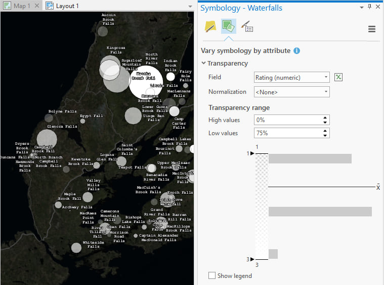
Now you not only get to show two attributes at once, but you no longer need the black outlines on the circles, since you can see where they overlap. Back on the Primary symbology page, click on the template symbol and set the outline to 0 points:
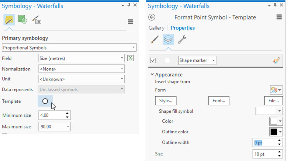
I recommend using outlines (on symbols, text, layout elements – everything) only when you need to.
You can continue to add attributes on the Vary symbology by attribute page, but for the next variable you’re going to duplicate the layer instead.
Copy and paste the waterfall layer in the Contents pane. Change the symbology of the new layer to Unique Values. Set the field to Trail Condition .
Now each of the white circles on the map has a smaller circle at its center. Don’t keep these default symbols. (They’ve got outlines for one thing.) Click on the More button and choose Format all symbols. From the gallery, choose “Circle 1”. On the Properties tab, change the size to 5 pt.
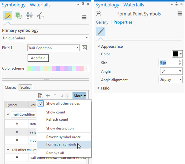
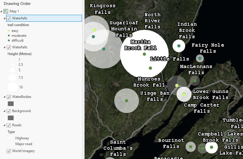
Return to the Primary symbology page. Right click on each of the symbols to change their colors. I chose Medium Lime, Lotus Pond Green, and Deep Forest.
Now you are showing three attributes of one dataset on one map: waterfall height, rating, and trail difficulty:
3. LEGEND
It is not normally recommended to show so many variables at once. Anything after two attributes gets risky, and can result in a map that is difficult to read. So be careful! One way to help your map readers handle all of that extra info is with a quality legend.
Not all maps need legends. Not all layers on the map need to be on the legend. If you think a feature is obvious without a legend don’t give it one! In this map it is fairly obvious (from the map’s title and also the labels) that the circles represent waterfalls, but we still need a legend to explain their variation in size, transparency and color.
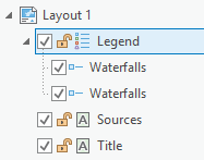
Open Layout 1 and expand the Legend item from the Contents pane. Remove everything except for the two Waterfall items.
Select the “Legend” header:
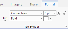
And then open the Legend Format tab on the ribbon. Here you can set the font properties of all the legend text items at once.
Double click on the legend header in the Contents pane to open the Format Legend pane. Here you have lots of options to play with. I’ll direct your attention to a few key ones:
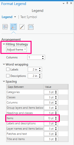
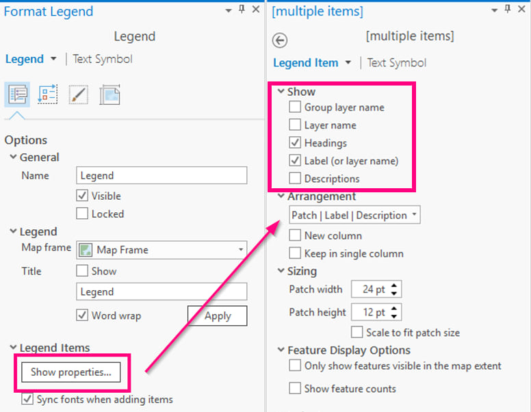
If you want to control the properties for individual legend items you can change the drop down menu from Legend Item to something else:
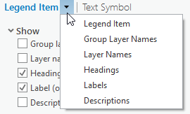
For example you might change the color of the legend headings to green in order to distinguish them from the labels.
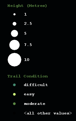
Some aspects of the legend are controlled from the map, not the layout. Switch back to Map 1 and open the Symbology pane for the green waterfall layer.
There’s a symbol class for all other values. This is useful when you’re adding data with new Trail Condition values. But you are done adding data, so you can remove this row. Click on the More button and turn off Show all other values.
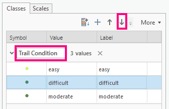
The values you do have aren’t in the best order. Use the arrow buttons to rearrange them. You can also edit the Trail Condition text, to update your legend heading. I made the decision to use all lower case text on my map, so I changed it to “trail condition.”
For the white waterfall layer, you can edit the heading text directly on the Contents pane:
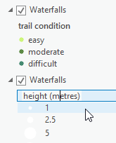
If you open the Symbology pane for the white layer, and switch to the Classes view, you can also control how many legend items are shown:

Check out your changes on the layout:
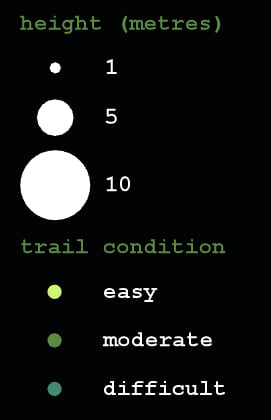
You still need to explain transparency to your map readers. There is a Show legend option on the Vary symbology by attribute page, but that kind of legend is more useful for continuous data. In your case, you only have three transparency values – corresponding to average, excellent, and outstanding waterfalls. A custom legend would be better. And it’s easier to do than you might think.
Return to your map, select the green waterfalls layer and make a copy of it. Open the Symbology pane, select all of the classes and remove them. now this layer will not draw on the map. It’s a dummy layer for your custom legend.
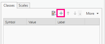
Press the Add unlisted values button:
And from there select Options > Add new value.
Add three new values and name them “average”, “excellent”, and “outstanding”:
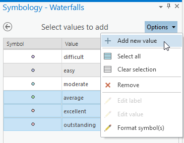
Since these values don’t actually exist in the Trail Condition field, nothing will draw on the map. Change the symbols and heading to match how you want them to appear in the legend:
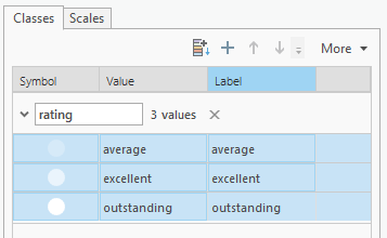
You’ll have to repeat some of the legend properties from above on your new layer. When you’re done you’ll have a clean looking legend that clearly explains your complex waterfall symbols:
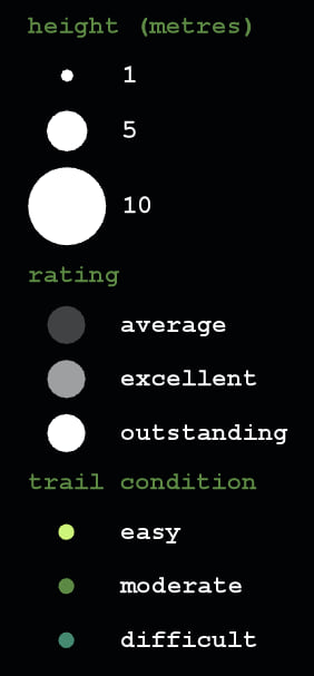
You can control the order of the legend items in the Layout’s contents pane.
4. LABELS:
Right now all three of the waterfall layers has labeling turned on because you made those layers using copy/paste. This is unnecessary. Turn labeling off for all but the trail condition (green) layer. There’s a button to turn labeling on or off on the far left of the Labeling ribbon.
Next to it is the option to Create label class… Click it.
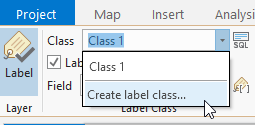
Make three new classes called “easy”, “moderate”, and difficult” to match the green symbol classes. If you switch to the Labeling view on the Contents pane you’ll see them all listed. You can get rid of Class 1.
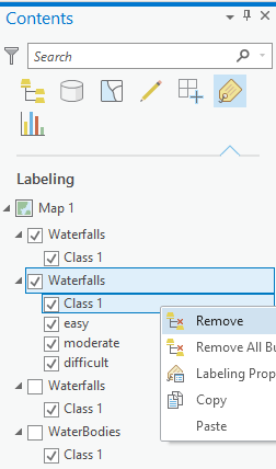
Select all three classes and set their basic font properties on the Labeling ribbon:

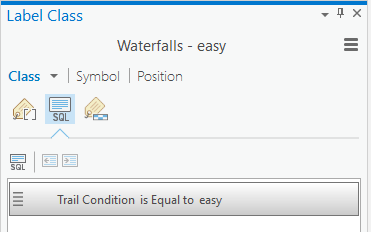
Then right-click each label class and choose Labeling Properties to open the Label Class pane and set up the properties that make them different from one another. They should each have a different query:
And a different color, to match the colors of the Trail Condition symbols.
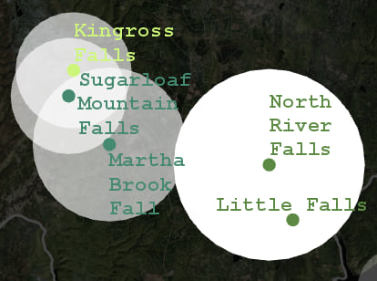
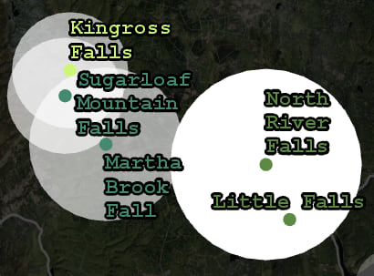
If you find that the lighter labels are hard to read on top of the white symbols, you can give them a 1 pt black halo:
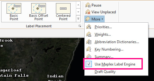
OK before going any further, I have a very important question: Are you using Maplex???? You probably are, since it’s turned on by default. But if your map is from an old mxd that someone in your organization set up years ago, this might not be the case. Most of your label wishes will be be answered by Maplex. You can find it on the Labeling tab of the ribbon:
Now you have access to a wealth of text properties, in particular options for positioning labels so they don’t overlap. But I’ll only point out a couple of these options here: I almost always recommend lowering Line spacing (aka leading), and in this map I also chose to change the text case to the ironically named Lower case:
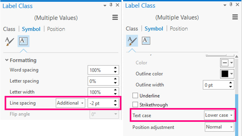
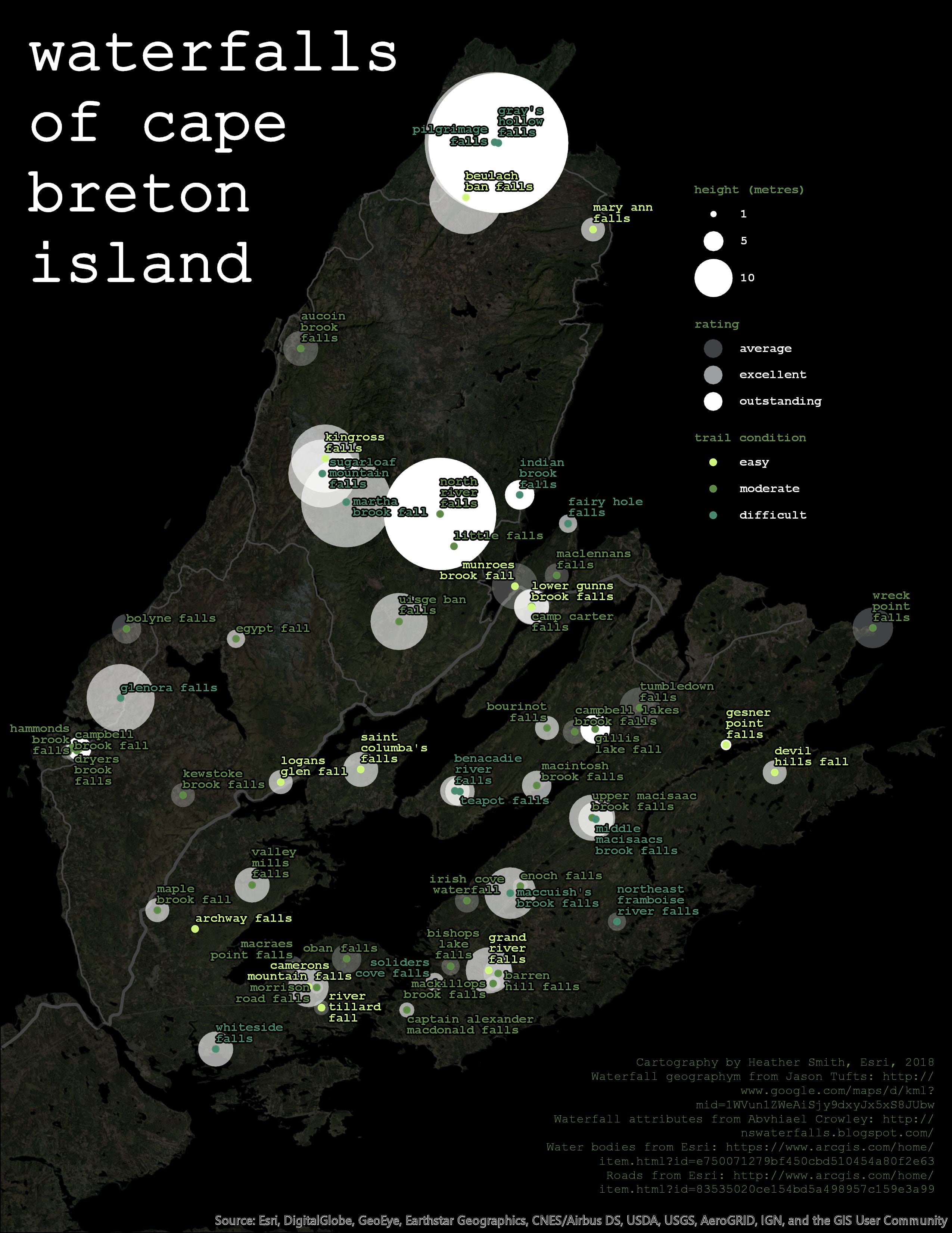
By decreasing the line spacing and coloring labels to match symbols, you’ve made the map easier to read. There’s still a lot of labels, but now it is clearer which label is associated with which symbol.
Don’t forget that you have more text on the layout besides the labels. You can set the text case of the map title to lower case, to match the rest of the map. And you can change the color of the credits to green so they recede a bit into the background:
Let’s review the tricks we used to go from a good map to a great map:
- Tone down the basemap with a transparent blanket layer.
- Visualize a second attribute using Vary symbology by attribute.
- Visualize a third attribute by duplicating the layer.
- Improve the legend by adjusting fitting, spacing and font properties.
- Simplify the legend by removing extra items and information.
- Create a custom legend by adding a dummy layer to the map with Unique Values symbology.
- Set up label classes that match your existing symbol classes.
- Make use of Maplex for better spacing, positioning, and font properties.
There wasn’t really anything wrong with the map you started with. But with not very much effort you were able to turn it into something a lot nicer. Can it be taken even further? Of course. Take a peek at Layout 3 in the project package, and check out the next tutorial to learn how to go from great to awesome with some more advanced techniques.


Commenting is not enabled for this article.