I am gazing into your future. So hazy…so many wonderful spatial concepts and geographic projects…WAIT. Something is coming into focus. Yes, yes it is becoming more clear now. I see you…a map maker…and you have such a look of fun and wonder on your face. But why? Ah, you are making maps sprinkled with glassy orb point features. Little translucent spheres adorn your map and you are having such fun. Such joy.
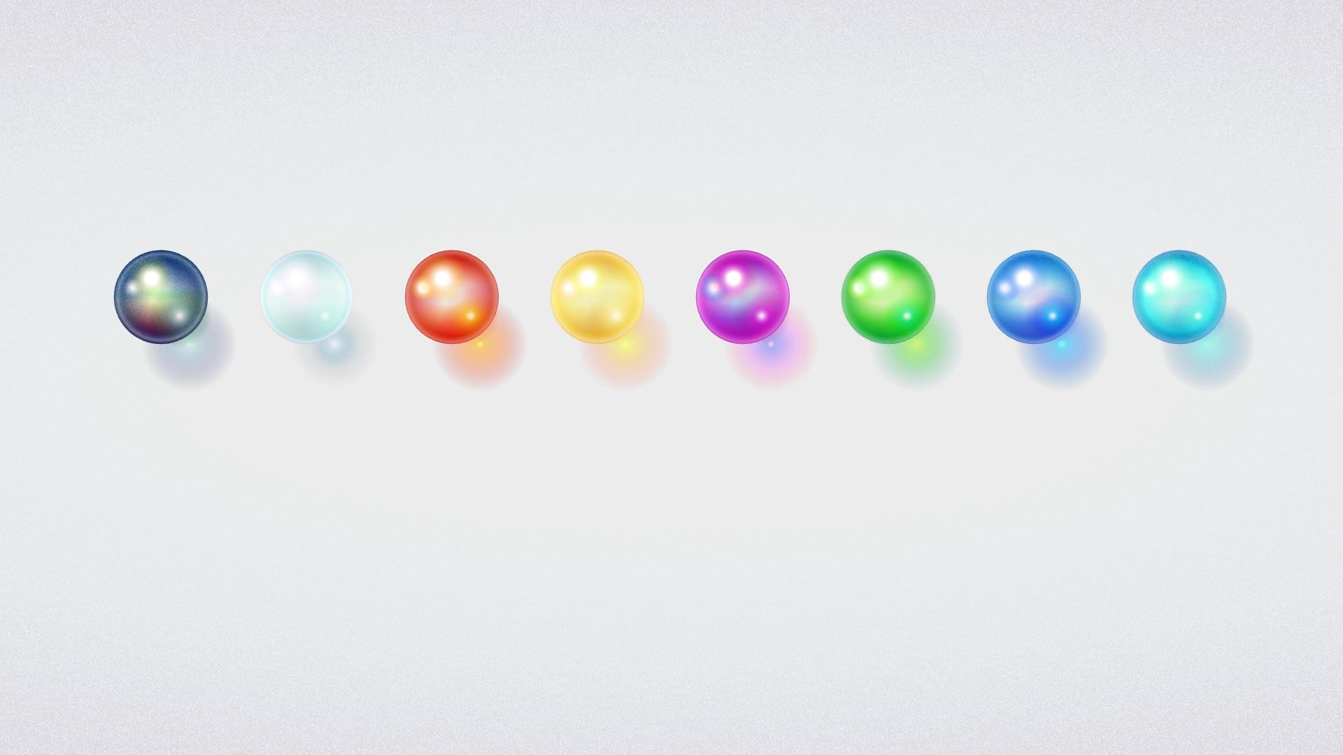
You can download this new style for ArcGIS Pro here. These symbols were made entirely in ArcGIS Pro, using the unknowably deep graphical capabilities of the symbology panel. I just love it. If you are feeling crazy, you can even kick back to some gentle piano musings and watch me build the first of these symbols in slightly fast-forward.
Ok ok, maybe you’re wondering how they look on a map? They look like colorful glassy orbs!
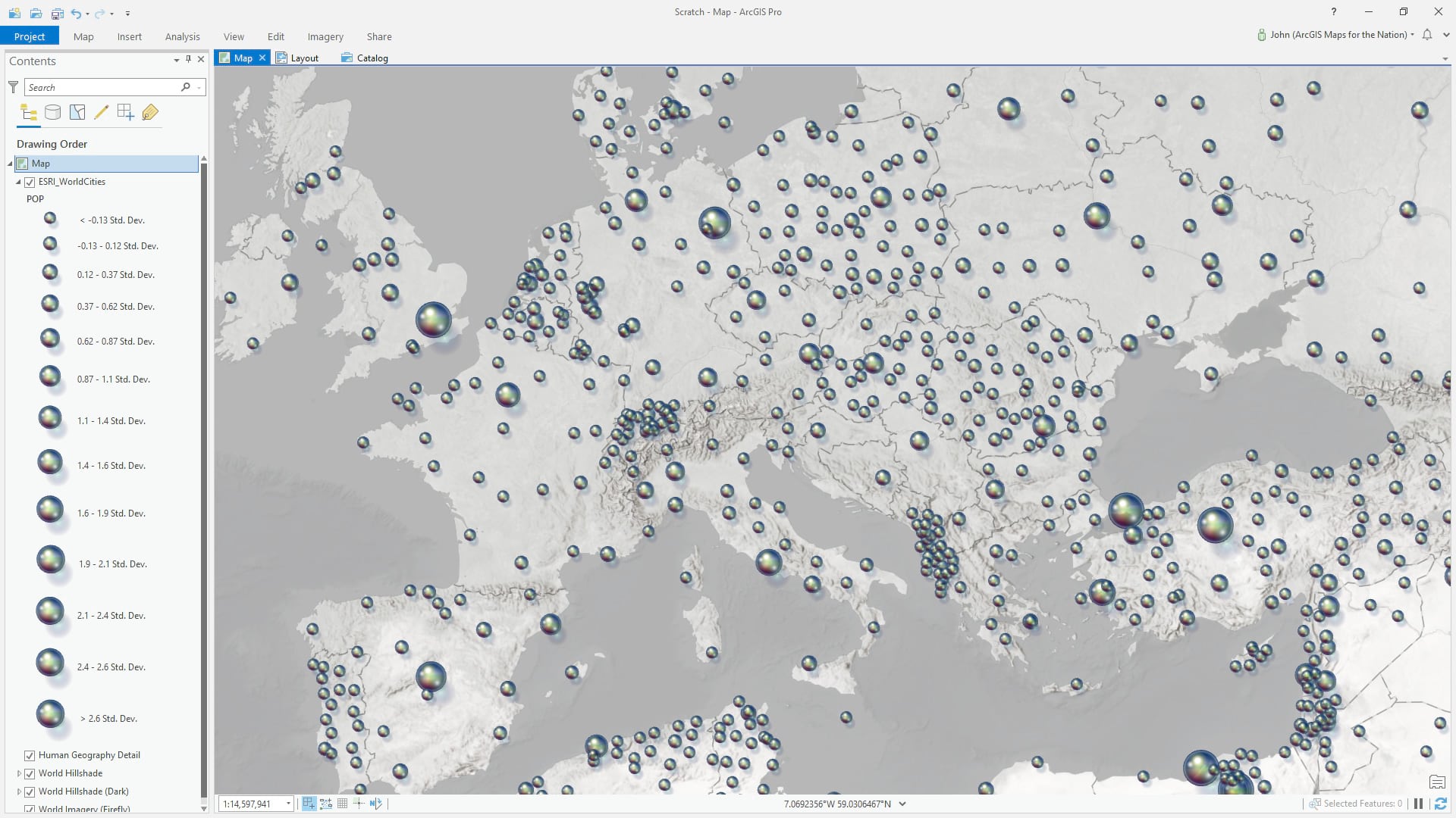
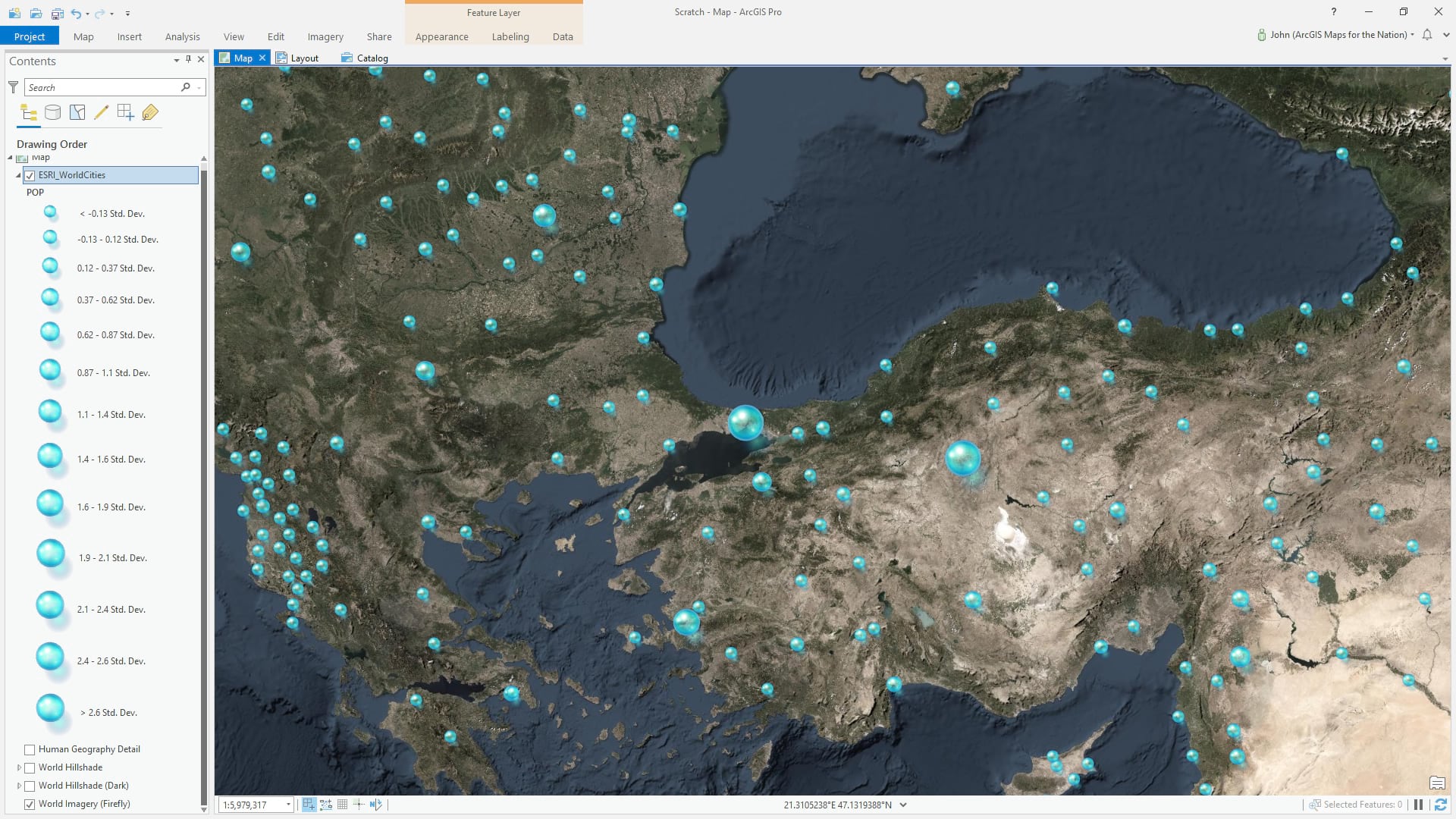
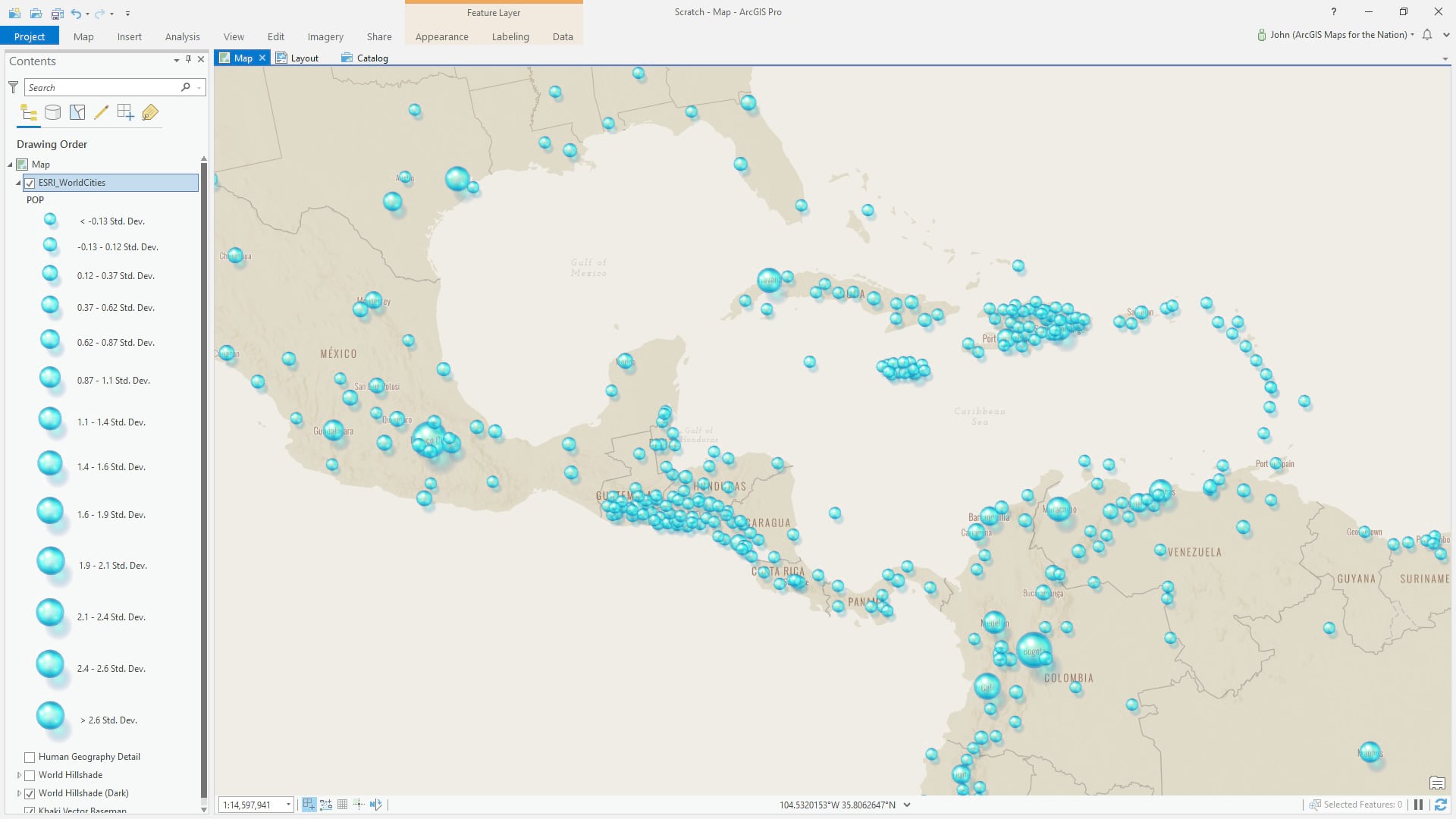
So give these a go if you like. The examples above are a bit silly but there’s a chance, in the right map, that they might be helpful to you. Really, though, I’m excited to show you just how capable and rich the design capabilities are in the Pro symbology panel. It’s amazing and so much fun. So here’s a breakout of building up this symbol…
…
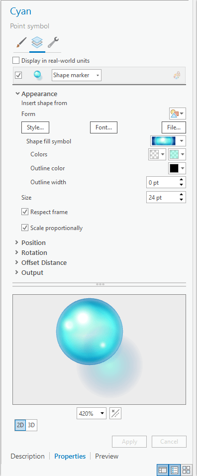
This point symbol is a shape marker. All the symbol layers are nested up inside the “shape fill symbol” so technically the design guts of this thing applies to a polygon (which is rendered inside a circle and presented on the map as a point feature).
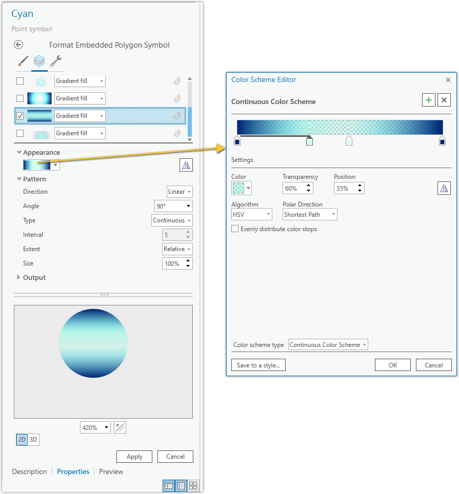
Here’s what it looks like when you drill into the shape fill symbol. It’s a polygon symbol and you can add any number of symbol layers (check the wrench icon to add or duplicate symbol layers). The bulk of the effect lies in stacking up layers of gradients (with varying amounts of transparency within the gradient so things fade into being invisible). We’ll start with this linear gradient with a semi-transparent center.
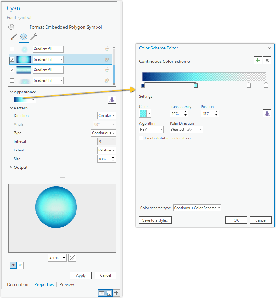
Atop that sits a circle gradient with a fully transparent center.
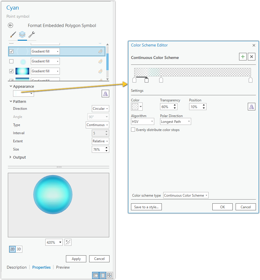
Next is a circle gradient that provides a subtle light ring around the symbol.
Ok here’s where it starts getting pretty interesting. The next circle gradient gives the effect of an inner reflection which helps to sell the notion of a glass ball. It’s just another gradient but given a “move” effect to nudge it down to the bottom corner.
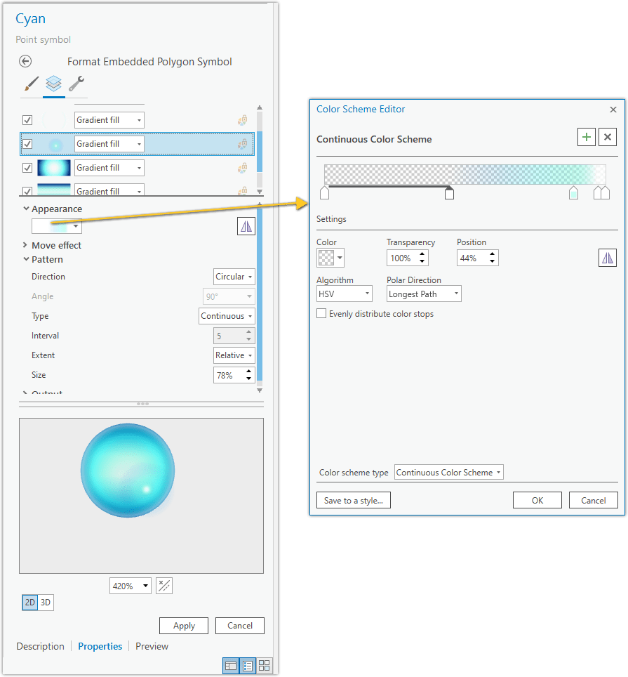
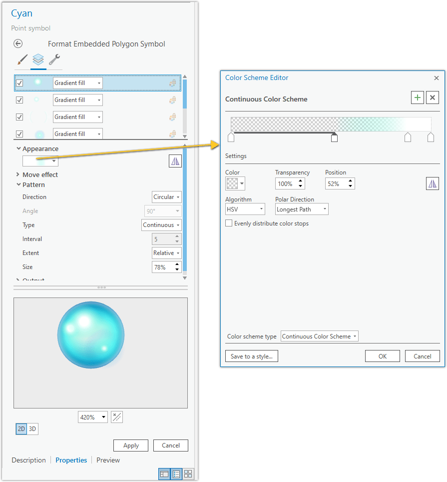
The same thing duplicated and positioned (move effect) at the top left provides the illusion of a reflection. It’s all tricks and illusions.
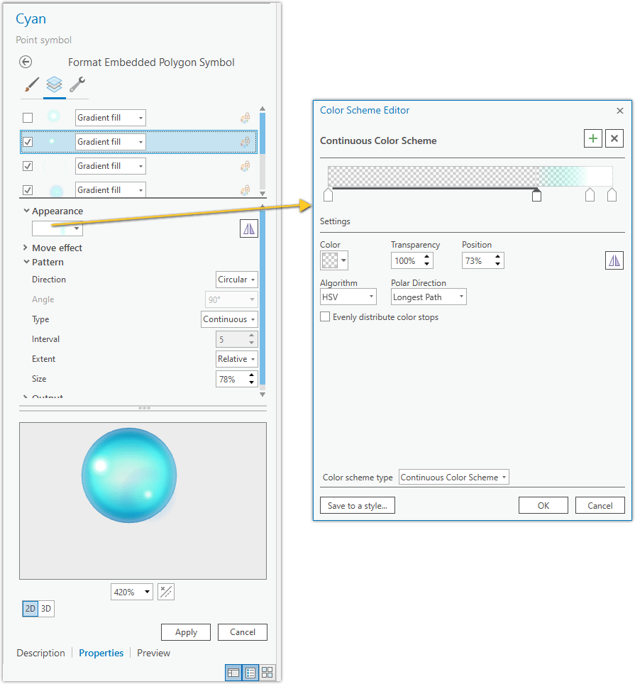
And we give that reflection a little buddy.
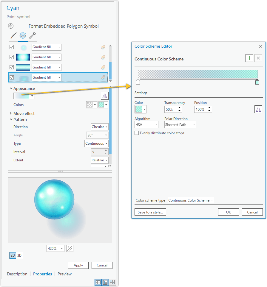
Lastly but not leastly it’s time for the translucent shadow. This is the clincher that really gives the symbol the appearance of transparency, as light passes through the sphere and casts a sort of shadow but also focuses the light to a bright center.
And that’s it. Glassy orb point symbols (here’s that download link) made in ArcGIS Pro to be used in ArcGIS Pro.
Do I hope you use this style and try out some glassy orb symbology? Sure! But what I really hope is that you feel encouraged to dive into the amazing capabilities of the symbology panel and create fun and interesting (oh, and useful) symbol features yourself! It is a total blast and, as with any self-directed learning, you’d have all sorts of tangent ideas about how to take these steps in your own much better and purposeful directions. Either way I hope you share in the comments some examples of your uses of the glassy orb style or the products of things you learned about the symbology panel.
I certainly wish you Happy Mapping!
Love, John

Article Discussion: