Everybody just loves a pen and ink stipple effect. It’s charming, it’s warm, it’s handsome, it’s tactile. It says, say, want to sit on the couch and I’ll read to you from your well-worn copy of Where the Sidewalk Ends?
I’ve tried out the stipple effect in maps (here and here) that I’ve hand-drawn (yes, and so should you!) as well as dipped my toe into creating a digital effect (here and here), and found that it gives a richness of clarity and depth. Then a few days ago I saw this wonderful hand stippled map drawn by Molly Elkins, on Twitter. The simple beauty of her map motivated me to go back to the inkwell and get an honest to goodness pen and ink style together for ArcGIS Pro.
Download the Pen and Ink style here. Go ahead. I’ll wait.
Welcome back! Here are some sample maps made in the process of building and testing it out.
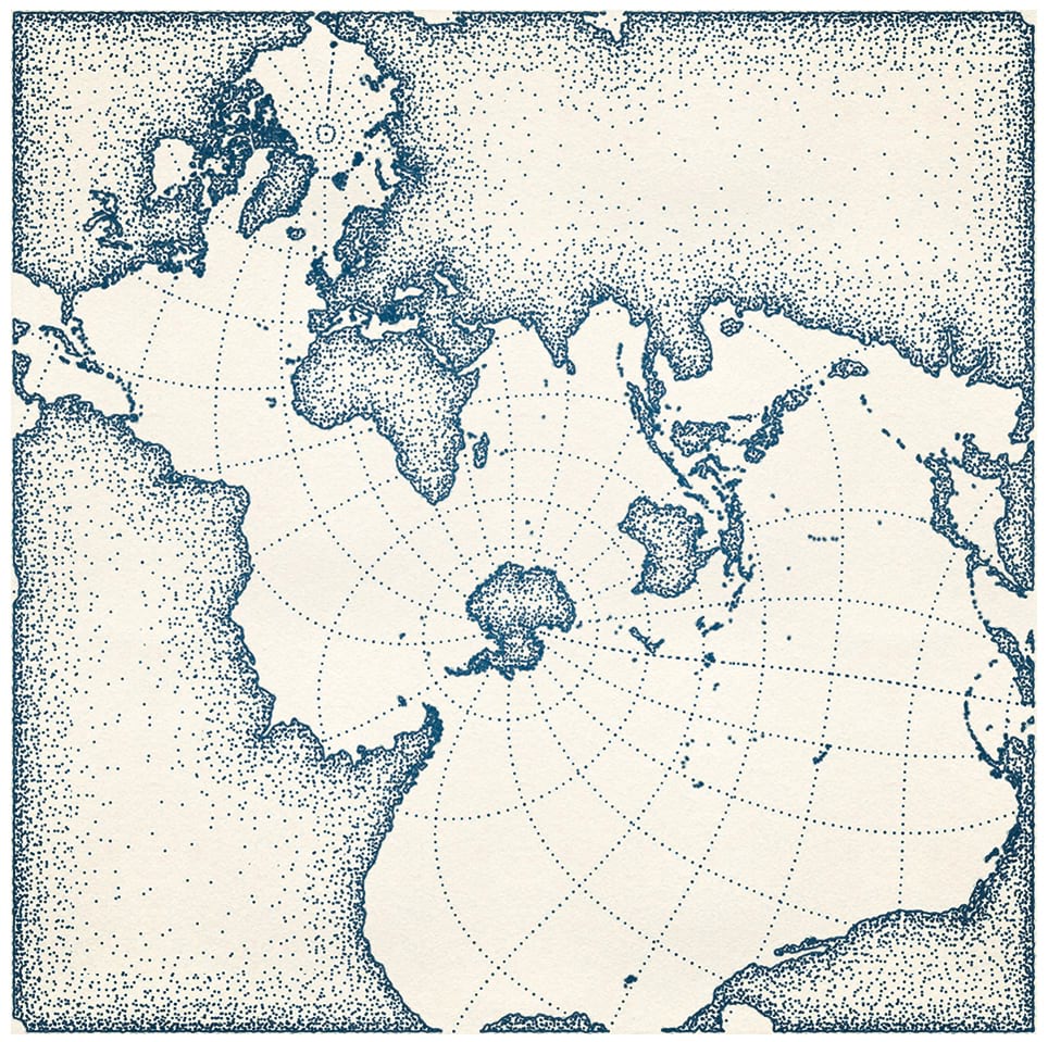
This is a Spilhaus map, showing the Earth’s oceans as a single body of water. But a pen and ink Spilhaus map? For twenty-five years Athelstan Spilhaus authored a comic strip educating the public on the wonders and possibilities of science. So absolutely a pen and ink Spilhaus map!
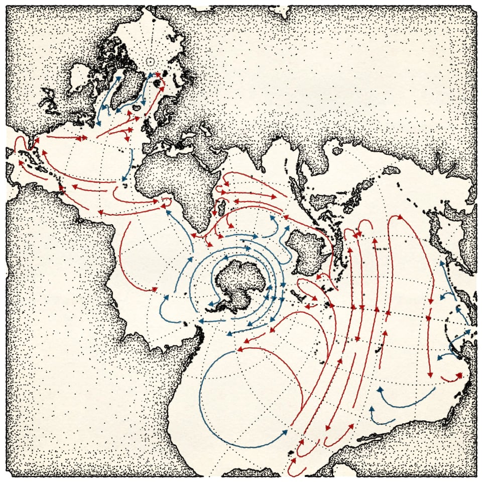
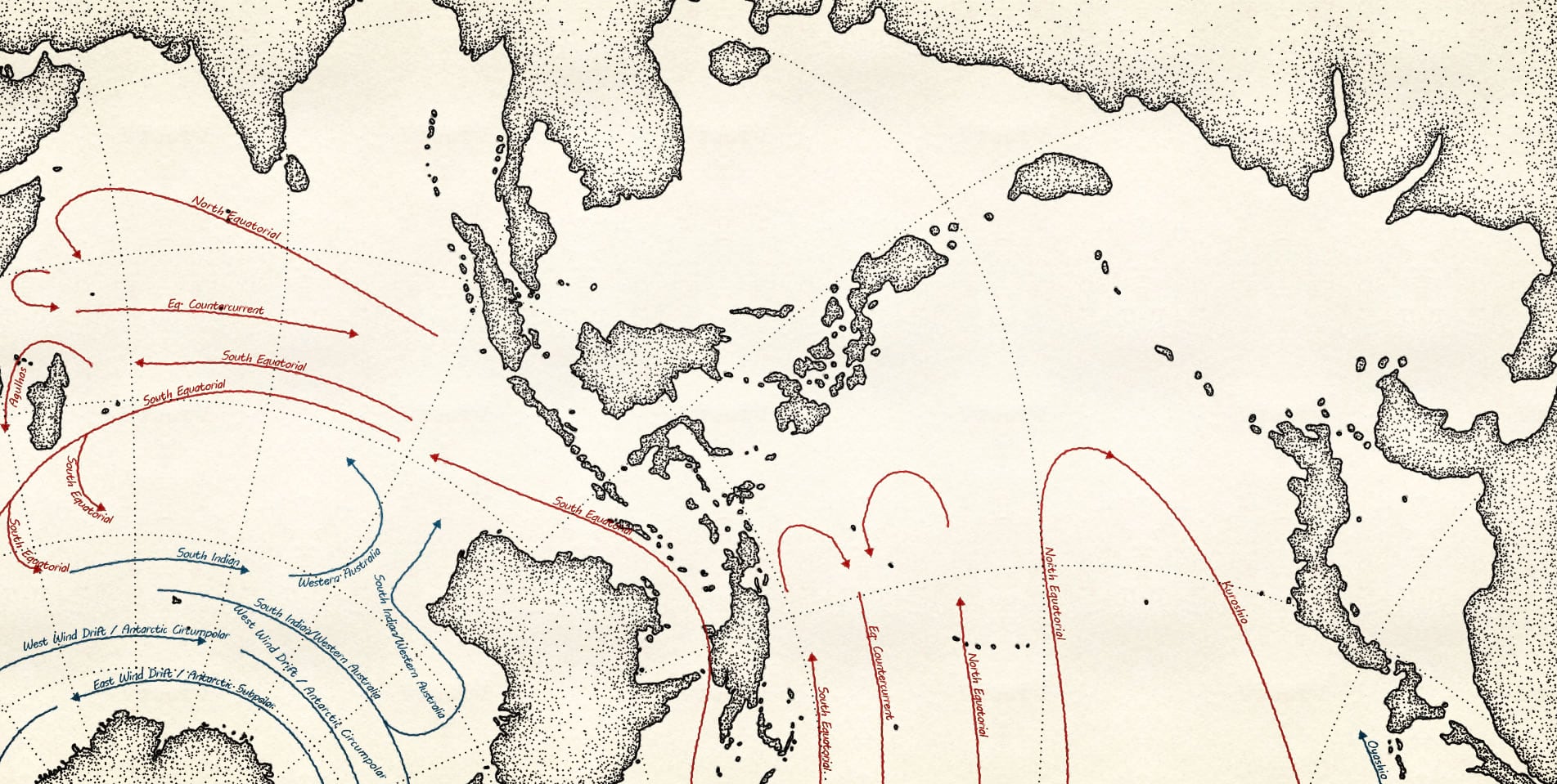
Speaking of science, can this style be applied to dynamic data served from the Living Atlas? Yes, here’s a version with some warm and cold ocean currents drawn in using the arrow line symbols in red and blue.
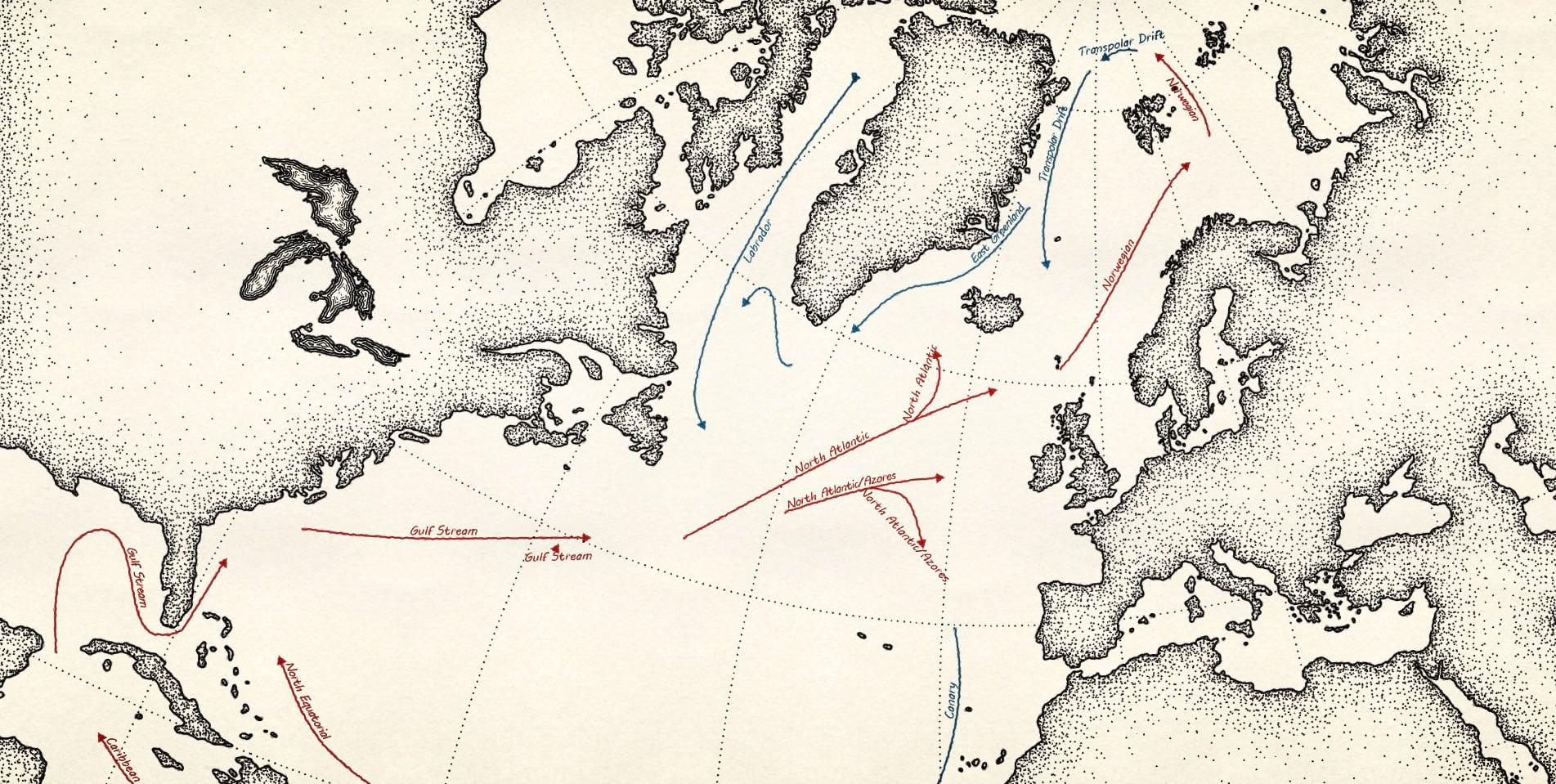
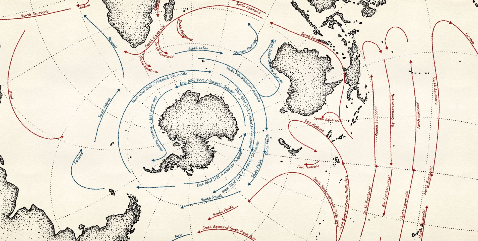
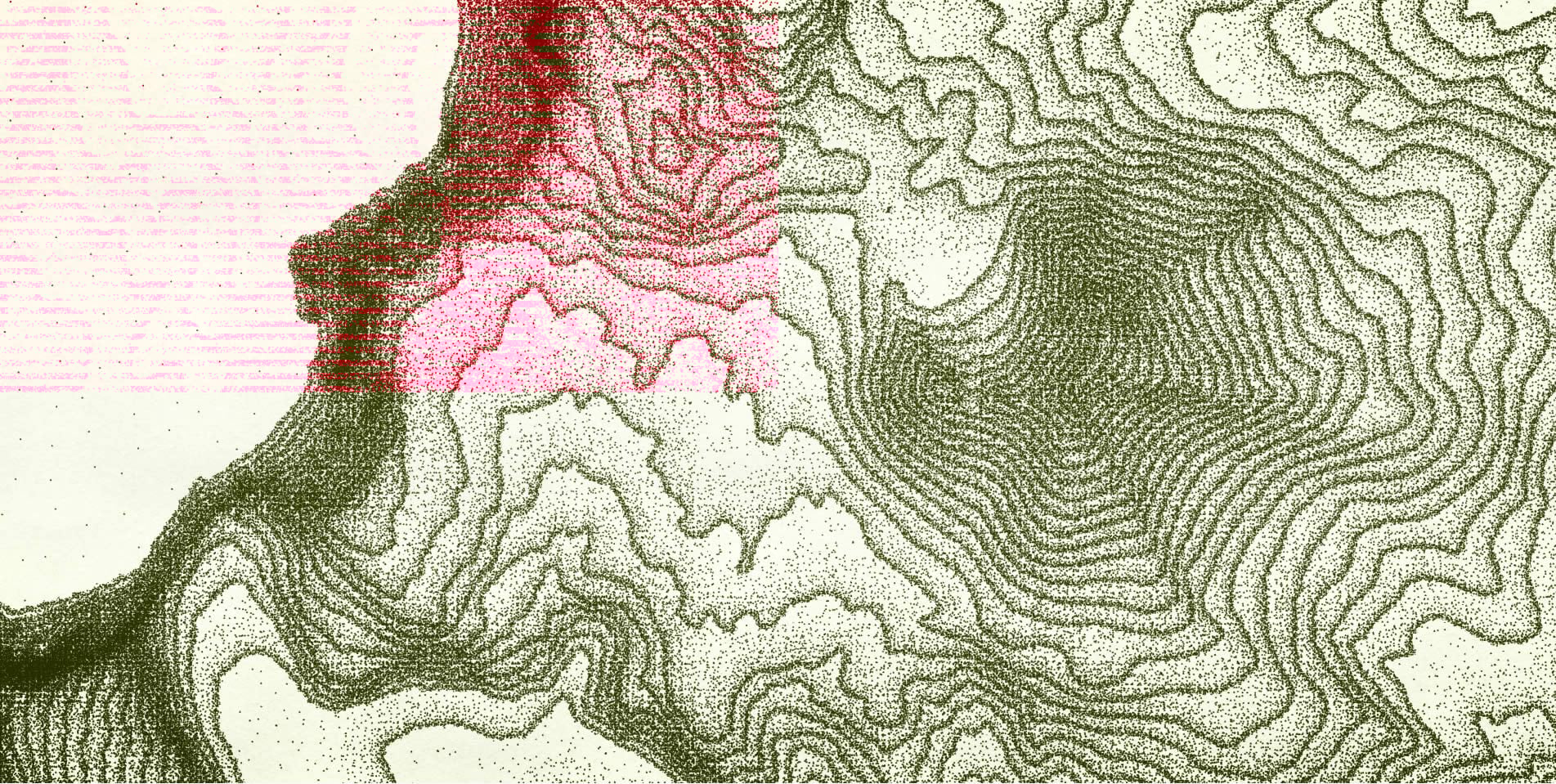
And because I’ve applied a style to digital data, I can zoom in for a closer look, this time with Pen and Ink labels.
That’s a pretty spartan map, though. What about something with a much higher feature density?
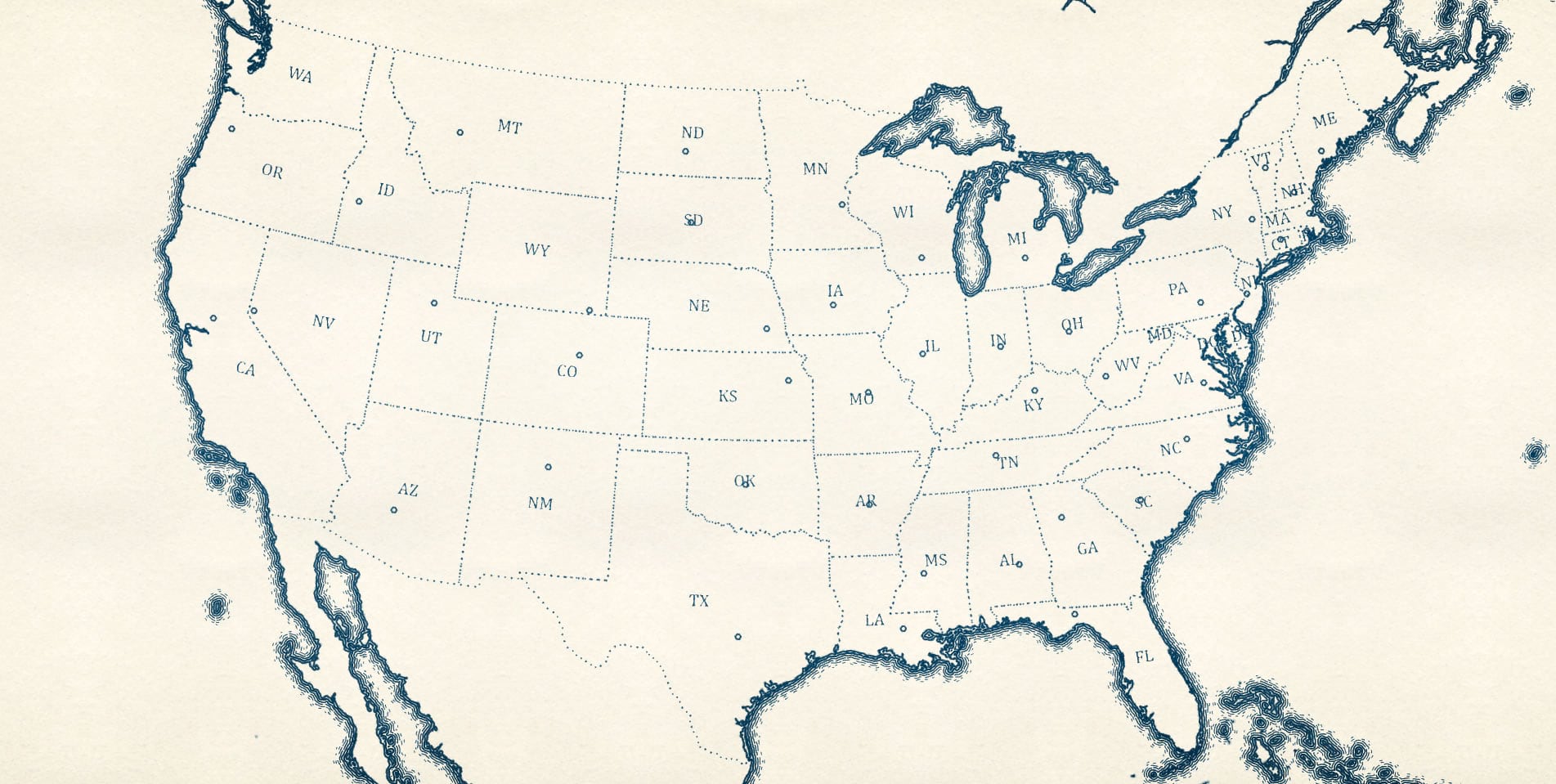
Here is a good old state map, using the “ripple” water fill symbol and some dashed boundaries.
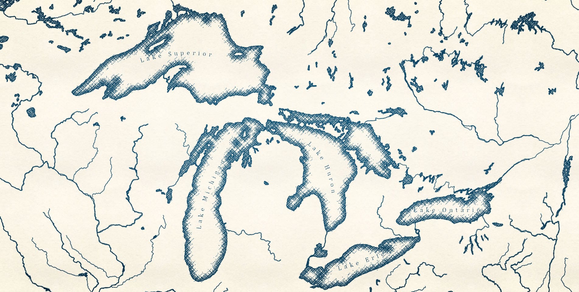
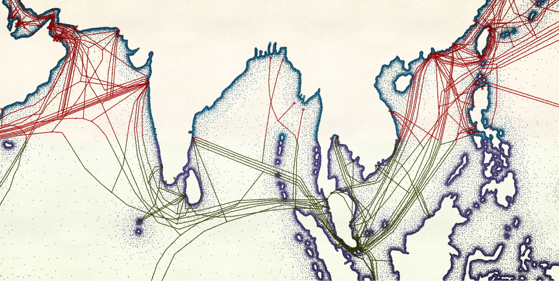
There are those handsome Great Lakes. Here is a map that zooms in on the inland sea, with a cross-hatched shade along the coast.
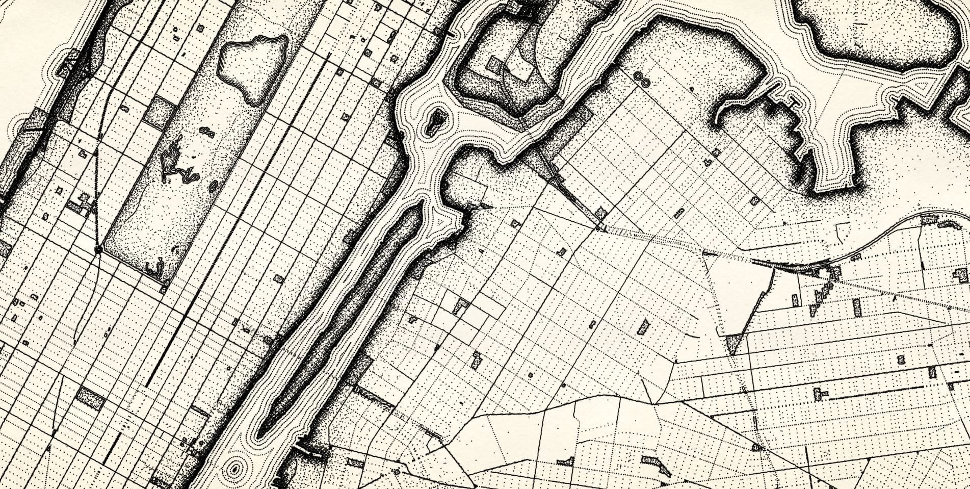
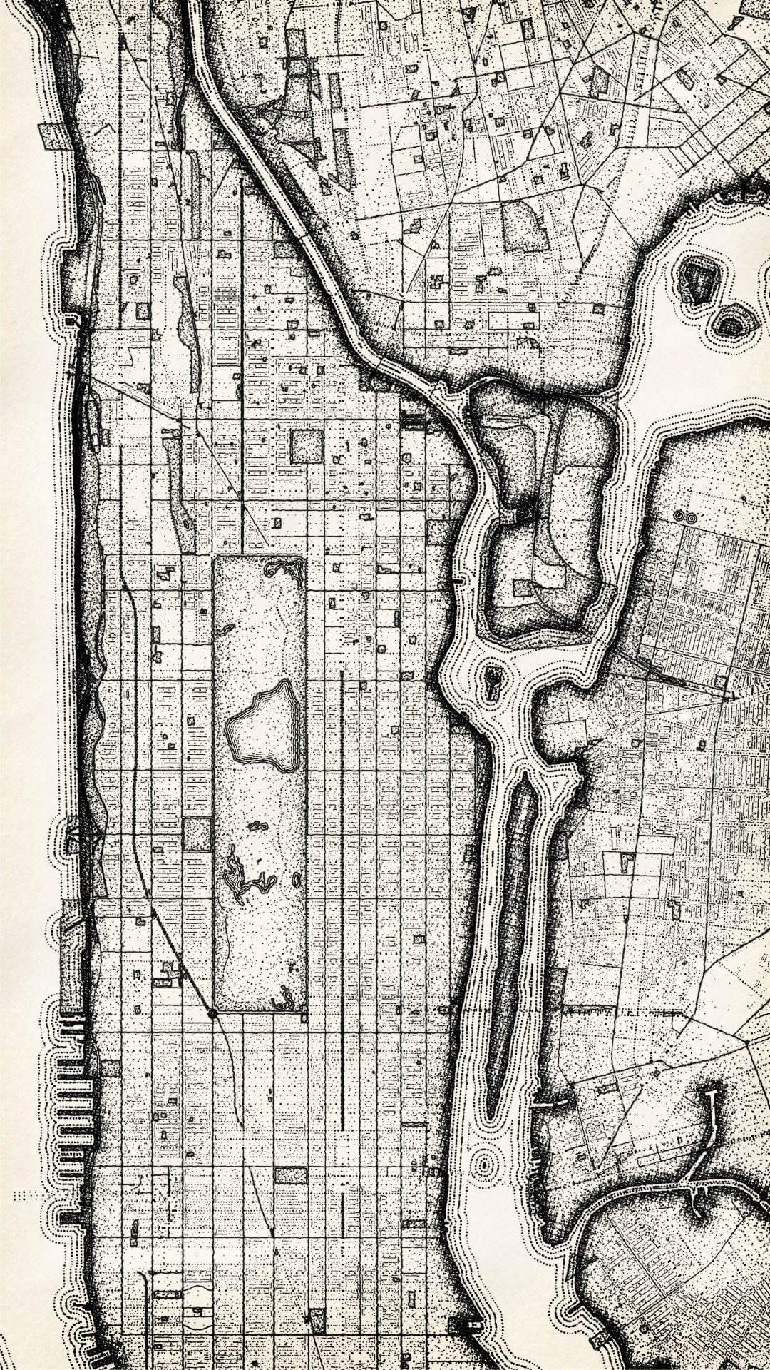
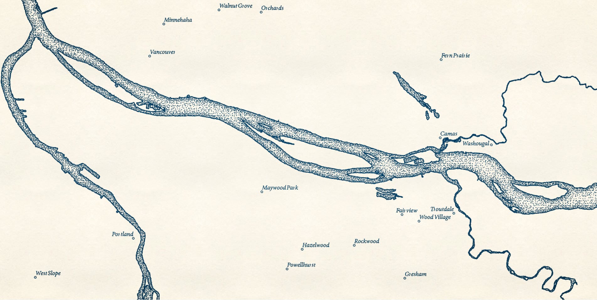
Speaking of water, here is a look at the Columbia River and surrounding towns.
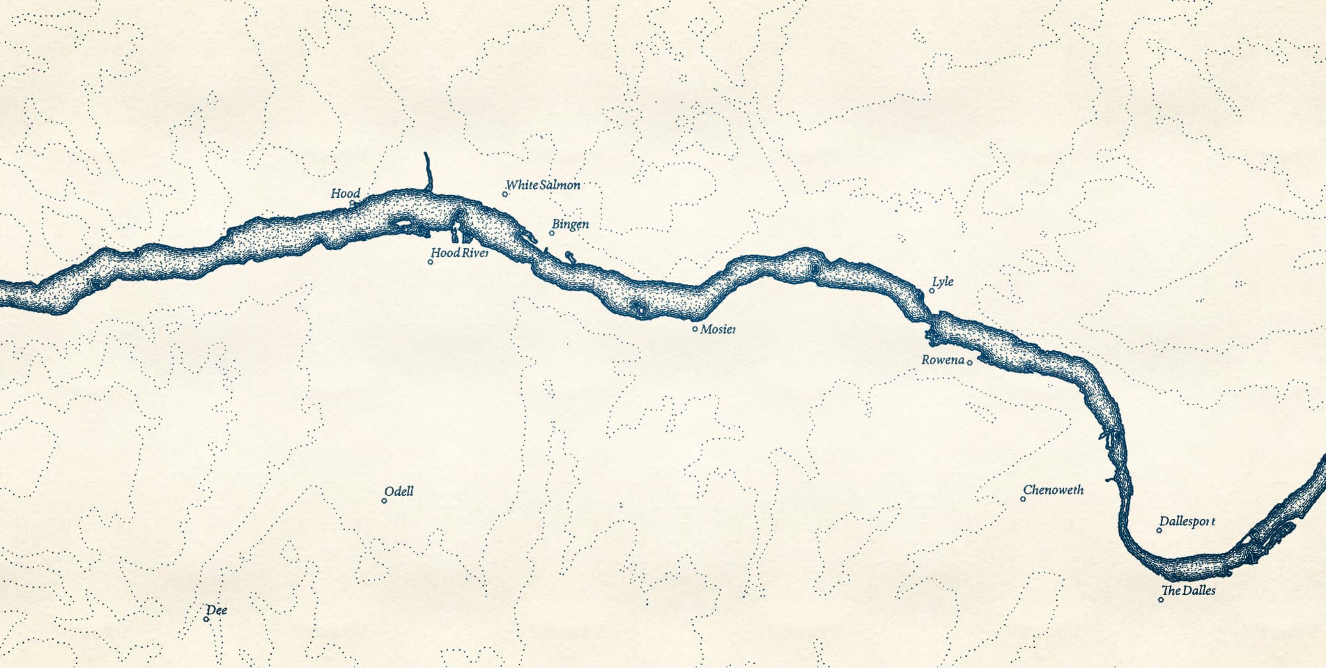
Here’s a version looking up river a bit to the beautiful Hood River area. I’ve added some contour lines generated by the contour tool.
Taking a big step back, here’s a look at the Indian Ocean (coasts drawn by Dylan Moriarty) and its undersea cables.
Lastly, here’s a look at the elevation contours of the eastern rim of Crater Lake. Easily one of the most beautiful places I’ve ever been. With a simple stipple symbol it gives me a real Maurice Sendak vibe.
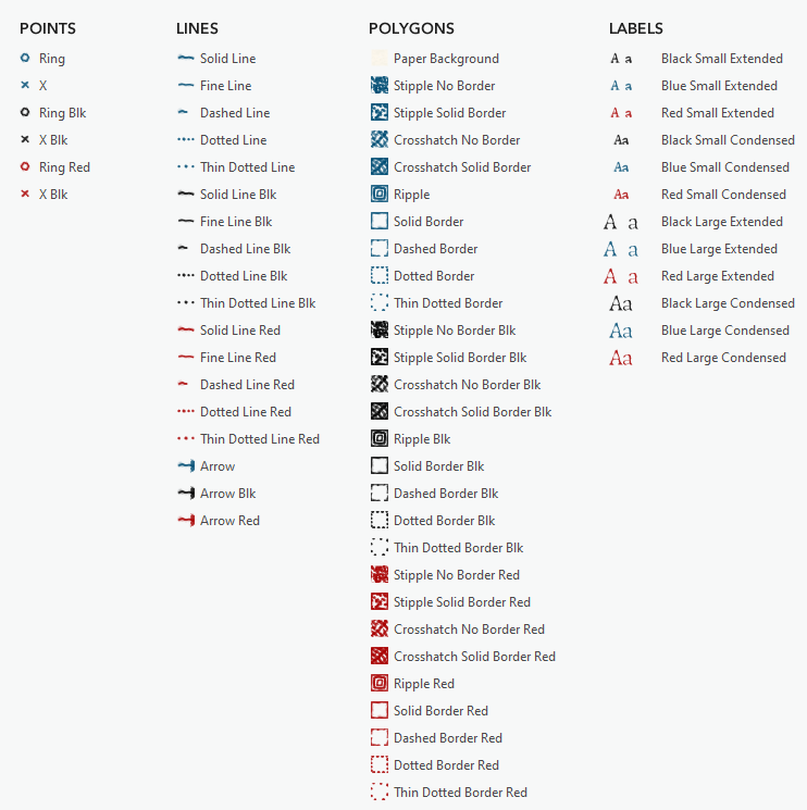
But the map I’m most excited to see is yours. I hope you download this Pen and Ink style and give it a try! Turn those vector maps into some inky goodness! Here’s a look at the symbols available in this style:
Happy stippling, John

Thanks John!
-rockrun
You bet, Patrick! I hope you try it out and share what you make. It’s a lot of fun.
Love it. Is there any way to do graduated stippling in this style?
Yes, for sure. That’s a good idea. I’ll update the style to include a handful of densities so you can use it for thematic mapping. Thanks Luke!
That’s beautiful! I remember using mylar and graphic pens to create stippling around my landscape architecture designs in graduate school….
Fun! It’s a charming effect. I’m making a how-to video right now walking through creating the effect in ArcGIS Pro. Will share that link soon.
Ok, here is a video about how to make the symbol and save it to the “Favorites” style. https://www.esri.com/arcgis-blog/products/arcgis-pro/mapping/how-to-create-the-pen-and-ink-stipple-effect-in-arcgispro-and-how-to-save-it-to-a-style/
Many thanks, John! I played a bit around to create a nice poster for my office:
https://blogs.sap.com/2020/05/19/download-your-sap-headquarter-geo-poster/
Very cool! Thanks for sharing Mathias.
Absolutely beautiful work, John! Thanks for the inspiration and the style file.
Thanks Wayne! Feel free to share out what you make with it. I’d love to see.
John, This style is way cool. I been trying to replicate some of them but now they are here. Do they publish to ArcGIS Online or are they already available in AGOL?
Thanks Michael! This style uses a couple symbol effects that don’t currently translate to the CSS symbology available in ArcGIS Online. But if you make a map using this style in ArcGIS Pro, you can publish it as raster tiles to have an online version of it. I haven’t tried that with this style yet, myself, but I believe it should work. Happy mapping!
Hi John,
Seriously fun stuff. Can you help me understand how you get the font effects to work? I’m able to substitute fonts and the effects continue to work, but I can’t figure out how duplicate or manipulate the cool wavy pseudo random distortions and shadows or whatever they are. Thanks!
Hi Matt! Thanks! Styles can include labels as well. It this style there are a handful of pre-made label styles that you can apply to your text in Pro. Here’s how: with a layer selected, turn on labeling. Then, in the label tab in the ribbon menu up top, you will see the set of pre-made label styles available from a list. You should see the set associated with this style (red, black, and blue labels in a couple sizes). Let me know if it’s still not clear and I’ll make a short video showing how.
Hi John, Thanks for the quick reply! Yep, I know how to apply the symbology to labels from the style. What I don’t get is how you created the pre-made label styles in the first place. The style gives each character a wobbly look and a subtle shadow with it’s own wobbliness (yes, that’s a word). I can go into the style in catalog and view all the properties for the style, but I don’t see tools and controls for manipulating these aspects of character display. Where’s the “Wobbliness” knob? The only thing I can figure is that it is… Read more »
Ahhhh, ok, yes now I get it. I’ll make a video walking through it and email you when it’s up. In the meantime, here is a tantalizing clue: https://www.esri.com/arcgis-blog/products/arcgis-pro/mapping/make-arcgis-pro-text-look-super-sweet/
Though this doesn’t go all the way through to adding a label to a style, it does show how you can use a polygon symbol for text (which is what I do to get the wobbliness). Thanks for the question, and the helpful prompt for a video. I’ll try to get it out tomorrow.
Happy Mapping!
Oh, I see. Yeah I suspected it had to do with the text polygon symbol. I can take it from here, thanks! Your blog on super-sweet text explains all. Wish I’d come across it before exposing my ignorance, sheesh…
One more question: When I try to apply the style on a label in an annotation feature class, it doesn’t seem to work. The label just disappears.
Edit: Figured it out. Need to first add the symbol to the symbol collection in the FC, then apply it. Cool.
Well, for posterity, here is a video: https://esriis-my.sharepoint.com/:v:/g/personal/john8409_esri_com/ETwrwjEreaVKmjba3i11sZ8BpZHpKzA_JCYi90pURCZk3A?e=uxFK01 But since you don’t need it, I made it for the “map like a Pro” series, which takes a bit longer to produce since it gets edited by professionals. Annotation is weird. Here’s how to get into the style of annotation. Right-click the annotation layer (nested between the group annotation and the individual class) and open the symbology panel. Choose “substitute symbols in collection”, then double-click into that preview row below it. That should drill you into the ability to format the symbol (the properties tab) or choose a polygon symbol from… Read more »
Awesome, I’m on my way, thanks for all your help John!