Setting the Stage (or Painting the Patio)
If you read my blog last week about trimming roses (and editing in ArcGIS Pro) you’ll be up to speed on my summer plans. As you can see, it’s crunch time to get some work done around the house before a full week at the User Conference and then visiting my wife’s side of the family in London. This weekend’s project was to touch up our sunbeaten patio. Here’s a before and after:

Looks pretty sweet if I do say so myself, and that was even before I applied the sealer.
If you read my blog about accessibility in ArcGIS Pro, you’ll also know that I have an unhealthy penchant for imagining how I might do everyday activities in ArcGIS Pro. This patio example was too easy – I obviously would use the Eyedropper tool!
In this blog series leading up to the User Conference, my goal has been to highlight key features from different parts of ArcGIS Pro. The other blogs cover the following areas: Tasks, Data Engineering, Accessibility, Layouts, and Editing. These are not exhaustive inventories of all ArcGIS Pro’s capabilities by any means; after all, there are literally hundreds of pages of help that document everything. Rather, these blogs touch upon a few key features to spark curiosity and then lead you to more resources. Think of them as an amuse-bouche to whet your appetite.
With so much mapping and visualization capability in ArcGIS Pro, I’ll admit this has been the hardest subject to pick only a handful of things to highlight, but here we go…
Key mapping features in ArcGIS Pro
Transparency
If you are coming from ArcMap, you’ll remember how transparency was applied at the layer level. Of course you can do that in ArcGIS Pro. It looks like this:
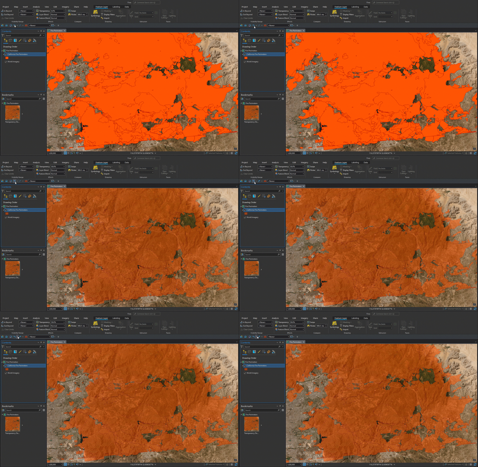
Compare that with setting transparency at the feature level. Note that separate levels of transparency can be set for the polygon fill and the polygon outline in this example:
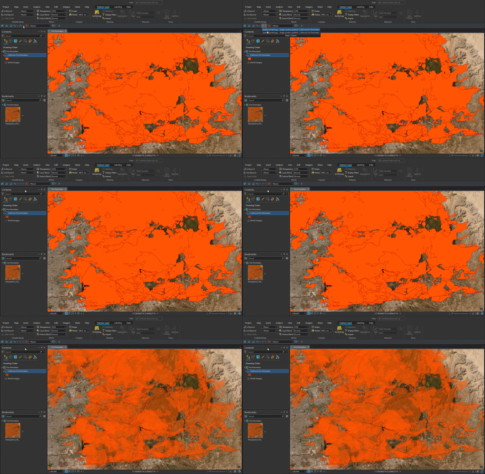
Each method of setting transparency can be useful. Experiment with both and see how you’ll get a very different result based on which one you use!
Layer Blending
It felt like a natural progression to move from color transparency to layer blending. Layer blending draws the entire layer and blends it with the content below it in the drawing order (the background). There are a number of different blend modes described in the apply layer blending help topic. Using the same overlapping fire perimeter layer from above, let’s see what the Color Burn (it’s fire data, I had to try this one) and Overlay blend modes do.
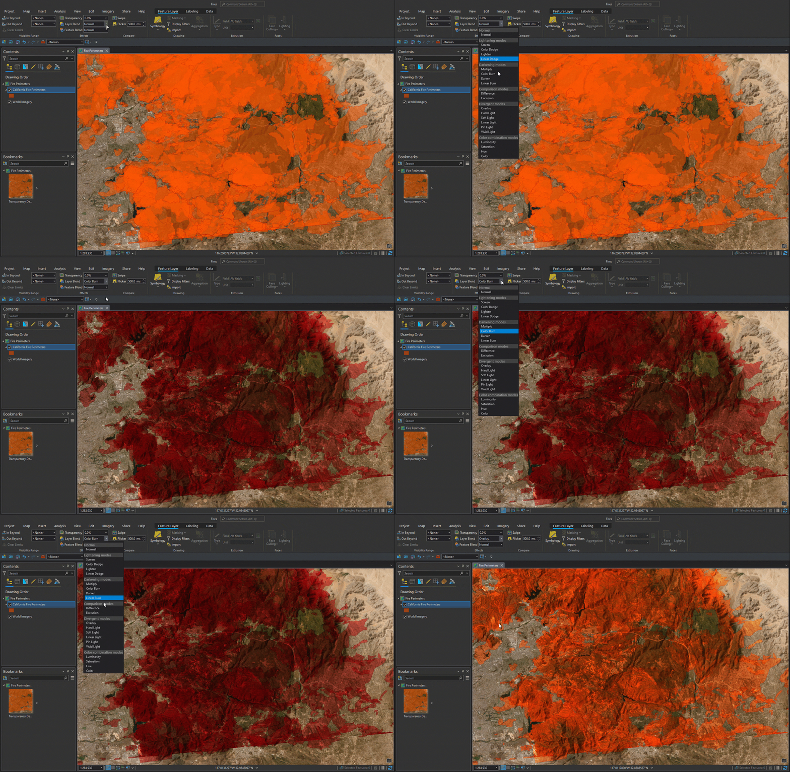
Layer blending takes your visualizations to the next level. For a masterclass in blend mode effects, check out Blend mode helper by John Nelson.
Color Management and PANTONE® Colors
Continuing along the color spectrum towards the professional, production end of the scale, ArcGIS Pro allows you to enable color management. Color management in ArcGIS Pro ensures that the colors you use in your maps, scenes, and layouts appear consistently across devices: for instance, on a different monitor, when exported to a PDF, or printed. Without color management, the devices that display your work do their best to approximate your chosen colors, but getting faithful color matching is unlikely.
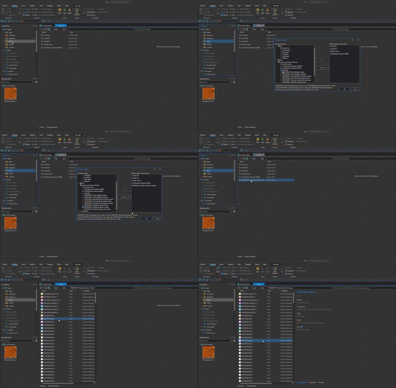
And if you need to use PANTONE® colors, ArcGIS Pro has you covered there as well with built-in Pantone system styles. To add a Pantone style to your project, right-click Styles > Add > Add System Style, and check the styles you need.
Feature Aggregation
I warned you that it would be hard to choose highlights for mapping and visualization in ArcGIS Pro – we’ve only looked at color so far. But I want to shift gears and surface some great functionality that is only getting more important as the data we work with gets bigger and bigger – visualizing features through aggregation.
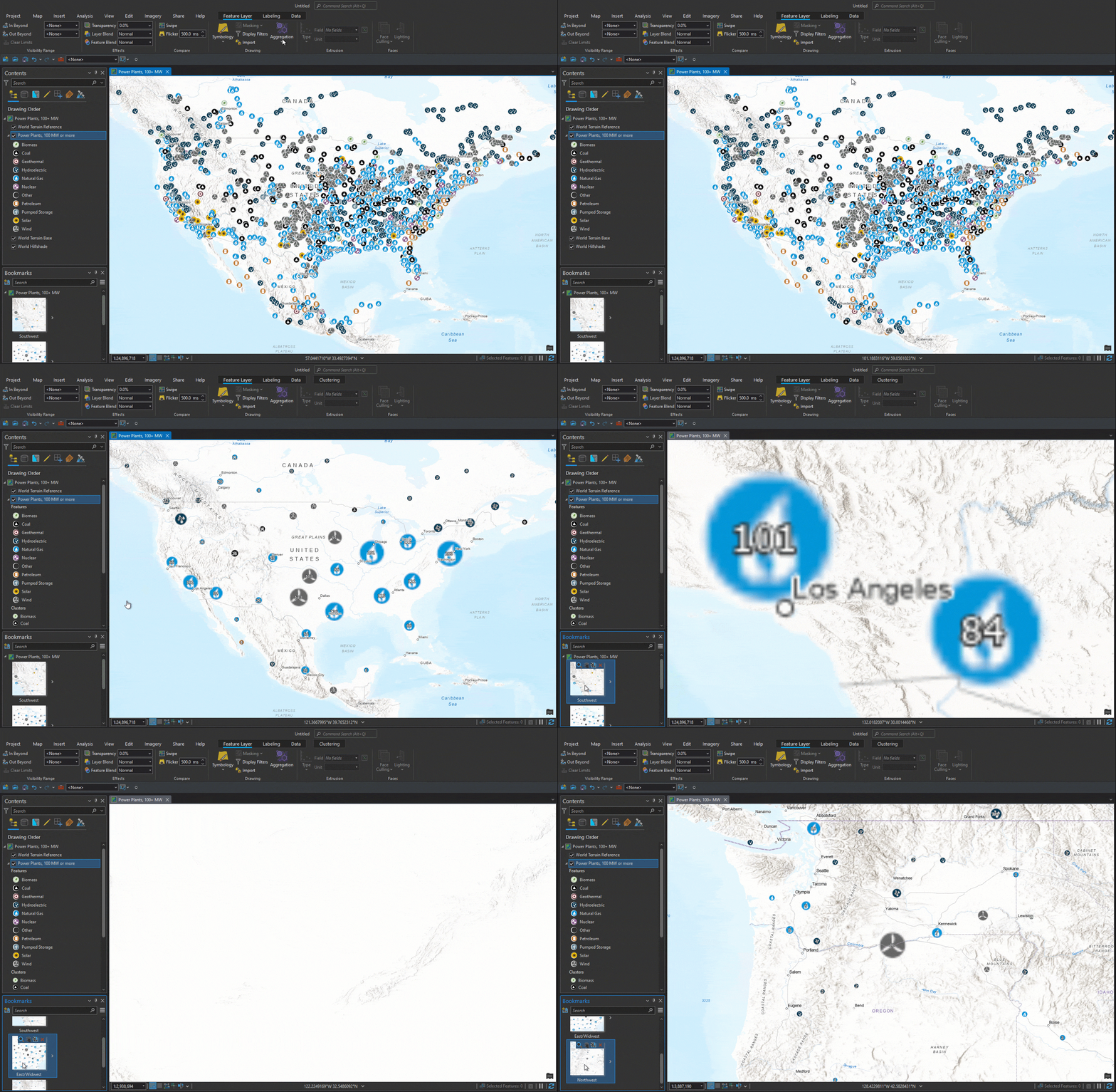
We’ve probably all seen maps that are just a blanket of overlapping points, obscuring any reference information that lies beneath, and ultimately difficult from which to derive any meaningful insight. Enter aggregation. As pointed out in that help link above, ArcGIS Pro offers different ways to aggregate data that meet different needs. These include aggregating features into bins, aggregating features into clusters, and aggregating values into related features. Each serves a purpose and you can explore those further depending on your data setup and your goals. Here we’ll show a quick demo of feature clustering using a Power Plants – 100 MW or more layer from the Living Atlas.
This layer contains 2,266 features, which isn’t even big data, but depending on the scale at which you’re viewing it, see how hard it is to glean much information other than, wow, I didn’t know there were that many power plants! By enabling dynamic point clustering, we are immediately able to explore patterns in a more meaningful way.
ArcGIS Pro Mapping & Visualization at the User Conference
If you are attending the User Conference in July and are interested in learning more, plan on attending one or more of the following:
ArcGIS Pro: Mapping and Visualization
ArcGIS Pro: Visualization Using Clustering and Feature Binning
ArcGIS Pro: Working with Temporal Data Across GIS
ArcGIS Pro: Voxel Visualization
If you’re particularly interested in some awesome new functionality coming to ArcGIS Pro later this year, don’t miss ArcGIS Pro: The Road Ahead.
Or come visit us in the ArcGIS Pro showcase area. There are a number of kiosks related to mapping and visualization. Use this UC map to find the following:
Cartography & Symbology
Labeling & Annotation
Animation, Time, & Range
Desktop Visualization
Scene Layers
Voxels
For ArcMap Users
Most of what I’ve touched upon here is functionality that was not available in ArcMap. Remember that ArcGIS 10.8.2 is the current release of ArcGIS Desktop and will enter Mature Support in March 2024. There are no plans to release an ArcGIS Desktop 10.9, and it is recommended that you migrate to ArcGIS Pro. See Migrate from ArcMap to ArcGIS Pro for more information.
I really appreciate the streamlined interface ArcGIS Pro presents. There is some learning curve to move away from ArcMap but now I cannot imagine going back.
Banner photo by Pawel Czerwinski on Unsplash



‘…later this year…’?!? When later?
Hi Branislav. ArcGIS Pro 3.2 is scheduled to be available in the October/November timeframe.