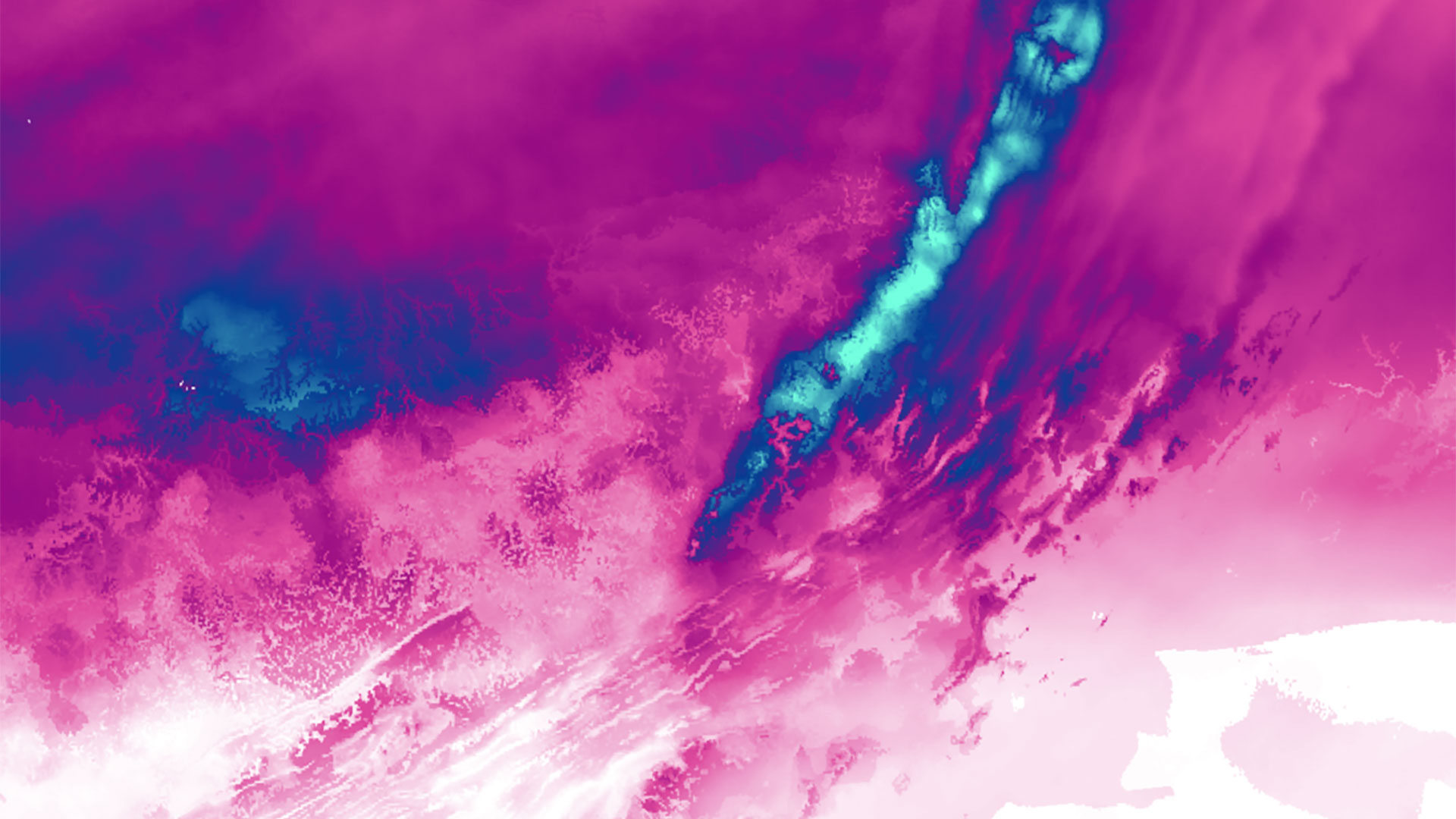
A few weeks ago, I did a little mapping hack. I knew I wanted to map a future snowstorm, but I didn’t want to wait until it happened to find a data source, pick colors, set up base data, etc. So, I made a map using the same data source but a totally different geography to test out my data processing and design decisions.
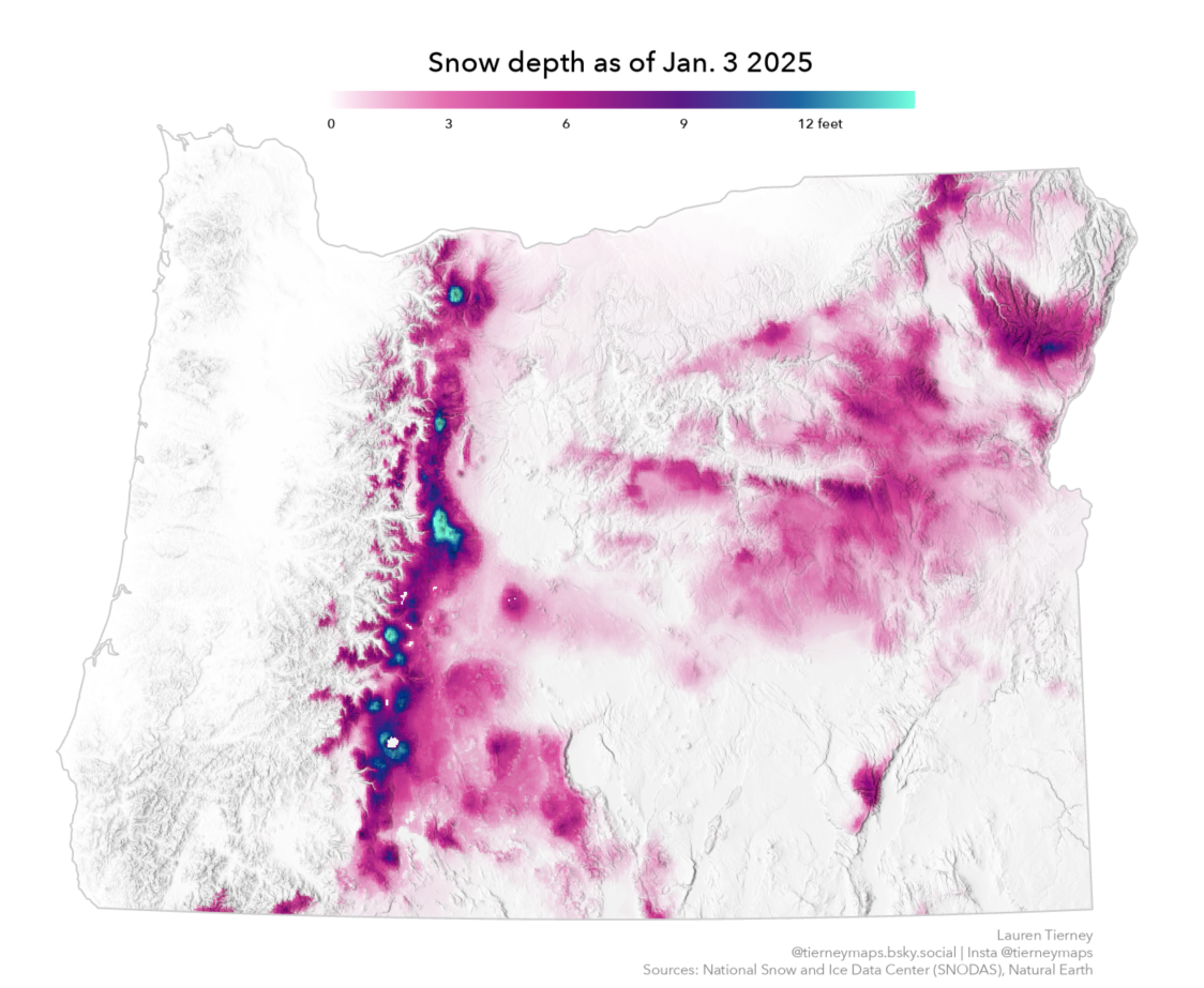
I could have waited until the day of the actual storm to find, download, process, and learn what data I wanted to use. But the nice thing about mapping snow is that there is always data available, and it is updated frequently. Plus, when you can do some mapping prep, it can really help when you want (or need) to make a map quickly.
I had two goals with this ‘test’ map developed using ArcGIS Pro:
- Learn how to process Snow Data Assimilation System (SNODAS) data.
- Develop a custom color ramp to visualize snowfall depth.
Working with the data
First, I re-acquainted myself with SNODAS data products. These products are found at the National Oceanic and Atmospheric Administration (NOAA) National Weather Service’s National Operational Hydrologic Remote Sensing Center (NOHRSC). This data product has a robust collection of snow pack properties, detailed in this very helpful user guide.
Building a custom color ramp
Second, I tested out a lot of different color ramps in ArcGIS Pro. There are many amazing color scheme ramps included, but I love building custom color ramps, so I did some experimentation.

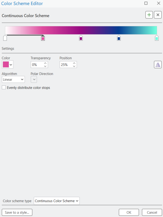
The first one I made, ‘snowfall1’, was a starting point for the colors I wanted to use. Pink/magenta for less snow and cooler blue tones for more snow. But too much of this ramp was pink/magenta, making it difficult to differentiate snow depths.
I added more blue to the second half of the ramp for ‘snowfall2’, but the blues I used did not smoothly transition from navy blue to sea green.
The ramp I ended up using for my maps, ‘snowfall3’, addressed the issues with the first two color schemes I made. Less of the ramp was in the pink/magenta hue, and there is also a smoother transition from navy blue to sea green.
Customizing my legend
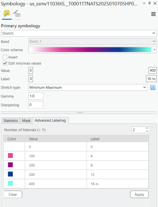
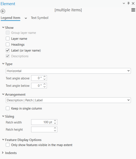
I was also able to experiment with the type of legend I wanted for my map. SNODAS snow depth is measured in millimeters, but for a U.S. audience, I wanted to make a legend in feet/inches. Adjusting both legend item settings and advanced labeling for my symbology, I could design a horizontal legend with labels in inches.
The final map
By making a test map, I was able to make a new snow map of a different geography very quickly. The below map of snow across the Midwest and Mid-Atlantic, only took 30 minutes to make.
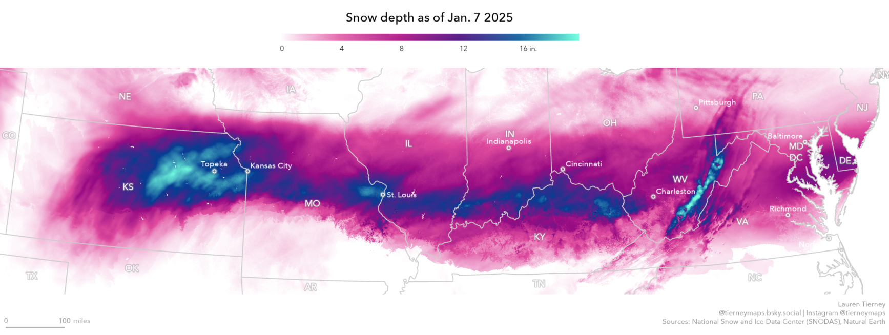
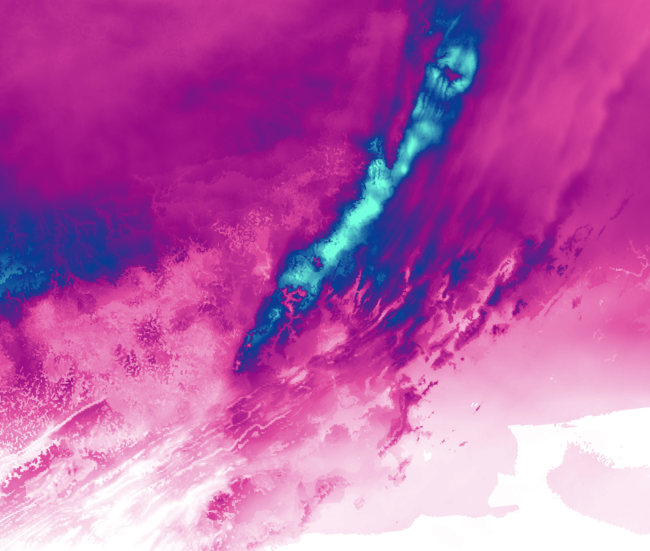
Ok. Maybe 45 minutes because I was busy exploring the beauty of the data. 😊 The patterns in the data show mountain ranges and hills, and the final colors help differentiate low and high snow depth.



Article Discussion: