Dynamic feature clustering – the ability to visualize point features in cluster symbols – has been added to ArcGIS Pro as of version 2.9. After installing or updating ArcGIS Pro to version 2.9 or later, this new way to map your point features becomes available. We hear from many of you wanting this feature in ArcGIS Pro via the Esri Community forums and ArcGIS Ideas – Thank you to everyone who indicated their needs.
It’s new in the relative sense: the concept is familiar, and is certainly helpful. Alongside dynamic feature binning, you now have an additional way to dynamically aggregate point features.
Feature clustering works on layers with point features. Specific to clustering, the layer does not need to be stored in an enterprise database. The main requirement is that the features must be point features.
If you haven’t had the opportunity to aggregate features with ArcGIS Pro, version 2.9 is the perfect time to try it out! Are you ready for a tour?
Clustering point features
Start by adding point feature data to a map. Then, select the layer you added in the Contents pane. After that, in the ribbon, click the Appearance tab, and click the Aggregation drop-down button.
There are three options to choose from; select Clustering. (Binning is only available to use if you have an enterprise database setup – read more about this here.)
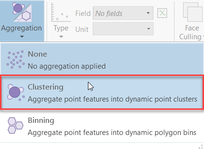
After clicking the Clustering option, it redraws your layer into clusters and adds a Clustering tab to ArcGIS Pro’s ribbon.
Open and view the Symbology pane. Underneath the title of the pane, you’ll see two tabs: Features and Clusters. Clustered feature layers have two types of symbology: one for clusters, and one for features when they aren’t clustered.
In the Contents pane, legends for features and clusters are separate. Most importantly, on the map itself, your point layer is clustered – with text values! But what do the text values mean?
Our goal is to make it simple to aggregate features dynamically and allow as much symbology customization as possible. Depending on the kind of symbology you use, cluster symbols will dynamically change size, value, or color.
The cluster text’s values are no different. The values you see on the clusters depend on the kind of data you are working with. In most cases, it is the total number of features in that cluster. In the practical example below, you’ll see a different behavior – but we’ll get to that in a moment.
Zoom or pan around the map view to see when and how your clusters change. You can still control the design of the symbols, but you should expect dynamic changes whenever the view or scale of the map is changed.
A Practical Example
Let’s get inspired and work together on a quick example. We’re headed to Madison, Wisconsin – where I found street-side tree data for the entire city via ArcGIS Hub. There are hundreds of tree species in this data, so I consolidated them to 68 unique classes – but you can work with the data the way it is out-of-the-box, as well. Anyway, the total number of records in this dataset for a city this size is over 110,000. This makes it a prime candidate for feature clustering.
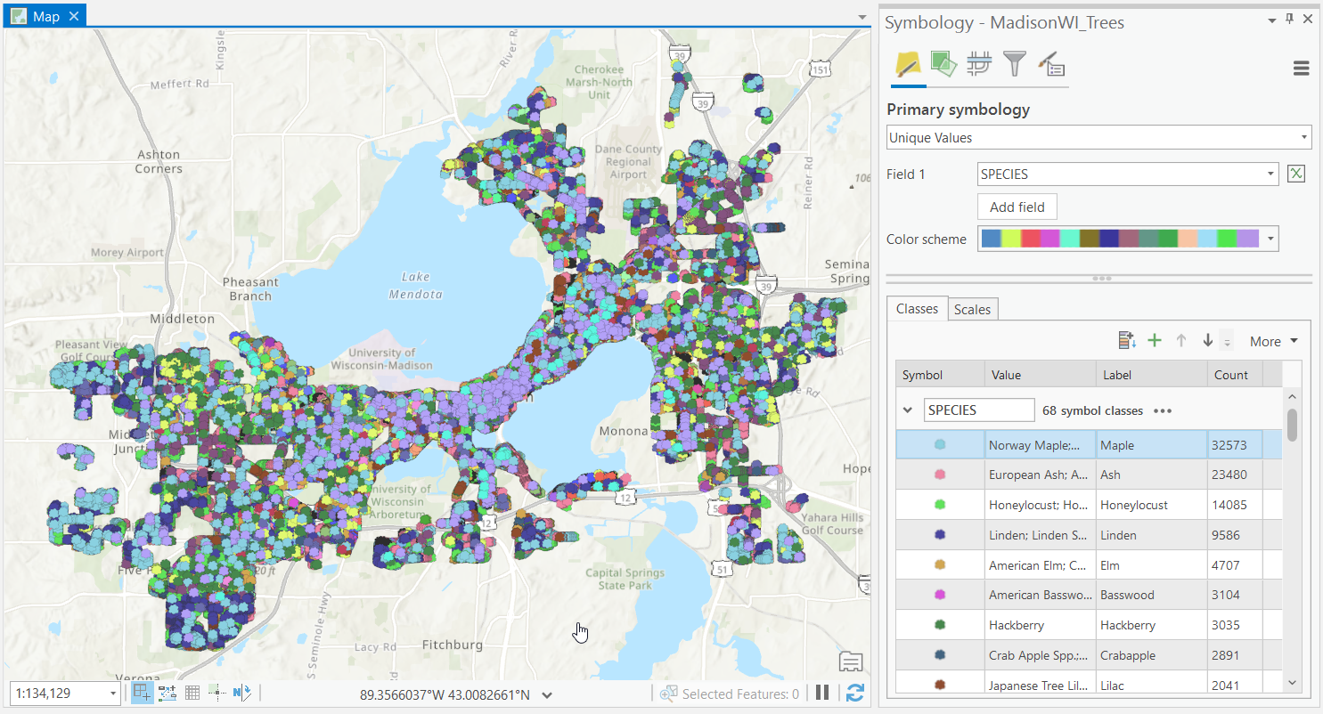
Because we’re symbolizing the data with unique values, each tree species has its own unique color. A lot of good that does us, though. We can’t discern anything from this map. So, let’s cluster the points!
When I choose to cluster the feature layer, the clusters are proportionally sized for the map’s scale. But something else interesting also happens. Because clustering supports unique value symbology, the text values on the clusters display the total number of records… but the color of the cluster’s symbol is the mode! That sort of dynamism gives me the answer to questions I hadn’t even thought of asking.
The map shows that Ash trees are the predominant species in downtown Madison (the center of the map between the two big lakes), while Maple trees prevail in the urban residential districts. Linden and Honeylocust trees triumph in the outer suburban districts. I can find out which species is the mode by clicking the cluster to view its pop-up.
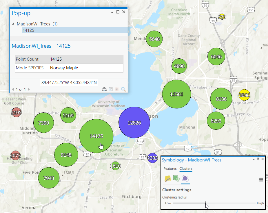
The map’s scale proportionally sizes the clusters. Size controls are found on the Clusters sub-heading of the Symbology pane, on the Vary symbology by attribute tab, under Size. In the graphic above I also included a snapshot of the Clustering radius. But what is the clustering radius, and how can you use it?
Clustering radius
Go to the Symbology pane and click the Clusters sub-heading, and then click the Clustering settings tab. Try adjusting the Clustering radius slider – in simplest terms, this is the distance at which features are aggregated into a cluster. It can be increased or decreased to allow for fewer or more clusters in the map. Right now, I’m a little left of center, so when I “lower” it, the map’s number of clusters increases. I’ve included the exact setting in the picture above and below so you can view the difference.
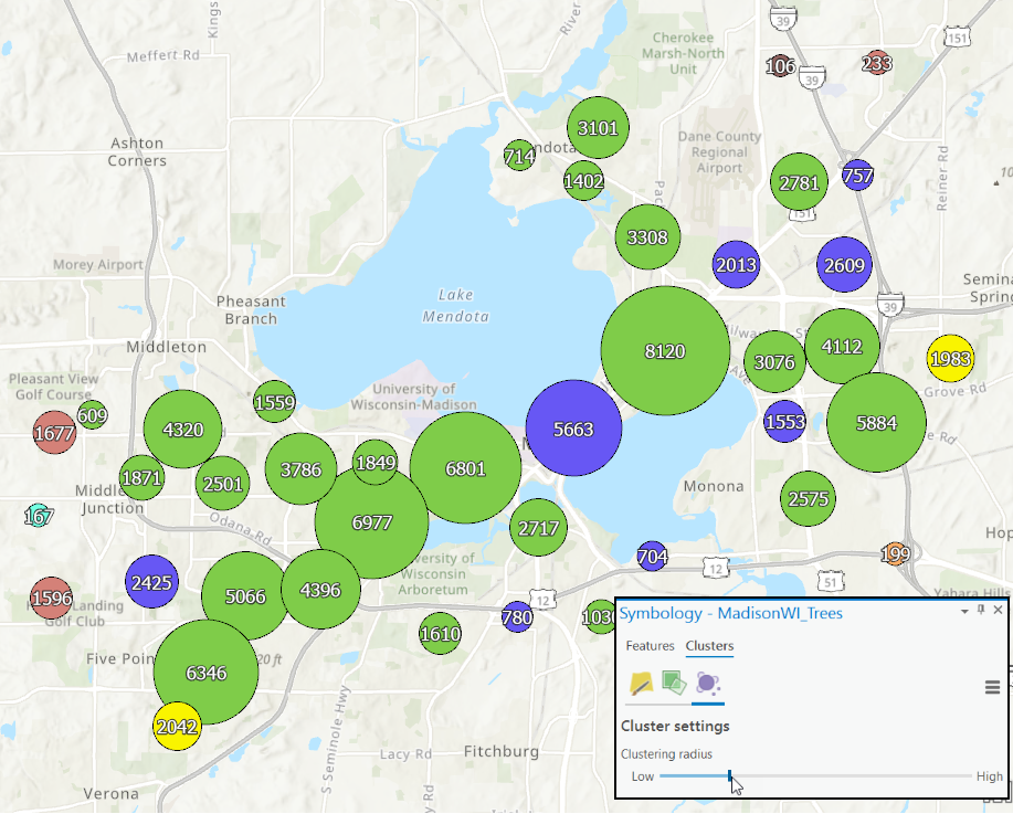
My recommendation is that you go with a higher radius when you have several known groups of close-together point features, and a lower radius when the data are more evenly distributed.
But what if we need a different statistic – something other than total point count? No problem: we can create a different summary statistic from a field in the data and symbolize that instead.
Building Summary Statistics
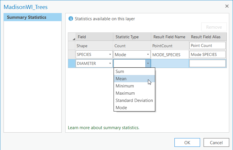
Perhaps we’re interested in the average diameter of the tree and want the size of the symbol to correspondingly grow or shrink based on that information. From ArcGIS Pro’s ribbon, under Clustering, click the Summary Statistics button.

Then, design a summary statistic field (instructions on how to do this can be found here.)
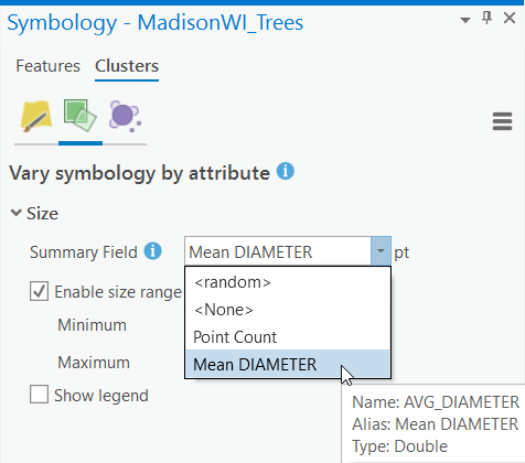
Finally, under the Vary symbology by attribute tab, change the cluster’s size using the mean diameter. This automatically updates the cluster’s text, as well.
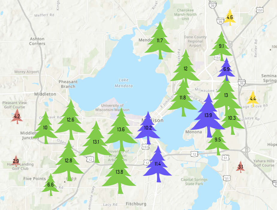
Back on the Clustering settings tab, I need to write a custom expression for the cluster text to round the value to the nearest tenth (the formula is “Round($feature.AVG_DIAMETER, 1)” if you’re curious).
Lastly, I play around with the clustering radius a little more and change the style of the text to avoid the symbol boundaries for smaller radiuses as much. And, most importantly – I chose a tree symbol for this tree-centric data. It’s only natural!
As one may expect, trees in the suburban areas are smaller in diameter since they are likelier to be younger trees. Many of the largest trees are near the University of Wisconsin Arboretum, an ecological preserve.
Conclusion
This brief tour of dynamic feature clustering only scratches the surface of the capabilities available. There are a variety of other clustering features available that you can read about here, if you’re intrigued.
Go ahead: give clustering a try! You may learn something new about your data, and we look forward to seeing some amazing maps that use clustering.
Thank you for your time and see you on the next blog!

Article Discussion: