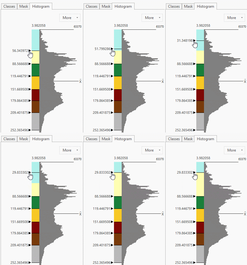
In terms of raster symbology, one of the most requested enhancements we have received was to show the histogram view with your class breaks (similar to the capability in ArcMap). In ArcGIS Pro 2.5, we have checked that off our equivalency list. You can now see a histogram distribution within the Classify symbology.
Because Pro uses a pane to access your user Symbology interface, we display a vertical (sideways) histogram, so that it has the same look and feel as the Graduated Colors symbology. Our histogram shows 100 bins (gray bars that show frequency), so that you have a finer view of the distribution. Not only can you see how your data is distributed, you can also use this to help set your manual class breaks.

Default methods
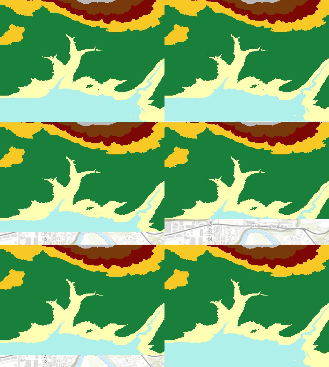
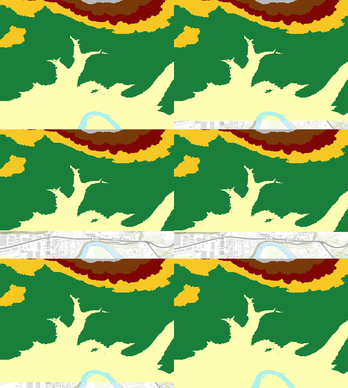
For instance, the elevation dataset has 8 class breaks using the Natural Breaks method. If we take a closer look at the rivers (blue areas), we see that particular class is also covering land features.

Manually customizing your classes
Looking at the histogram distribution, we can adjust the blue river class to another naturally grouped area of pixels. To do this, drag the class break to a position in the lower range of the data, where the frequency displays a natural break (as the first GIF demonstrates).
Now the classes appear to better capture the river. Seeing the various patterns and breaks in the distribution does not always mean that our data will fit certain landforms or elevations, but it gives us clues as to where the data is clustered. This enables us to help us manually set our own class breaks based on the features we would like to highlight.

For more information about the histogram for the Classify symbology, see Modify class breaks with a histogram.
Article Discussion: