We feel thrilled to announce that the Time Series Cross Correlation tool is released in ArcGIS Pro 3.3! This tool calculates the correlation between two time series stored in a space-time cube across time. This tool helps us to identify whether 1. the two time series are correlated 2. they are positively correlated or negatively correlated, 3. there is a time delay between the two time series, and how long the delay is.
The concept of this tool is straightforward. The Primary Variable and Secondary Variable represent the two time series that will be compared. This tool shifts the secondary variable in time and calculates a Pearson correlation by pairing the corresponding values of each time series after the shift. This shifting and calculation repeats up to the specified maximum number of time lags. For example, if you set the maximum time lag to 2, the tool will shift the secondary variable one time step and calculate the correlation. It will then shift the secondary variable two time steps and calculate the correlation. Therefore, this gives you the correlation of the two time series at the time lag 1, and the correlation at the time lag 2.
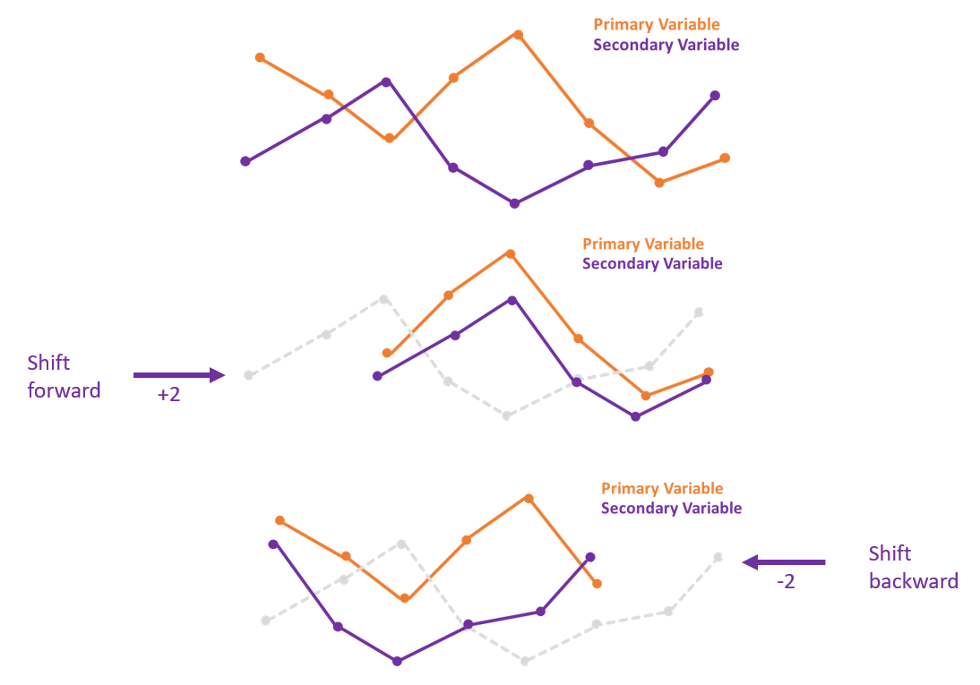
By default, the secondary time series is shifted in both directions. If you assume that the primary variable lags behind the secondary variable, choosing to shift the secondary variable forward only is more appropriate. On the other hand, if you assume the primary variable leads the secondary variable, you should choose to shift the secondary variable backward only. (Fig. 1) As the image is shown below, the sign of a time lag value represents the time lag direction. When the highest correlation value corresponds to a time lag value of +2, it means that the primary variable lags behind the secondary variable 2 time steps, while when the highest correlation value corresponds to a time lag value of -2, it indicates that the change in the primary variable occurs 2 time steps before the secondary variable.
This tool can be used as an exploratory tool if you only care about the strength of the correlation between the two time series at a specific time lag. However, the correlation might result from the underlying trend, seasonality, and autocorrelation. Therefore, if the goal is to estimate the optimal time lag between the two variables, this tool also allows us to remove all the underlying structures before the calculation.
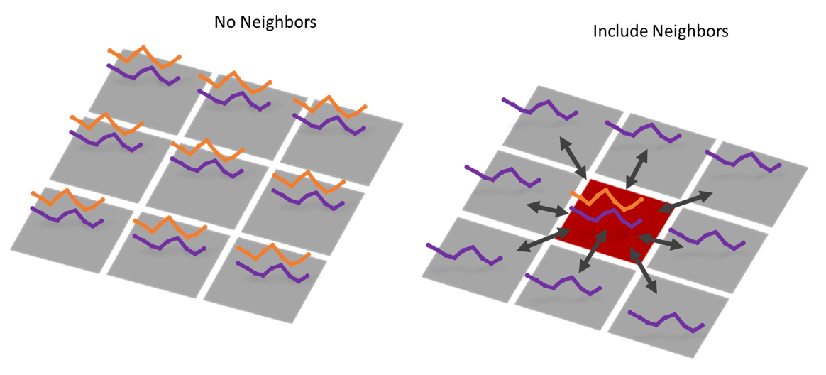
In addition, this tool has the capability to incorporate spatial neighbors. When including neighbors, it calculates the correlation between the Primary Variable at the focal feature and the Secondary Variable at each of its neighbors. In the image on the right side (Fig. 2), the location in red is the focal feature, and it has nine neighbors including itself. Therefore, the cross correlation of the focal location for a given time lag will be a weighted average among the nine correlation values (eight neighbors and itself). We can also choose to save the Output Pairwise Correlations Table, which exports the pairwise correlations between each location and each neighbor at all time lags. By including neighbors in the calculation, you may improve the estimate of the correlation or even detect the dispersion process.
The rest of this blog article will demonstrate three problems that can be tackled by the Time Series Cross Correlation tool.
- Is the seasonal pattern of temperature correlated with the seasonal pattern of precipitation? How do their correlations vary across space and time?
- When a surge of COVID-19 cases occurs, how long does it take before a surge in deaths occur?
- When a hurricane occurs, how does the runoff disperse?
Data used in this Blog Article
- Monthly mean temperature and monthly mean precipitation from Dec 1997 to Nov 2017 across the US. The original multidimensional raster data is provided by NOAA (National Oceanic and Atmospheric Administration). The multidimensional raster data was converted into a space time cube by the Create Space Time Cube From Multidimensional Raster Layer Please read this blog for further information on how to convert raster data into a space time cube.
- Weekly number of Covid-19 cases and deaths by state in the US in 2020. The original data is in CSV format provided by CDC (Centers for Disease Control and Prevention) at here. The CSV file was converted into a space time cube by the Create Space Time Cube from Defined Locations tool.
- Runoff values per three hours in Louisiana, Mississippi, and part of Arkansas from Aug 23 2005 to Aug 31 2005 (under the impact of Hurricane Katrina). The original multidimensional raster is provided by NOAA, and was converted into a space time cube by the Create Space Time Cube From Multidimensional Raster Layer tool.
1. How are the seasonal patterns in temperature correlated with the seasonal pattern in precipitation?
We may have learned the characteristics of climate zones in the geography class. Temperature pattern and precipitation patterns should be correlated to some degree, but there might be a time delay. For example, precipitation tends to be concentrated during the summertime in the Tropical Climate, while precipitation is concentrated mostly during the wintertime in the Dry Summer Climate. Therefore, it brings up a question: how are they correlated in terms of space and time? Can we visualize the relationships on the map? This section will show you how the Time Series Cross Correlation tool can help us to answer this question.
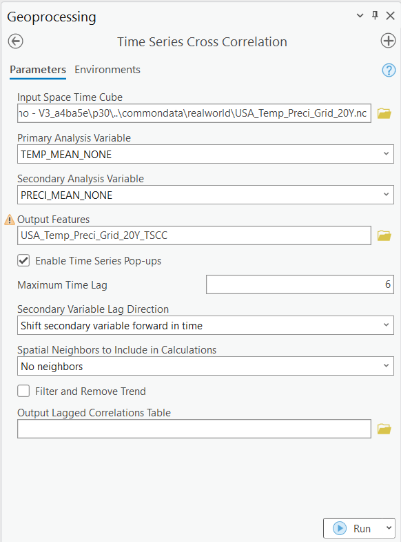
The tool is configured as shown in the image below (Fig. 3). The Input Space Time Cube is the cube that contains the Primary Variable and the Secondary Variable that we are analyzing. I select temperature as the Primary Variable and precipitation as the Secondary Variable. Maximum Time Lag is set to 6, and the Secondary Variable Lag Direction is set as Shift secondary variable forward in time. It means that the time series representing precipitation is shifted forward 1 month, 2 months, 3 months up to 6 months, and the correlation value at each of these six time lags will be calculated.
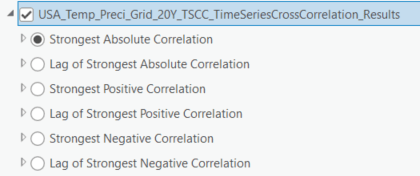
The output of this tool is a group layer which shows us the Strongest Absolute Correlation, the Strongest Positive Correlation, the Strongest Negative Correlation, and their associated time lags (Fig. 4).
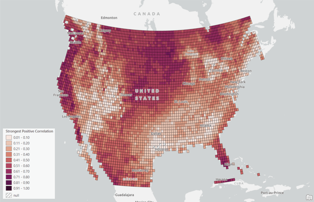
We will investigate the layer of the Strongest Positive Correlation since we are more care about the positive correlation (Fig. 5). The Strongest Positive Correlation is the largest correlation value between two variables among all time lags. Therefore, locations in lighter shades mean that the temperature and precipitation do not significantly correlate with each other at any time lag. You might notice that those regions are mostly within the Mountain West and the South. The reason might be that the temperature there has a strong annual seasonal pattern while precipitation does not. On the other hand, locations in darker red indicate that the temperature and precipitation strongly correlate even though they do not align in time.
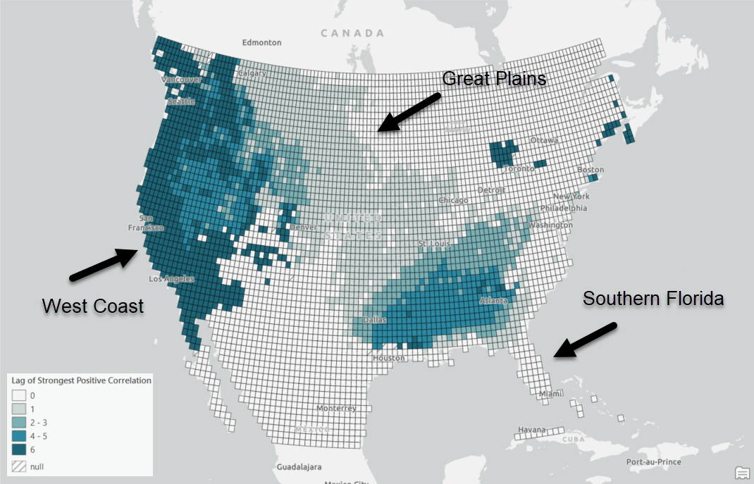
We can then check the Lag of Strongest Positive Correlation layer to see how well the two variables align in time (Fig. 6). The locations in lighter blue mean the two variables align better in time. For example, temperature and precipitation in the Great Plains and Southern Florida align well since these regions are in beige or light blue in Fig 6. However, these two variables do not align well in the West Coast since the region is in dark blue.
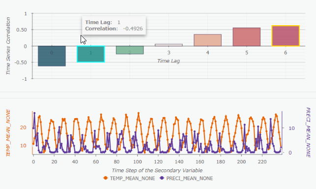
The temporal patterns on the West Coast can be further explored by the pop-up charts (Fig. 7). When you click a feature on the map, there will be two charts that are interactive in a pop-up. The line chart on the button shows the two time series we are examining. The bar chart on the top shows the correlation value at each time lag. When hovering over lag 1 on the bar chart, precipitation in the line chart is shifted forward 1 month (Fig. 7); when hovering over lag 4, precipitation is shifted forward 4 months.
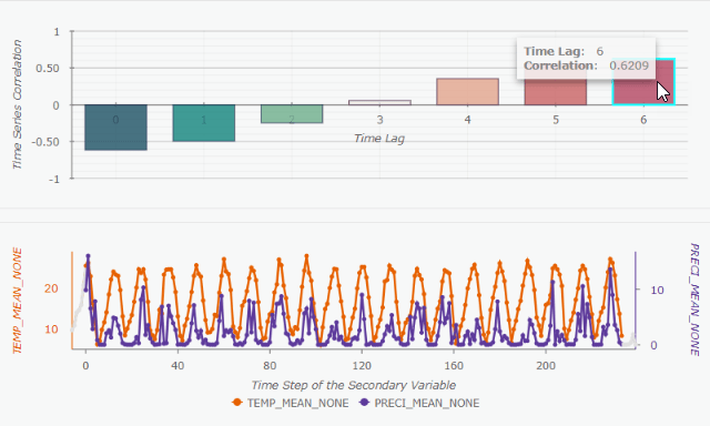
We can see these two time series highly correlate at a time lag 6 (Fig. 8), which indicates that the seasonal pattern of temperature does not match the pattern of precipitation by 6 months. This makes sense because on the West Coast, we have more rain in the Winter and less rain in the Summer. Through this pop-up chart, we are able to visually explore how the two time series align at a certain time lag.
2. How long is the delay between a surge in COVID-19 cases and a surge in COVID-19 deaths?
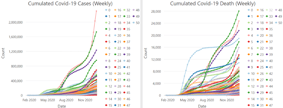
In this section, we want to understand the delay effect of COVID-19 cases and deaths (Fig. 9). This is different from just analyzing how well the temperature and precipitation correlate in space and time. To estimate how the number of COVID-19 cases affects or influences the number of COVID-19 deaths after a certain amount of time has passed, it is crucial to remove the effect of the underlying trend, seasonality, and autocorrelation. By doing so, we can avoid obtaining spurious correlations and solely concentrate on understanding the relationship between infection and death.
As shown in Fig. 10, all the underlying structures can be removed by checking on the Filter and Remove Trend checkbox.
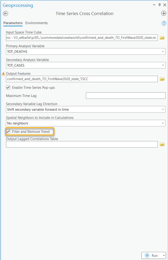
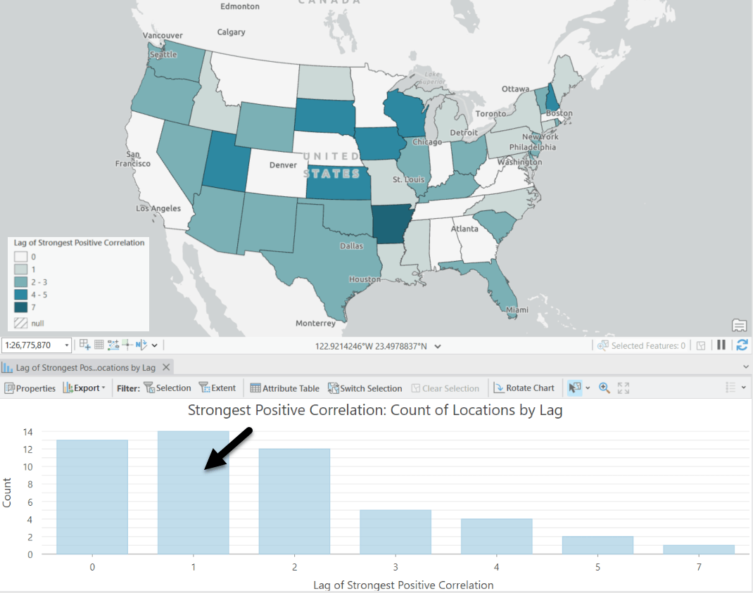
Fig. 11 shows the result of the Lag of Strongest Correlation. As shown in the map, the time lag varies in different states. The bar representing the count of locations at time lag 1 is the highest, which means there is typically a one-week delay between the occurrence of COVID-19 cases and subsequent deaths. However, in many other states, the delay can be less or more than a week.
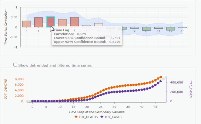
Let’s click on Arizona to have a closer look (Fig. 12). The positive correlation appears at the time lag +2, meaning the time delay between COVID-19 cases and Deaths is 2 weeks. Additionally, you might notice that after filtering and removing trends, the tool returns the confidence Interval for the correlation (this light blue shading area) for us.
3. How did the runoff disperse during the impact of Hurricane Katrina?
Another way to use this tool is to compare the time series of a focal point to the time series within its neighborhood, which helps us to explore the process of dispersion. In this section, I am going to use runoff during the impact of Hurricane Katrina in 2005 as an example.
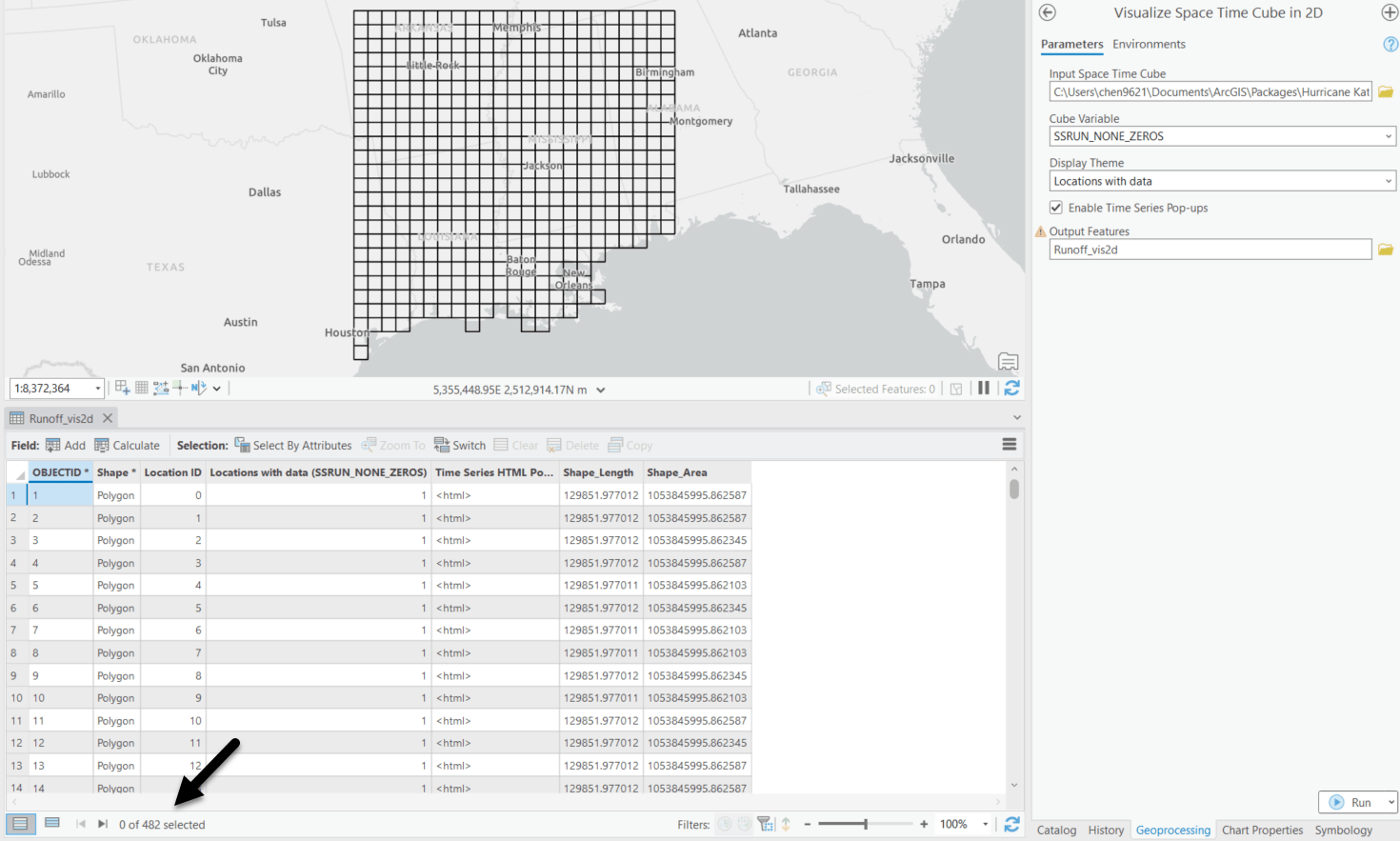
In this case, all the locations in the study area should be treated as the neighbors which each focal point should be compared to. With the help of the Visualize Space Time Cube in 2D tool, we are able to get the total number of locations with data in a space time cube (Fig. 13). There are 482 rows in the Output Features, Runoff_vis2D, which means the total number of locations in the study area is 482.
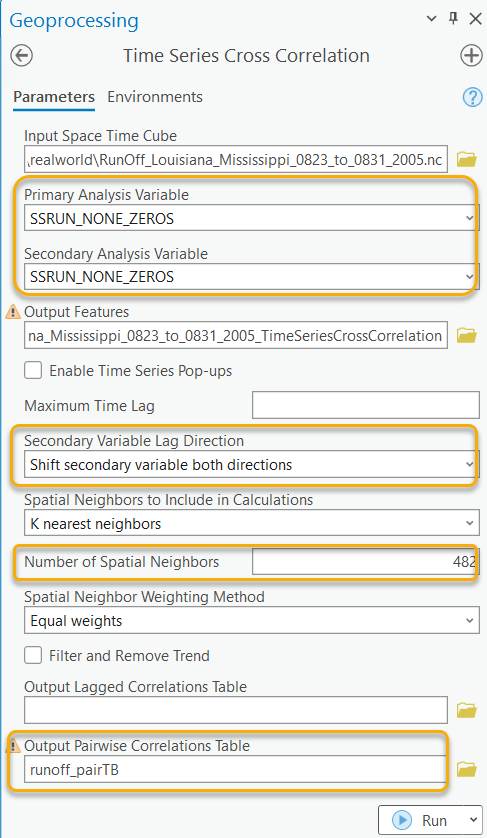
The Time Series Cross Correlation tool is then configured as the screenshot below (Fig. 14). The Primary Variable and the Secondary Variable are both set to “SSRUN_NONE_ZEROS”. The variable represents the volume of runoff every three hours. The Secondary Variable Lag Direction is set as the default “Shift secondary variable both directions” because the surge of runoff in a neighborhood area can occur before or after a focal point. The Spatial Neighborhood to Include in Calculations is set to “K nearest neighbors”, and the Number of Neighbors is set to “482” to include all locations. Then, we need to save the Output Pairwise Correlation Table to get the pairwise correlations between each location and each of its neighbors at all time lags. After running this tool, apart from the Output Features, we will have an Output Pairwise Correlation Table as shown in Fig. 15.
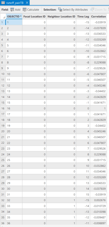
The Output Pairwise Correlation Table needs to be further processed before we can visualize the dispersion of the runoff. Firstly, we read the Output Pairwise Correlation Table in the Python Notebook (Fig. 16)

Secondly, we can find out at which time lag a focal feature has the highest correlation with each of its neighbors (Fig. 17). For example, if the focal feature A and its neighbor B have the highest positive correlation at a time lag of +1, it indicates that the surge of runoff at location A is delayed by 1 time step (equivalent to 3 hours) compared to the surge at location B. On the other hand, if the focal feature A and its neighbor C have the highest positive correlation at time lag -1, meaning the surge of runoff at location A occurs first, followed by a surge of runoff at location B after one time interval of 3 hours.

Now, every combination of focal point and neighbor has a new field called “idx_max”, representing the how many time steps it delays or leads it neighbor. As shown in Fig. 18, the “idx_max” of a location is summed up as a new field named “df_sum_lag”. The location with the smallest “df_sum_lag” indicates the occurrence of the surge of runoff at the earliest time. Conversely, the location with the largest “df_sum_lag” indicates the occurrence of the surge of runoff at the latest time.

To visualize the “df_sum_lag” on the map, we need to read the Output Features (Fig. 19).

Then, join the “df_sum_lag” back to the Output Features (Fig. 20).

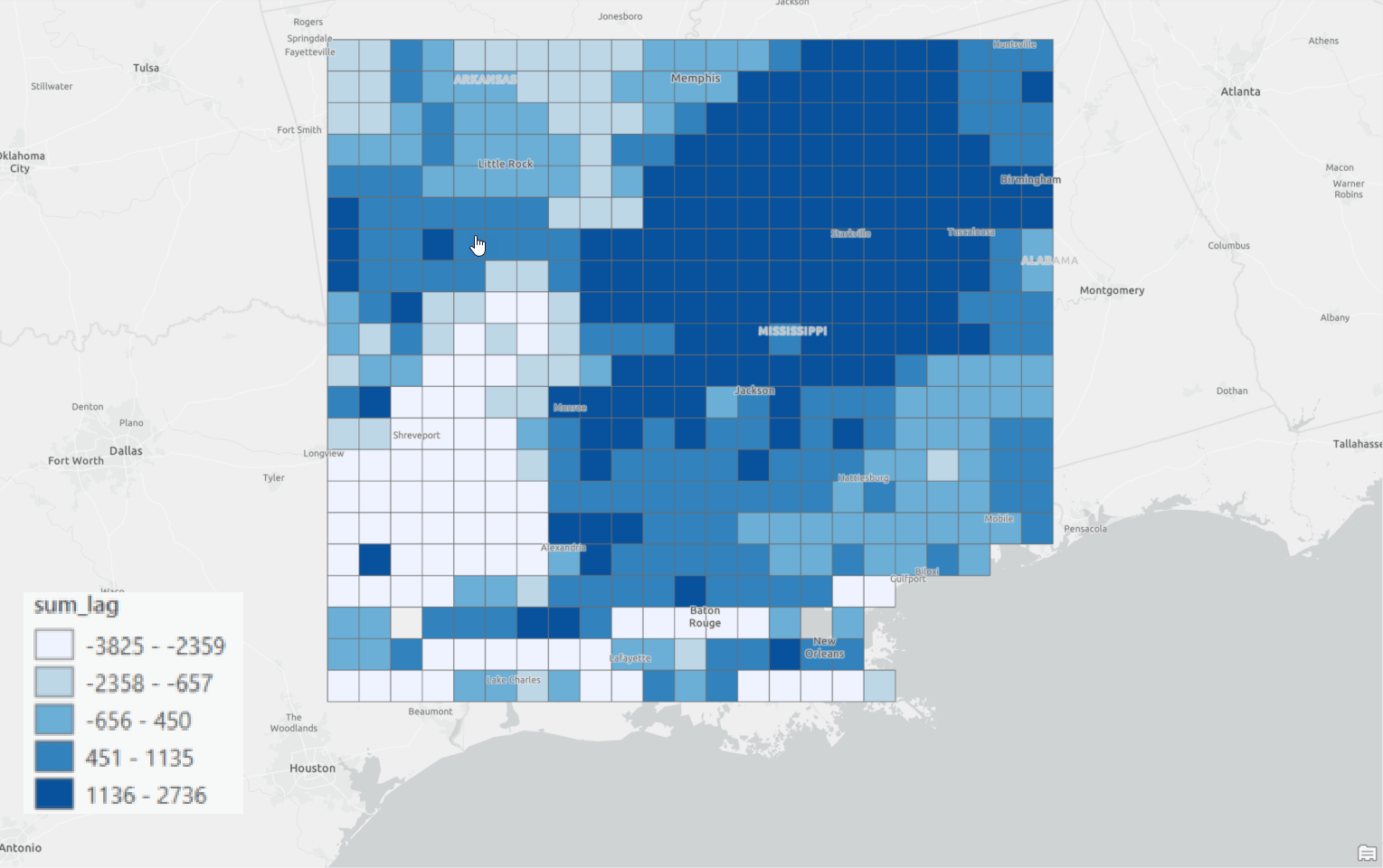
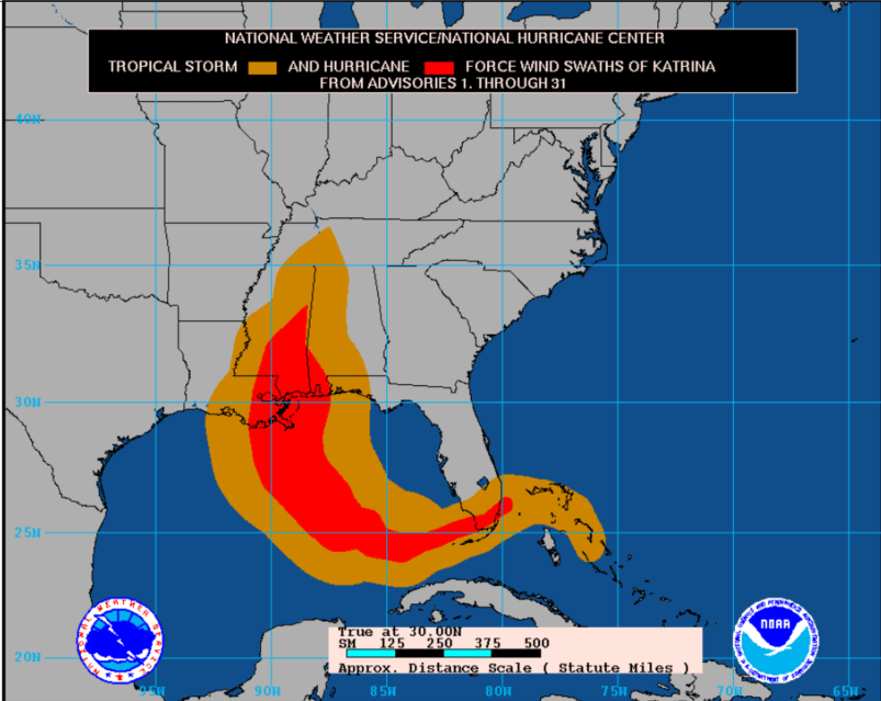
Alright! Now the “df_sum_lag” is ready to be symbolized on the map (Fig. 21). Locations in lighter blue indicate that the surge of runoff there occurs earlier, and locations in darker blue indicate that the surge of runoff there occurs later. This analysis result makes sense because we can notice the dispersion of the runoff matches with the path of the Katrina hurricane (Fig. 22).
Conclusion:
Although the concept of this tool is straightforward, this tool can be used to answer various questions. It not only serves as an exploratory tool to assess alignment between time series but also enables us to identify the delay effects if we remove all the underlying structures in the time series. Additionally, the tool provides the option to incorporate spatial neighbors if we are more interested in the correlation between one variable at a location to another variable within its neighborhood. This blog article only shows a few use cases, but more use cases can be considered. For example, you can compare the hourly rains to runoff to prepare for the peak of runoff so that we can prevent flood damage. Or comparing the marketing campaigns to sales to estimate the effectiveness of the campaigns. We are excited to see how you will use this tool!
For further information, please visit the ArcGIS Pro page or the What’s New documentation and post your questions in the ArcGIS Pro board in Esri Community.

Commenting is not enabled for this article.