Quite often analysts are tasked with uncovering the patterns of where objects travel. For example, this could be showing patterns in vehicle movement, animal behavior, or sensor data. This blog outlines a simple workflow using GeoAnalytics Desktop tools to create a track heat map in three quick steps: create lines of movement from GPS points, aggregate lines into bins, and symbolize your results.
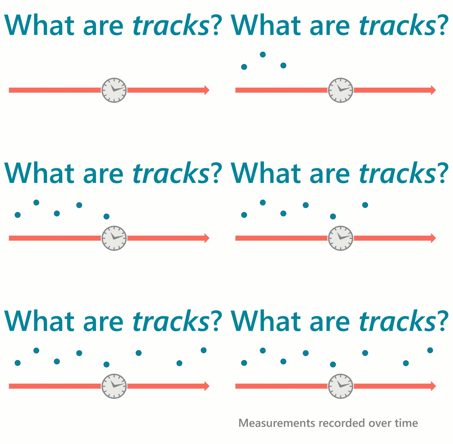
Unsure whether you have track data? Tracks are points collected over time with a unique identifier for each object being observed. Examples of a unique identifier are the FlightIDs for airplanes or the name of a hurricane.
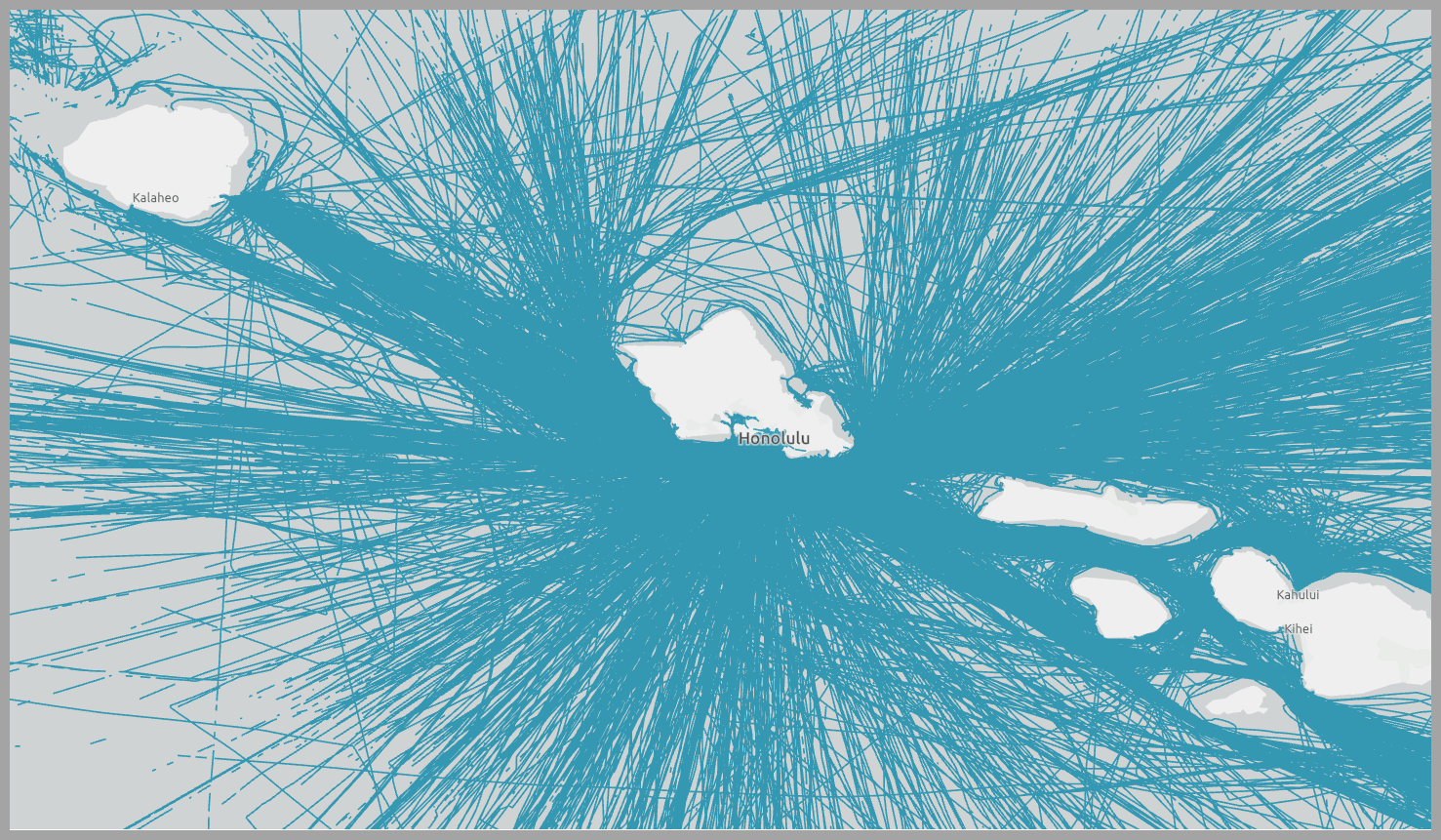
In this workflow we analyze tracks composed of 50 million GPS points representing ship movement near Hawaii. Each GPS point has a field for the time, location, and a ship ID as well as some other attributes like status, heading, and vessel type. Using ArcGIS Pro, let’s visualize the input tracks as they travel near Hawaii:
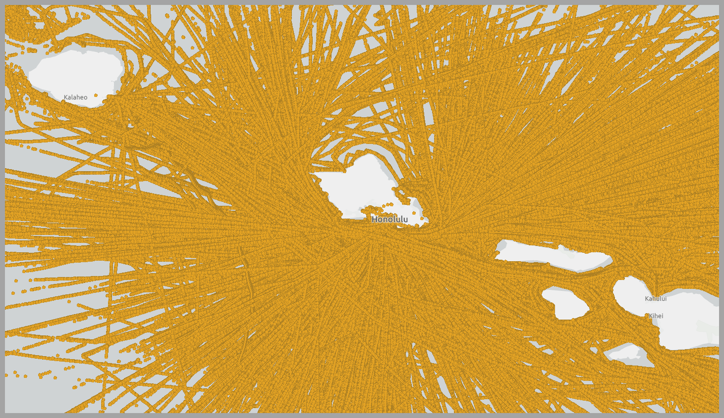
As you can see, other than noting that ships aren’t traveling on land, there aren’t many noticeable patterns. To uncover patterns in a large dataset like this, it’s common to aggregate all the raw points into bins (squares or hexagons) to show where the most observations were made. However, binning the points won’t reveal the travel patterns of sequential points (tracks); instead it will just analyze where the GPS points were collected. Because we’re interested in the pathways of ships, let’s use a more suitable workflow for track analysis than point binning.
Step 1: Create tracks from time-enabled points
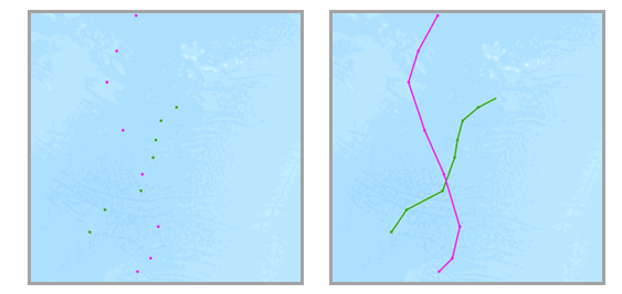
To create the track features (lines) we want to visualize as a heat map, use the GeoAnalytics tool Reconstruct Tracks. This powerful tool summarizes points collected over time into lines representing unique track events for each object.
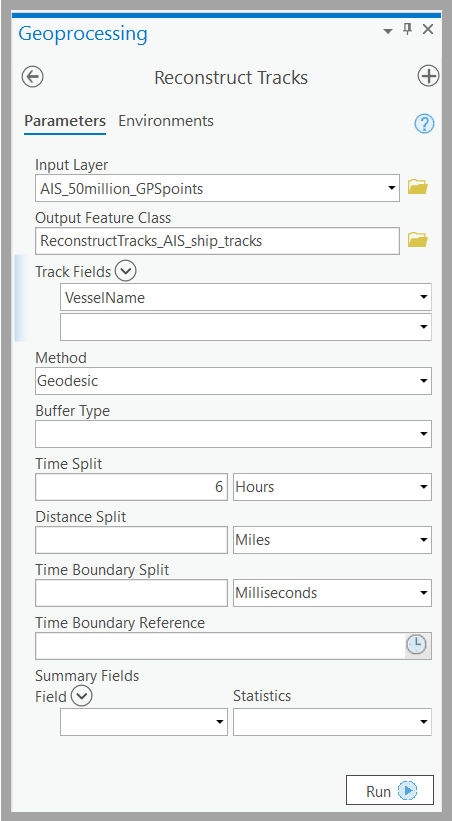
For this workflow, we use the field VesselName to identify unique ships. Additionally, we choose to split tracks when there’s a time lapse of 6 Hours or more between points. For example, here are the input parameters:
The result contains trips (blue lines in the map below) for each vessel.
Step 2: Aggregate track features into hexagon bins
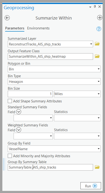
Next, we create the heat map of the tracks. Since we’re interested in a detailed heat map, we use a grid distance of 1 mile. We use the GeoAnalytics Desktop tool Summarize Within – which can summarize points, lines or polygons into polygons or bins. Here is an example of the input parameters:
Step 3: Symbolize your results
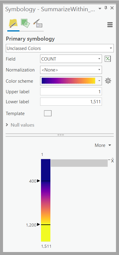
The result of Summarize Within is a hexagonal grid with a COUNT field to tell us how many ships traveled through each grid cell. To symbolize the result as a heat map and make the high-count locations standout, use Unclassed Colors and a Multipart Color Scheme on the COUNT field. Here is what the symbology parameters look like:
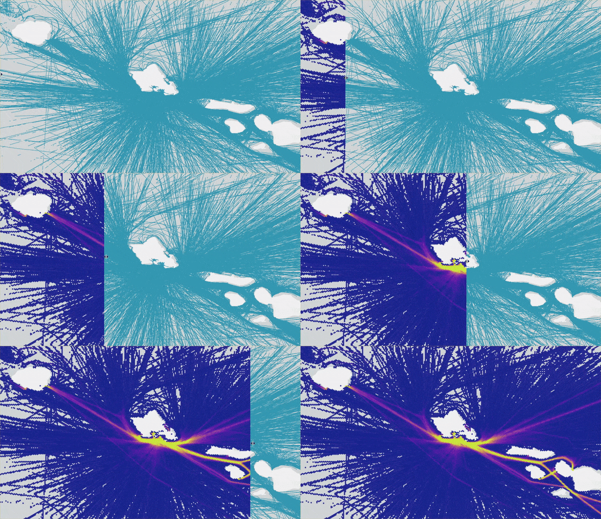
The output of the Summarize Within tool is a heat map representation of trends within your track dataset. Contrast the results of Reconstruct Tracks (blue lines) and Summarize Within (heat map) to visualize the impact this heat map workflow has in understanding track patterns. The heat map uncovers trends in ship traffic volume that would have otherwise been hidden without summarizing the large datasets using GeoAnalytics. We use the Swipe effect tool in ArcGIS Pro to really illustrate the improvements:
Remember how this workflow begins with 50 million points? Well, on my laptop I was able to run Reconstruct Tracks analysis in just under 5 minutes and Summarize Within in only 2 minutes! GeoAnalytics Desktop tools allow us to complete jobs that may have previously (before parallel analysis with GeoAnalytics) not completed or took multiple hours using analysis tools.
Are you currently working with track datasets? Comment below and tell us about the problems you are solving and the workflows you use to do it.
If you’re interested in completing this workflow, check out a sample script (and sample data) written in arcpy here.
Laptop specs : 16 GB of RAM, 4 cores.

Article Discussion: