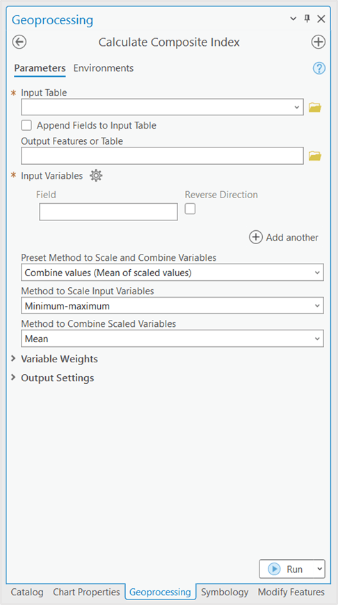
With the release of ArcGIS Pro 3.1, you now have access to a new tool in the Spatial Statistics toolbox: Calculate Composite Index.
What is an Index?
Composite indices are commonly used across social research, epidemiology, government programs, and more, to measure complex phenomena using a single indicator. The new Calculate Composite Index tool provides a workflow and guidance to help generate these indices.
Case Study – Mapping Severe Influenza Risk
Understanding the problem and choosing variables
Suppose a group of public health analysts want to target their flu season health campaigns at a more local level by understanding what areas of the country are most at-risk for severe cases of influenza.
There is no single measurable variable that can tell the analysts here are the places where people are most at-risk. Being at-risk for severe cases of influenza comes from multiple attributes that each are measurable on their own and can be combined to measure the larger theme of Severe Influenza Risk. The new Calculate Composite Index tool can help achieve this goal.
One way to break up the influenza risk problem is into two parts – Risk factors and Vaccination status.
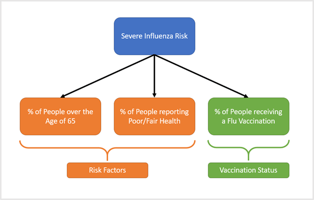
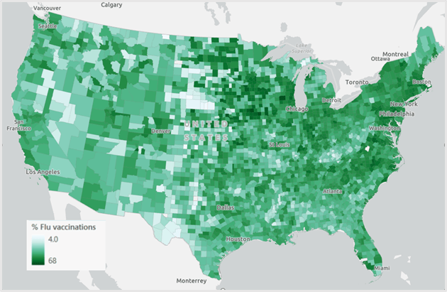
Risk factors can be further broken up into % of people over 65, and % of people reporting poor/fair health. Vaccination Status can be directly measured by % of people receiving a flu vaccination.
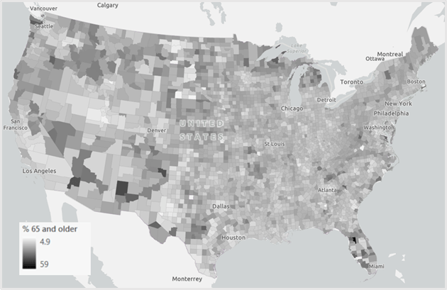
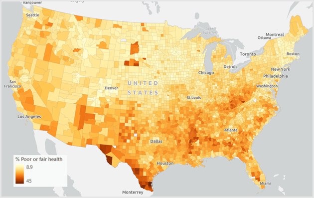
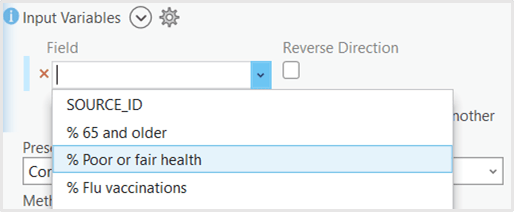
Each of these variables can be added as inputs to the Calculate Composite Index tool.
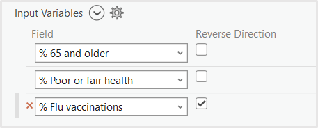
When calculating an index, it’s important to ensure that each of your variables are contributing to the phenomenon you’re measuring in the same direction. In this case, as each of our variables increases, we would like for Severe Influenza Risk to increase as well. For the Risk factors variables this is already true. As the % of People over 65 increases, so does risk. However, for the vaccination variable, we see the opposite effect. As the % of People vaccinated for influenza increases, risk decreases. To flip this relationship, we can check the Reverse Direction box next to the vaccination variable. This reverses the relationship, so as the % of People vaccinated for the flu decreases, risk will increase.
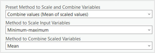
Though each of the variables are represented as percentages, their ranges differ. When combining variables that are not in the same units or range, there are several ways to preprocess the variables before combining. A simple way to preprocess the variables is through a method called min-max scaling. This method transforms each variable so its minimum value is equal to 0 and its maximum value is equal to 1. Min-max scaling does not change the shape of the distribution, so if the distribution is skewed or has an outlier to begin with, it will also be skewed after scaling.

Once variables are preprocessed, they must be combined using a mathematical operation such as sum or multiplication. The preset methods in the tool can be used to specify a preprocessing method and a combination method. The first preset in the tool – Combine values (mean of scaled values) – applies min-max scaling to preprocess, then mean to combine.
Output Settings
To further customize the index output, a custom name can be specified, such as Severe Influenza Risk. Additional outputs can also be specified – these postprocess the output index to make the results more interpretable. In this case, if the analysts are interested in understanding what counties might have much higher than average risk the Standard deviation class could be selected as additional output, since standard deviations are measured in relation to the average.
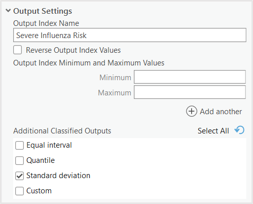
Once all the settings have been specified, the tool can be run.
Results and Interpretation
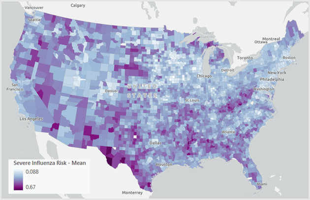
The Calculate Composite Index tool outputs the Severe Influenza Risk Index as an average of each of the preprocessed variables. Counties in purple have higher risk, and counties in light blue / white have lower risk.
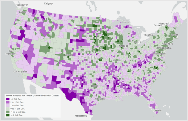
The second output is the Standard Deviation classes. The darker purple areas can tell us which areas have risk much higher than average since their values are at least one standard deviation above the mean. Public health analysts could prioritize the purple areas for their influenza vaccination and education campaigns.
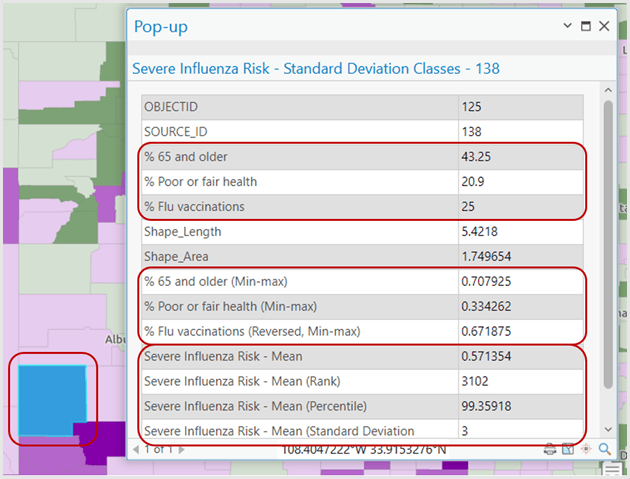
Investigating an individual feature’s results can help reveal more about what leads to a higher or lower risk index value. The feature below in New Mexico appears as dark purple in the standard deviation classes map.
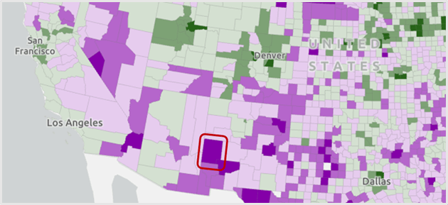
In the pop-up, you can see the variables’ original values, as well as their preprocessed values. While, in this county, there is not a particularly high percent of people reporting poor health (the min-max value is ~0.3 in a possible range of 0 to 1), the percent of people over 65 is relatively high, and the percent of people receiving flu vaccinations is relatively low. The variables driving this county’s risk to be over three standard deviations higher than the average are the age of its citizens and the low vaccination rates.
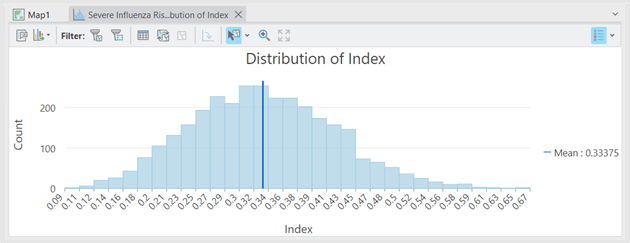
The tool also creates several useful charts, including the distribution of the index, the distributions of the input variables, and the relationships and correlations between variables.
Conclusion
The Calculate Composite Index tool can help researchers, policy makers, and analysts create an index to quantify immeasurable phenomena by combining together the measurable components of the problem. See the links below to learn more about how the Calculate Composite Index tool works, and best practices when creating a composite index.
Resources
Calculate Composite Index Documentation
How Calculate Composite Index Works
Calculate Composite Index Best Practices Technical Paper


In mobile view there is no “show my location” option. Please add this function.