Introduction
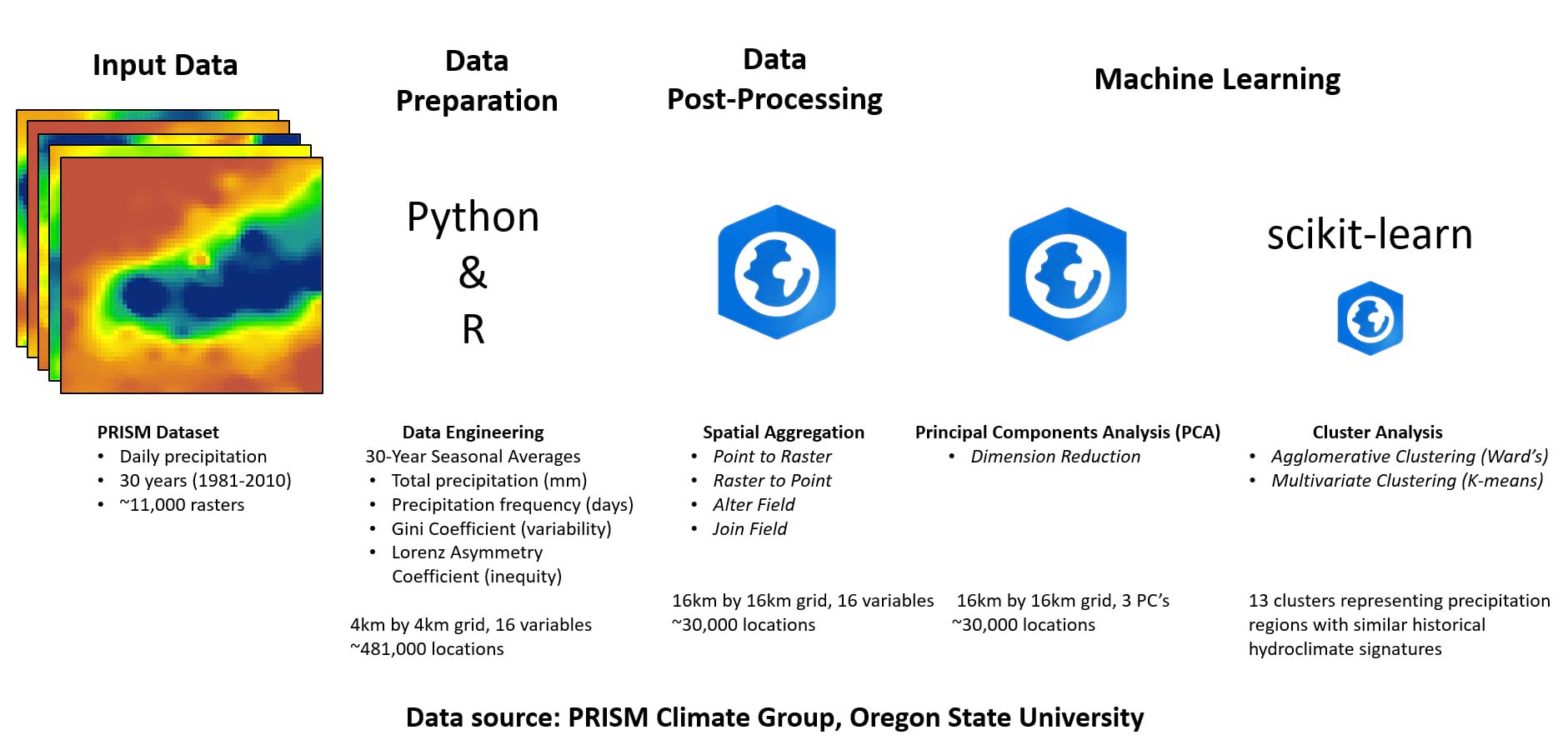
This blog series is based on the recent research paper “Delineating precipitation regions of the contiguous United States from cluster analyzed gridded data”, from a 2021 issue of the Annals of the American Association of Geographers (Marston and Ellis, 2021). The goal of the paper is to create a map of climate regions in the United States based on 30 years of historical precipitation data. My goal is to use a combination of Esri technology and open-source technology to reproduce the workflow and replicate the results. Throughout the following blogs, we’ll perform the entire analysis using:
- ArcGIS Pro
- ArcGIS Notebooks
- ArcGIS API for Python
- R-ArcGIS Bridge
- Open-source Python
- Open-source R
The problem
Humans have created and used climate region maps to help understand climate geography and its impact on agriculture, navigation, weather and natural hazards, where we live, where we travel to, etc. since the time of the Ancient Greeks. Within the past 150 years, several climate region classifications have been proposed, each with variations in their input data, methodology, and purpose. For example, the extremely well-known Köppen classification divides Earth into climate regions based on precipitation and temperature, while the Thornthwaite classification outlines regions based on a location’s precipitation and evapotranspiration characteristics. More recently, the National Centers for Environmental Information (NCEI) produced a 9-region climate map of the US based on county-level climate characteristics, which were spatially aggregated first to the US state level, and then to the region level.
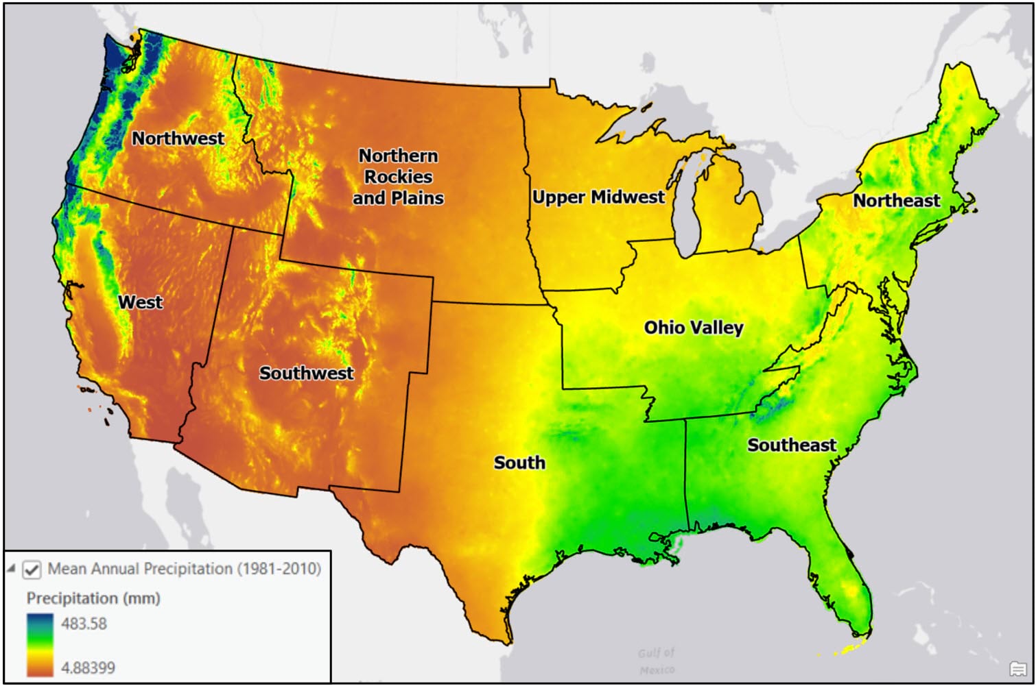
The many factors that influence climate—temperature, precipitation, elevation, latitude, proximity to oceans—however, do not adhere to geopolitical boundaries, so the NCEI map may not represent the true climate geography of the United States. For example, the Northeast, Southeast, and Ohio Valley are relatively homogeneous in mean annual precipitation, while there is much more intra-region heterogeneity in the Northwest and West. The range of average annual precipitation across the Northwest is several hundred millimeters!
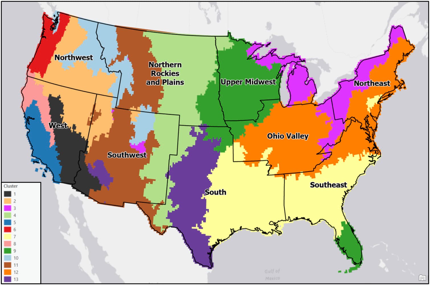
In the paper, the authors use a novel, data-driven approach to create a modern climate region map based on seasonal precipitation trends in the US for the 30-year period of 1981-2010. They calculate a total of 16 different precipitation variables (4 variables x 4 seasons) for each location in a gridded dataset of daily precipitation data, then use a series of machine learning techniques for dimensionality reduction and cluster analysis. The final clusters represent climate regions with similar seasonal precipitation signatures over the 30-year period.
What’s next
In this series of blog articles, I’ll walk you step-by-step through my process of reproducing the analysis in this paper including the data ingest, preparation, engineering, and machine learning. Hopefully at the end you’ll have not only learned a bit about climate geography in the US, but more importantly how to leverage open-source Python and R with ArcGIS Pro and ArcGIS Notebooks to complete an end-to-end spatial data science project.
References (for the blog series)
Marston, M.L., Ellis, A.W., 2021. Delineating precipitation regions of the contiguous United States from cluster analyzed gridded data. Annals of the American Association of Geographers. 111(6), 1721-1739.
Hair Jr., J.F., Anderson, R.E., Tatham, R.L., Black, W.C., 1998. Multivariate Data Analysis (5th Edition). Prentice-Hall, Inc., Upper Saddle River, NJ.
O’Sullivan, D., Unwin, D.J., 2003. Geographic Information Analysis. John Wiley & Sons, Hoboken, NJ.

Is there a way, or will there be a way at some point, to use our own web maps as the map to guide through?
Hi @Terry Brock, good question. While using a web map as the foundation for your tour isn’t supported yet, we’re looking into how we can make that happen for a future release. Thanks for your patience—I’ll be sure to keep you posted on its development!
Hi Hannah, there’s a blog post from February 2019 about saving URLs and launching from specific points within the guided tour in Classic Story Maps. Will that function be made available in the new Story Maps? I am trying to provide a table of contents of sorts (made from buttons) so users can jump straight to a particular place in the tour. Any suggestions? Thanks.
UPDATE: My colleague pointed out that there is a toggle switch for “navigation” which then creates up to 10 heading based links at the top of the map.
Link to blog post – https://www.esri.com/arcgis-blog/products/story-maps/mapping/launch-a-story-map-tour-at-a-specific-tour-stop/
Hi @Jesse Gutierrez I’m glad you discovered story navigation, that would have been my suggestion for the time being. Linking to a specific point is not in our immediate plans for the tour block, but we are considering ways to enhance the navigation feature—enabling section-specific links that are shareable could be a potential outcome there. I’ve added your feedback to our database to help inform those decisions. Thanks for sharing!
How to include an existing story e.g. Guided Tour in a story? I think I get that a story can embed other story types such as Guided Tour and Sidecar… and I see how to start a new one but how do I include an existing one? Thank you for help.
Hi Hannah, I really like the ability to design my own themes but I just spent two hours setting up a guided tour and manually placing all my locations only to get to item 30 and not be able to add any more locations! Is there really a limit on how many items you can add to a guided tour? If I can’t have more than 30 locations this story map is unusable and unfortunately was a waste of time 🙁
Hi Shawny, thanks for reaching out. Tour is limited to 30 points at the moment, but we’re currently working on a few enhancements to the tour block—including upping the max number of points—that we’re aiming to release in early October. I’ll be sure to notify you in this thread as soon as those updates have been made!
That is good news long term, unfortunately we have to have our map up by Oct 1st, so I am back to the drawing board.
There’s no limit to the number of tour blocks you can add to a single story, so including several might be a possible solution? Depending on your topic and content, it might make sense to break the tours up by region, or type of place represented, with a separate block for each. You could then use the story navigation feature to let readers jump to the tour that most interests them. Just an idea—good luck!
Hi Shawny, the tour block in StoryMaps has been updated to support 100 places. You can learn more here.