Imagine working hard each month, only to see a third of your income go directly to keeping a roof over your head. This is the reality for many Americans facing a “housing burden,” where 30% or more of their income is spent on housing costs. For those earning less than $75,000 annually, this level of spending can mean tough choices between essential expenses. This blog will guide you through a workflow to explore patterns of housing burden using a new tool in ArcGIS Pro 3.4, Assess Sensitivity to Attribute Uncertainty, with the Hot Spot Analysis and Calculate Composite Index tools.
To get acquainted with the Assess Sensitivity to Attribute Uncertainty tool, please refer to the newly released introductory blog! In the American Community Survey, attribute uncertainty is measured by a Margin of Error (MOE) with a 90% confidence level. This margin of error is typically not used in analyses, and many analysts move forward as if the data have no uncertainty. However, with the Assess Uncertainty to Attribute Uncertainty tool, you can see how sensitive your analytical results are to uncertainty in the input data.
I want to perform a hot spot analysis analyzing the percentage of households in each county experiencing housing burden. Recall that housing burden is defined by the American Community Survey as 30% of the income spent on housing for those making less than $75,000 annually.
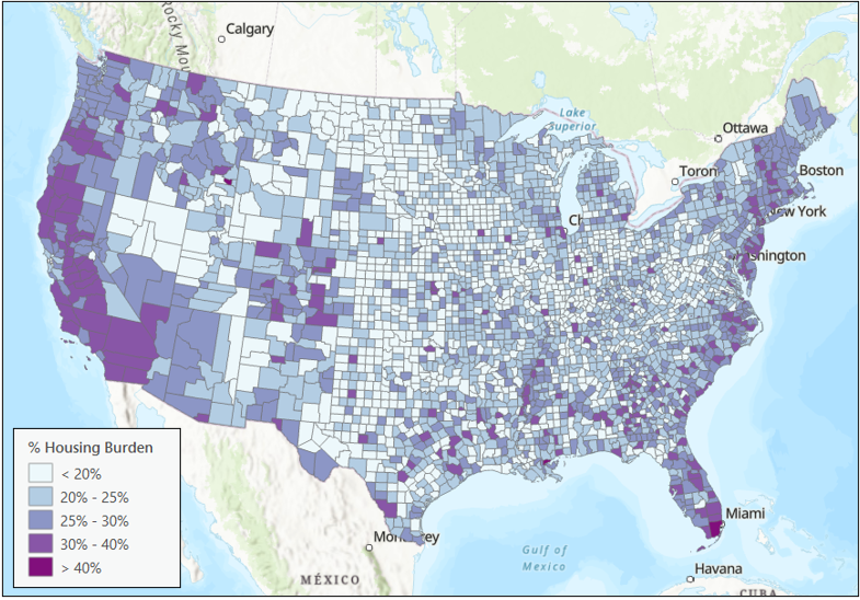
Map 1 shows the percentage of households in each county facing housing burden. Areas on the coasts and several Colorado counties show higher housing burden levels. However, this map may not show the whole picture. This map is based on the point estimate for each county, but we know the actual percentage of households in each county may be higher or lower than the point estimate. We should explore the margin of error to better understand the patterns.
What is a Point Estimate? What is a Margin of Error? The Census creates an estimate of the true value of a variable based on a sample of the residents. This is called the point estimate. The margin of error provides a range of values that may contain the true value. The true value of the variable is unknowable without sampling every single individual.
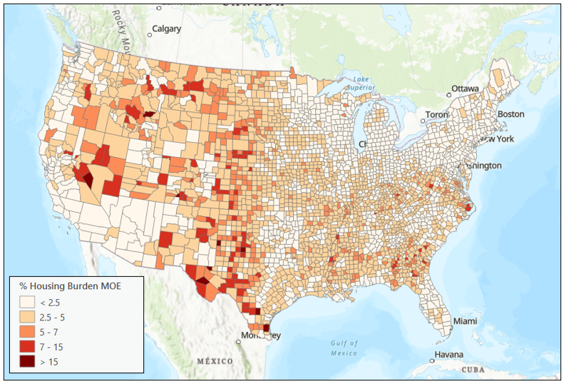
The American Community Survey defines margins of error as 90% confidence intervals. These intervals indicate a range within which there is a 90% probability that the variable’s actual value, such as housing burden, lies. In Map 2, the darkest areas indicate regions with the widest margins of error. These large margins of error can result from factors like small sample sizes or sampling uncertainties. We can use these margins of error to provide a new layer of context to a typical analysis.
To understand which parts of the US are experiencing high rates of housing burden, run a Hot Spot Analysis.
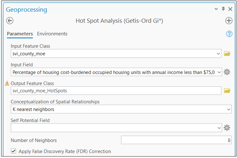
In the Hot Spot Analysis tool, I’ve specified values for the input features, the variable of interest, and the conceptualization of spatial relationships. Choosing K nearest neighbors with eight neighbors ensures that each county is connected to precisely 8 neighbors despite variations in county sizes.
The Hot Spot Analysis (Map 3) shows statistically significant hot spots along the coastlines, Colorado, and the southeast.
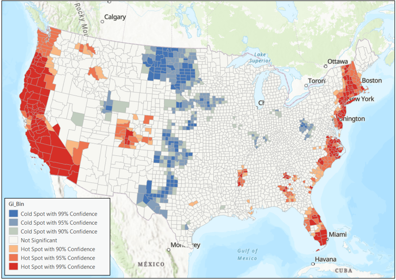
Recall this hot spot analysis is the result of analyzing the point estimates. The point estimate reflects just one possible value of the true measure. Incorporating the margin of error provides additional insights. It recognizes the range of possible values for each county. This is where the new Assess Sensitivity to Attribute Uncertainty tool is helpful.
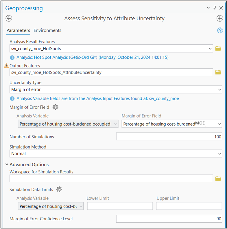
In the tool, I’ve specified the Margin of Error field under the Uncertainty Type parameter and provided the corresponding margin of error field in the Margin of Error field parameter. The default simulation method is Normal, which is suitable for this scenario since the margins of error in ACS data are derived from a Normal distribution. Consequently, the simulations for each county will adhere to a Normal distribution. In the advanced accordion, there is an option to set the “margin of error confidence type.” Given that ACS margins of error are defined at a 90% confidence level, I can retain the default setting of 90. A value closer to 100 will have simulations closer to the point estimate. In contrast, a lower value closer to 60 will provide a much wider range of simulations.
Once I run the tool I get the following output (Map 4). We have two layers, one representing our original hot spot analysis and the second representing the uncertainty associated with each county’s original hot spot classification.
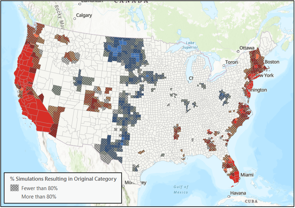
The uncertainty is represented by a layer of hatching. There is hatching over the county if less than 80% of the simulated hot spot categories are the same as the original hot spot category. Let’s look at an example.
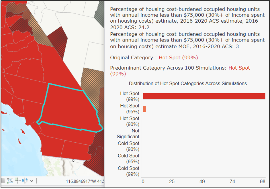
When we click on San Bernardino County in California, we see that its original category, Hot Spot (99%), is also the predominant category across all 100 simulations, with 98 of the simulations landing on Hot Spot (99%).
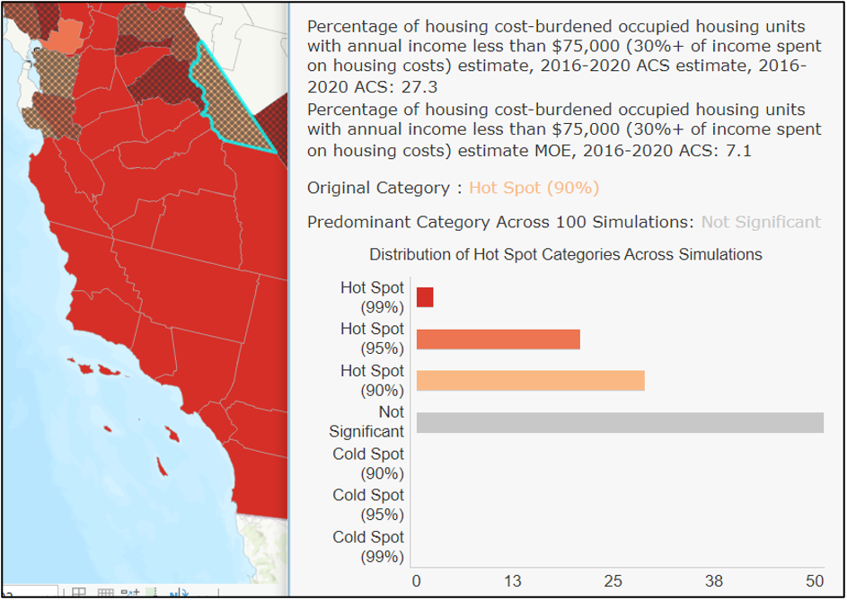
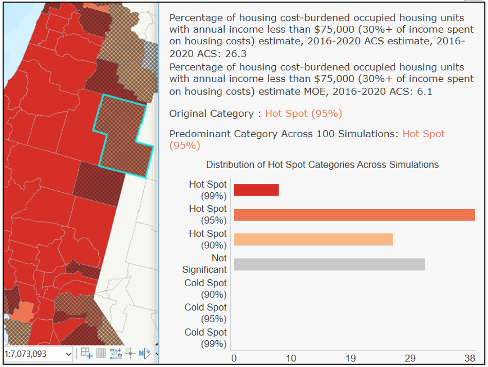
When we click on Mono County, California, we see a county with an unstable hot spot. Its original hot spot category was Hot Spot (90%). Still, its predominant category across 100 simulations was Not Significant, for 50% of the simulations.
In this third example, we click on Lake County, Oregon. It is also classified as unstable but slightly different from Mono County in California. Its original category was Hot Spot (95%), and its predominant category was also Hot Spot (95%). However, fewer than 80% of the 100 simulations landed on that original category. There were other simulations spread between Hot Spot (99%), Hot Spot (90%), and Not Significant, with over 30% of simulations landing in Not Significant.
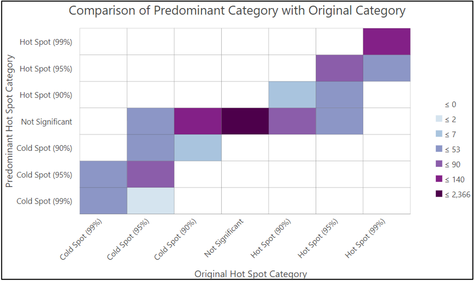
The chart below represents the relationship between the original and predominant categories. The counties initially and predominantly Hot Spot (99) are in the cell in the top right corner of the chart. The counties whose predominant category across the 100 simulations is Not Significant are represented in the middle row.
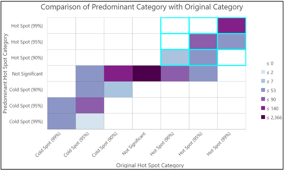
When we highlight the top right nine cells of the chart, we can see the counties whose original categories were hot spots at any level, and their predominant categories were also hot spots of any level.
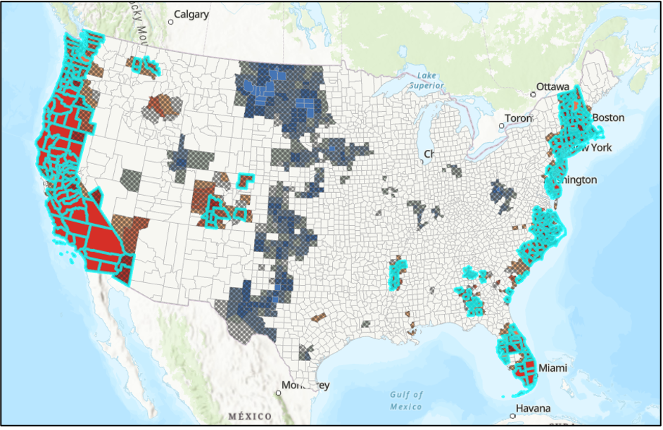
The counties highlighted from the chart selection are originally and predominantly hot spots. This might give us a sense of where the stable hot spots are. However, there is another way we can use the simulation information to determine where there are stable hot spots on the map. Specifically, identifying where at least 80% of simulations result in a hot spot categorization of any level (90%, 95%, or 99%). We can combine this information using another tool in the Spatial Statistics Toolbox, the Calculate Composite Index tool.
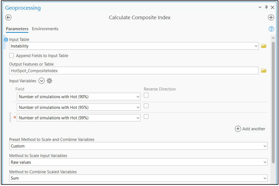
I want to combine the number of simulations that resulted in each hot spot category in the Calculate Composite Index tool. I set the method to Custom, Raw Values, and Sum to give me the total number of simulations in any hot spot category.
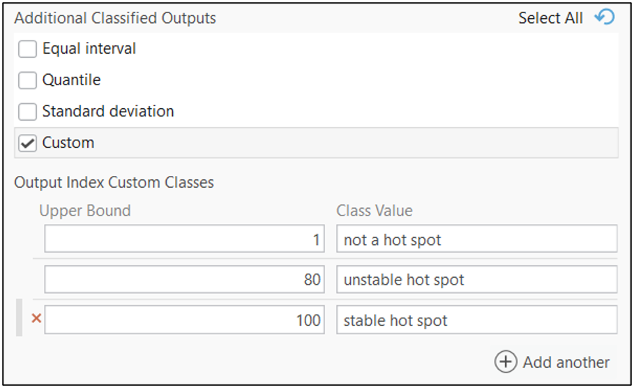
Within the Additional Classified Output section, I define Custom classes. Specifically, I classify scenarios where more than 80 out of 100 simulations fall into a hot spot category as a stable hot spot while designating hot spot categories with one to 80 simulations as unstable hot spots.
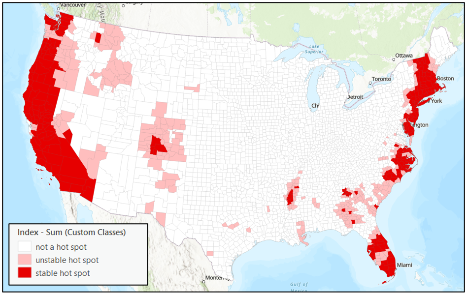
This index approach presents the information we saw in the chart selection slightly differently. You could change the cutoffs for a stable or unstable hot spot as an analyst. You could include only the 95% and 99% Hot Spots or choose to weigh each hot spot level differently.
Incorporating margins of error or other measures of uncertainty adds a crucial layer of context to your Hot Spot Analysis, regression models, and more. By using tools like Assess Sensitivity to Attribute Uncertainty and Calculate Composite Index in ArcGIS Pro, you can account for data variability and make more informed decisions. Check out these resources to further explore these techniques and strengthen your analyses.
Further Resources
Introductory Assess Sensitivity to Attribute Uncertainty Blog
Assess Sensitivity to Attribute Uncertainty Documentation
Learn More about Assess Sensitivity to Attribute Uncertainty

How will the filter work? Will it be possible to filter by floor like in a floor-aware map?