At Esri, we want to ensure that every user has an amazing experience using ArcGIS Online. We aim to deliver not only powerful features, but also continually improve our interfaces for both experienced and new users. We want to pair powerful capabilities with beautiful and easy-to-use design so that you can be at your absolute best. That’s why we’re really excited to introduce some changes coming to the way you work with items in ArcGIS Online.
New look and layout
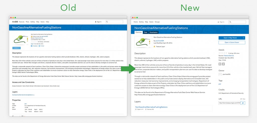
First, we’re updating the visual look and feel of the item details. By changing the type, colors, and layout, we want to help make it easier and more efficient to get the job done. For example, we’ll highlight the most common actions in the top-right of the page, using new button styles to make it easy to open a layer in the map viewer, create a presentation, or share an item. New button styles and typography will guide you to the workflows and content that matter most. The new tabbed layout will add a depth of new features (more on those later!) while still keeping the look streamlined and easy to use.
Explore
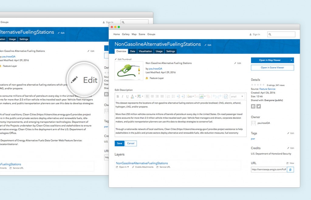
For users who want to get a sense of what an item is all about, we’ll put all the most important elements front and center in the ‘Overview’ tab. Item owners and administrators will also have access to convenient, in-place editing of properties like an item’s description and tags. Changing an item’s summary will be done right where you’re reading it. Quick inline editing will make it easier to keep your items up to date and accurate.
Data
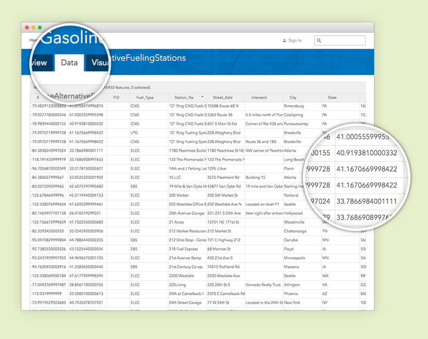
Viewing and working with attribute data will be a core part of item details. Currently, to view the attributes of a layer, you have to open the layer in the map viewer. The new ‘Data’ tab will allow you to view, edit, and sort attribute data quickly and easily from the item details, without reloading the page. When you need to update a particular attribute, just double-click a cell to edit the data inline and your changes will be saved automatically. You’ll also find a new, integrated way to view and navigate through related records and attachments.
Visualization
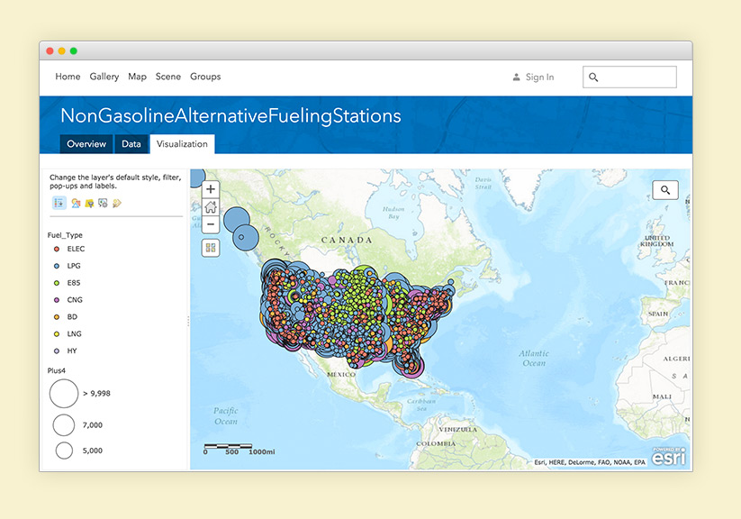
Another important aspect of geospatial data is what that data looks like. With the new ‘Visualization’ tab, a slew of powerful features will be at your fingertips. Change a layer’s default styles, update popups, and create labels from the item details page itself. We’re putting powerful map viewer capabilities like smart mapping right inside the ‘Visualization’ tab, so our users can get more done in less time.
Usage
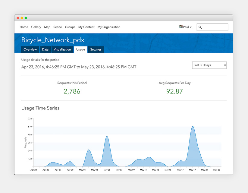
As an item owner, it’s important to know how your content is being used and viewed. To help owners and administrators get answers to these crucial questions, we’re adding the ‘Usage’ tab. With a clean dashboard view, getting insight into usage patterns will be easier than ever. View requests over time during defined time periods, or adjust the time period to a custom range you’re interested in. The dashboard shows averages, totals, and a time-series view of what’s happening with your item.
Configuration
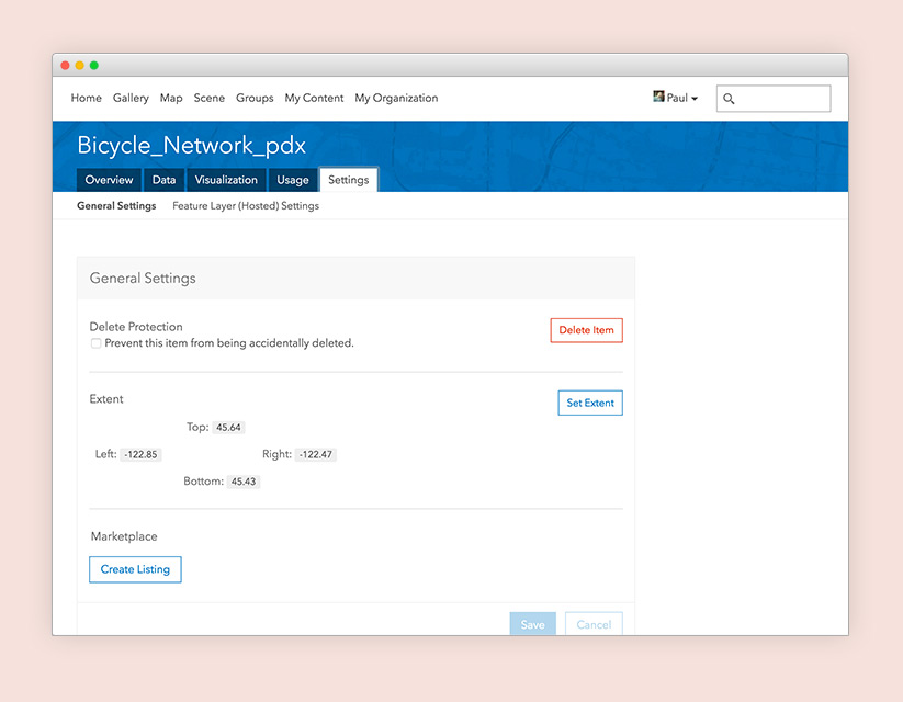
With this upcoming redesign, we want to give ample space to fine-tune all the settings that make an item tick. The new ‘Settings’ tab will neatly organize all the configurable settings of an item in one place. Change options like editing and delete protection, register an application, or set an item’s default extent, all in one place. Settings will be visually grouped to make them easy to find and understand.
Moving forward
This design update is just the beginning. We’re constantly brainstorming and testing ways to make sure your experience is powerful and streamlined. We know that especially for our experienced users, substantial change to our interface can take a while to get used to, but from our user testing, we’re confident that you’ll fall in love with the new look and all the extra power that comes with it. And remember we love getting feedback, so whether you have an idea or a particular workflow you think could be improved, let us know!
Article Discussion: