Shared Theme was introduced in the March release of ArcGIS Online. It is an administrative setting that allows organizations to easily apply a consistent theme to configurable web applications. If you missed all the details about Shared Theme, take a look at this blog.
In this article, we show examples of applying Shared Theme to create a consistent branding experience across configurable apps in an Organization. All examples include the settings used in Shared Theme properties for each example gallery.
Shared Theme properties are located in the Organizational settings. There are 4 main theme zones to set, each controlling an area of the display in the supported configurable apps. 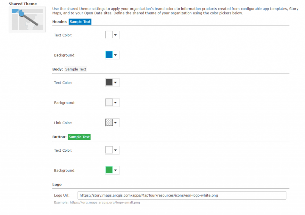
- Header: Primary color of the application, most often applied throughout the configurable apps, and holds the title of the application.
- Body: Color of a body of text within an app.*
- Button: Buttons in the app such as legend, layers, edit, and basemaps.*
- Logo: Logo typically resides in the upper left or right-hand corner of an app.*
*Not every app contains a location for the theme part
When choosing colors for your shared theme it’s a good idea to consider the color contrast ratio to ensure that there is enough contrast between the text color and background so people with low vision can read the text. To learn more about color contrast testing see this blog.
Below are the Shared Theme properties and how they are applied to a Geo List application. 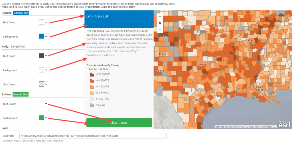
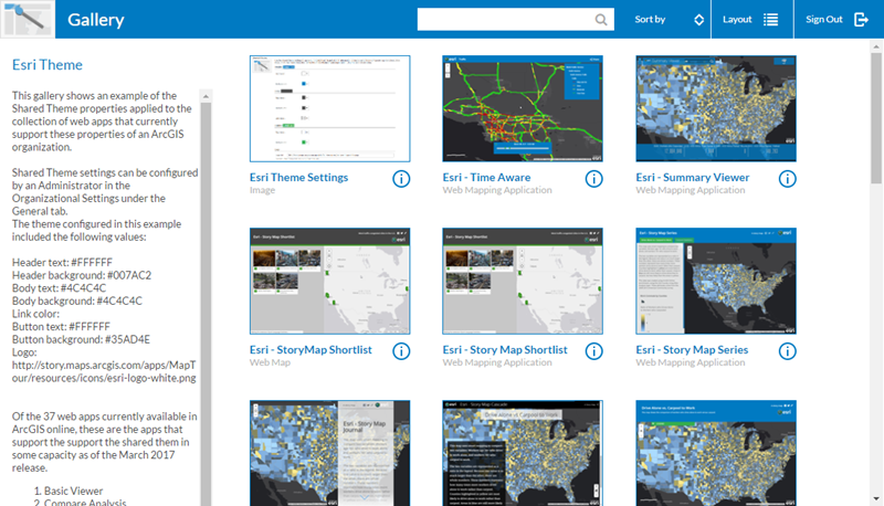
Esri theme was designed with a logo and Esri’s branding colors.
This example does not include a logo. When choosing not to include a logo, simply leave that option blank in the Shared Theme properties.
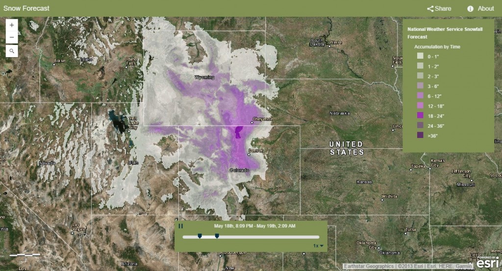
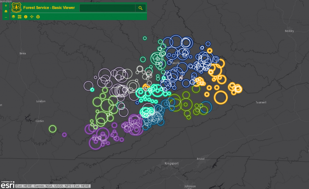
This theme is modeled after the United States Forest Service brand. A logo was obtained from their website along with colors that model their brand.
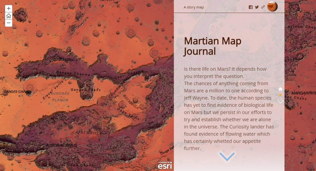
This example shows a custom theme created to represent Mars colors. The colors selected meet the color contrast guidelines to support viewers with low vision.
Use Shared Theme properties to create a consistent and clean appearance for apps created in your Organization. If you have questions about Shared Theme post it GeoNet.

Article Discussion: