As Halloween draws near on October 31st, the spooky season is filled with excitement and eerie anticipation across the United States. While some may prefer to skip the frights, others relish in the thrill of haunted horror films and spine-chilling scares where the sound of creaking doors is music to the ears and flickering screens spark more than just fear. Whether cozied up at home or nestled in dimly lit theaters infused with the fresh aroma of popcorn, horror fans are spellbound by the heart-pounding scenes that make them scream.
But where can we discover these daring film enthusiasts? Thanks to Esri Demographics’ Market Potential data, we can identify areas where horror movie buffs are most likely to get their frights this Halloween.
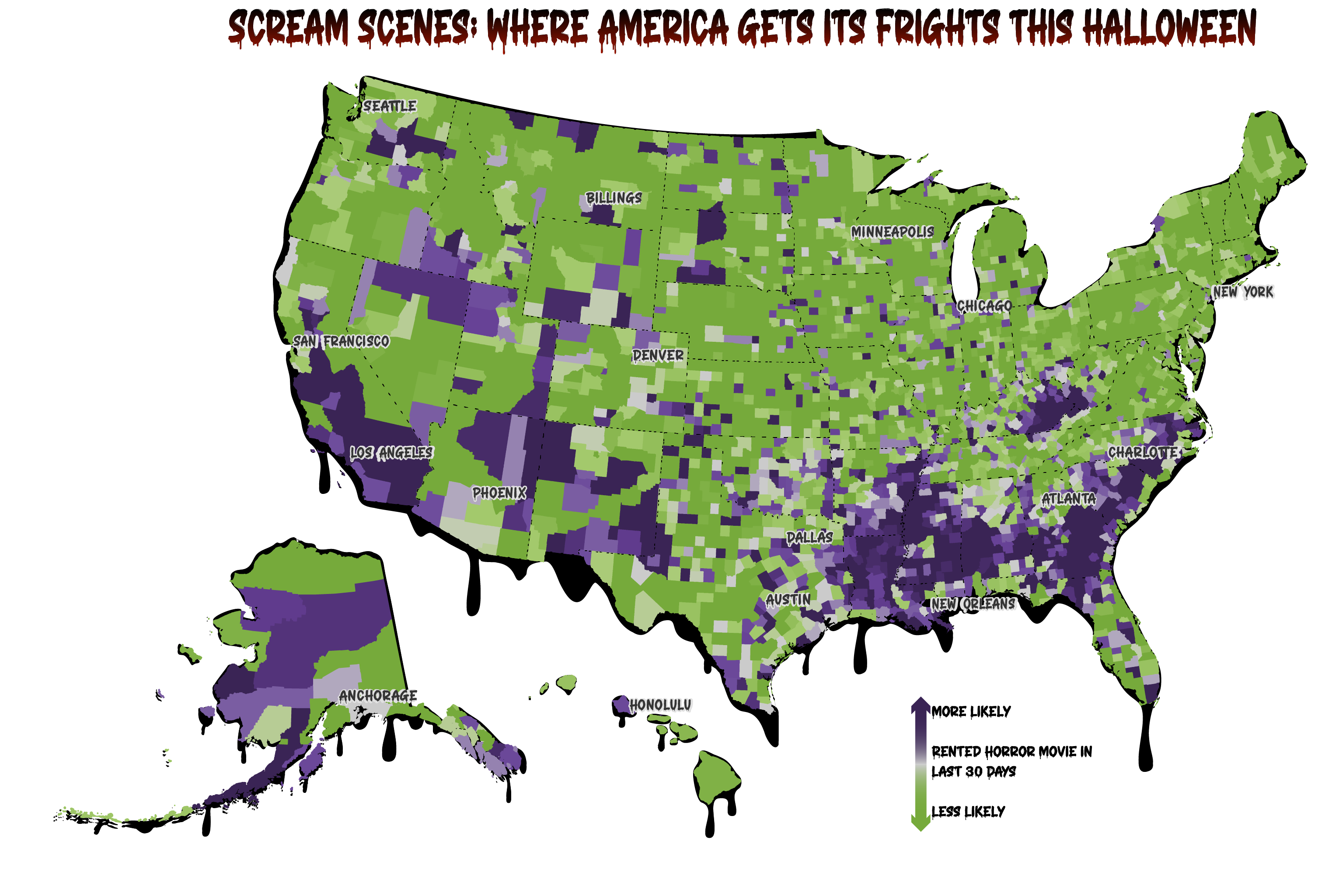
The US county map below reveals a distinct pattern in the Southeast and Southwest, with areas shaded in dark purple indicating a higher likelihood of residents renting a horror movie within the last 30 days. Additionally, intriguing clusters of horror cinema viewers can be found in Kentucky, Washington, and Alaska. Those areas shaded in green highlight where renting horror movies is less common.

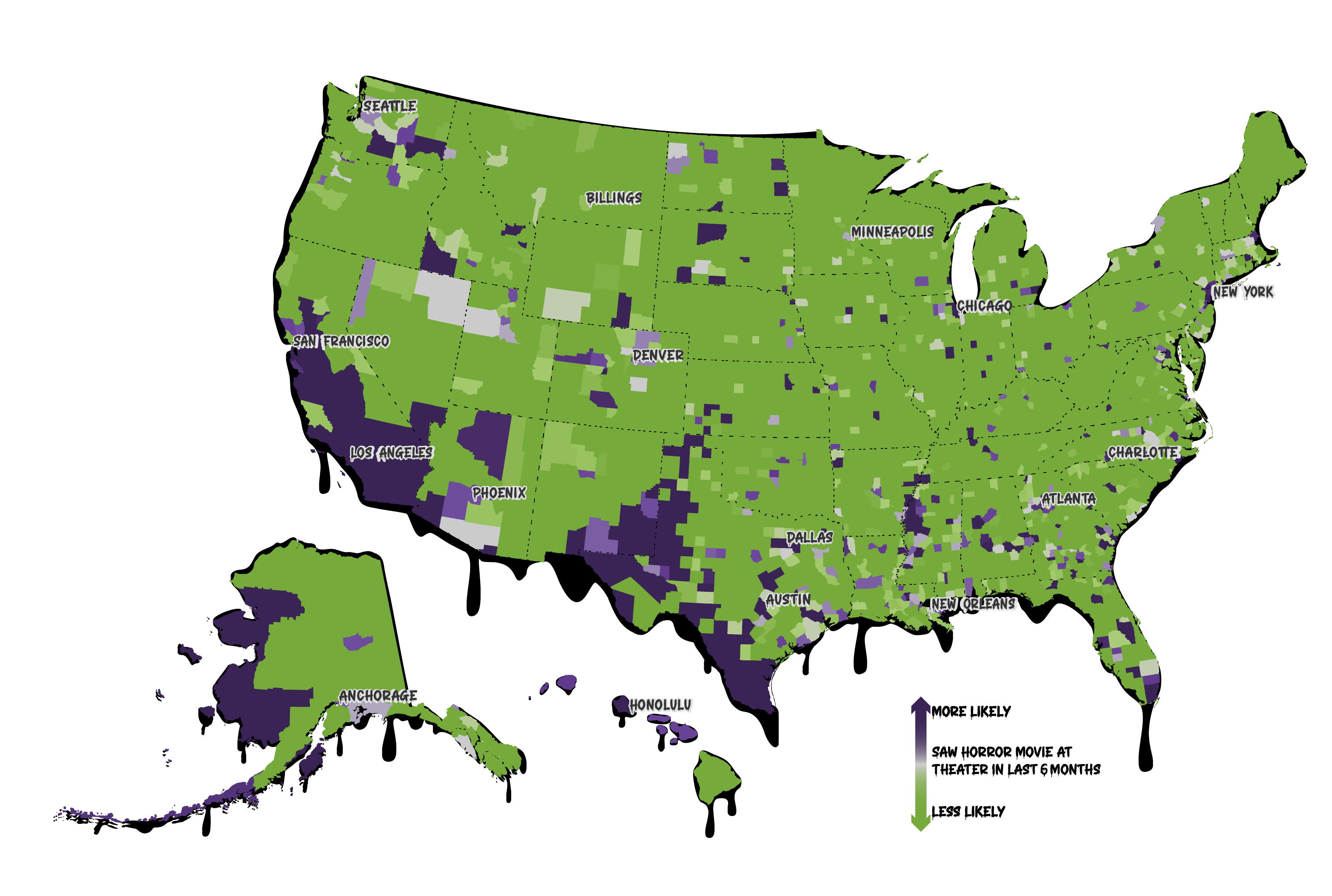
But what about those who prefer the security of fresh popped popcorn while seeking a jump scare or two? Using the same colors for comparison, in the map below we can see who is more or less likely to have seen a horror movie in theaters within the last six months. While the Southwest US enjoys in-theater horror as much as in-home, the Southeast does not seem to hold the same affinity for in-theater movies.

Whether you’re a devout horror fan, someone who keeps the lights on, or someone who enjoys the spooks from afar, take a moment to appreciate the scream scenes that make this fright-filled day extra thrilling. Esri Demographics data is available for all your mapping needs—ranging from fun and serious projects to anything in between. Discover more in the links below.
Happy mapping!
Learn more
How were these maps made?
These maps were created using ArcGIS Pro using unclassed color symbology with Halloween serving as color inspiration. ArcGIS Pro layouts bring Alaska and Hawaii into the same view as the conterminous US, creating a cohesive picture of the entire country. Lastly, the layout was exported as an AIX file so the final creepy touches could be applied in Adobe Illustrator using ArcGIS Maps for Adobe Creative Cloud.
Data methodologies
Market Potential data estimates are developed from survey data from MRI-Simmons and Tapestry Segmentation to provide the expected number of consumers and a Market Potential Index (MPI) for thousands of items. Represented as point-in-time estimates as of July 1, the data is available for Esri’s standard geographic areas and for any user-defined polygon such as a ring or drive time.
View the Esri Market Potential Methodology Statement
Frequently asked questions
Use the data reference page to help answer additional questions about Esri Demographics.
Helpful links:
Demographic Mapping & Site Selection Software | ArcGIS Business Analyst
ArcGIS Living Atlas of the World
Connect with us:
If you have a question or comment about Esri’s US data, send us an e-mail. We’d love to hear from you!

Article Discussion: