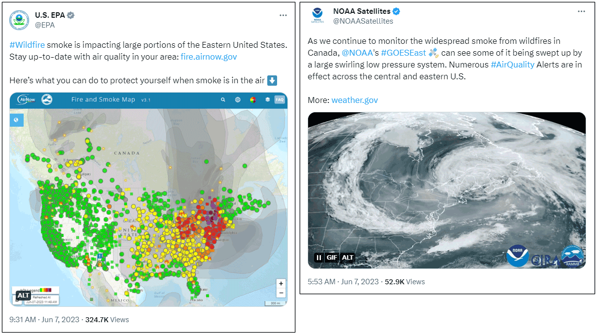
In the news: Smoke from Canadian wildfires has spread across the U.S., triggering health advisories in many areas with recommendations to limit outdoor activities and warnings for those with heart or breathing issues to stay indoors.
As of this post, more than 1000 wildfires are burning across the Canadian border, with smoke from the fires swirling across the U.S. and Canada, creating unhealthful conditions, postponing athletic events, and forcing many to wear masks or take other precautions.
Make a Canadian wildfires smoke map
ArcGIS Living Atlas of the World includes authoritative content that helps you learn more about current and predicted smoke conditions and current air quality resulting from the Canadian fires. Follow these steps to make your own Canadian smoke, fire, and air quality map in a minute, maybe less.
You can view a similar blog article covering smoke and air quality using different Living Atlas content which is also applicable to the current Canadian fires. For more information, see Map in a minute: Map smoke and air quality using ArcGIS Online and ArcGIS Living Atlas.
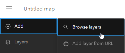
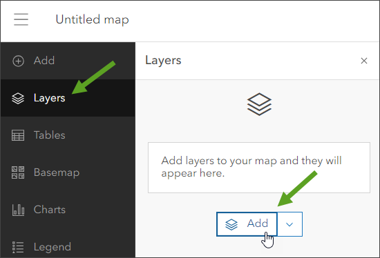
Step 1 — Sign in to your ArcGIS account and open Map Viewer. There are two ways to add layers from the Content (dark) toolbar:
(1) Click Add, then Browse layers.
or (2) Click Layers, then Add.
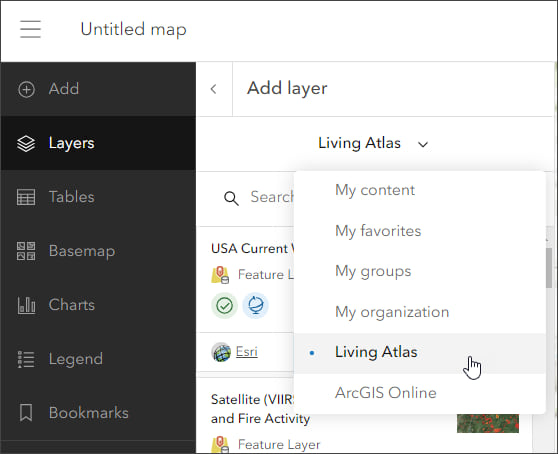
Step 2 — Choose Living Atlas from the Add layer drop-down.
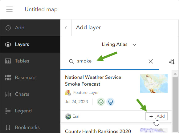
Step 3 — Enter “smoke” in search to locate matching layers from the Living Atlas. Locate the National Weather Service Smoke Forecast layer and click [+ Add] to add it to the map.
Tip: To learn more about any layer, click the layer card to view the item information, such as overview, description, and more. Click View item at the bottom to open the item pages.
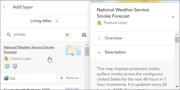
From the National Weather Service Smoke Forecast item details we learn that the layer displays projected visible surface smoke for the next 48 hours in 1 hour increments, and is updated every 24 hours by the National Weather Service.
The Canadian fires smoke map
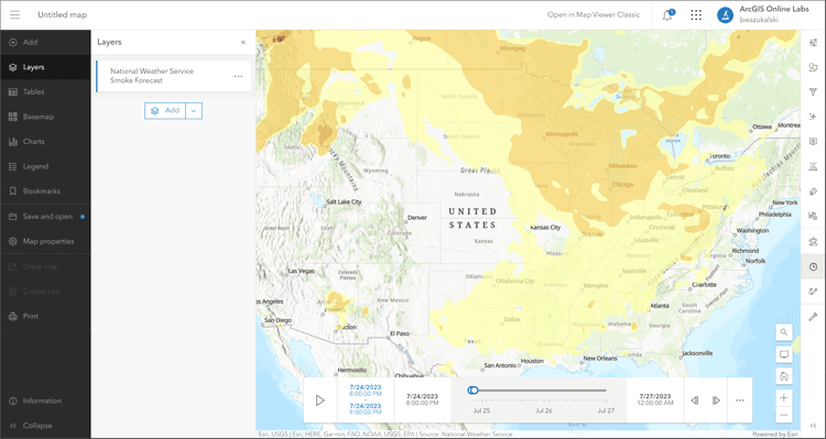
Technically, in well under a minute, we’ve created a map showing the spread of smoke from Canada’s fires. Because the layer is time-enabled, a time slider automatically appears that allows us to play or step through the time intervals in the forecast.
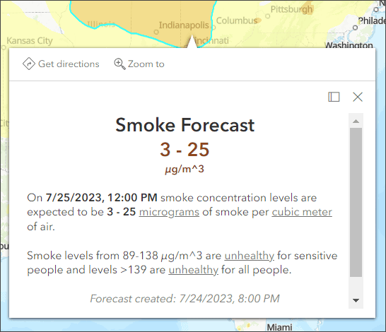
The pop-up delivers additional information about the smoke polygons.
Improve the map
With a few additional steps, the map can be improved using styles, effects, and additional layers to make it more expressive.
Experiment with different basemaps to see which you like best. You can alter layer transparency and symbols to emphasize the content you want. Use Effects to emphasize layers or alter their display.
The map shown below uses the following:
Physical Geography Basemap. This prototype web map provides a detailed vector basemap with a monochromatic style and content adjusted to support physical geography information. While technically a prototype, I like this basemap and use it frequently. I’ve added it to my organization’s custom basemap gallery. For more information, see Use ArcGIS Living Atlas to create a custom basemap gallery.
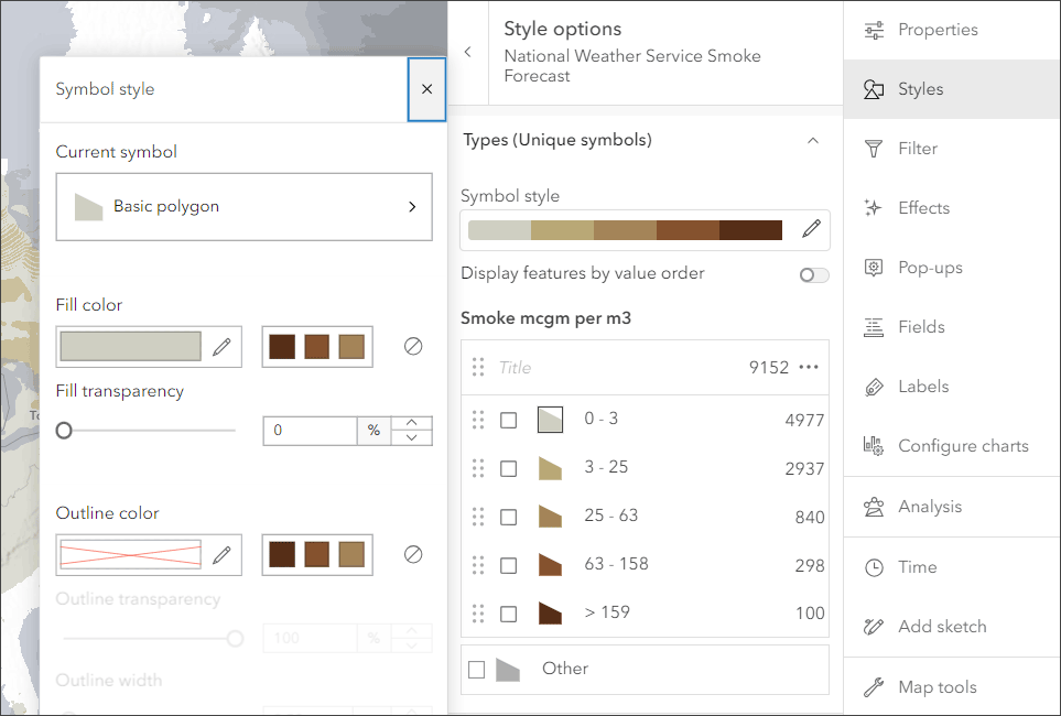
My preference was to show smoke areas colored from gray (light smoke) to dark brown (heavy smoke). The unique symbols were adjusted to show a gray to brown color classification.
Transparency, found in Properties in the Settings (light toolbar) for the smoke layer, was adjusted to %10.
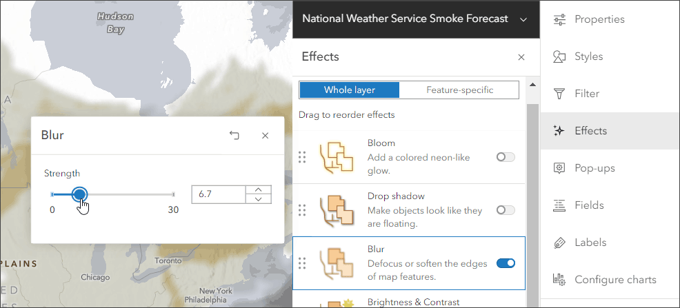
Blur was applied to the smoke layer since the polygons are only an approximation of the actual smokey areas. Experiment with different settings to get the desired result.
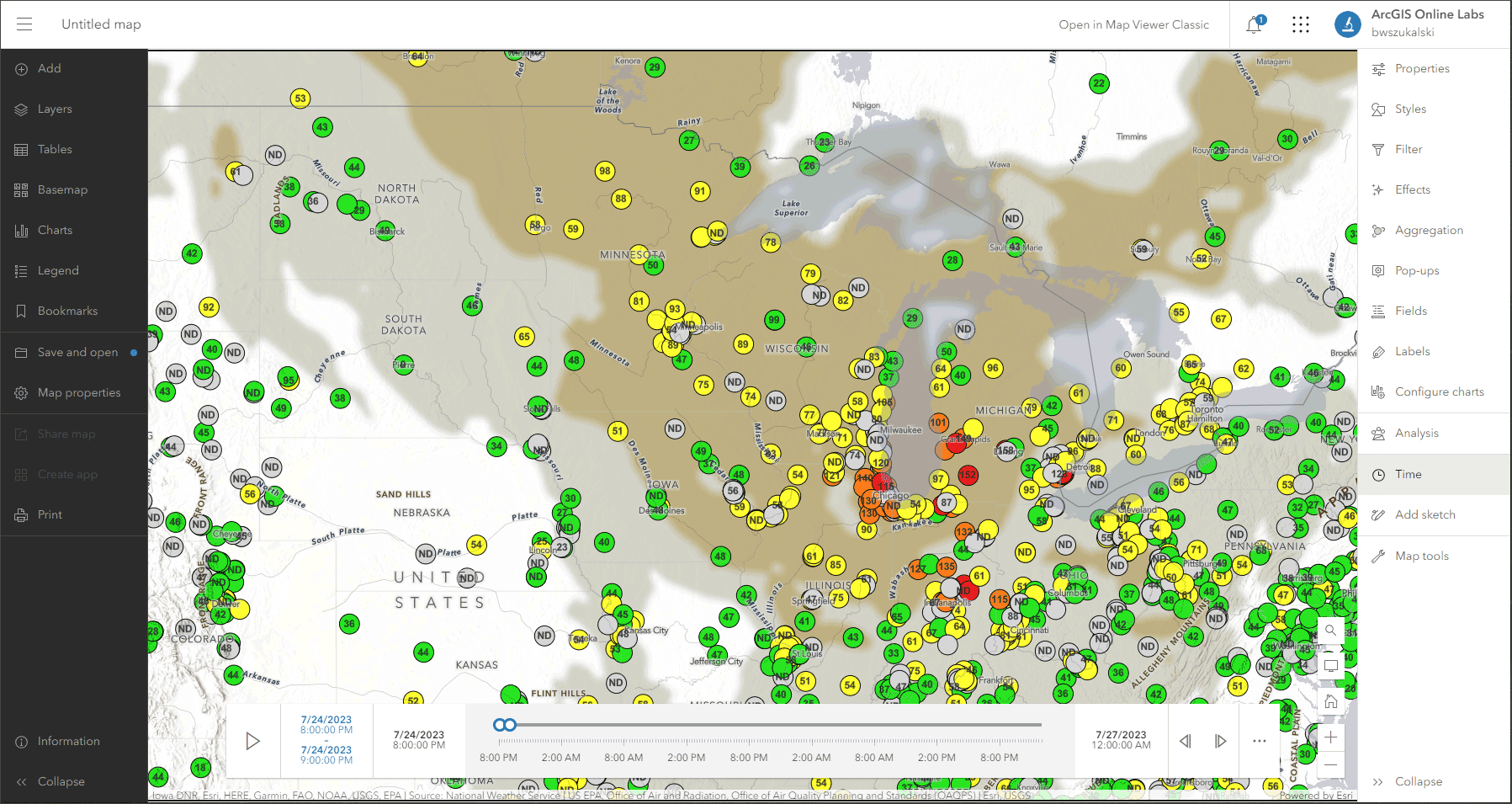
Optionally, add additional layers such as USA Current Wildfires, Satellite (VIIRS) Thermal Hotspots and Fire Activity, or Air Now Current Air Quality Site Data to provide additional context. Use one of the ArcGIS Instant Apps to create an application that can be used by anyone with just a few more clicks.
This is the map authored using the Air Now Air Quality Monitoring Site Data layer. Compare this to the default map above.
Use Air Quality Aware
Air Quality Aware is a Living Atlas app intended to provide information about the current conditions of air quality in the United States, along with the potential human health impacts. Use the app to create an an air quality map for any location in the United States.
Click on a location in the U.S. to see the Air Quality Index (AQI), including ozone and particulate matter, for now, later today, and tomorrow. The National Weather Service’s 72-hour forecast for wind will also be displayed along with population data and key demographics.
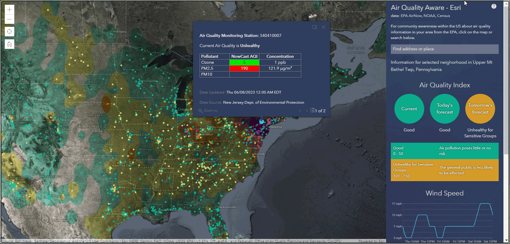
The app includes authoritative Living Atlas content from the EPA’s Air Now program for current and future air quality information, NOAA National Weather Service wind forecasts, and demographic data from the U.S. Census Bureau American Community Survey.
For more information, see Access the latest air quality and human impact information with Air Quality Aware.
More information
For more information, see the following:

Commenting is not enabled for this article.