Ah maps. It’s all about encoding data into colors and stuff. But does it have to stop there? Why not get a bit more literal? Here’s how to make a thematic map of low values and high values look like an elevation map with low areas and high areas. Low and high looks low and high! Get it?
Here’s a rundown for the video-averse among you…
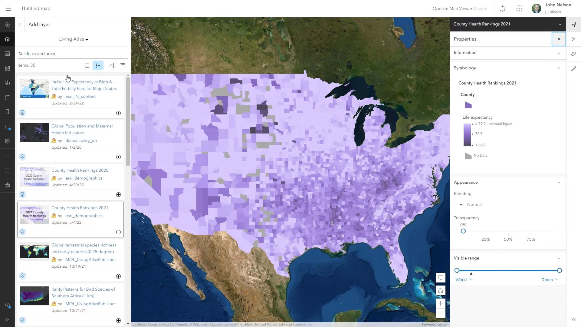
1. Find a grand and glorious polygon layer with some attribute that you want to map. In this example I’ve chosen Life Expectancy from the 2021 County Health Rankings which I added via Living Atlas.
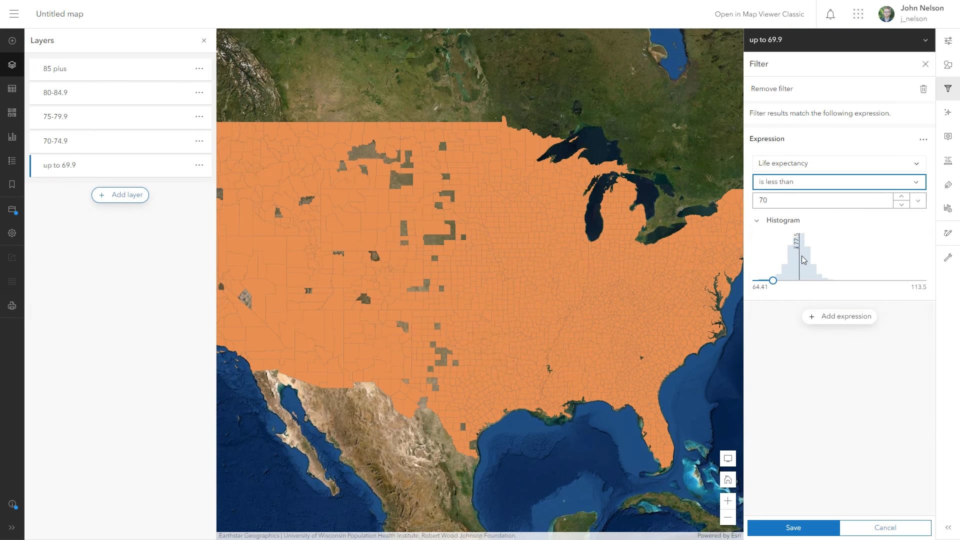
2. Duplicate this layer as many times as you want to want to have range breaks, and apply a filter to each copied layer so that it shows a specific range of the data. I ended up with five separate layers, each showing a five-year slice of life expectancy. Order the layers so that the highest value layer is on the top of the list.
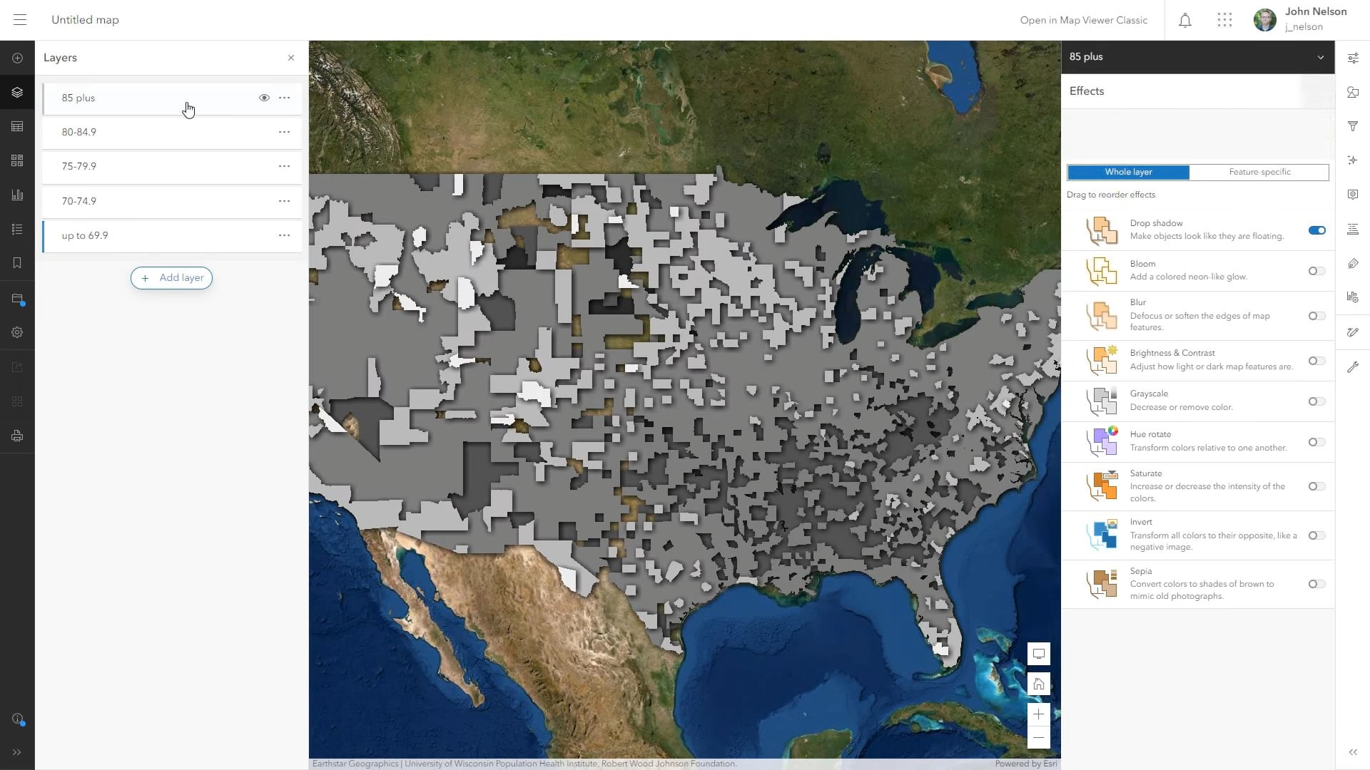
3. Give each layer a gray color so that together, they look like a grayscale map. Light gray for the highest values to dark gray for the lowest values. Apply a drop shadow effect to each layer.
4. Create a group and add all the layers to this group, keeping them in descending order. Then, with the group selected, apply an overlay blend mode (my favorite blend mode).
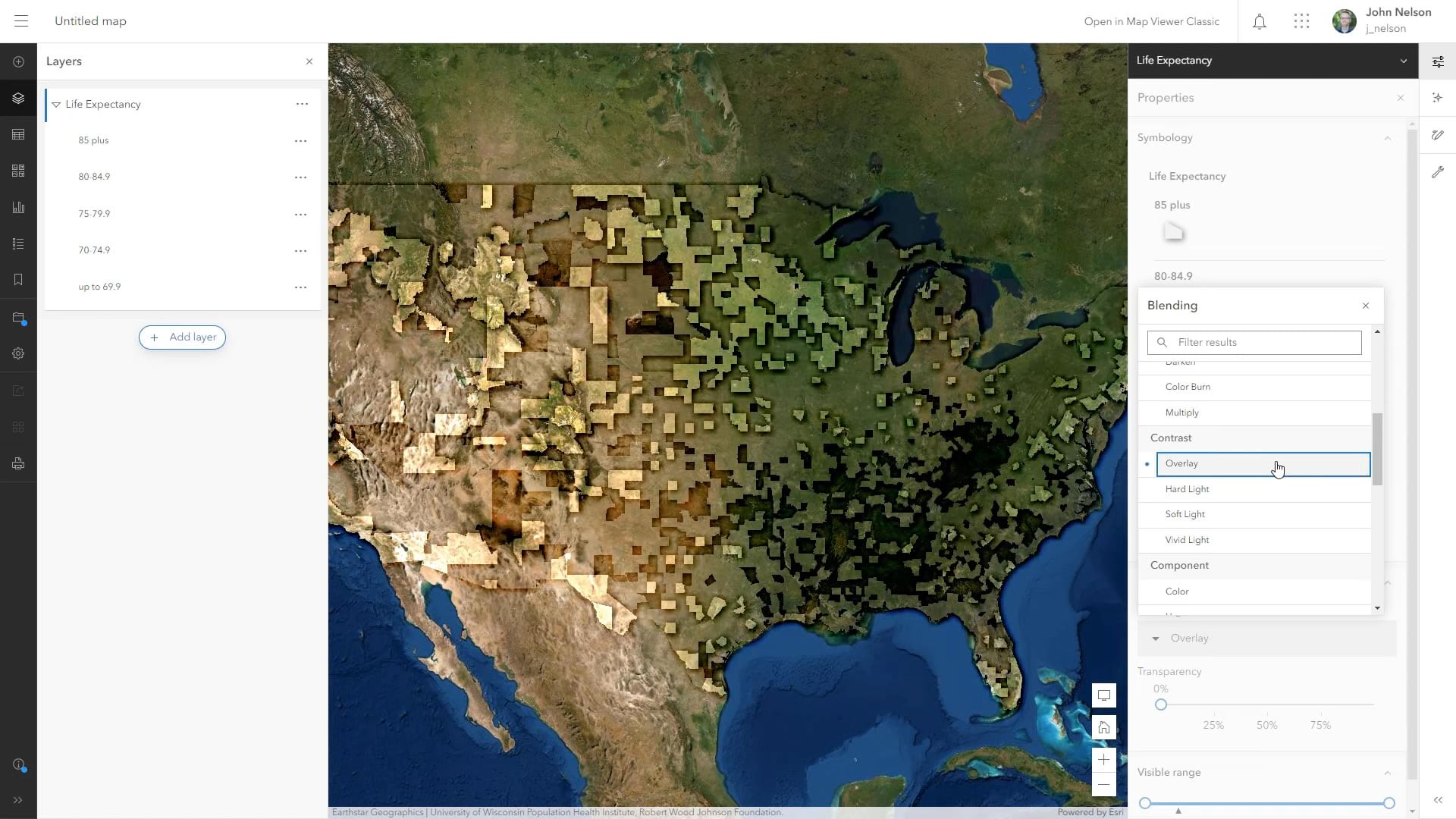
Overlay applies the light and dark grays of the layers (and their drop shadows) as tones to the underlying imagery, giving them a sense of illumination and depth. The lighter areas appear to be high plateaus and the lower areas are basins. It’s a landscape of low and high elevation driven by the low and high values of the thematic data.
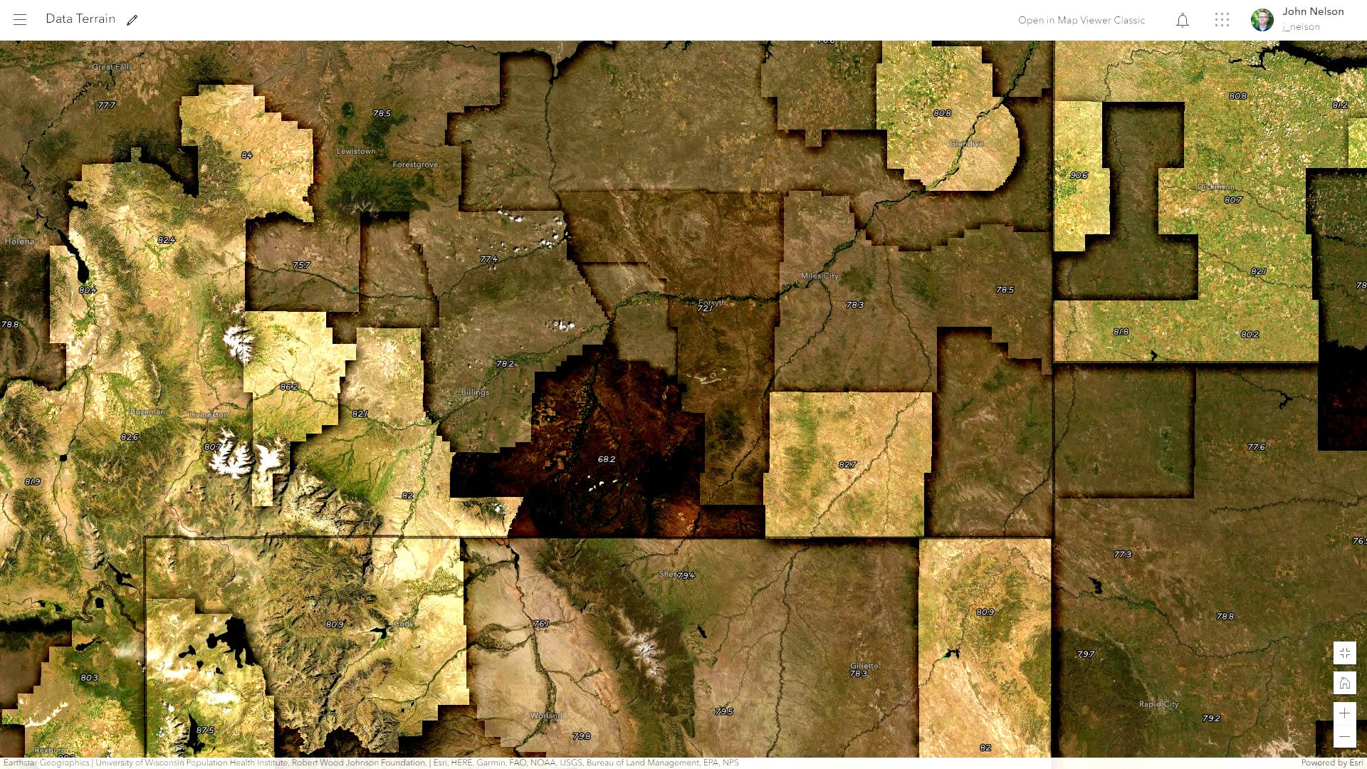
If you’d like to have a closer look at the example I’ve made here, you can fire up this web map. I’ve added labels for the life expectancy data, so there’s a bit more context when you zoom in. This is a fun one and pretty easy. Give it a shot with some choropleth maps you have laying around and see if it gives them a new sense of interest and intrigue.
Love, John

Article Discussion: