ArcGIS Living Atlas of the World now includes the best available medium scale world soils data and maps from the International Soil Reference and Information Centre (ISRIC) to support your mapping and analysis workflows.
Released in May, 2020, ISRIC used machine learning to predict values for 11 soil variables worldwide. They began with 230,000 soil profile observations, assigning values everywhere on the planet but Antarctica. Because quality varies worldwide based upon the density and quality of observations, they also provided an uncertainty value for each predicted pixel in each variable. Their original integer values at every depth range with uncertainty are available in ArcGIS Online (projected to web mercator) in the multidimensional tiled image layer World Soils 250m.
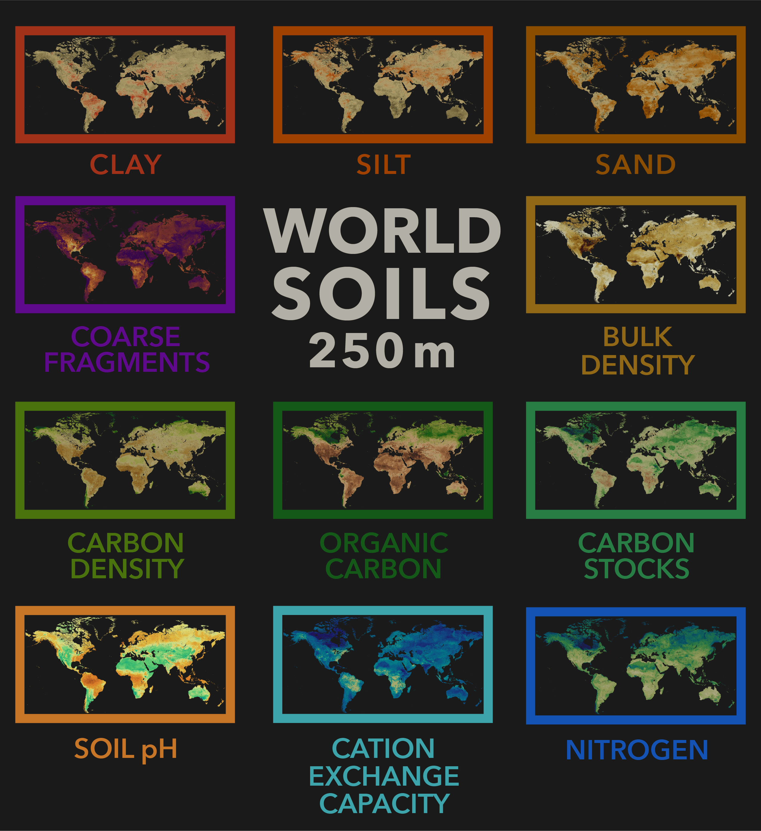
The World Soils 250m layers in the Living Atlas of the World feature these same 11 different soil themes, at 250 meter resolution, in their 6 depth ranges. They have been translated using online raster function templates into 32 bit floating point values for user convenience, and are adorned with specially designed cartography that leads to better understanding of the world’s soils. Popups are configured for each layer to give user friendly answers to human queries.
In our last blog, we showed you how to get started using these layers in analysis. A lot can be done with these rich layers: identify where there is carbon content, analyze places to grow specific crops, select sites for planning activities, understand the chemical properties of the substrate, and estimate costs. In many parts of the world, for many decisions, these layers bring a more realistic answer to land management questions.
Different soil variables at different depths, served together
World Soils 250m layers are served in 3 dimensions, represented by six depth ranges. This is very useful for discerning phenomena in topsoil vs. subsoil, or if you are interested in analyzing soil characteristics for a specific crop by its rooting depth, for example.
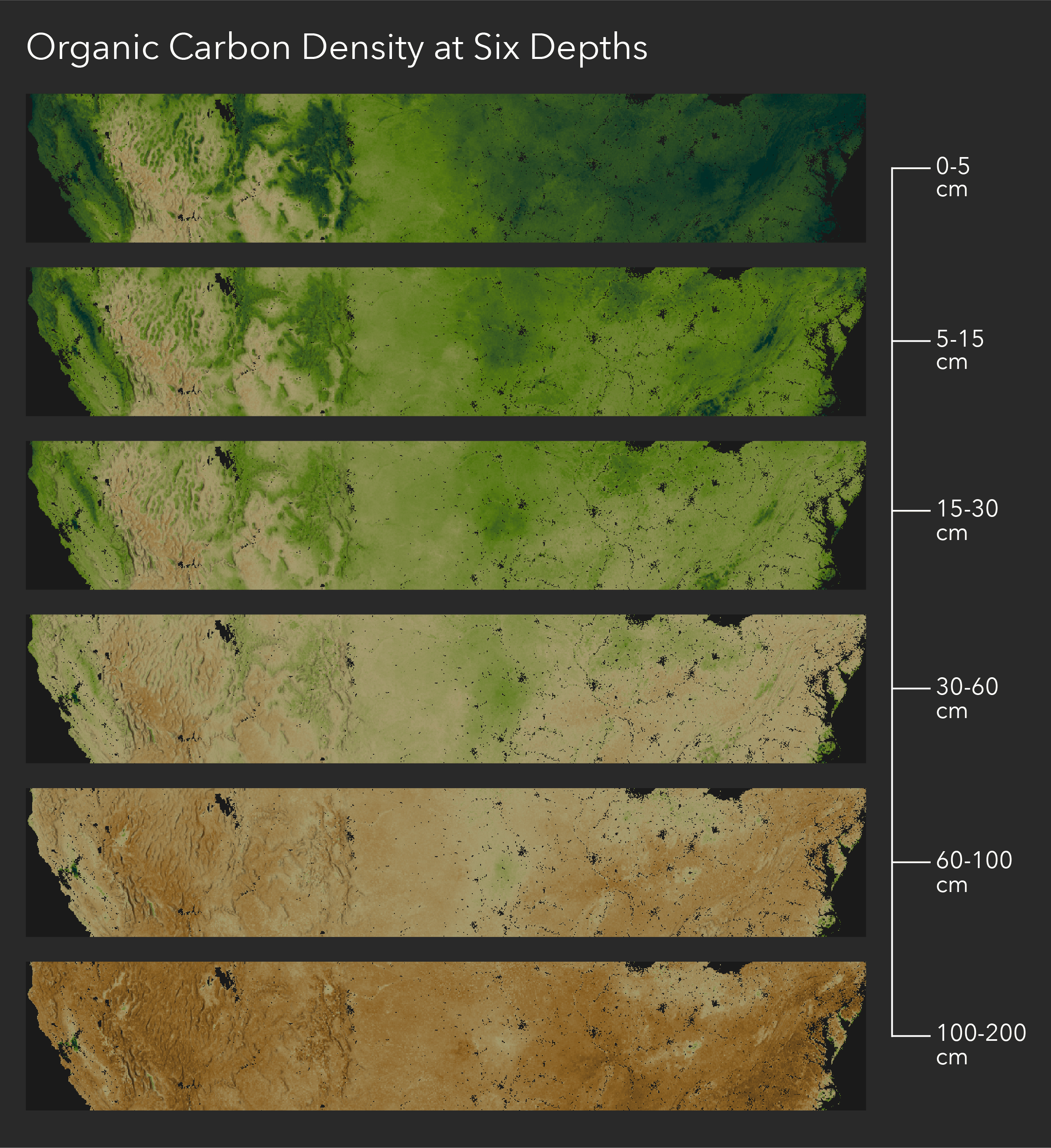
The depth ranges are as follows:
- 0-5cm
- 5-15cm
- 15-30cm
- 30-60cm
- 60-100cm
- 100-200cm
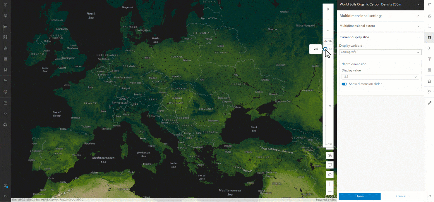
Check out where to find the multidimensional depth slider in ArcGIS Online:
Let’s dig into some of the finer details of the layers.
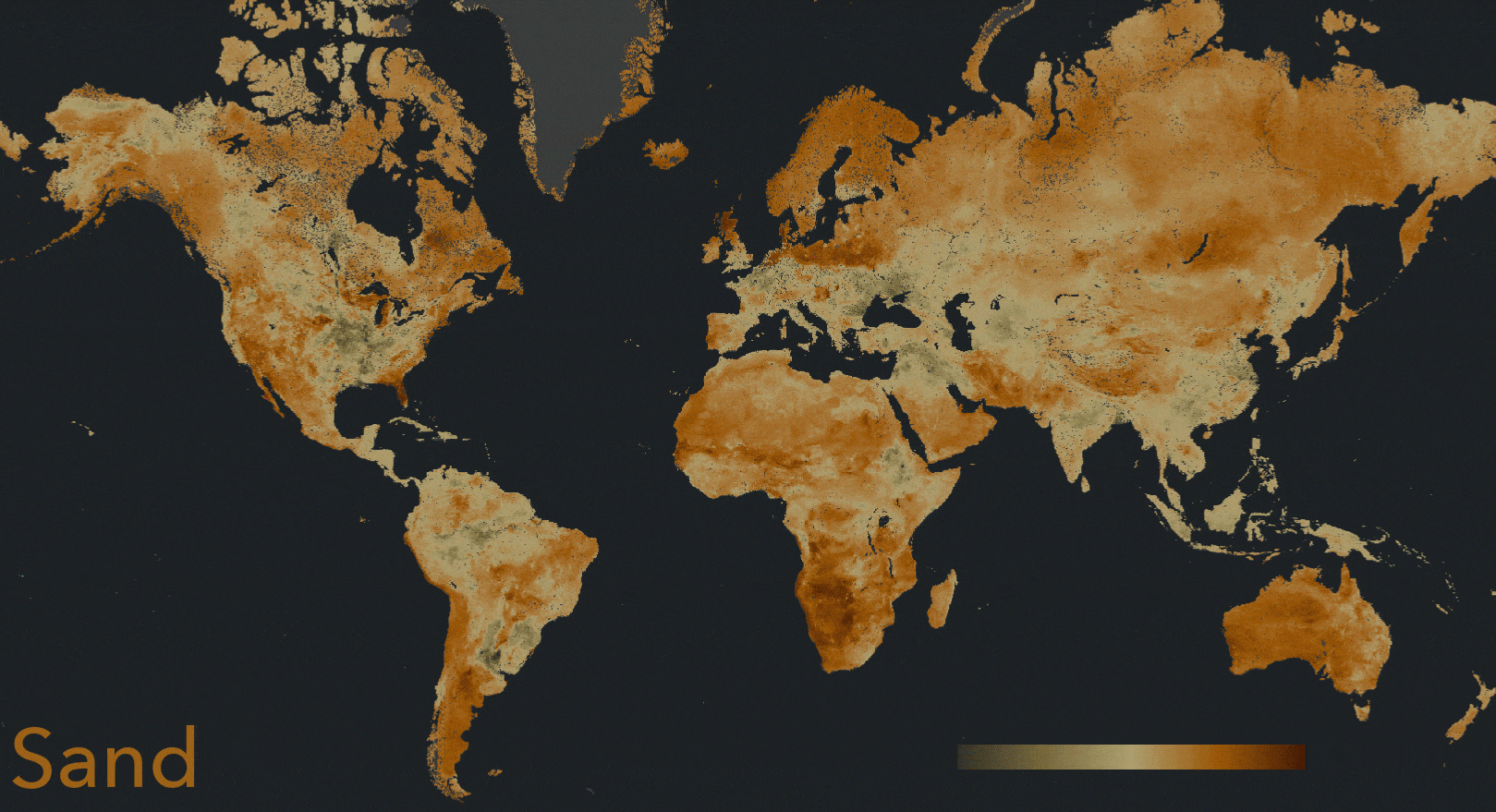
Sand, Silt, and Clay
The three particle size values of sand, silt, and clay, each useful on their own, combine into soil texture. Many plants have a preferred texture. Some crops or agricultural processes do not do well in the wrong texture.
In addition, sand, silt, and clay can be modeled for hydrologic purposes. The texture is useful in predicting runoff and infiltration rates, as well as drought susceptibility.
Since sand, silt, and clay are part of a particle “family” they were designed to all share the same low and mid color before moving into their own differentiating color of red, orange, and brown. A diverging palette was used so that they start with dark brown at 0%, change into a gold tone at 50%, and beyond, show themselves in their own earthy color.
This diverging palette allows everything to be discernible and of equal importance.
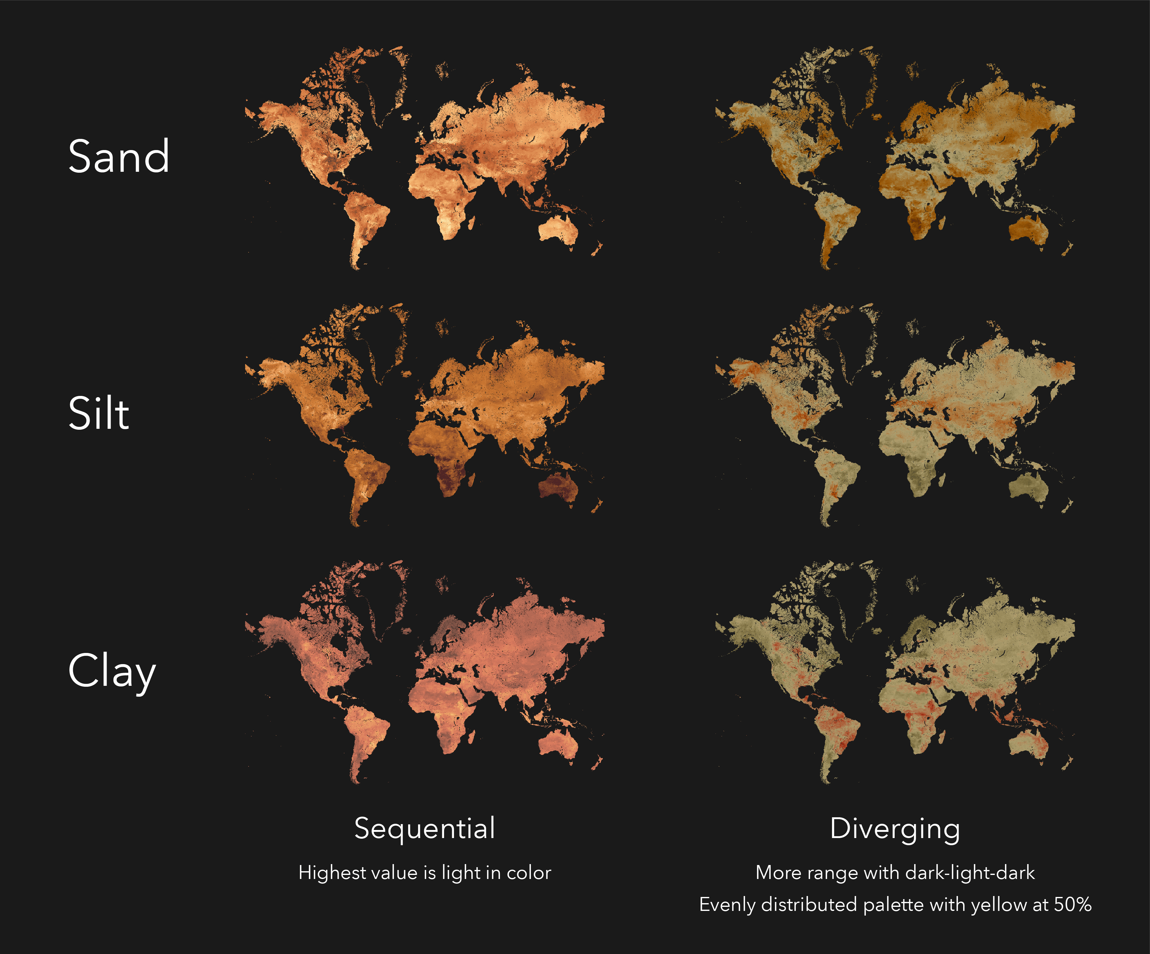
You can see the entire range of data, and more easily consume it even at a global scale.
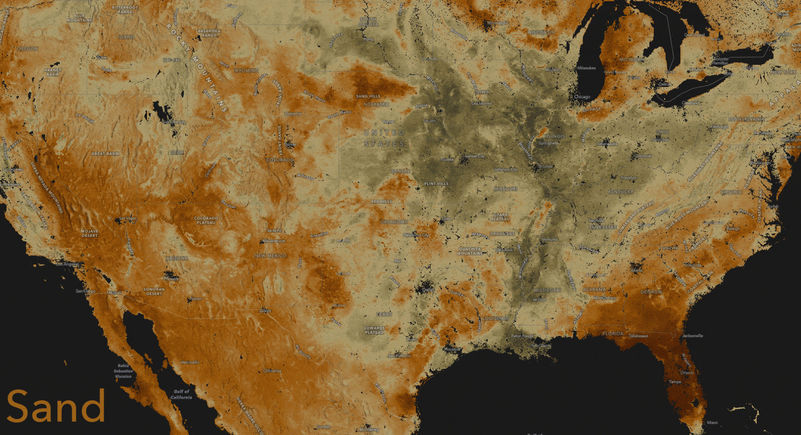
In the United States, the Sand Hills in Nebraska and Florida are especially sandy. In the heart of the USA where great rivers predomininate, silt makes up a lot of the landscape. Clay content is especially high in the Mississippi Delta and parts of Minnesota.
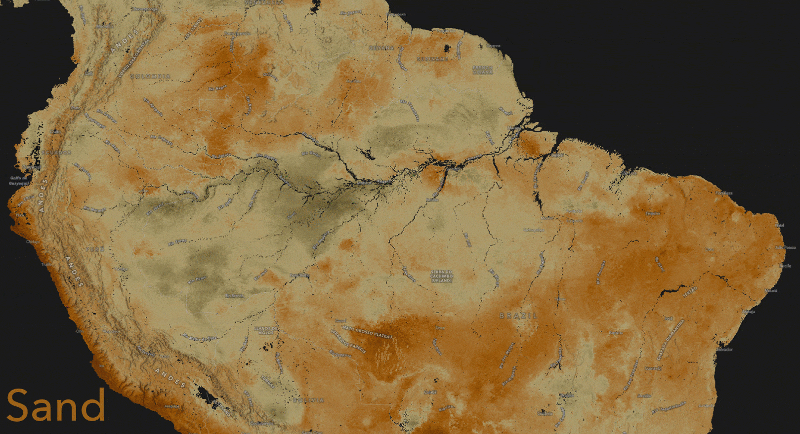
In the Amazon Basin there is much clay throughout, but also you can see where silt was carried and deposited by the great river, and where sand predominates on the Mato Grosso Plateau and in Northeast Brazil.
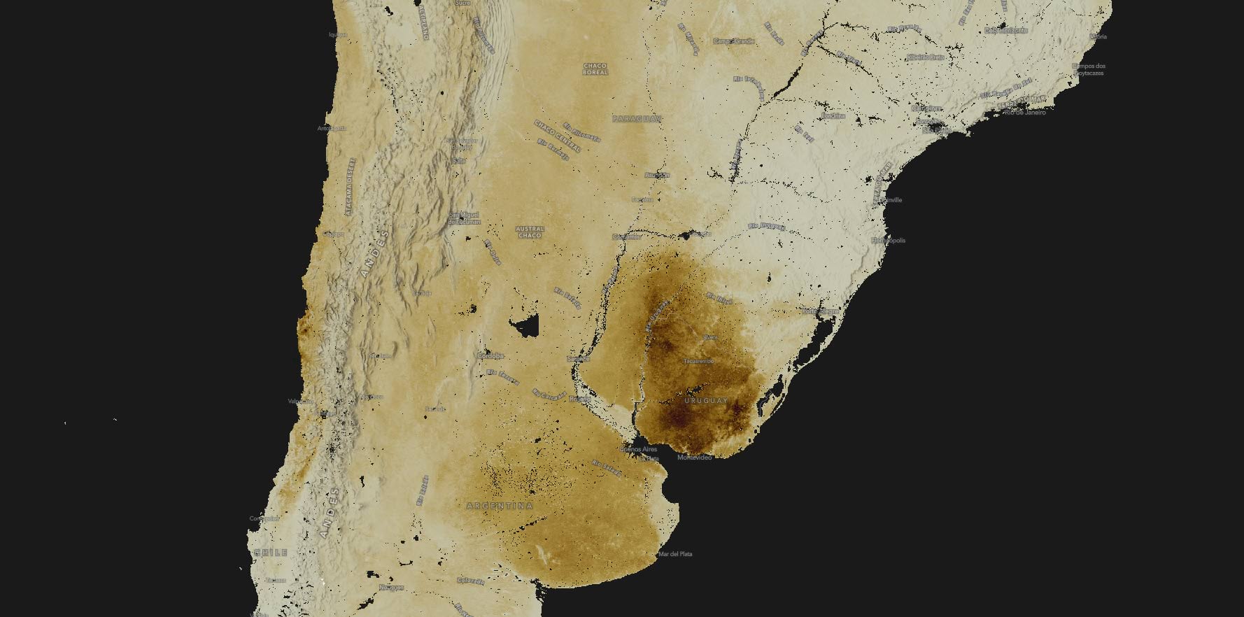
Bulk Density
Bulk density is simply the dry weight of a given volume of soil. It is a measure of soil compaction. In the darkest brown parts of Uruguay shown here, root growth may be impeded by the dense soils.
Coarse Fragments
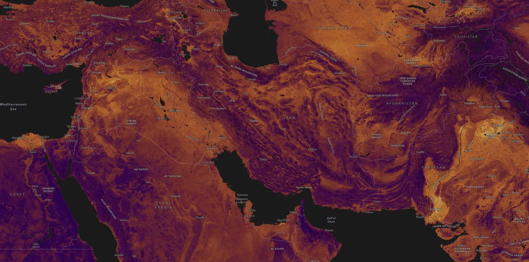
Coarse Fragments quantifies the proportion of the earth’s crust in a particular location that is larger than 2mm in size, larger than a grain of sand. Does an area even have much soil, or is it just… rocks and stones?
Areas of mostly soil, with a low percentage of coarse fragments, glow in yellow. On this map you can see them in Punjab, the Nile Delta, and the Indus River Valley. Where stony or rocky landscapes remain you see a deep purple indicating a high percentage of coarse fragments.
Carbon Density, Organic Carbon, Carbon Stocks
The World Soils 250m collection serves carbon three ways. Organic Carbon density maps the amount of carbon per unit of volume. Soil Organic Carbon shows the amount of carbon per unit of mass, and Organic Carbon Stocks displays the amount of carbon per square meter of land surface to a depth of 30cm (one foot).
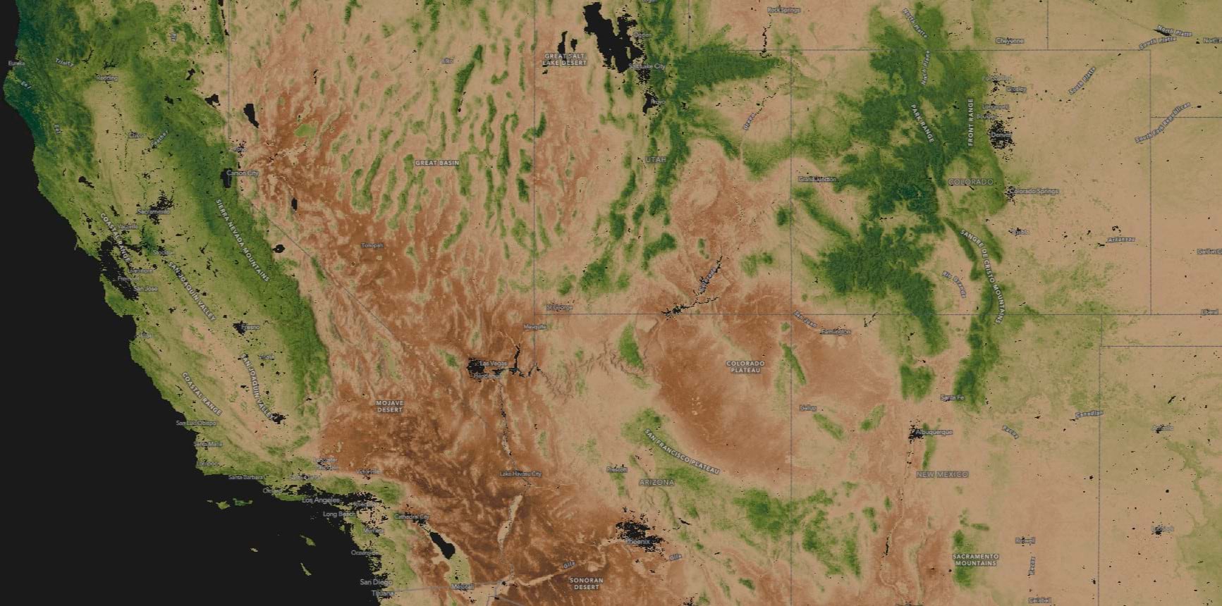
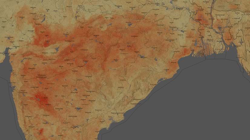
In the Southwestern United States, the higher elevations are forested while lower elevations are mostly grassland or shrubland. This image of Soil Organic Carbon shows where over time, carbon from the high elevation forests has built up in the soil. You can see how the bumps on the ‘washboard’, the Rocky Mountains, and the Sierra Nevada show in emerald green, reflecting a higher carbon content than the valleys below.
Nitrogen
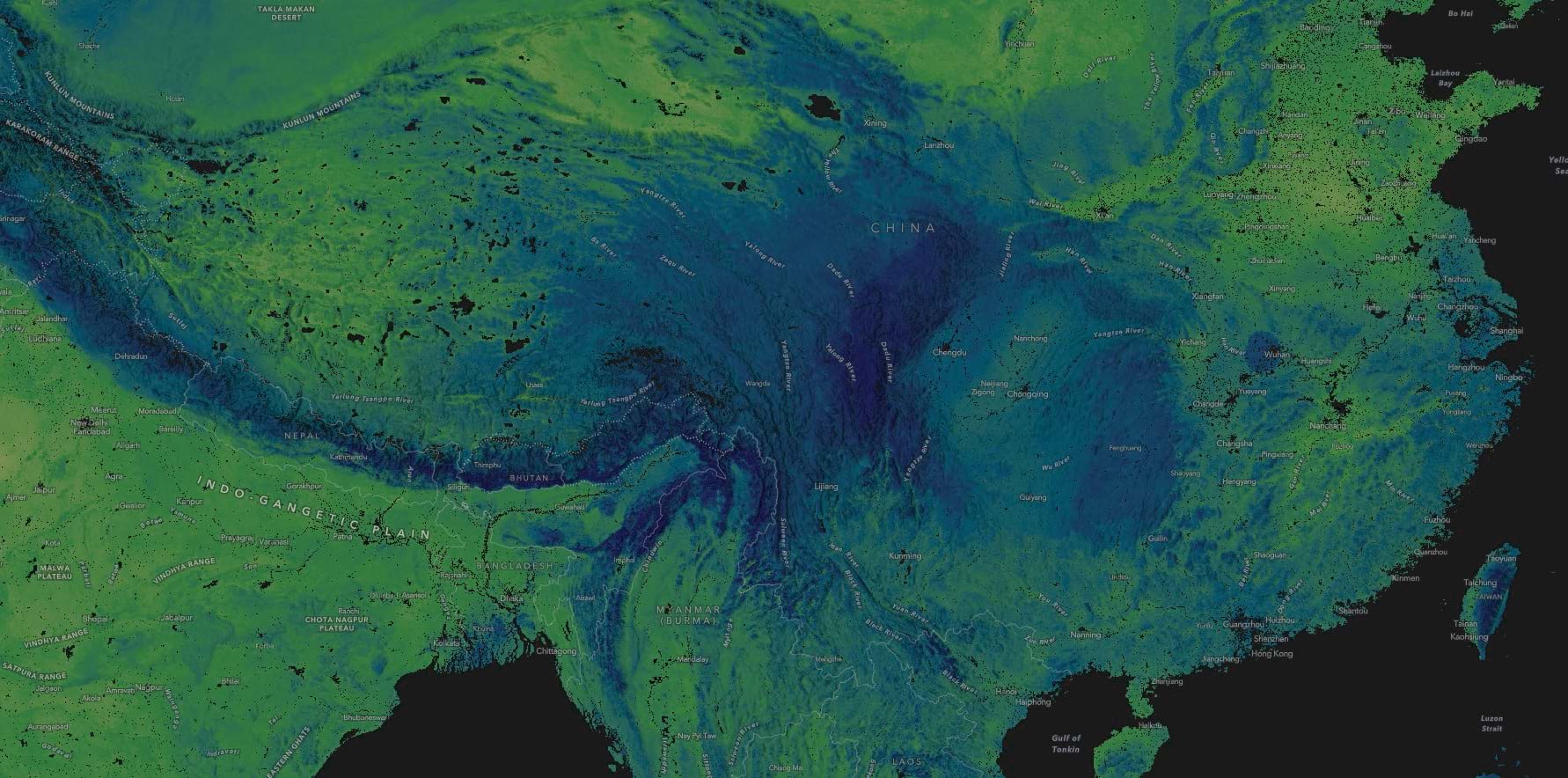
In the Himalayas and Central China, mature forests capture and store nitrogen in the topsoil. The higher nitrogen content shows up in deep blue.
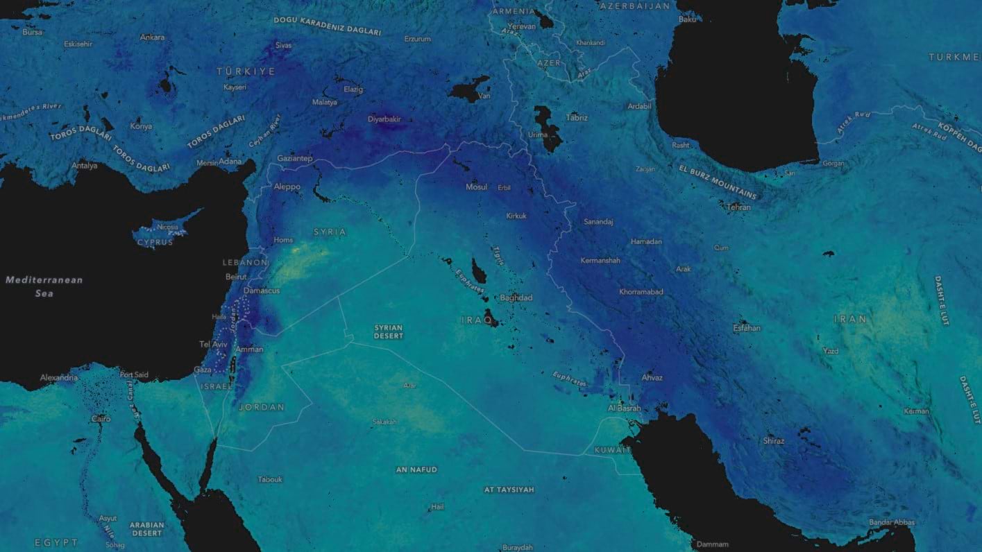
Soil pH
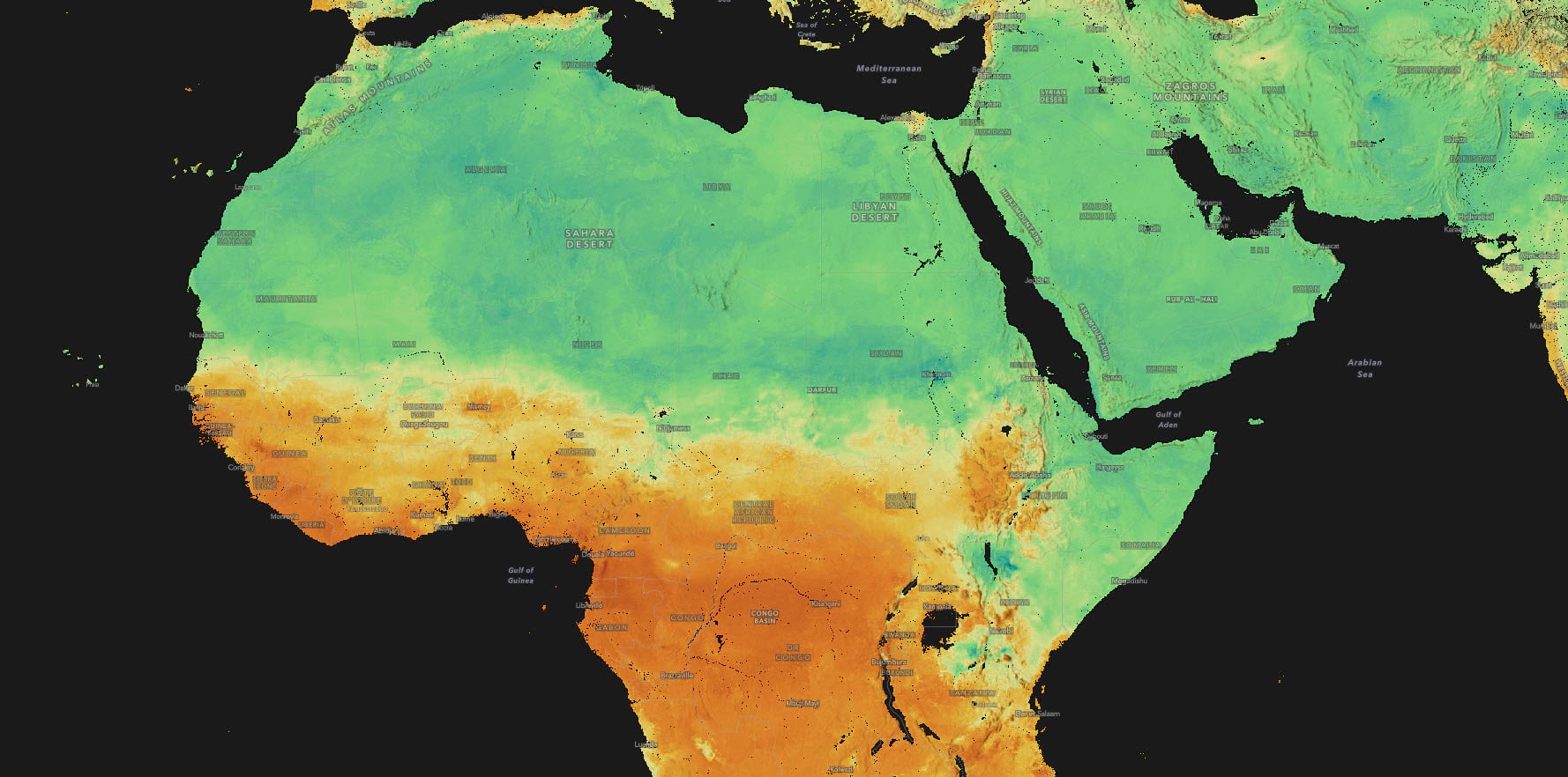
In this view of Central African pH, alkalinity shows up in light Kelly green on the dry Horn of Africa and in the Sahara. The rainforests of the Congo Basin show up in orange.
Cation Exchange Capacity
Cation Exchange Capacity quantifies the available ions of calcium, magnesium, and potassium in the soil, which are essential for plant growth and health. It is a measure of soil fertility.
We all learned about the Fertile Crescent in school, where civilization is said to have begun in the Near East. But we never expected the Fertile Crescent to reveal itself to us so elegantly in the cation exchange capacity map. The Fertile Crescent appears here in deep blue to purple.
World Soils 250m Cartographic Mask for Map Making
One last thought, with a tutorial: We included a cartographic mask for help in displaying these layers.
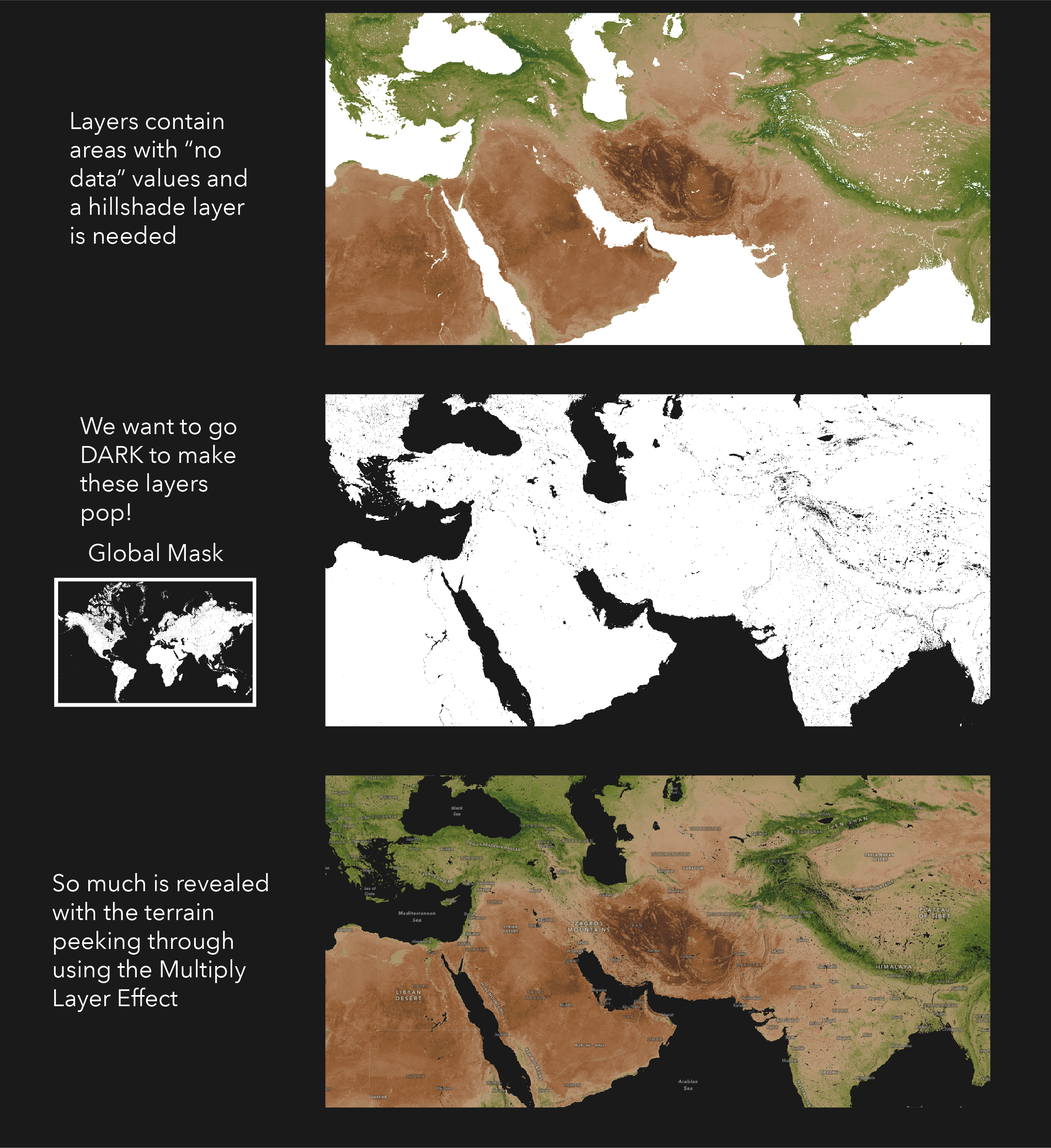
The World Soils 250m layers were designed for a dark background, which really helps the colors to pop. However, there are areas with no data in the soil datasets, like cities and bodies of water. Without a mask, these areas turn white and become the map subject.
Make a Soil Map
Here’s how to make a map featuring one of these layers, including a dark background and mask, in 7 steps:
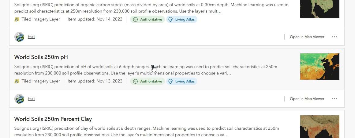
Browse to the World Soils 250m Living Atlas layer of your choice. As an example Let’s make a map of world soil pH in the top 5cm. For this, let’s go to the content item page for World Soils 250m pH.
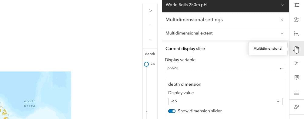
Click the open in map viewer button in the upper right corner of the page. You will see the layer open in map viewer with a table of contents on the left, and other options for the layer on the right.
Let’s adjust the depth slider to show just the 0-5cm layer in the map. On the right you will see a button that looks like a cube, this is the multidimensional button which gives us access to the six depth ranges. The multidimensional settings will appear along with a depth slider. Move the depth slider from the default to the top value of –2.5cm which is the mean depth of the 0-5cm depth layer.
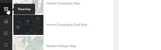
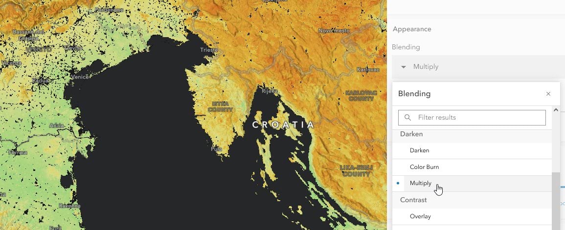
These World Soils 250m layers look great on any background, but are designed to work best on a dark background. On the left side, look for a button that says basemap and click it to change the basemap. As you can see there are several dark basemap options. Let’s choose the one that says Human Geography Dark Map.
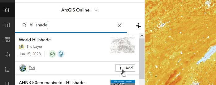
Next, click on the layers button and click the add button to add the world hillshade from ArcGIS Online.
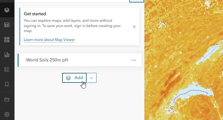
In the search box type “world hillshade”. You will see the tile layer World Hillshade. Click add.
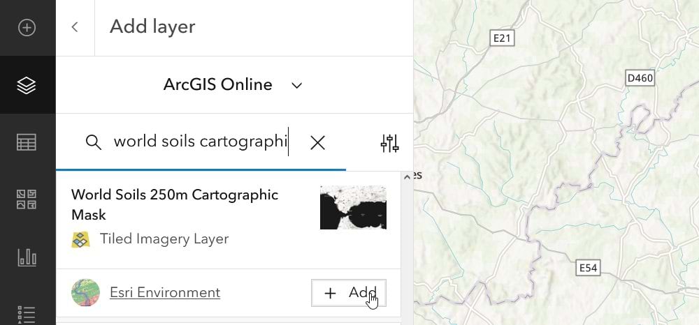
Next, click on the layers button and click the add button to add the cartographic mask from arcgis online. In the search box, type “world soils cartographic mask”. You will see the tiled imagery layer called World Soils 250m Cartographic Mask. Click add.
In the table of contents, drag the World Soils 250m pH layer to the top of the stack. On the right side in the Properties pane. Look for the section that says Appearance and Blending. By default, the blending of the pH layer is normal, but we want the layer to blend with the shaded relief below it. Click on normal and choose the Multiply blend mode.
Thank you for reading and please reach out to us with comments or questions!


Article Discussion: