Most demographic and health maps start with a spreadsheet of some kind. Good mapmaking can require good data management in addition to cartography. Data is rarely perfect, which is why ArcGIS Online makes doing quality assurance and data prep as painless as possible. Just because your tabular data is not “GIS-ready,” you can still make a great web map in ArcGIS Online!
Once you bring in a spreadsheet (either from a csv or text file or from file stored in Google Docs) into ArcGIS Online, you can use this checklist for quickly evaluating your tabular data, and mapping it without doing a lot of data prep and manipulation beforehand. When you host a feature layer, you have the ability to edit the data.
- Number of records as expected?
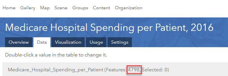
Quickly check that the number of records in your table matches what you’re expecting on your map. This may sound obvious, but it’s a split-second quality assurance check that can save you hours later by avoiding rework. Check this from the feature layer’s Item Details Page’s Data tab by viewing the number of features.
- Data Types are as desired?
The most interesting attribute in my layer of Medicare Hospital Spending per Patient is a numeric value called Score. This variable represents the normalized hospital spending-per-beneificiary per medical episode for some common procedures and hospitalization episodes: heart attack, heart failure, pneumonia, and hip/knee replacement. I need it to be a numeric field, but because there are some records with the values of “Not Available” it was imported as a string field. I can use an use the number() function in an Arcade Expression to temporarily convert the string to a number, but I’d like to hardcode the numeric field into my layer, so that if it gets exported into another format, it will be there.
To do this, I open the layer in the Map Viewer and apply a Filter.

Then I use the dropdowns to subset the data so that I am only working with records that have valid scores:
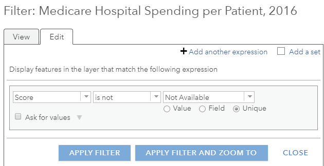
I now see fewer points on the map, and fewer records when viewing the table within Map Viewer:

Even with the filter applied, this attribute is still recognized as a string field, so I’m unable to do the Smart Mapping I want on the score. I’ll fix this by going back to the Table View within the Map Viewer, and selecting the hamburger Options menu in the top right of the table, and then Add Field (this appears because this layer is hosted by me):
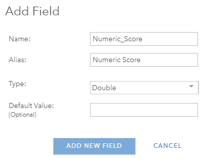
Scroll to the right of your table, and you will see your newly added field. Now we can calculate it! Click on the field heading, and select Calculate.
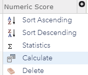
The expression is very simple here now that the “Not Available” values are filtered out. It’s Numeric_Score = Score.
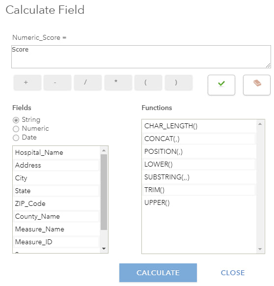
Now you should see your new column populated with the valid scores from the original field. We can now turn off our original Score field. While viewing the table within the Map Viewer, select Options, Show/Hide Columns and uncheck the original “Score” field.
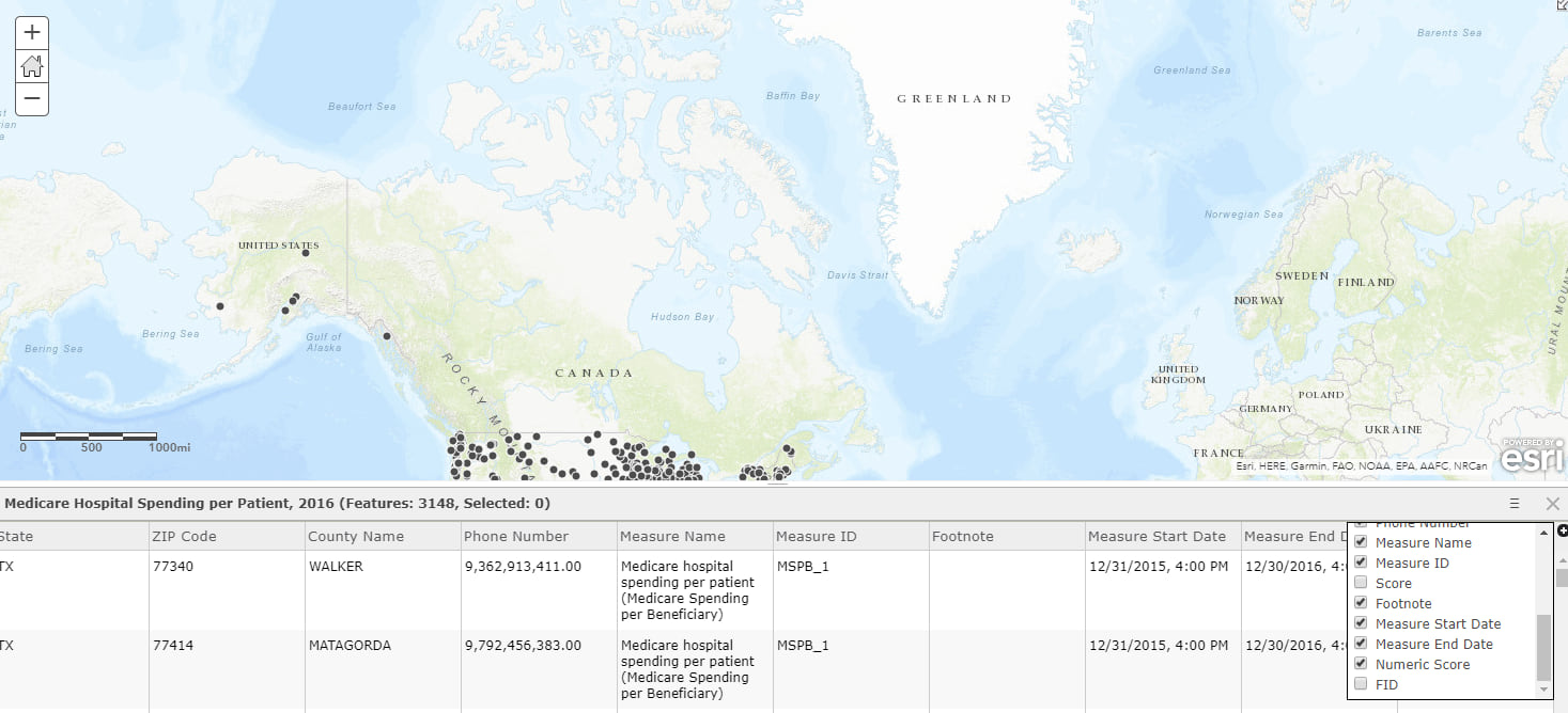
Now I’m able to use my Numeric Score field for the Smart Mapping I want to do!
- Sorting is as expected?
When you sort your data by a variable or attribute, are the top records (e.g., store locations, cities, hospitals, campuses) the ones that you would expect? Are there any null values or other odd values that would be revealed by a quick sort? I can sort while viewing the table within the Map Viewer, or I can do this back in the Item Details Page’s Data tab, as I did below:

- Do max and min values look right? Does the average value look right?
Now that I’m working with a numeric field, the Statistics option will appear when we click on the field header in the Map Viewer. (The Statistics option does not appear for string fields.)
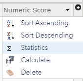
When clicking on Statistics, the descriptive statistics appear. Let’s check that this looks right.
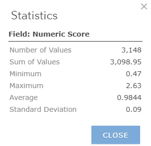
The average in our case should be 1 (or very close to it), since it’s a normalized score comparing hospitals on their Medicare spending per patient. The value here is .9844, close enough for our purposes.
Some “score” type variables have a very well-known maximum, such as test scores, credit scores, or GPAs. Less obvious is that these scores also have a minimum, usually of zero. That means that any -999 values (often indicating null values instead of a “Not Available” string that alters the field type) need to be filtered out before taking an average, or before applying cartography styles to our map. Check that you see a minimum of zero and not -999. If you didn’t catch this before bringing your table into ArcGIS Online, that’s okay. That’s what the filter button is for!
- Anything out of range?
Can a place really have 370 days of sunshine per year? Nope, because 370 > 365, which is the maximum number of days per year. If you have any variables that are time-related (hours per week, days per year) then you have some “acceptable ranges” that you can quickly check that your data values fall within the range you expect before you do any further analysis or Smart Mapping.
Ranges don’t necessarily have to be time-related. Age-related ranges are another common type. The range used for the working age population is usually age 16-70. Voting Age Population is often defined as 18+. Childbearing age (for women) is often defined as 15-49.
Ranges can also be something else besides time or age: full-time college students, for example, almost always have a unit-load between 12 and 20 units per term.
To check the ranges of multiple fields quickly, work in the Item Details Page’s Data Tab, and select Show Detailed View on a particular field:

This will take you to a histogram of the values, as well as the settings of that field:
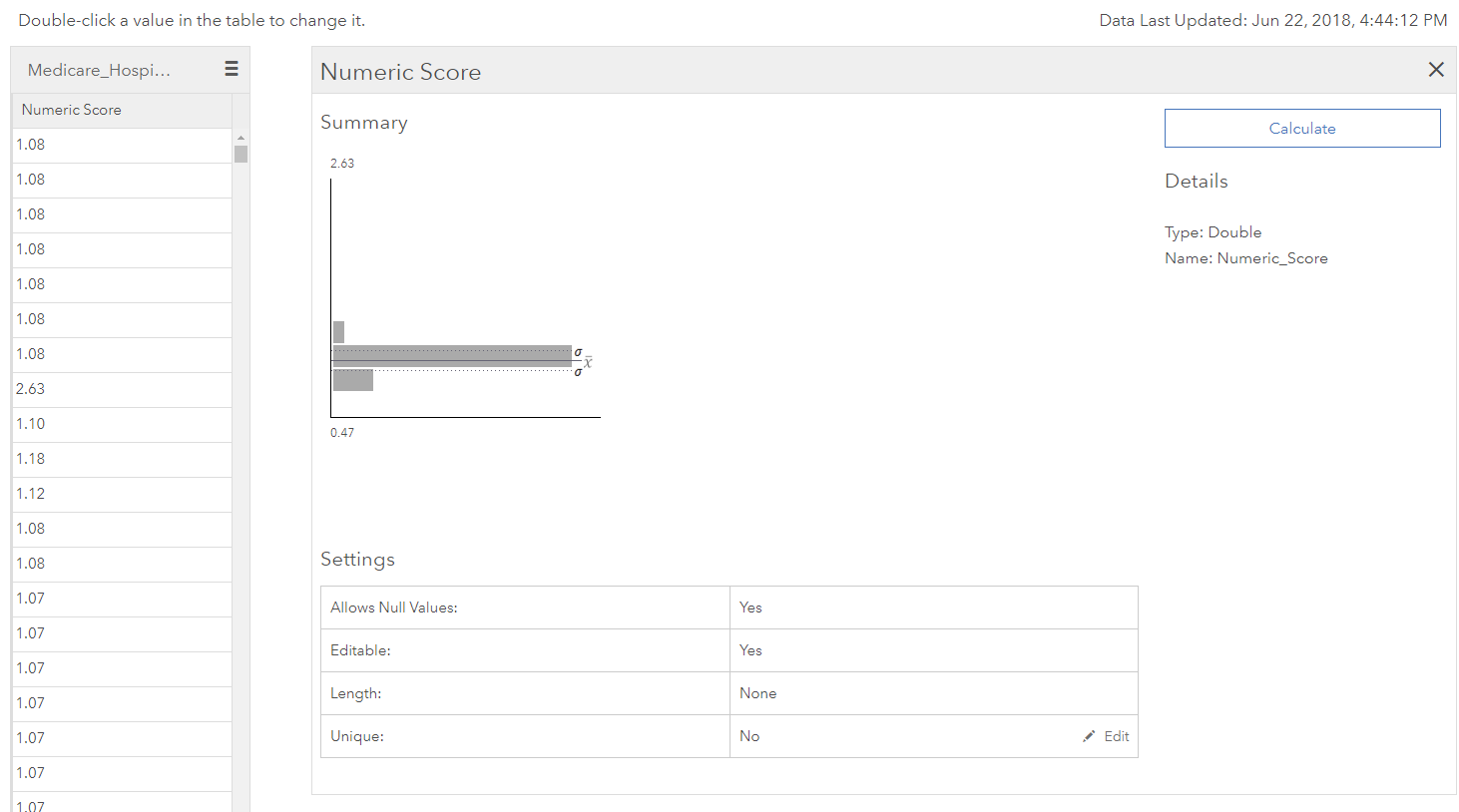
From here, you can select different fields by using the hamburger menu button on the column on the left:
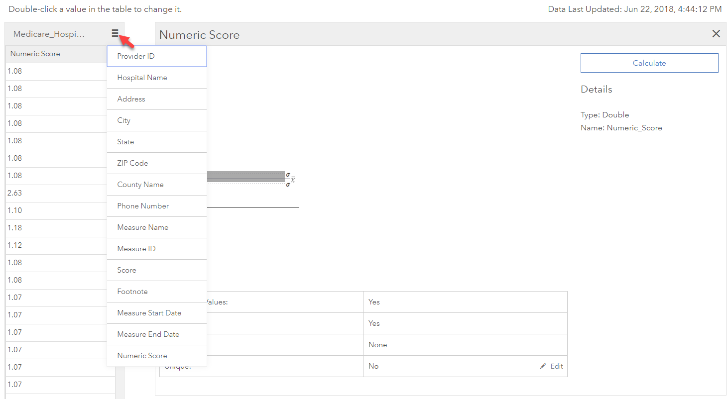
Much faster than working in the Map Viewer!
Keep in mind that these ranges can be different for different subgroups (subsets of the full amount of records). For example, perhaps unit-load ranges differ for semester campuses and quarter programs. Or the body fat percentage ranges that are completely different for men and women. You can check that your values are within these acceptable ranges by applying and removing additional filters, then viewing the summary statistics within the Map Viewer.
- Does the change from year to year look believable?
If you have multiple years of data, a quick test to check the quality of the data is to add a new field, or use an Arcade Expression, to calculate the change from year to year. Profits, campus enrollment, or disease survival rates almost never increase by 400% in one year. If it looks too good to be true, it just might be miscalculated, or it might point to a larger data quality issue.
- Sum (all parts) = whole?
Do all your parts add up to the whole? Parts can be either geography levels, or subgroups that are mutually exclusive and completely exhaustive.
Geography check:
Does the sum of population in all counties add up to the state populations? We can spot check a few states by quickly applying and removing filters to show only one state at a time, and then using the Statistics option from the Table View to check the sum.
Subgroups check:
Does the sum of all your subgroups add up to the total? For example, do all your counts for servicemembers in each branch of the military (Air Force, Army, Coast Guard, Marines, Navy) add up to your counts for total servicemembers in each state? Do all categorical percentages sum to 100 percent? Does your male and female population add up to your total population for each county? Doing this type of check in a systematic way by writing an Arcade Expression will help you identify problem states, counties, or tracts in a matter of seconds. Here’s an example using the Generalized USA Counties layer from ArcGIS Living Atlas – let’s check that the male and female population adds up to total population for each county. My favorite Arcade function for doing these types of checks is the iif() function. It’s very similar to an IF statement in Excel.
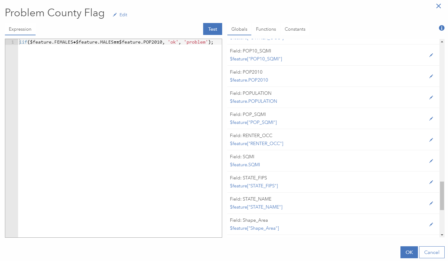
Click Test to check for syntax errors, and then click OK at the bottom. Fortunately, I did not find any problem counties in this layer, but if we had any, all our problem counties would be identified (and mapped!) for further investigation. Keep in mind that parts will only add up to the whole if your categories are mutually exclusive and completely exhaustive, meaning each person is in one and only one subgroup.
Adding to the checklist
What are some tips you’ve picked up over the years to check data quality? What quick fixes do you do to tabular data in ArcGIS Online? Feel free to add to the ideas presented here to create your own personal checklist for evaluating and prepping tabular data.

Commenting is not enabled for this article.