With the November release we are introducing several enhancements to charts in Map Viewer to elevate your charting experience. Continue reading as we explore these topics in the detail…
Custom sort for Bar charts
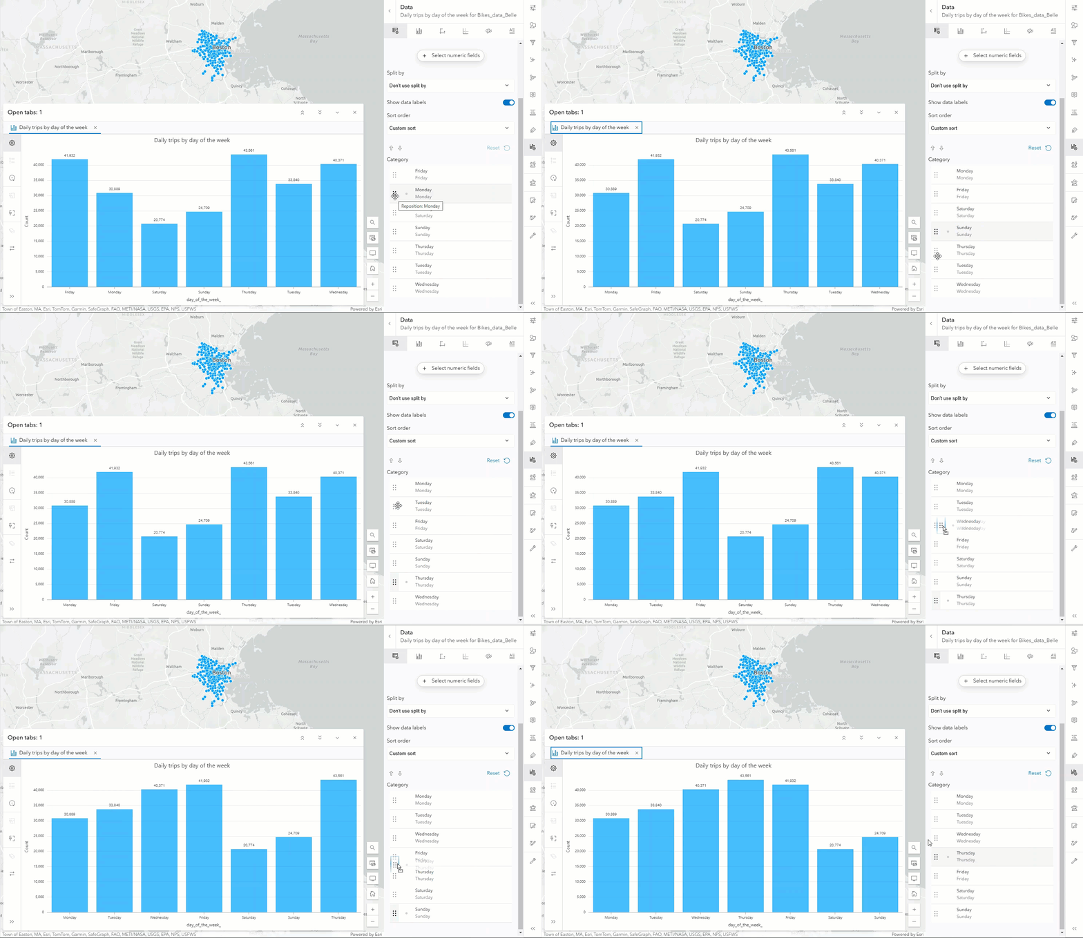
You can now customize how bar chart categories are sorted to match your preferences. For example, if you want to arrange the days of the week in their natural order, just choose custom sort from the dropdown to rearrange them easily.
Temporal guides
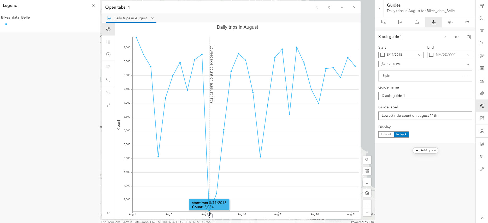
Temporal bar charts and line charts now support temporal guides so you can annotate a specific date or range of dates in your chart. For instance, if you want to call out a date with a particularly low value you can do that by adding a guide at that specific date.
Bar chart categories from numeric fields
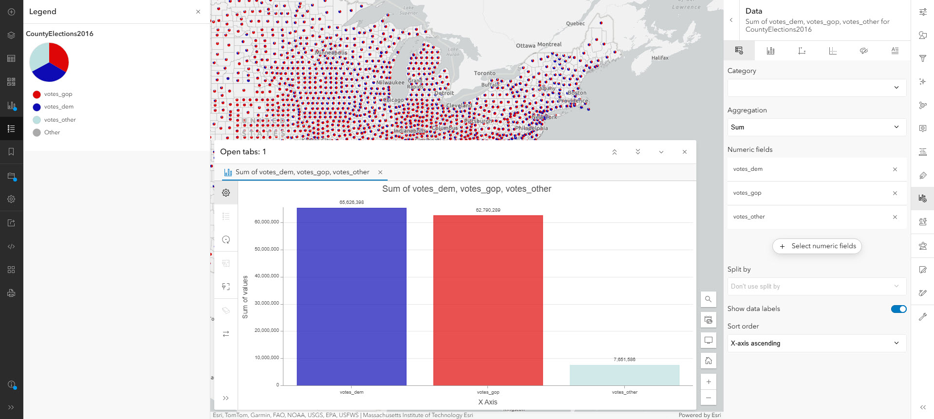
Typically, we use a category field to create bars in a bar chart, right? But if you want each bar in your chart to match a column in your table, you can make a bar chart using numeric fields as categories. For example, with this county election data, I can make a bar chart with three bars by picking three numeric fields – total votes democrat, total votes republican, and total votes other, and setting the aggregation to sum. Now each bar in the chart is the sum of values for its corresponding numeric field. And you’ll notice if I use pie chart symbology with those same fields the bars in the chart will match the pie slice colors in the map.
Support for subtype group layers
Last but not least, we’ve expanded our support to include another type of data source ‘subtype sublayers’ from subtype group layers. So, if you work with those data sources, now you can use charts to your advantage.
————————————————————————————————————————————————————————————————–
If you have any questions or comments, feel free to leave them on this blog or ask a question in Esri Community. I hope you enjoy these new features and would love to hear how you are utilizing these enhancements in your work!


Article Discussion: