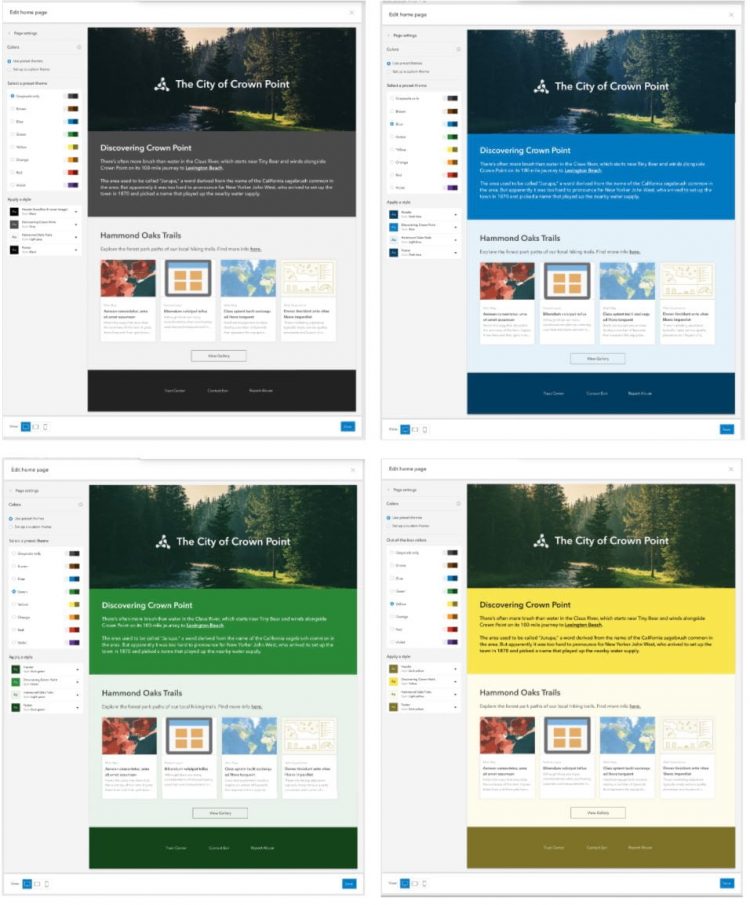
With the April 2021 update of ArcGIS Online, you can select from a palette of preset color themes —including blue, green, brown and yellow—to quickly transform your home page from black and white to color. When you select a new color theme, the home page editor automatically applies that color theme to the existing content on the home page. You can explore the various color themes to see how your home page looks and find the one that works best. The figure below shows the effect on the home page when you select different color themes, moving from gray to blue to green to yellow.

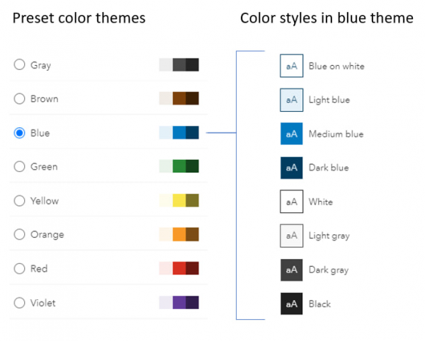
Each color theme contains complementary color styles that define the text color, background color and button color of the individual style. The original, single, Gray theme contains four color styles. The new color themes contain eight color styles, four of which are the same gray styles, allowing you to intermix color styles with gray styles on the home page.

As you select different color themes, the original gray styles applied to the blocks on your home page will change to the associated color style in the selected theme. The gray styles are duplicated in the colored themes for ease of use; however, when you apply a gray style in a color theme, it will remain gray as you switch between color themes.
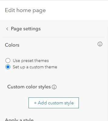
When your organization’s brand requires specific colors, you can create your own custom theme with four color styles that you define. Choose the option to Set up a custom theme, then choose Add custom style.

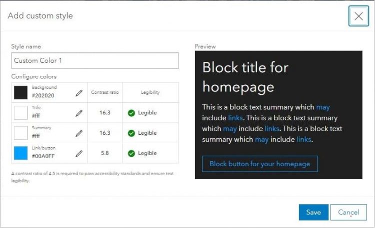
When defining a custom style, you specify:
- Background color
- Title color
- Summary color
- Link/button color
To help ensure that the colors you choose have sufficient color contrast, look for a green check in the legibility column. A green check indicates that the contrast ratio (e.g., the ratio of the title color and the background color) is greater than 4.5 and passes accessiblity standards for legibility.

Once you’ve created your custom style, you can then apply it to the content on your home page in conjunction with the gray styles.
Happy coloring!

Article Discussion: