Watch and map earthquakes in real time using subscription free layers available from ArcGIS Living Atlas.
What’s the first thing you do when an earthquake hits? After getting under a table, I always check a map to see where and how intense it was. Now checking that map is faster and easier for everyone in the world.
Near real-time earthquake information from USGS has been available in Living Atlas for years, but now there is an improved version of the Recent Earthquakes layers.
These new layers feature several improvements:
- Faster updates within your map or app
- Higher performance even under heavy demand
- Fewer layers that make applying filters easier
- Time is now enabled and is customizable using the time slider
- ArcGIS subscriptions are no longer required so anyone can view your map
Recent Global Earthquakes
The USGS maintains a Prompt Assessment of Global Earthquakes for Response (PAGER) program that is an automated system for rapidly estimating the shaking distribution, the number of people and settlements exposed to severe shaking, the range of possible fatalities, and economic losses. The estimated losses trigger the appropriate color-coded alert which determines the suggested levels of response (Red, Orange, Yellow, Green, or None Issued).
The maps and layers available from Esri present recent earthquake information directly from this PAGER program. Events are monitored 24-hours a day and are updated as frequently as every 5 minutes.
This means as soon as you feel or hear about an earthquake you can pull up this layer and find out exact details about the event’s location, magnitude, depth, PAGER, or tsunami warning. There is also is a direct link to the official USGS event page for even more information.
Also included is the shake polygon layer which provides a map of ground motion and shaking intensity using the Modified Mercalli Intensity scale, which helps to define the extent of the areas affected.
Multiple Earthquake Map Options
While you can customize an earthquake map however you like, several different maps already include preconfigured labels, pop-ups, and cartography.
1. Recent Earthquakes Layer
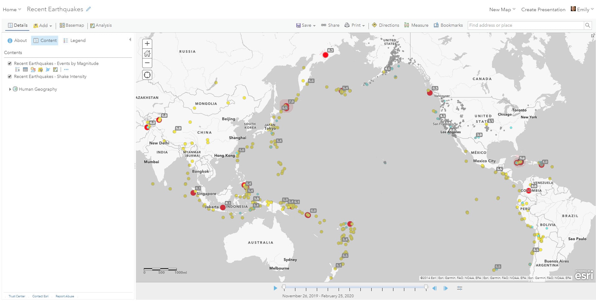
In the Recent Earthquakes layer, you’ll find events classified by magnitude. You may notice that some of the earthquakes have their magnitudes labeled. The map was designed with an Arcade label expression that restricts it to only display the magnitude for those earthquakes with PAGER alerts – thus highlighting the ones with greater impacts to human lives and property.
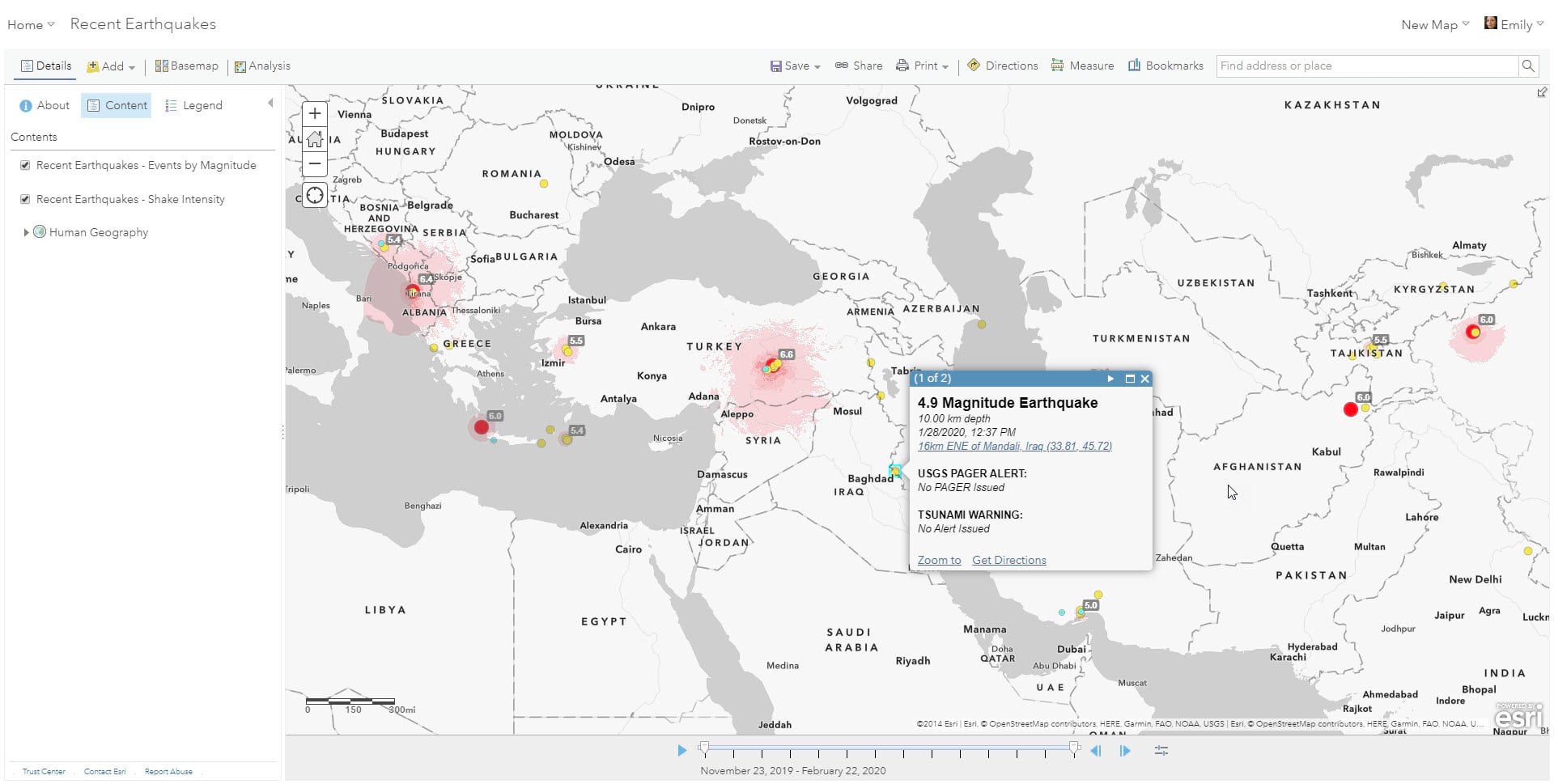
2. When? How big? How bad?
There is a second web map here which takes a deeper cartographic dive into the visualization of this layer. The approach was to create a map that would be able to answer those immediate questions people have when seeking information about earthquakes, namely:
When was the earthquake?
How big was the earthquake?
What are the impacts on people and the environment?
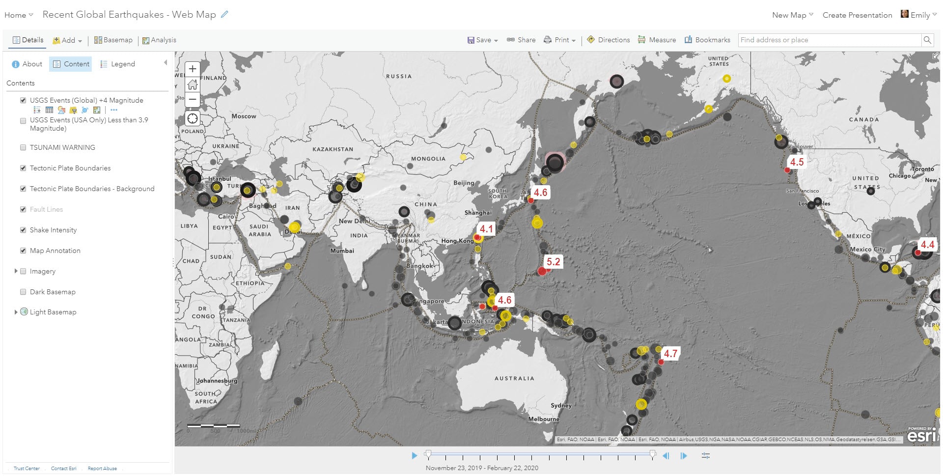
You can see here that once you know the earthquake color palette (Red < 24 hours, Yellow < One Week, Gray < 3 months) and that the stroke or outline of the point indicates PAGER or impact, you can start to answer the above questions easily even though there are hundreds of points on this map.
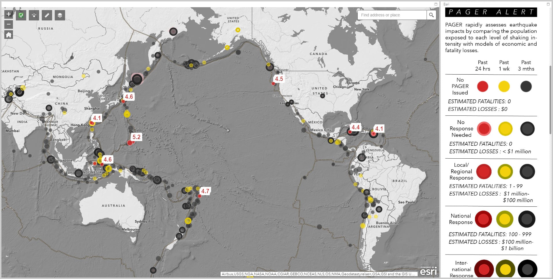
However, because the visualization of layer uses Arcade to join the three fields of time, magnitude, and alert level together, it returns 60 possible symbol combinations thus making the legend quite extensive. With that in mind…
3. Ready to Go…
The third option is a web app that’s available here for users who want the above map, but also need a built-in legend that has been customized already for sharing.
Updating Your Own Maps
Now if you have already been using Esri’s earthquake layer from Living Atlas, the older map service version of this feed will continue for the next year, but you should begin to move to this feature service version now before the older maps and layers are retired.


Article Discussion: